Monday, November 30, 2009

The End of An Era At 40% Off!

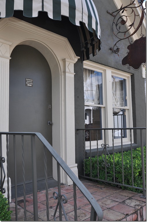
 stringer 021 Brian Stringer Antiques – the adorable French House.  Houstonians know not to enter through this door – rather they go around to the side door.


One of Houston’s best known and oldest antique store is closing shop, and it’s a very sad day.   Upon hearing the news, I stopped by Brian Stringer Antiques the other day to talk with Brian and his charming wife Kathy and  find out why they were shutting their doors.   Walking

around their wonderful shop, I felt a tremendous surge of nostalgia knowing that this was all coming to an end.    After all, Brian, ever the debonair Englishman,  is the godfather of antiques here, and for decades his shop was the first stop for interior designers and their clients.   It’s been a long haul for the couple, even longer for Brian who started out solo, long before he was married to Kathy.  Over the years, their popular shop grew, expanding to a main showroom and the charming faux French house with its striped awning next door.   At one point, they even did a stint in Dallas.  Everyone in Houston knows the shopping ritual here:  you go the main showroom first, work your way to the back storeroom, stop at the side showroom, then exit through the metal garage door to go outside where you then enter the little French house through its side door.    Going through those same motions that day, I wondered, how many times have I been here over the years?  Hundreds?   At least that, I decide. 
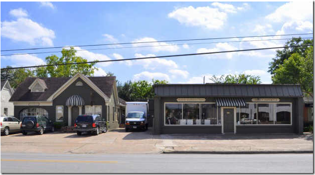
 

   image The main showroom on the right – the French house on the left.   At one time the house on the right (not shown) was also part of the complex.  One year Ginger Barber moved her shop, The Sitting Room, into that house on the right, renting it from the Stringers.  Today, after moving at least three mores times,  Ginger is back near the Stringers again – her shop is now two doors down, on the left!  The West Alabama corridor has so many fabulous antique stores, it has become a major destination for shopping. 


Why close the shop after all these years?  Settling into one of their comfortable chairs, Kathy Stringer proceeds to explain:   they are looking to have more fun in their lives after working so hard, for so long.    The decision to close wasn’t easy, but over the summer – it was finally decided.   The Stringers are thrilled to be entering this new phase of their lives.   But still, why?   Kathy says simply, “the business was running us, we weren’t running the business.”   Today’s climate is certainly not wonderful for the antiques business.    They have seen it all change – EBay, 1st Dibs and Internet sales have made it less personal – there’s not much client loyalty in this high-tech era.   China has become a huge influence on the market – their reproductions are taking over the world.  And then there’s the Euro -  at first, dealing with the new currency was beneficial for the Stringers – today, the dollar can’t compete.    Ticking off the list of reasons why the Stringers want out, Kathy laughs:   “We  survived the 80’s in Houston and thrived – now we are just too old to wait this current recession out.”   And then there’s this reason:  France is calling them.  They own a 14th century chateau in the countryside between Bordeaux and Gers.  Simply put, they want to spend  more time there. 
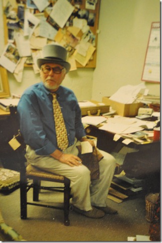


stringer 082This framed photo of Brian Stringer with the caption “Our Fearless Leader” graced the showroom for years.


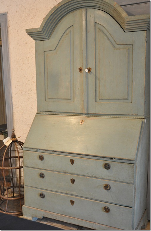
Who can blame them for wanting to close up shop?  Brian Stringer started out in the antiques business over 40 years ago – all spent in the same location on West. Alabama.   He’s been the trend setter here, others followed his lead and his hunches.   In the beginning he imported mostly pine and oak pieces from  England.  Kathy estimates they have sold thousands of his famous dark oak Windsor chair.    Trends dictate changes and the Stringers headed to Italy for mirrors and light fixtures.  There, they discovered the gorgeous painted pieces that Brian Stringer Antiques became known for.   Always ahead of the curve, Stringer was the first in Houston to import the Italian furniture.   Later, continental furniture came from Spain and filled the shop.   Still on top of their game even today,  the shop has a large selection of the popular Swedish antiques.


stringer 073

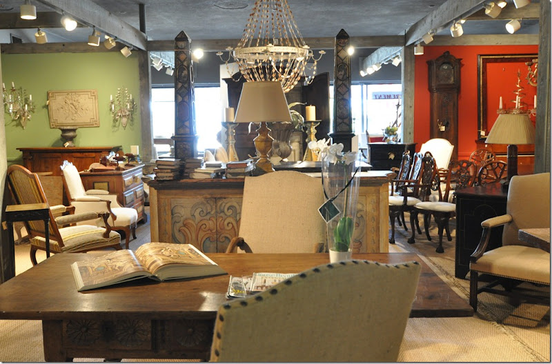
The main showroom of Brian Stringer Antiques – the painted Italian console is the look the Stringers became famous for during the past decade.


As we continued to talk, Kathy reflected on the changes in the business.   Though the Stringers have had an internet presence for five years, it has not been as beneficial as old fashioned advertising in magazines like Southern Accents and House Beautiful.   Their beautifully photographed ads brought in profitable bicoastal business.    When 1st Dibs came calling, Kathy found it too complicated to get involved with.   Perhaps she knew where it was all heading.    With the volatile Dollar and the terrible business climate here and overseas, the Stringers are just ready for a change.    They don’t want to sell their business – they want to close the door and walk away.   To this end, everything, and I mean everything, in the store is on sale at 40% off.    Brian Stringer Antiques will stay open until the majority of the stock has sold.   When it is all finished, whatever is left, they’ll either keep or put in storage.     Then they’ll head for France to relax and we’ll be left to find new places to shop.   Walking around the store for the last time – memories flooded through my mind of all the beautiful things I have bought here over the years and all the things I had wanted to buy!     Mostly, there were times when I would stop in just to look at the antiques, and there were  other times when I would come to rummage through the wonderful George Smith fabric samples, that they alone in Houston carried.     I wonder who will buy the property, the valuable real estate their store sits on?   Will the new owners also sell antiques?    The change wouldn’t be as profound if they would just sell the business outright, along with the merchandise.  At least it would still be here, albeit with different owners.   Still, I think the Stringers made the right decision to just close their doors.    No one but those two could ever run Brian Stringer Antiques.   


DID YOU SAY 40 PERCENT OFF????????

Yes I did!  Everything in the store is  now 40 percent off!   Forty Per Cent!!??!!!  Everything!!!!   It’s enough to make your head swim at the possibilities!   If you are looking for that certain something – now’s your chance.  And hurry!  Forty percent off is awfully tempting to a lot of people.
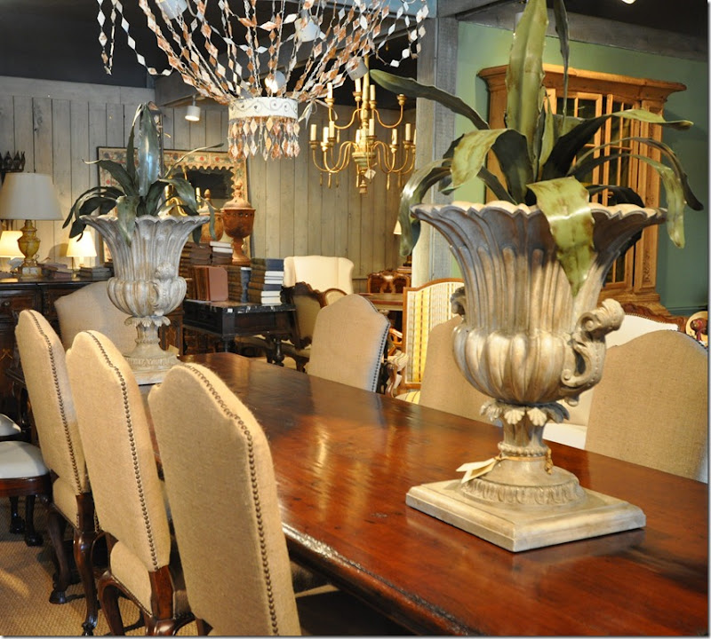


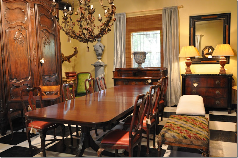
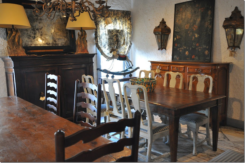
stringer 122 Brian Stringer Antiques is the place to go for wonderful antique and reproduction dining tables.  Their chair selection is legendary.
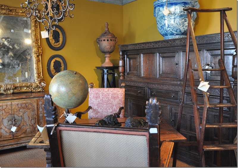


stringer 111 There’s not much here I don’t want – the globe, the library ladder, the urn, the portraits, the mirror, the desk.   Wrap it all up and move it to my house, please!
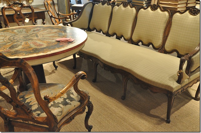


stringer 088This settee drives me wild – if only I had the space for it!  The Italian table with the painted finish became a signature look for Brian Stringer Antiques.


stringer 118

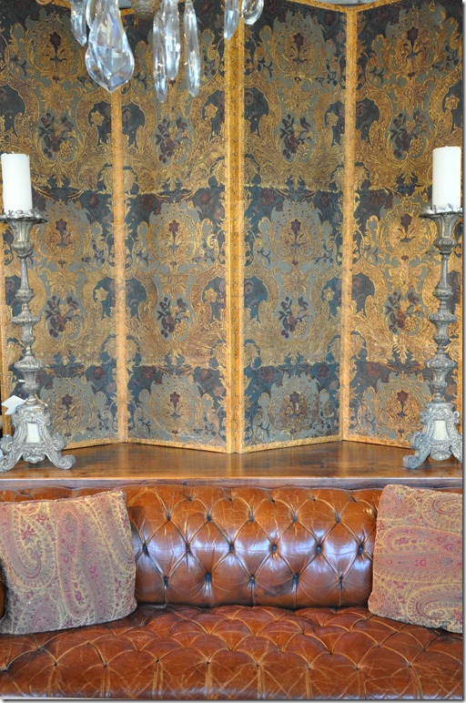
There is this remarkable Spanish leather screen from the 1690s - amazing.  The leather sofa is the real deal. 


stringer 104

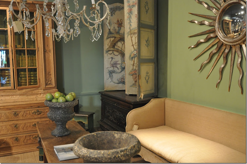
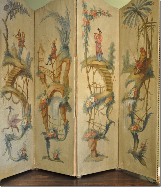
There are several Swedish sofas in the shop, but that screen is catching my eye!


stringer 094

To die for!


stringer 107 Look at how beautifully this French antique armoire is finished inside – it’s like two pieces of furniture in one!
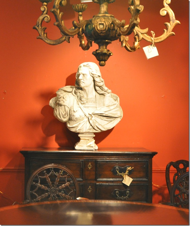


stringer 109 The bust is fabulous, especially against these vivid colored walls.
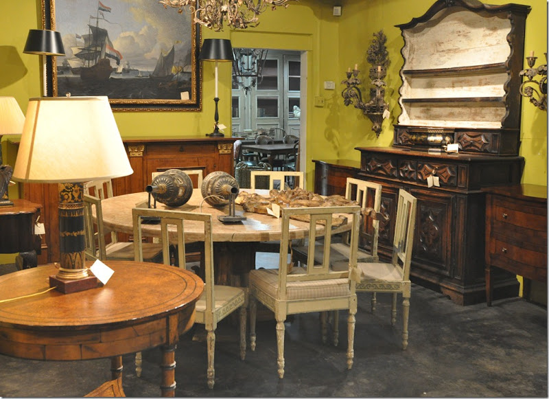


stringer 039 There’s more eye candy in the back showroom – these chairs are beyond fabulous!
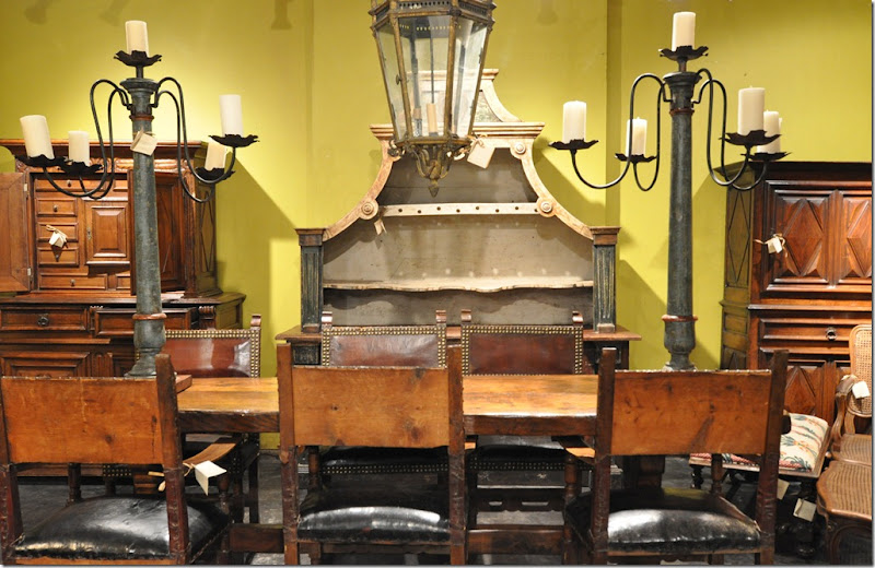


stringer 042 I’m not sure if the cabinets are an exact pair – but at 40 percent off, who cares? (Open your screen all the way to see the entire picture.)


stringer 032

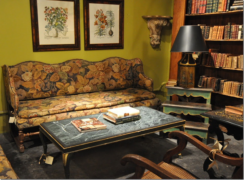
I’m crazy about the sofa, though I would probably recover it and save the upholstery for pillows.
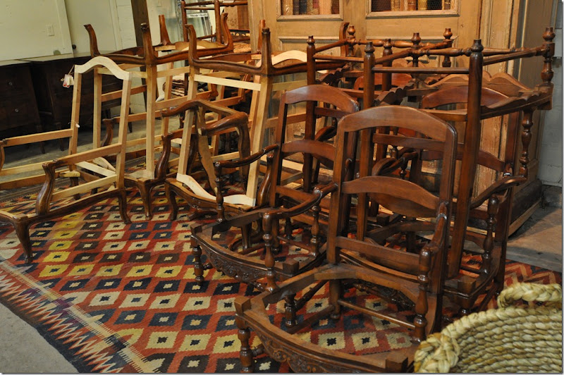


stringer 028 Besides antiques, Brian Stringer Antiques carries a fine line of reproductions.  Now is the time to buy a chair at these prices.
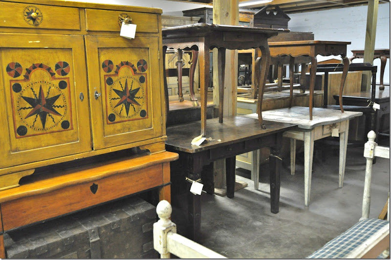


stringer 049 One of my favorite parts of the shop – the back storeroom where a million antique tables are stacked on top of each other.  Notice the darling white table with the blue trim.
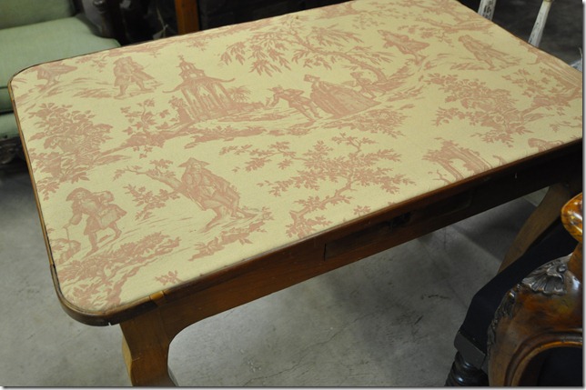


stringer 051This table, topped with the red George Smith toile, is just too cute.  


stringer 056

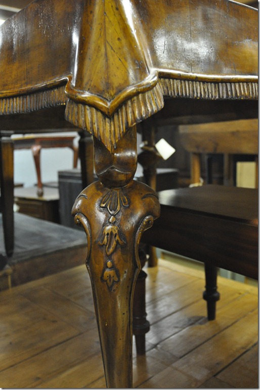
 This remarkable side table is made with a carved wood “tablecloth” covering it!


stringer 059

The side showroom always has the most wonderful antiques placed about.


stringer 071

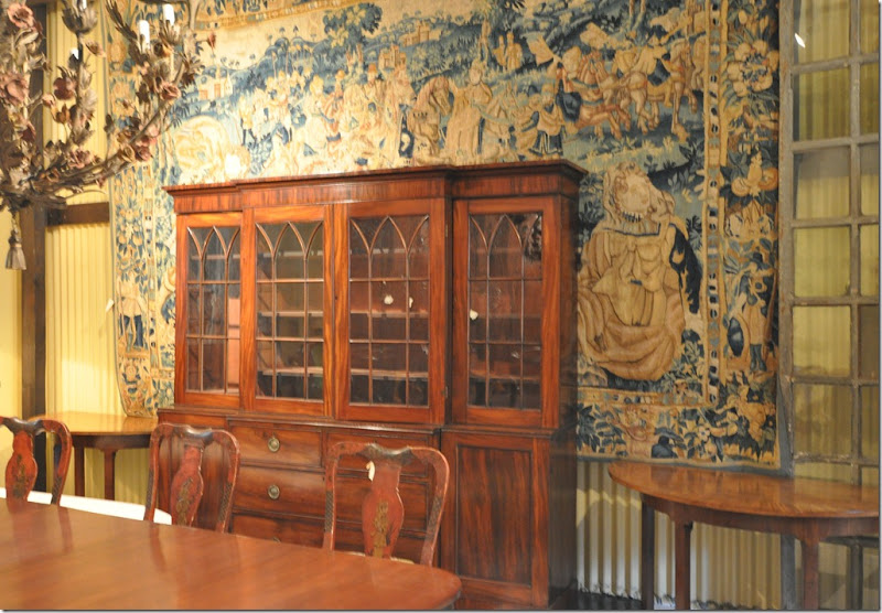
An absolutely amazing centuries old tapestry – just waiting for it’s new home.
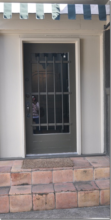


stringer 124Now that we’ve toured the main showroom, it’s time to go outside through the garage door and enter the French house, via it’s side door – got that? 


stringer 134

The French house used to be stocked mainly with French provincial antiques.  Now I notice there are a lot of Swedish antiques in here too.


stringer 140

The furniture in the French house is always less dressy.   This is where I usually found what I was looking for.
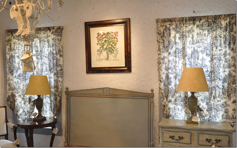


stringer 145 I love that painted cabinet – so pretty with the blue trim.


stringer 150 What a great painted desk.


stringer 154One of my favorites today! 


stringer 151 The French house is so charming – you really feel like you’re in the South of France, except for Houston’s traffic out the front window!


stringer 155

Yes!!!!!!


stringer 163

  I don’t want to leave.  I’m lingering around, stalling, wondering is this the last time I’ll be here?   What will happen to this charming house? 


Over the years, the Stringers absolutely charming house in Houston was published a few times – once in a local magazine and once in Southern Accents.  A few years ago House Beautiful invited Patrick Dunne to go to  France and visit the Stringers at their 14th century chateau with the romantic name:  Commanderie de  Sainte Antoine.   Brian had bought the property without Kathy, though when she first saw its turret, she instantly understood what had attracted him.     It was a man’s house totally,  with thick stone walls and floors and an ancient studded front door.    The house started out as a fortified hospital run by the Brothers of Saint Antoine, a band of monks, who set up hospitals to treat a mysterious skin disease that swept through Europe during the Middle Ages.  After the French Revolution, parts of the chateau were left to fall into ruin, while other parts became the main house in the small isolated town.    The Stringers have spent years renovating their place, but Kathy has left the interior decorating to Brian, worried she might make it all too pretty for him.   The house is huge and one entire wing has spent the last century boarded off.  Of course there is the turret - a tower room with sweeping views of the countryside.    Now that the business is to be closed, the Stringers are looking forward to spending more time here where they are sure to be happy and content, sipping wine and eating cheese – and doing all the things that those in the French countryside do so perfectly.

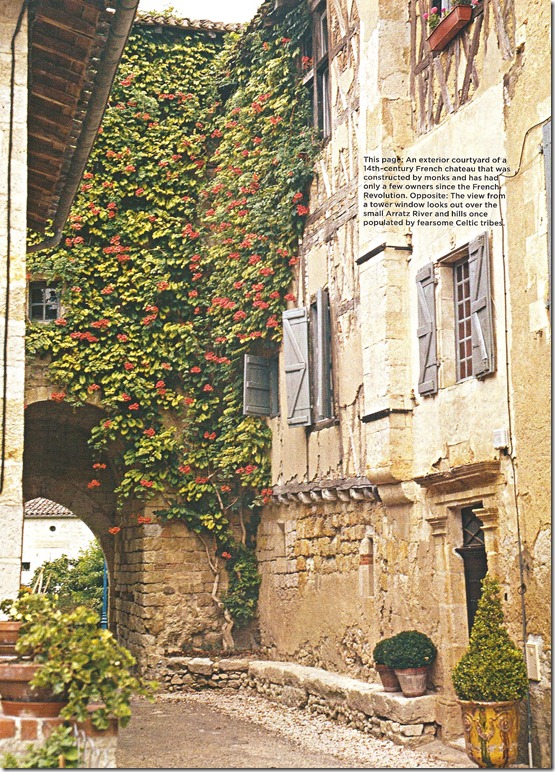


1 The tower room has views of the countryside.  Once this turret protected the monks from marauding Celtic tribes that lived in the hills beyond.


2 The exterior courtyard of the Stringer’s 14th century chateau.  
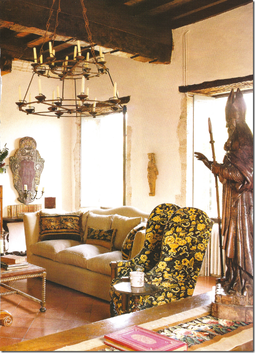


image The Stringers furnished the living room with large upholstered pieces brought from home and even more massive sconces and religious Santos.   Notice the fabulous ceiling beams and the depth of the walls at the windows.
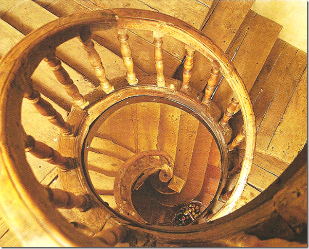


imageThe amazing three story, winding staircase.  No furniture could be brought up the stairs – it all had to be hauled through the windows using a pulley system.  The staircase is so old and rare it is protected by the Historical Monuments of France Society. 
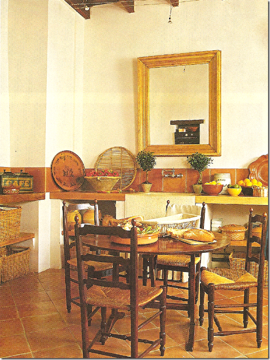


image The charming eat in kitchen with an old farm sink and terra cotta tiles.  No overhead cabinets for sure, the baskets do double duty instead.   Notice the overhead pinlights that are strung on wire in the kitchen.   Kathy designed this space – installing it on the second floor to be near the shaded loggia outside the kitchen’s door.
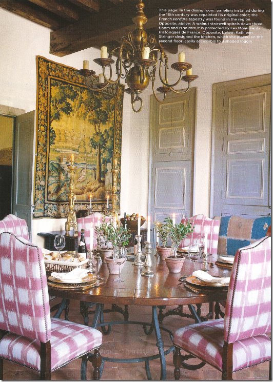


 image In the dining room with 18th century paneling – the Stringers repainted it in its original color.   The tapestry was bought at a nearby market.   The table with its iron base and wooden top surrounded by tall chairs is typical of what Brian Stringers Antiques sold for years and years:  their tables and chairs were some of their most popular items.    The Stringers plan to spend more time here when the business is closed.  Kathy knows Brian will be happy here – the chateau is a life long dream of his, something she instantly recognized when she first saw it


Brian Stringer Antiques is located at 2031 West  Alabama in Houston.   For current hours, please call 713-526-7380.


image

The West Alabama Corridor:

If you plan to visit to take advantage of the 40 percent off sale and want to make a day of shopping in the area, be sure to also stop in at Ginger Barber’s Sitting Room which is next door.   Further up the street is Tara Shaw and  Heather Bowen Antiques.  Continue up W. Alabama to Antiques and Interiors on Dunlavy, Boxwood and The Country Gentleman, then hit up Foxglove and Alcon Lighting.  

If you haven’t passed out from exhaustion yet, turn around and head back to Brian Stringer’s and go the other way on W. Alabama.   Stop at Jane Moore’s, then at Ferndale, go to Brown, Bill Gardner, Made in France, and Objects Lost and Found.   Back on W. Alabama, continue on to Thompson and Hansen, The Gray Door, Chateau Domingue, Indulge on Saint Street, and 2620 on Joanel.   Hungry?   Go to Tiny Boxwoods.  I won’t even tell you what you are missing a street up on Westheimer!     Enjoy!!    

Reminder:  Alessandra Branca is now on The Skirted  Roundtable HERE.  
Faith Hill and Tim McGraw List Belle Meade Manse

SELLERS: Faith Hill and Tim McGraw
LOCATION: Chickering Lane, Nashville, TN
PRICE: Your Mama Don't Know
SIZE: 6,430 square feet, 6 bedrooms, 6 bathrooms
DESCRIPTION: n/a

YOUR MAMAS NOTES: Late last night, after a long drive that followed a longer weekend of festivities, family, several turkeys, a sizable sack of salt water taffy and far too many gin & tonics, Your Mama received a covert communique from Vlad the Revealer who pointed us toward the Nashville estate of country music mega-stars Faith Hill and Tim McGraw who appear to have put their plush property up for sale.

It certainly makes sense that the Hill-McGraws would sell their Chickering Lane estate since they've spent years and many millions building a new nest on nearby Crater Hill Drive in which they can house their boat load of Grammies, CMAs, AMAs, ACMs, and People's Choice Awards. However, Your Mama has yet to locate a complete listing or even an actual asking price for the Hill-McGraw mansion located in the swanky neighborhood of Nashville known as Belle Meade. So, although we'd bet our long bodied bitches Linda and Beverly that the property is for sale, we can't yet say it's for sale without also offering this caveat: It may or may not be for sale after all. Okay? We'll try and get that bit of confusion cleared up soon.

Anyhoo, property records and previous reports reveal the Nashville nobles purchased the 4.22 acre property in December of 2004 for $2,550,000. Records show the quasi-rural, pastoral and bew-collick estate spreads across 4.22 acres and includes a center hall, antebellum-style mansion–or is it a colonial revival number?–built in 1934 that measures a sizable 6,430 square feet and includes 6 bedrooms and 6 poopers.

A long flight of wide brick stairs leads from the driveway to the front door which is tucked into a double height portico held up by six spindly columns that Your Mama could probably snap with one swift kick iffin we were inclined and angry enough. Inside, the wood floors have been ebonized that gives the historically minded architecture a slight touch of the contemporary and allows all the mostly tan, taupe and beige day-core a dark base on which to stand out. The Hill-McGraw's nice, gay decorator–or skilled ladee dee-ziner–has used the entrance hall to successfully set the mansion's decorative mood which Your Mama might describe as updated traditional merged with some much welcomed and needed modern moments.

The entrance hall splits the home down the middle and is sparsely furnished but exuberantly decorated with a wonderfully worn and perfectly sized rug in shades of cafe au lait and beige, a couple of ridiculously over-sized, tulip-like stone urns sitting on chunky pedestals and four serpentine sconces that are, rather strangely, affixed to the double doors that open to the formal living and dining rooms. A tightly curving and terrifically southern staircase opposite the front door has wood treads covered with a beige runner and swoops up to the bedrooms on the second floor.

The formal living room, missing a coffee table on which to set cocktails and done in a number of shades of beige, has just enough black or nearly black accents–the wood flooring, fireplace surround, lamp shades and wing back chairs–to keep the room from visually evaporating into a giant field of ecru nothingness. Even still, the symmetrically placed furniture is an undeniably dee-lishus mix of clean lined modern things such as the long library table cleverly placed in front of the multi-paned floor to ceiling window and updated traditional pieces such as the wing back chairs that flank the fireplace. Your Mama would bet our bank account the rug is hand woven silk and feels heavenly under a bare foot. Like the living room, the dining room day-core also follows a mostly symmetrical pattern and also has a magnificently long library table, only this one with spiral carved legs set cleverly in front of the window.

Modern and traditional elements meet in the kitchen as well. There is a black and white tile floor, lavishly expensive stainless steel appliances including two refrigerators and a double wide range with more burners and griddles than a private chef could ever want. There are two work islands, one a chunky, glossy black that is threatened with bodily harm and a cracked counter top by a linear pot rack and the other, a spare, lab table like thing lit by two simple drum shade light fixtures. Along the window wall, custom build cabinetry gives the eyeballs a good and need zapping with it's fire engine red color.

The kitchen's tile floor continues into a crisp but still cozy family room area with dramatically high ceilings and a couple of massive, winter white chaise chairs for boob-toob viewing placed in front of a huge and glossy black cabinet with glass fronted shelving. A nearby room, let's call it the sun room, retains its original and marvelous architectural detailing in the form of a coffered ceiling and elaborate corbels–that Your Mama hopes are plaster–and opens to the side terrace through at least seven massive, arched French doors .

The side terrace, which has a roof of fabric panels that can be pulled open or closed to ward off the harmful rays of the steaming summer sunshine, spills down to the simply shaped and enormous rectangular swimming pool. Brick and stone terracing surrounds the swimming pool and instead of chaise lounges the Hill-McGraws and their team of decorators have chosen chunky sectional sofas for lounging and sunbathing. Two adjacent pavilions, connected by a vine covered pergola, have a distinct John Woolf/Hollywood Regency thing going on and Your Mama can only hope and pray these pavilions provide poolside poopers and wet bars so swimmers and sunbathers need not trot up to the house in order to make use of a terlit or mix a mid-day cocktail. An outdoor shower has been installed near the pool and children, there is little Your Mama likes more than an outdoor shower. If y'all haven't experienced that bit of summertime bliss you really should. The Hill-McGraw's outdoor shower consists of a brick wall and curtains that can be pulled closed along the circular bar for privacy.

Your Mama presumes that the Hill-McGraws will be moving to their new Nashville estate over on Crater Hill Drive which they've been custom building since 2004 when they bought the hilltop property for $3,000,000 and took out another $12,000,000 to build the damn thing. According to the good folks at Virtual Globetrotting, Mister and Missus Hill-McGraw also own a farm in Williamson County's Bear Creek Road that they picked up in 2001 and which was formerly owned by country music legend Hank Williams Sr.

Records and previous reports also show that in addition to the comely country couple's Nashville area properties, they also have a big house in Beverly Hills. Located behind the gates of the fancy-schmacy Beverly Park community, the 10,000+ square foot, 6 bedroom and 7.5 bathroom beast was first listed in October of 2008 at $14,800,000 and remains listed as the "Best Deal In Beverly Park" at $10,800,000.

Sunday, November 29, 2009

Chinoiserie Central at a Piano Nobile


image

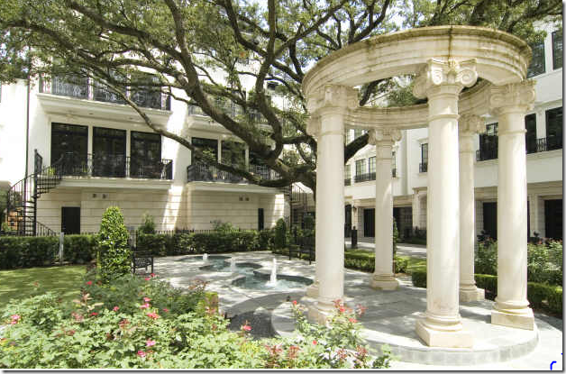
Cheyne Walk’s Courtyard – A Townhouse Development by Rohe and Wright Builders  in Houston.


J, Randall Powers, one of Houston’s hottest and certainly one of its most talented interior “decorators” (he prefers that title, thank you ASID very much)  is currently on a ride up to the stratosphere.   It’s hard to think of anyone working  in this town today that is more sought out or busier.   His work has been seen in Elle Decor a few times, he even made the cover, and also in House  Beautiful and Southern Accents, among others.   While much of his published work leans toward the contemporary – one of my favorite projects of his is a classic, Georgian styled townhouse that was featured in a 2006 Paper City story, and earlier in Cote de Texas HERE.    The Paper City article written by Laurann Claridge, and featuring the fabulous photography of Tria  Giovan, was  titled “Bespoke Townhouse” which summed it all up perfectly.   Though the majority of Powers’ clients request a sleeker look, I have a sneaking suspicion that he might actually prefer designing traditional interiors with an edge – though this is just a guess.  Judging from his own house – Powers certainly prefers to live with an eclectic mix of fine antiques, tailored upholstery and contemporary artwork.  Wherever his heart truly lies, this  four story townhouse features sophisticated, yet inviting interiors, and it certainly deserves a second look – especially since it was recently put up for sale and never-been-seen-before pictures of this wonderful house appeared in the real estate brochure.   
 

image

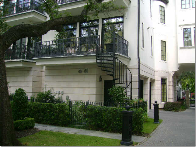
Cheyne Walk – A 14 Unit Townhouse Development:  Randy Powers designed the house seen on the left, above. 

The Powers designed townhouse was built several years ago in  Southampton – an established and exclusive neighborhood near the Museum District.  The 14 unit complex, named for the famous Cheyne Walk on the River Thames in London, has a white limestone and stucco facade with a decidedly English look to it.   Each townhouse has four stories and an elevator -  and each surrounds a central courtyard with a sprawling 100 year old Live Oak tree that shades it all.   The townhouse, located at the front corner of the complex, is a traditional Piano Nobile with its main living area on the second floor.   Pictured above, the top floor boasts a large terrace that overlooks the treetops of the verdant neighborhood.    Powers worked on the project for two years with the owners who were downsizing from a slightly larger River Oaks home.  Powers was the only designer they considered.  Though the square footage was almost the same as their former house, the scale of the new rooms was much smaller, requiring all new furniture to be purchased.  Powers brought elegance and quality to the townhouse:  reconfiguring the floor plan, he added custom detailing at every turn until it became a truly bespoke commission.   Oddly, after working so long and so meticulously on the design, the townhouse was recently sold – which, luckily for us,  allows a second peek into its interiors via the real estate listing.    


image 

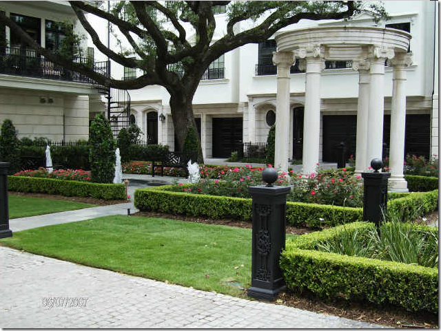
Inside the courtyard – the back of the townhouse overlooks the tall oak tree.   The second floor is reached by a winding staircase.  You can see the garage on the right side.  The street is located through the gates on the extreme right of the picture. 


image

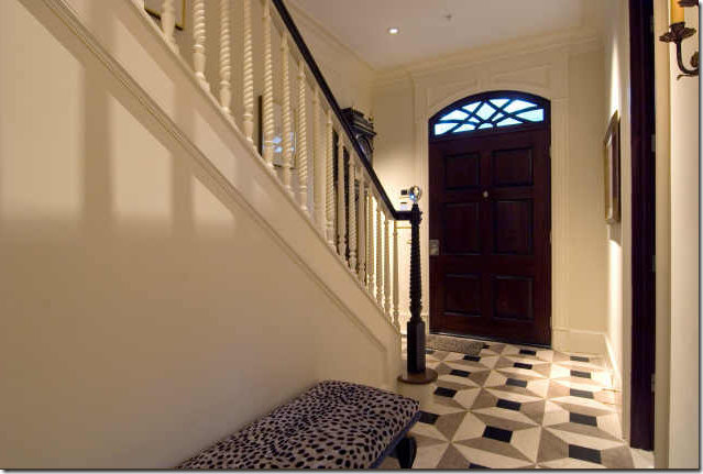
The Entry Hall.


The quality seen throughout is evident with the first glance into the townhouse.  The entrance hall is tiled with a classically patterned antique marble.  The four story stairway has hand turned banisters, and its walls are paneled up through to the top level.      Powers found the newel post’s crystal ball on one of his many shopping trips.   Touches of black like the painted handrail are found all through the townhouse. 


image


In this photograph from the real estate brochure – one gets a larger view of the entrance hall.   On the ground floor, there is a library, guest bedroom,  and garage.  The public living spaces are on the second floor – or the Piano Nobile.  This elegant entry looks as if it might be found in any Georgian townhouse in London.


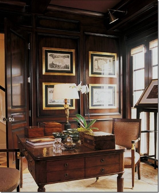
Capture4 The Library.

Located on the first floor, the mahogany paneled library with its beautiful partners desk has a hand rubbed wax finish that took over two weeks to apply.   The ceiling is coffered with insets of a Rose Tarlow leather.   The interior doors with their crystal knobs are topped by transoms.   Nine feet tall, the solid doors are all  painted brown, in lieu of being made of the preferred mahogany which proved prohibitively expensive.   A series of antique French maps line the walls.    The pair of chairs are Jansen and the rug is a rare Agra from Carol Piper  Rugs in Houston.   Through the open door you can see into the marble floored entry hall.    


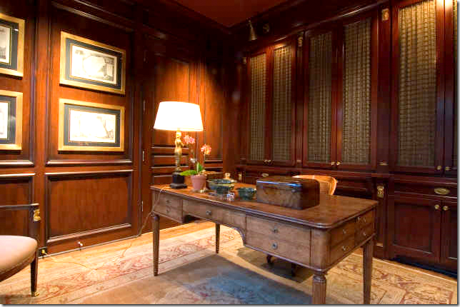
image

The real estate brochure provides another view of the library.  Throughout the townhouse bookcases are fronted by bronze grills with fabric in place of solid cabinet doors.   Notice the wonderful hardware on the cabinetry. 


\Capture3

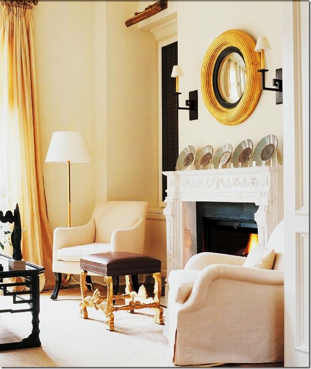
The Living Room.

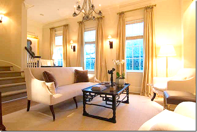
The living room is on the second floor or Piano Nobile – these windows with their silk taffeta curtains overlook the front of the townhouse.  Simply furnished with unmatched  Rose Tarlow chairs covered in linen, the elaborate mantel with a collection of Ming celadon plates is the focal point.    The convex mirror is also by Rose Tarlow while Powers designed the sconces.    A fabulous David Iastesta chandelier provides the sparkle.   Because of the couples large collection of Chinese porcelains, there is a touch of chinoiserie found in every room.  Here the coffee table plays that role. 


Capture2Coconut matting on the floor adds a casual texture to the space as do the textured shades.  The stool ties in with convex mirror and the floor lamp – adding just a touch of gilt.


image

A few years later – how does the living room look, as photographed by the real estate agent?  No surprises here – it looks just as beautiful!  Powers design has certainly held up well.   In this picture,  you can see the textured shades that hang behind the curtains.  In a nook behind the sofa, it looks like there is a piano there. 


 image

In yet another real estate photograph of the living room – an acrylic table appears next to the Rose Tarlow chair.  And here, one can see how the dining room is located right off this space. 


Capture5

The  Dining Room.

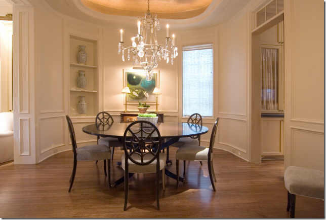
Originally the floor plans called for the living room and dining room to be one large open space.  Powers reconfigured it so that the dining room became a separate room, giving it a slight oval shape.  The moldings here and throughout were inspired by Sir John Soane’s Georgian houses.    A Dennis and Leen rock crystal chandelier hangs in the space and built in shelves are filled with Chinese export porcelains that the owners collect.   The chairs add the touch of black chinoiserie found throughout; the round table is by Dessin  Fournir.   And not one to miss an opportunity to create visual interest, Powers lined the ceiling with Gracie’s gold leaf tea wallpaper.


Capture6

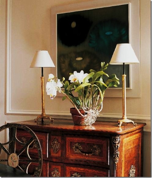
A close up of the handpainted chairs -  just beautiful!    Powers is a respected art collector who undoubtedly helps his clients with their choices.  Here,  an oil by Ross Bleckner hangs over the stunning 18th century German chest. 


image

The real estate brochure:  The dining room is located between the front living room and the back kitchen/sitting room.   Here you can see the slight oval shape to the room.  Powers cleverly designed the bookcase on the left to mimic and balance the lone window on the right which provides a pleasing symmetry to the room.    The “feet” seen on the table in the professional pictures are now gone – they must have been a staging prop. 


Capture7

The Sitting Room.

At the back of the second floor, opening onto the terrace and overlooking the courtyard is a small sitting area and the kitchen.  Powers wisely wallpapered both areas to dress up the kitchen, giving it a room-like appearance.   The antique Flemish mirror is actually hiding the flat screen TV.    The sofa was custom made to fit into the niche created by the cabinetry. 


`

Capture8 The Kitchen.

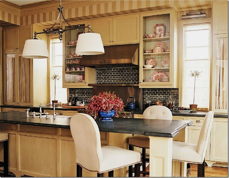
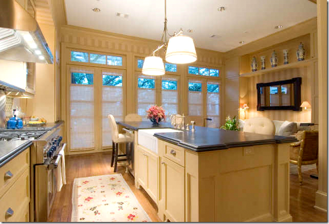
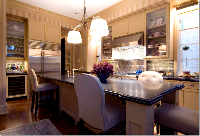
Black honed granite mimics soapstone on the countertops.   Meals are eaten at the island which is surrounded by barstools.   Fabric conceals some glass fronted cabinets  - while others are left open to display the owner’s collection of transferware.   What a beautiful kitchen!  The dark colored subway tiles mixed with the white grout is so effective!


image


In the real estate brochure – another view of the kitchen/sitting room is shown.   The large Live Oak trees in the courtyard are visible through the transoms.    The shades are raised from the bottom up which provides privacy – yet still lets in a view of the treetops.    The kitchen is a simple, yet effective galley design. 


                                       image

In this view from the real estate brochure  – you can see the refrigerator and the bar area on the left side of the photo.    Through the door is the dining room. 


image

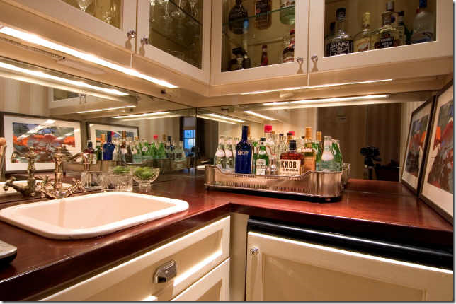
A close of the corner bar area – complete with a wine refrigerator and sink.  Powers thought of everything in his redesign of the space


image

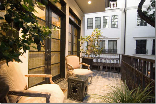
The second and third floors open to a small terrace overlooking the central courtyard.  Here, the terrace off the kitchen is accessed by a spiral staircase that leads down to the courtyard.  Not sourced, the chairs are probably from a line of outdoor furniture that resembles indoor pieces. 


Capture12

The Master Bedroom.

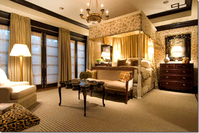
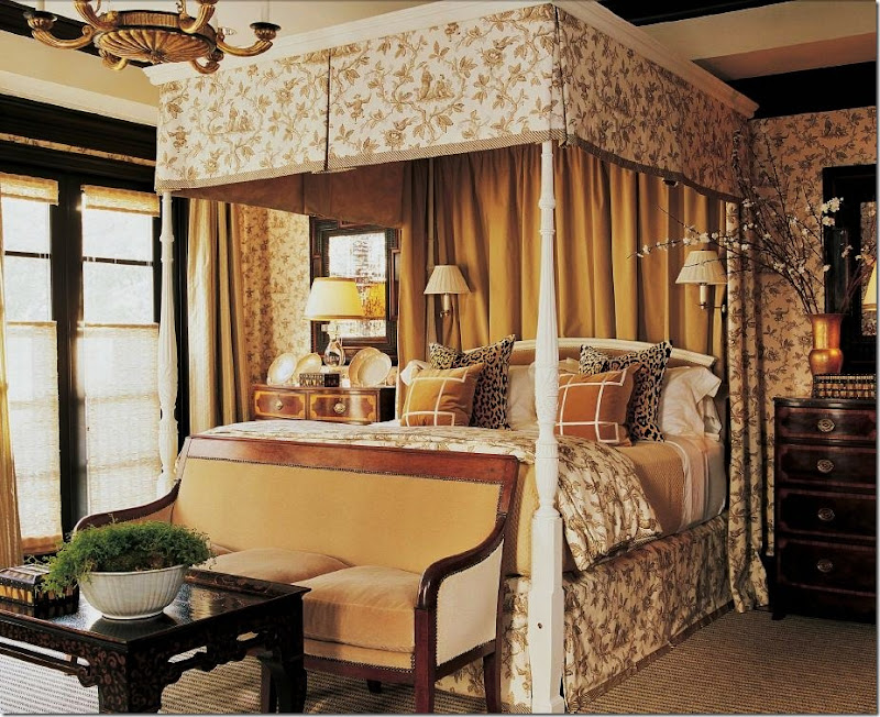
On the third floor is the master bedroom – a gorgeous room wallpapered in Chinese Toile, brown, by Colefax and  Fowler.  The original Rice bed was brown wood, which Powers had painted white and raised to meet the high ceilings.    English chests stand in as night tables underneath 18th century Flemish mirrors.   The black chinoiserie table is by Rose Tarlow.   Just gorgeous!   The wallpaper makes the room so cozy yet it has a distinct air of sophistication – a rare combination which only a very talented designer can achieve.  I love how he mixes in the cognac colored velvet with the brown and cream toile.   Who says toile is outdated – it is so fresh looking here.    Without a doubt, this is one of my favorite bedrooms Powers has ever designed – I’m just wild about it!


Capture10

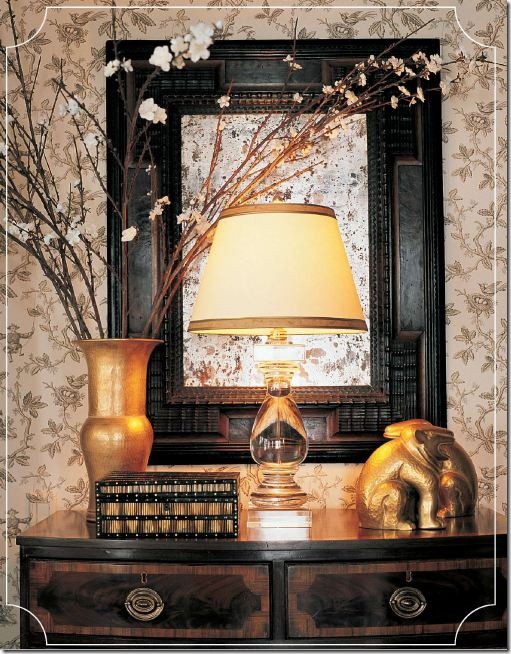
A close up of the chest.   The lamp is from Visual Comfort – for whom Powers now designs a line of light fixtures. 


Capture11

Hiding the TV is an 18th century Swedish pine armoire.   More chinoiserie shows up in the two chairs.  Brunschwig and Fils famous silk velvet leopard covers the stool and bed pillows.    Notice all the moldings and window trim are painted in black.


image

A larger view of the room from the real estate brochure.   Here you can a detailing of the molding in the ceiling corner.  Also notice the wonderful flat weave carpet with its subtle stripe.   These windows open to a balcony which overlooks the back courtyard. Interestingly – the chinoiserie table has been changed in this picture from the one above.  Probably the table was backordered and when the professional pictures were taken – the showroom let Powers borrow a similar Rose Tarlow table. 


image

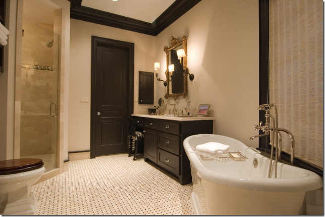
From the real estate brochure – a glimpse into the woman’s bathroom with its beautiful tub and English styled faucet.  The cabinetry is done in dark wood, as the toilet seat – most likely from Michael Smith’s Kallista line.  


Capture9

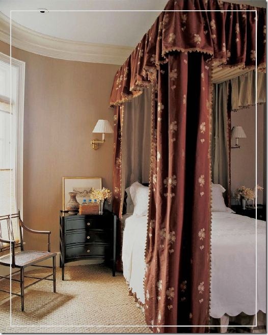
A guest room with a canopy made of Rose Tarlow fabric ticking and brocade.    I believe this bedroom might be located on the first floor, next to the library. 


image

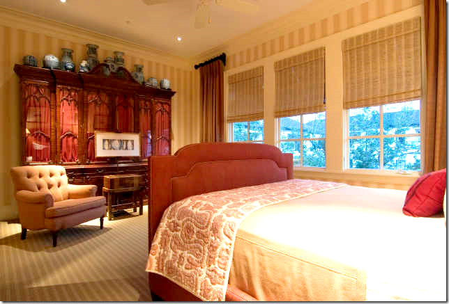
From the real estate brochure – a surprise guest bedroom – done in deep red and taupe.   I love the breakfront with its collection of blue and white porcelains on top.   What a beautiful room to be a guest in!


image

The large media room on the top, fourth floor.   A sectional – updated with stylish legs and a tight back fills out the space.   The stripe in the wallcovering is repeated in the carpet.  A black Chinoiserie table and chair brings the Oriental black theme up to the top floor.  


image

Top Floor Terrace.

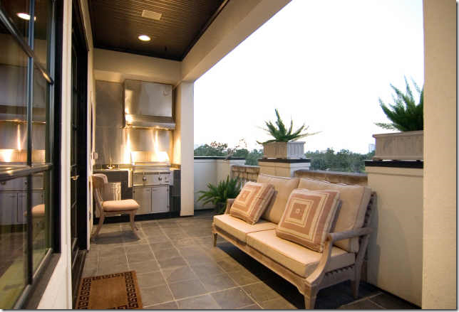
Outside the media room is the large terrace with an outdoor kitchen.   It looks like Powers painted the beadboard ceiling black here – further bringing in the theme even to the outdoor space.   This floor plan -  four floors with a top terrace kitchen – is being built all over the inner city neighborhoods of Houston.   The view must be fabulous up there – but so must be the heat in the summer!  


To judge Randy Powers true abilities – take a look at a similar townhouse for sale in the same complex.  In this picture, the living room and kitchen are pictured as they “finished” out by the builders.   Now,  compare Powers living room design with this room:


 Capture3

Hard to believe the difference between the two – it’s not only the furniture, but  it is also the cabinetry, the mantel, the moldings, the window treatments, the fabrics, the flooring, the lighting, the accessories and art work – it is ALL the choices Powers made that make a room uniquely his. 


image A view of the inner courtyard of Cheyne Walk – Powers townhouse is where the spiral staircase is.  This development proved so popular that once all the units quickly sold out, Rohe and Wright  Builders erected another section with 11 more townhouses on the adjacent property.       


 image

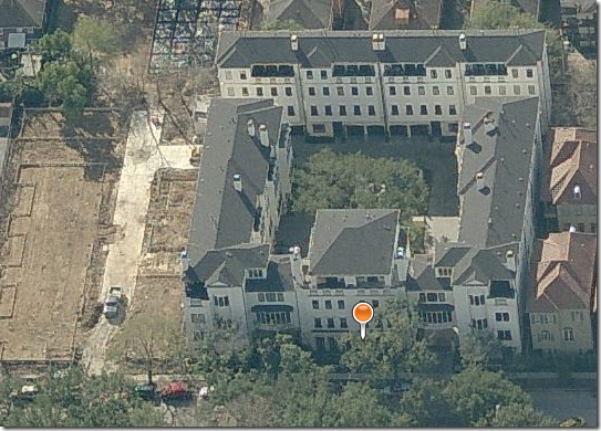
Cheyne Walk – Via Bing Satellite


Bing satellite view of Cheyne Walk – The Powers townhouse is to the immediate left of the orange pin.   And, at the left of the development – this view was taken before the new development of 11 townhouses was built.  You can see the land was being readied for construction.   These townhouse have all since been built and sold!


image

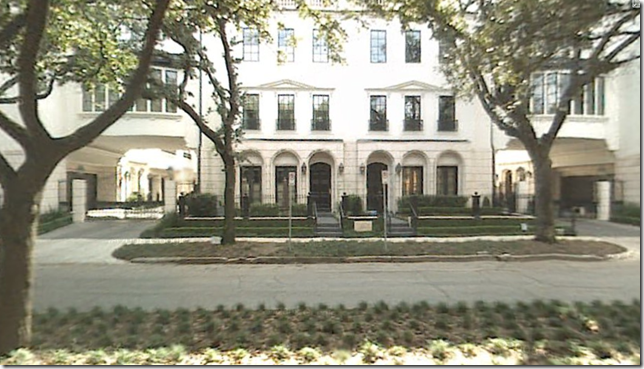
A Google Map street view of the townhouse – on the left.


image

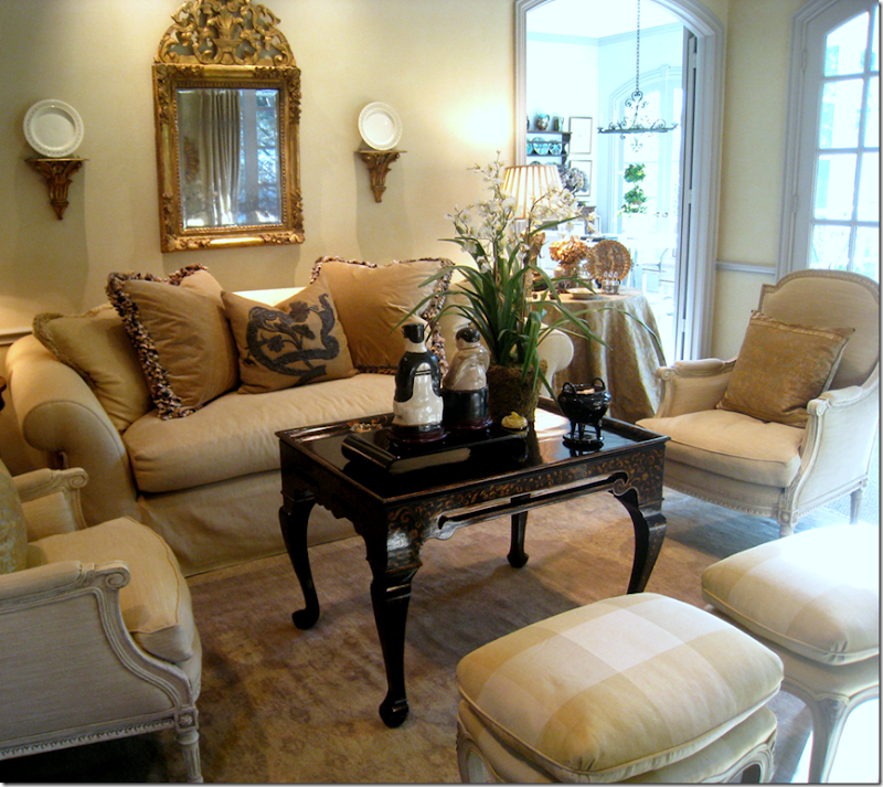
Writing this story about  the Powers designed townhouse, I was excited to see several familiar design elements.   The Rose Tarlow chinoiserie table found in the master bedroom is similar to a Rose Tarlow table I used in a client’s living room.   Melrose House has several  chinoiserie styled cocktail tables and they are all beautiful!  The height on this table was particularly pleasing – it resembles  a tea table more than a coffee table, though my client drinks neither!


 image

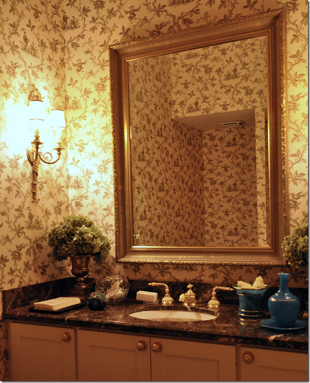
  The Colefax and Fowler Chinese Toile wallpaper that Powers used in the master bedroom is a particular favorite of mine.  I used it in my powder room when the time came to replace the worn striped paper that was previously  there.


image

A  client, after seeing it in my own  powder room, asked for the same paper in her  powder room.   The paper comes in different colorways – the blue is very attractive also. 


What Is a Piano Nobile?


Villa Rotunda or Villa Capra, located in northern Italy is 0ne of Palladio’s most famous design and is a true Piano Nobile.    The stairs reaching to the second floor and the prominence of its windows gives away the fact that it is a Piano Nobile before you even enter the house.  These clues are hallmarks of its design.    Amazingly this house remains in private hands. 


The townhouse that Randy Powers designed is a Piano Nobile.   But, what exactly IS a Piano Nobile?   The term is derived from the words noble floor or level.  Originally found in classical renaissance architecture – the Piano Nobile refers to a house where the principal rooms are on the second floor, while the first or ground floor contains service or rusticated rooms.  The practice originated for several reasons – the second floors have better views, there is less dampness higher up, and odors from the street were not as obvious up there.   Venice is home to many of the original Piano Nobile buildings, which are easily identified by the larger, more prominent windows and balconies on the second floor.    In older houses, the Piano Nobile was often reached by an outside staircase, eliminating the need for nobles entering on the servants floor.   In larger houses, the Piano Nobile continued to be built through the centuries, especially when the architecture was classic.    Today, the arrangement of reception rooms on the second floor is gaining popularity as real estate values escalate and three, four, and five story townhouses are undergoing a building resurgence in revitalized inner city neighborhoods. 


File:Cà Foscari and Giustinian palaces from San Toma' .JPG

The Palazzo Foscari  in Venice, Italy was built in 1492 on the Grand Canal.  Notice the prominence of the second and third floor windows and balconies while the first floor seems much less substantial. 


In England, an example of the Piano Nobile is found at Chiswick House.   Designed by William Kent in 1796, the property belonged to the Devonshires for many generations.   As is obvious from the outside, the second floor or the Piano Nobile is the prominent floor here, reached by twin outside staircases. 


image

An example of a newly constructed house using the Piano Nobile principles.


To read more about Randy Powers on Cote de Texas, go HERE.  To read a fabulous interview with Powers by Diane Dorrans Saeks, go HERE.  And, Randy Powers web site is HERE.
A reminder – An interview with Alessandra Branca on The Skirted Roundtable is available HERE.