Friday, March 30, 2012
UPDATE: Rosie O'Donnell
As discussed here and everywhere earlier, Miz O'Donnell heaved her 11 bedroom and 12.5 pooper compound on Miami's celeb-studded Star Island on the open market today with an asking price of $19,500,000.
listing photos: EWM International
New Zealand's Karl Urban To Sell Auckland Crib
LOCATION: Auckland, New Zealand
PRICE: Undisclosed
SIZE: 281 square meters, 4 bedrooms, 2 bathrooms
YOUR MAMAS NOTES: Not caring a lick or an iota for action/sci-fi books and movies—no shade, babies, it's just not our cup of entertainment tea—Your Mama has to admit when we first heard last week from from a Kiwi named Kiki that actor Karl Urban was selling his rather homey house in Auckland (New Zealand) we were like, "Who the hell is that?"
Natch, we fired up our trusty laptop computer and discovered Mister Urban, a well-built brunette with somewhat delicate facial features whose big break came on the New Zealand soap story Shortland Street, has successfully crossed over from the Australian/New Zealand movie scene to the Hollywood big time. In addition to scads and scores of movies and tee-vee shows Down Under, he's appeared in a substantial number Hollywood-made sci-fi and action nuggets that include Lord of the Rings: The Two Towers, The Bourne Supremacy, Star Trek, and Xena: Warrior Princess. His Internet Movie Data Base resume shows beaver-busy Mister Urban has hefty handful of film projects in the hopper or in production that include a sci-fi thriller with Vin Diesel (Untitled Chronicles of Riddick Sequel) and still-to-be-titled sequel for Star Trek with Chris Pine and Zachary Quinto.
Your Mama doesn't know how to look up public property records in New Zealand so we really can't say when Mister Urban and his Missus bought the gated residence located in the upscale Auckland enclave of Herne Bay or how much dinero they forked over to buy it. We also don't know, as it turns out, at what price the property is listed. That's because current listing information does not indicate a specific asking price but does show that unless the property sells before, it will be sold by auction on the 4th of April. A recent report in the local papers shows the house has a "capital value" of $1,410,000 (NZ), an amount that converts to $1,150,450 (US).
We are not familiar with the specifics way of the New Zealand real estate business so we haven't a clue what "capital value" is and we also can't say if this auction business is customary for the region. In the U.S., a property auction often reeks of desperation (and/or foreclosure) but iffin we were the betting type—and we're not—we'd wager both our long-bodied bitches Linda and Beverly that the scheduled auction for Mister (and Missus) Urban's digs in Auckland are absolutely not an indication of an over-squeezed pocketbook.
Anyhoodles poodles, listing information does reveal the ship-shape, two-story shingled cottage measures 281 square meters and includes a total of 4 bedrooms and 2 bathrooms. A quick consult with our conversion contraption allows all us Americanos not on the metric system to understand 281 square meters is the exact equivalent of 3,025.66 square feet.
A bowling alley-length entrance hall with wood beamed ceiling and wood floors stretches clear through to the back of the house where it opens through French doors to a sizable wood deck that extends the first floor living areas into the tropically-landscaped and high-hedged back yard. Groovy, geometric-minded light fixtures splash a honeycomb-like pattern on the walls that, by our meaningless opinion, complements the colorfully graphic area rugs but competes uncomfortably with the numerous wall-hanging artworks.
The wood floors continue into the not-very-formal "formal" living room with fireplace and high wood beamed ceiling. The furnishings are eclectic and include linen slip-covered and leather sofas, an iconic Isamu Noguchi coffee table, a rug that looks like it was inspired by something our Grandma T-T tatted, and a variety of artworks on the walls including one over the fireplace ringed with a tangerine-colored frame that has Your Mama drooling with envy...over the frame, not the painting.
The adjacent dining area has full-wall built-in buffet with turquoise and orange painted accents and French doors open the dining area to the back deck. The dining area is completely open to the compact but well-equipped kitchen with free-standing center work island not particularly fancy stainless steel appliances. One entire wall of the kitchen is covered in snap shots and other family ephemera, a warm and fuzzy design idea the children can inexpensively and easily do in their own homes.
Upstairs a second sitting room (lit with the same geometrically-minded lights as in the entrance hall) opens to a deep covered porch with glistening bay views over the trees and roof tops of the surrounding homes.
Obviously we're not apprised of Mister Urban's specific real estate plans but eh told the local press he has no plans to relocated to Tinseltown and, in fact, has definite plans to stay in Herne Bay 'hood.
listing photos: Custom Residential
Rosie Redux: O'Donnell Lists Star Island Estate
Apparently the Nyack (NY)-based Rosie O' also doesn't need or want her mansion in Miami Beach, FL because today word comes down the celebrity real estate street via the South Beach Condo Blog (SBCB) that she somewhat surprisingly listed her Star Island estate with an asking price of $19,500,000.
Records show Miz O' picked up the waterfront property in March 1999 for $6,750,000. The Dade County Tax Man shows the just over 1-acre pie-shaped parcel has 203 feet of water frontage with private boat dock. Listing information reveals Rosie O's estate includes an 11,104 square foot main mansion plus two separate and private guesthouses. Listing information also indicates there are 12 bedrooms and 11.5 bathrooms on the property including a "vast master suite" complete with private office, sitting room, fireplace and waterside terrace.
The handsome devil at the SBCB says the estate "has been upgraded from when she originally purchased the property" and listing information reveals there's a "professional kitc[hen]" and "impressive millwork." Outside there's a large motor court that wraps around a giant tree, lots of tropical landscaping that includes a privacy screen of foliage along the water front, various dining and lounging terraces, a built-in barbecue station, and a kidney bean-shaped swimming pool.
Other high-profile residents of Star Island include music mogul Tommy Motola, Miami Beach royal Gloria Estefan, showbiz entrepreneur Sean Combs (otherwise known as P. Faddle or Puff Diddle or whatever) who makes everyone take off their kicks before going inside, shoe tycoon Donald J. Pliner whose house has a fab key-shaped swimming pool, and German property developer Thomas Kramer who appeared in all his kinda-creepy glory on The Real Housewives of Atlanta as one of Kim Zolciak's friends.
Although her house is priced the lowest Miz O'Donnell may face some stiff competition from her neighbors. There are currently at least five other Star Island estates listed on the open market with asking prices from $19,999,999 to $35,000,000.
aerial photo: Bing
Thursday, March 29, 2012
A Few Changes at My House
For the past few years I have been changing up things in my house a little bit at a time. The biggest change was going from yellow walls to gray walls. It all started when I changed the kitchen countertop from tile to white marble – my light yellow walls suddenly didn’t really look good with the marble – and since all the rooms in my house flow together, the implications were large. Once I decided to repaint, like a game of dominoes, it all started falling, piece by piece.
The trouble is this – how do you redecorate without your husband really noticing? If I had told Ben I was going to redo the entire downstairs, he would have had a heart attack. In order to save his life, I never told him. Instead, the changes were done a little bit at a time over the course of a few years. Slowly, slowly, and quietly. Once the countertops had been paid for and forgotten about, I had the walls painted. Well, they needed it anyway!! Once the walls were gray, I lived with the old yellow silk ticking curtains for a while before I changed them out for the grayish taffeta. And who would ever notice a few new slipcovers anyway? Certainly Ben didn’t. He pays so little attention to what I’m doing around the house, he is still oblivious that I have been redecorating for the past couple of years all with a grand scheme in mind.
It takes patience, though, to live with your house in flux while you wait it out. It can be torture waiting out the next big step. And then, there is never the “big reveal” – something I always insist upon for my clients. And then, it can seem like the end is never in sight. There’s always something else that needs to be done. Of course. But, with a few final changes that were recently made, I think it’s almost all done, for a while at least.
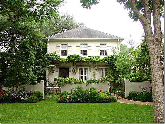
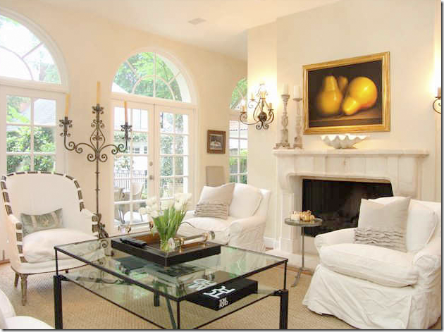
I always say the big changes started at my house when I changed out the kitchen countertops, but to be honest, it started in 2004, 8 years ago, when I toured this house with my sister-in-law. I had always loved this house built by favorite Kurt Aichler. I had seen its interiors in magazines but never in person. The house we saw that day was beautiful, decorated by its owner Michelle Stewart, who has since moved on to bigger and better things. The floor plan is perfect, the landscaping is lush, and Michelle’s furnishings were so pretty. I was sick when I went home that afternoon – you would have been too if you faced a house full of reds and blues and yellows! The next day, I sent all my family room furniture to Hien Lam to be slipcovered in white linen. So, truly, this house was start of all my problems and I blame Michelle for them all!
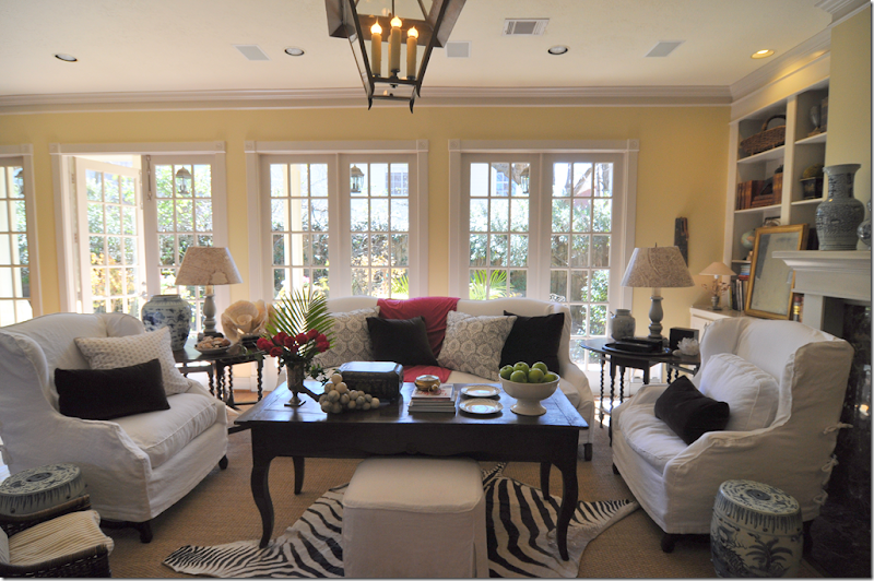
Stewart’s family room was all white linen. I thought I had died and gone to heaven.
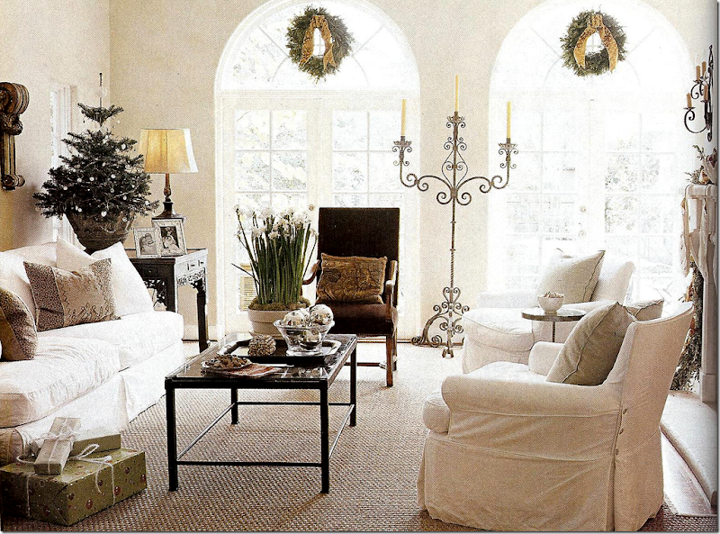
Here the same room decorated for Southern Accent’s Christmas issue. I still think that candelabra is one of the prettiest I’ve ever seen. I just noticed the room is white with brown velvet. Looks familiar! I call this house the “one that got away.” Snort. Yes, it got away because we couldn’t afford it! We’re being honest here, right?
Changes:
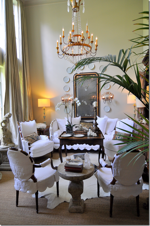
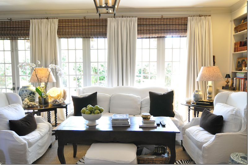
BEFORE: My living room was filled with Bennison fabrics and checks. Once I repainted the walls gray, nothing really went together anymore. I lived with the gray walls for months before I changed out the curtains. Then all the furniture was recovered in an ivory linen. All in stages.
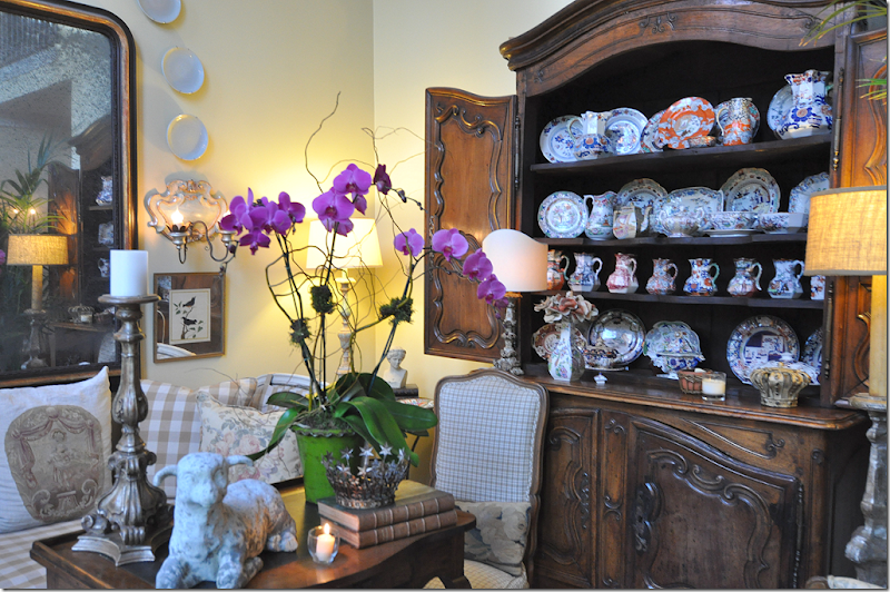
Even my collection of Masonware didn’t make sense anymore, so it’s now on vacation in a storage cabinet.
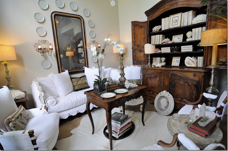
AFTER: Although the room looks very different, the only change besides the slipcovers was the white cowhide rug and the little concrete table.
Instead of the Masonware, I used white books and shells.
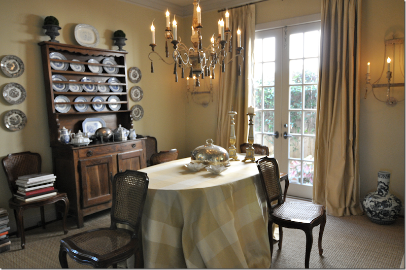
BEFORE: My dining room had the same yellow curtains and a yellow plaid table skirt. I had blue and white transferware in the hutch and on the walls are my old sconces.
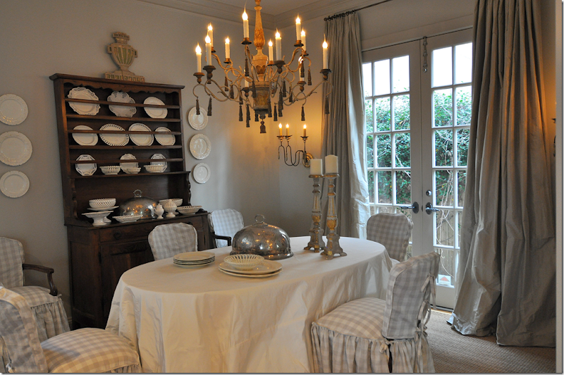
AFTER: The changes came in stages. First the paint. Then the gray taffeta curtains came a few months later. The skirt was changed to a white matte taffeta from Rogers and Goffigon – the fabric is one of my favorites because there is no shine to it. The slipped chairs made the biggest difference but that was a last minute change I hadn’t even planned on making until the day when Pam Pierce’s new website launched and I stared at it for days on end. Her beautiful slipcovers inspired me to make this change.
And finally, the blue and white transferware joined the Masonware and is sitting out the next decade. I love the white creamware instead. Will I ever change to a table instead of the skirt? I’ve thought about it, but I love a skirt in a dining room. To me, it’s so romantic and soft looking. Maybe in another house I would change it out, but here – I can’t imagine it.
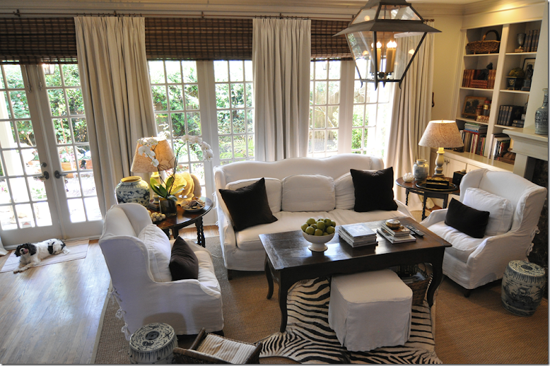
BEFORE: My family room has gone through a lot of changes over the past 8 years, but here you can see the yellow paint and why it had to go. And, I finally wanted curtains in here, something I had resisted for 18 years. I always insist on curtains for my clients, but for myself? I let it slide.
AFTER: The new paint and the curtains and shades made a huge difference. The room instantly became cozy and warmer. The sound is muffled – which is really great during March Madness. This was one change Ben totally approved of.
The other day I had a client over to look at the curtains so she could visualize how they would look in her house. Ben joined in the conversation – extoling their virtues. I was stunned – who are you and what happened to my husband? BTW, the client ordered the curtains. Thank you Ben!
The only change besides the curtains and paint were a few brown velvet pillows.
And so, almost everything was finally done. The wall color now made sense with the fabrics and the curtains. It only took a few years, but it was worth it. The only issue left was the foyer. I call it that – a foyer – but it’s really only a long, wide space that the front door opens on to. I rarely show this area of my house because I’ve never been happy with it.
The “foyer” – looking back from the stairs and family room to the front door. The living room is at the right of the front door, then the dining room is on the right of this table. You can see the secretary behind the table.
And looking the other way. Here you can see the desk behind the round table. I love how Sammie Jo is in all the pictures. Georgie is scared to death of the camera and runs away. I can even “pretend” to take a picture without even holding a camera and she still runs away.
The main issue was “Le Secretaire” – which I had inherited from my mother’s house. It is pretty enough – but it has this Venetian paint job which drives me crazy. It got to the point where I didn’t even look at it. My mom kept saying it needed painting. And it did, but I never got around to it because the style of the piece just wasn’t what I wanted.
And those sconces!
I decorated it with white porcelain and antique books. Here are some “drama shots” I took one day pretending I was Eddie Ross. Sad, but true.
Oh wait, there’s more Eddie Ross pictures. It all came to a head when I showed you Angie’s house. Remember Angie?
Angie had the beautiful house in the country and the apartment in NYC.
Both homes were filled with Swedish furniture she had bought from the Lone Ranger Antiques. Like these two matching cabinets behind the sofa.
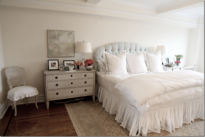
Her NYC apartment has three Swedish chests in the bedroom. All from the Lone Ranger.
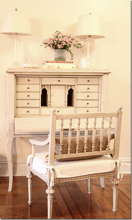
And there was this pretty desk and chair in Angie’s NYC apartment living room.
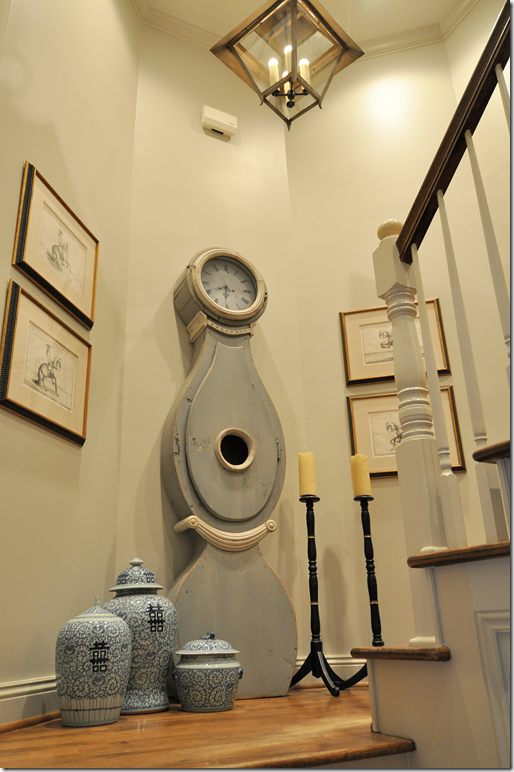
All of Angie’s pretty Swedish pieces got me thinking. I know the Lone Ranger – and have bought from him before at Round Top. This is my clock which came from him. His prices are phenomenal for the look. His pieces aren’t period, but they do have some age. But for the price of an 18th century chest – you could buy 20 of his chests. Plus, he’s so easy to deal with. And everything for sale is listed on his web site HERE. And he delivered, almost immediately. So easy.
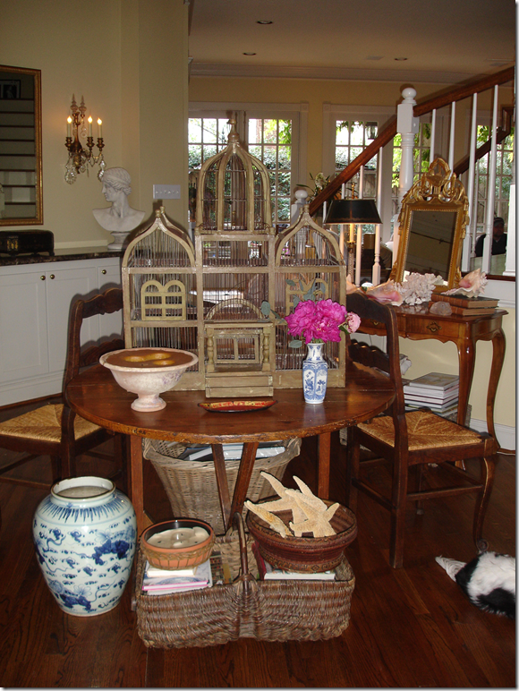
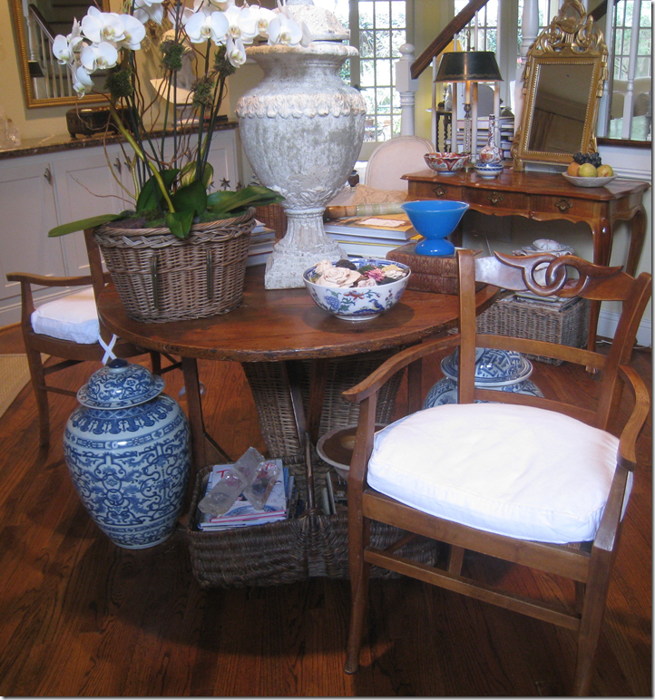
Do you blame me for dreaming of painted Swedish pieces? Over the years, I’ve used this wine tasting table as a stage to showcase my brilliant styling techniques. Here, my birdcage was used for years to fool visitors into thinking they were visiting an English Manor House in the Cotswolds.
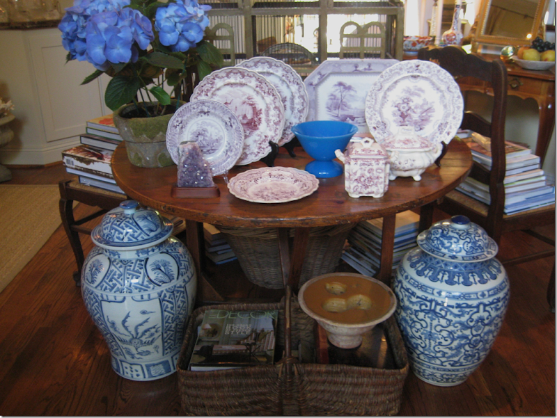
To further the look, I added two large blue and white jars and some purple transferware. Yes, M’lord.
Here I was running a shop selling said purple transferware. Omg, this is sooo embarrassing!
And now, with all the transferware apparently sold….
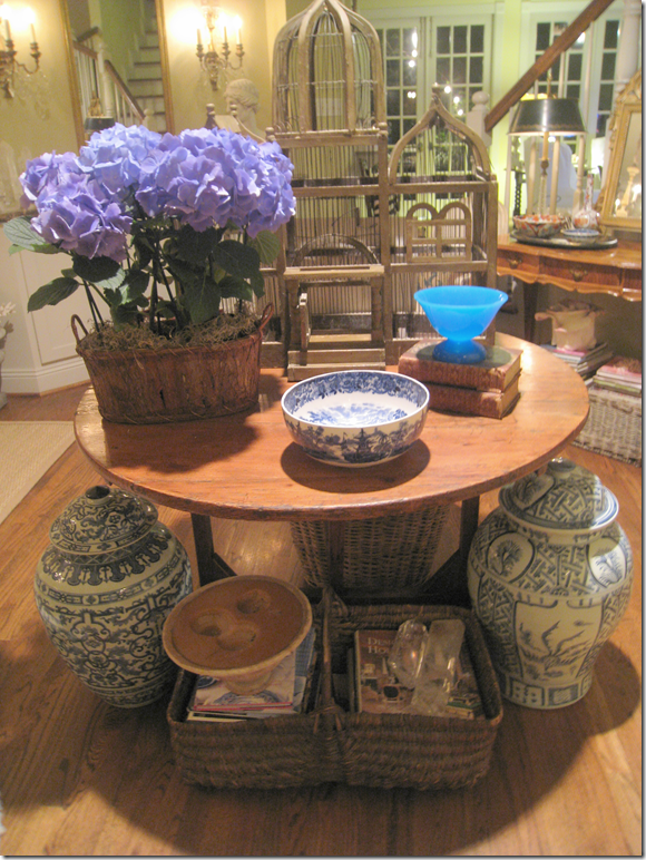
I think I took a picture of this table every time I bought a new blue hydrangea. I have no idea why.
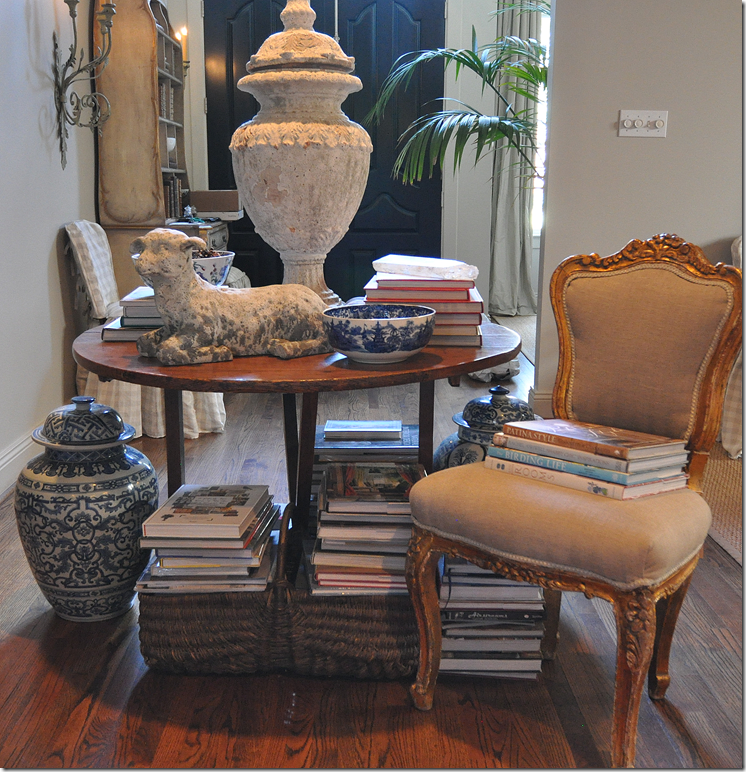
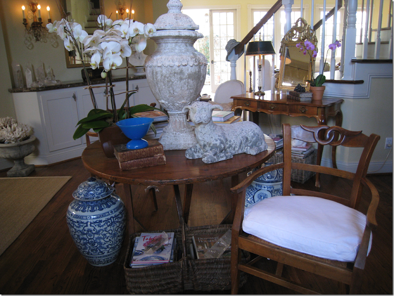
Ah, here’s a change. The birdcage was retired for this large faux old urn that all the stores were selling a few years ago. I got mine from Wisteria. The blue hydrangeas were changed out for white orchids.
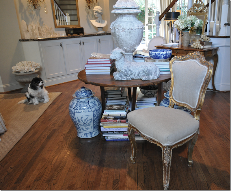
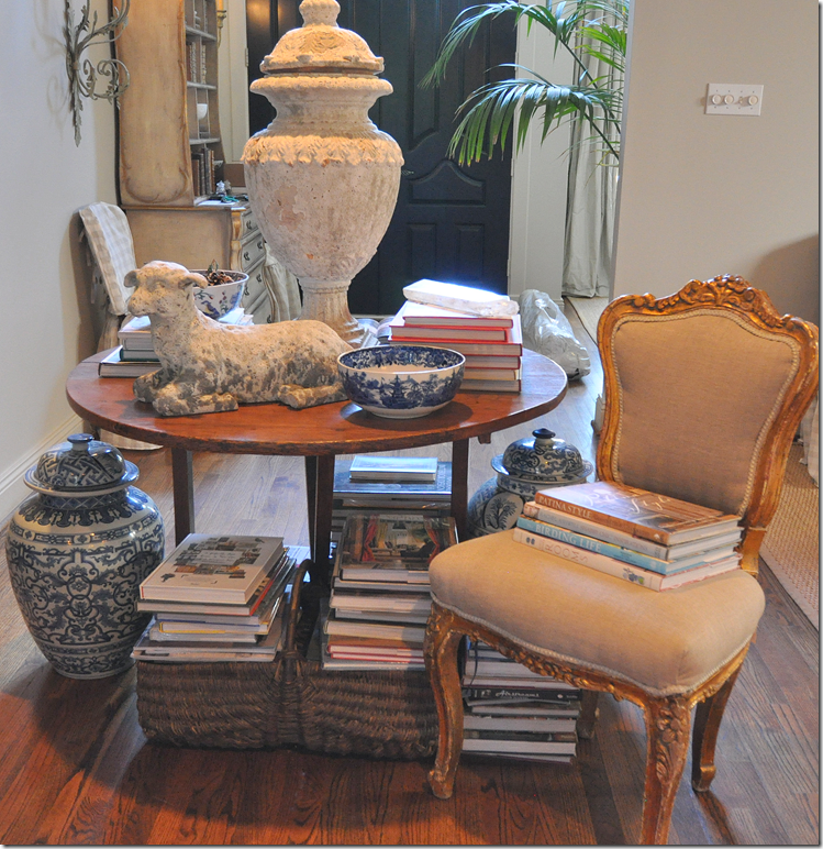
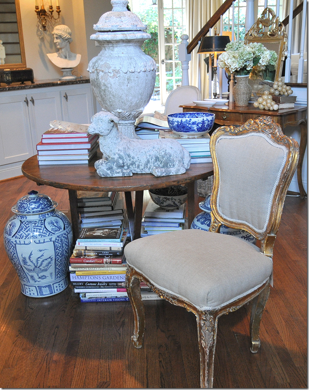
Aw, the lamb makes her first appearance. And I notice the desk in the background got an editing job too. I am cracking myself up at all these pictures I took of this stupid table!
During family dinner parties, the table became extra seating. Not sure where urn went to?
And this is how it was – facing the other way – with “le Venetian Secretaire” next to the front door …
and the desk from my teenager bedroom next to the stairs. A call to the Lone Ranger was needed, asap.
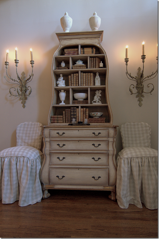
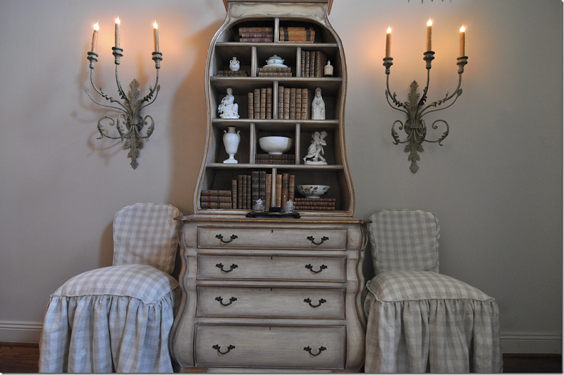
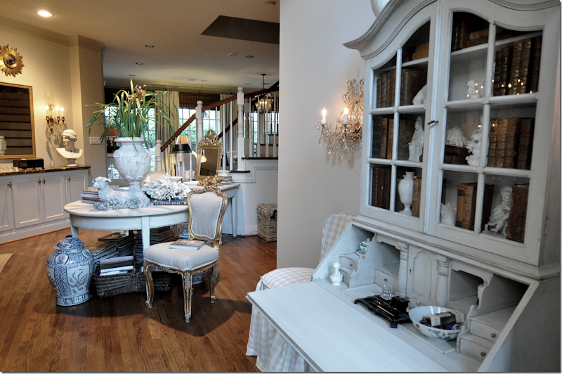
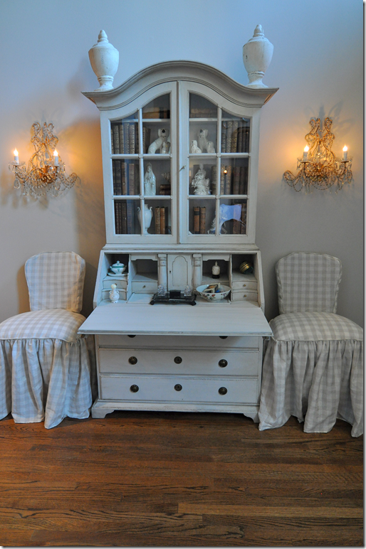
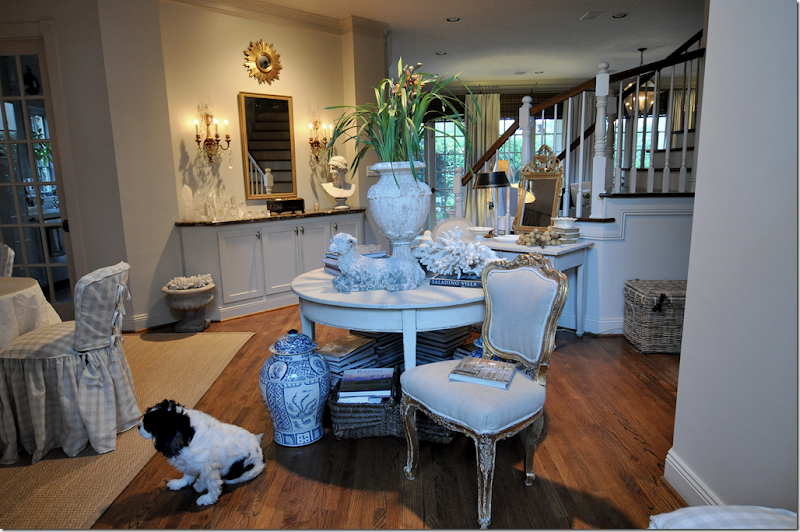
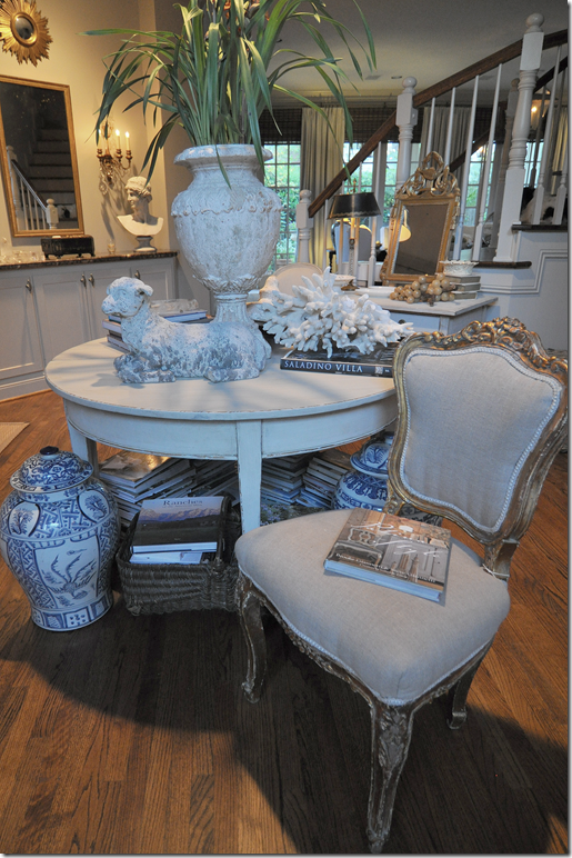
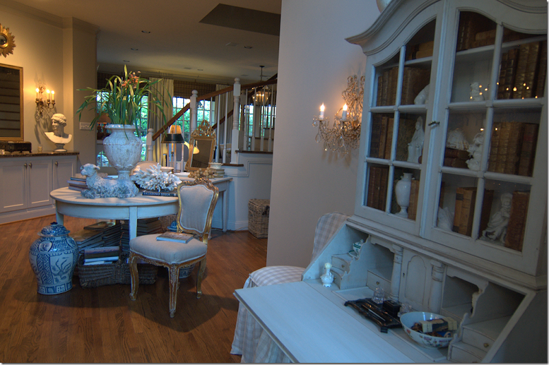
Here’s how it all looks today. The Swedish secretary is to the right of the “Foyer.” Two demi lune tables stand back to back in the middle, and a desk stands in the back next to the stairs.
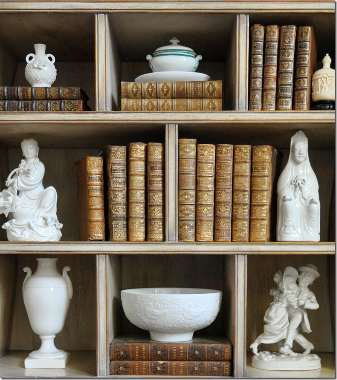
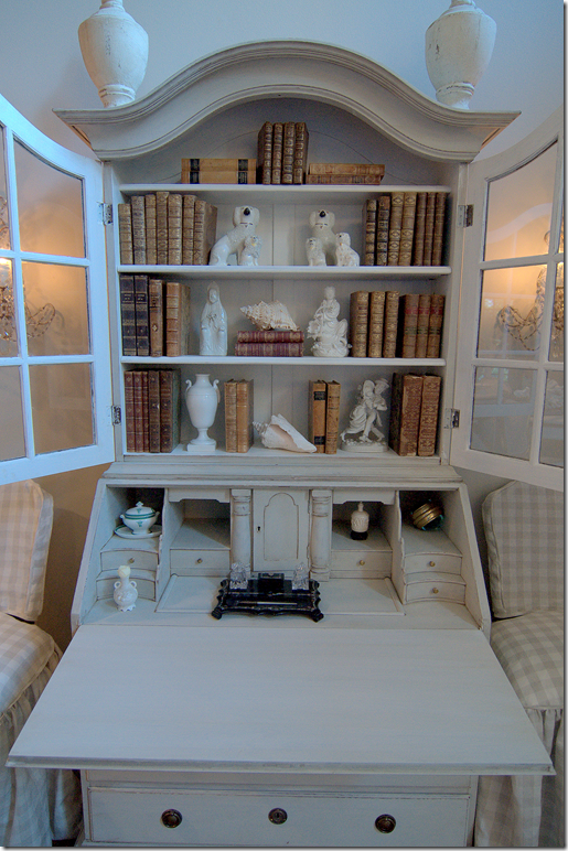
The secretary is a light grayish white. I filled it with the same things there were in Le Venetian Secretaire.
Books and white porcelains.
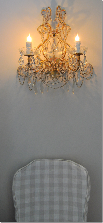
Of course those huge iron sconces had to go. I got these on 1st dibs from Melissa Levinson in L.A. HERE. She actually overnighted them to me. I picked this pair because of the crystal macaroni beading – I love that!
The demi lunes fit the space perfectly – I’ll keep these forever. One day they can be separated and used in an entirely different way, but for now – they are placed back to back. Hi Sammie Jo!
The urn and the lamb need to go, I know. But I just love the look of the white furniture here instead of all the brown.
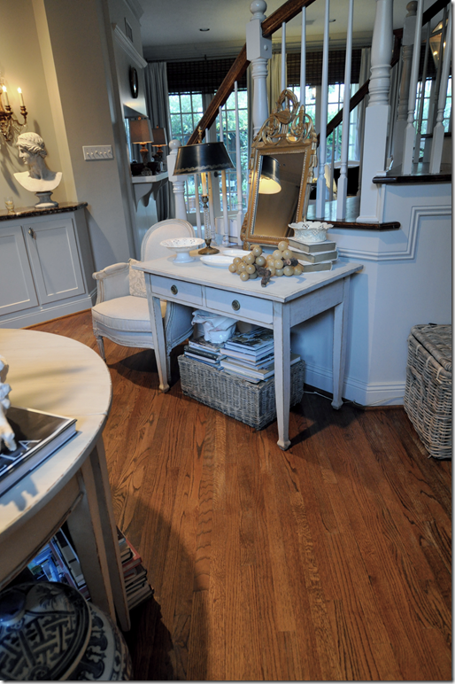
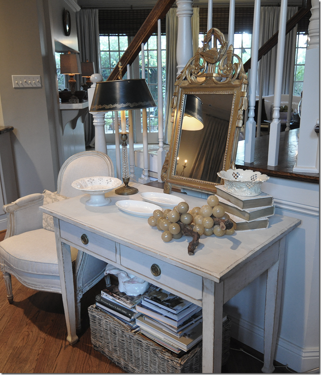
And here is the little desk against the stairs.
Again, this is really versatile piece that could be used as a nightstand one day or an end table.
The only question I have is the floors. After almost 18 years, they need refinishing badly. At one point I had thought I would paint them a light, gray color – upstairs and down. An alternative would be to bleach them. I know that would look good with all the painted pieces, but lately I’ve had my heart set on darkening the floors – almost a dark-black. Angie has white walls and black floor with all her light antiques.
Angie’s bedroom – dark floors, white walls and the same Lone Ranger demi lunes.
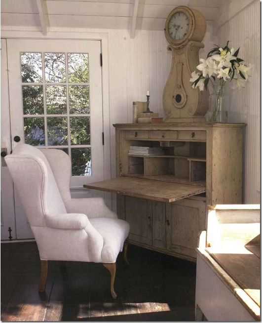
This Swedish furniture dealer has the dark, dark floors.
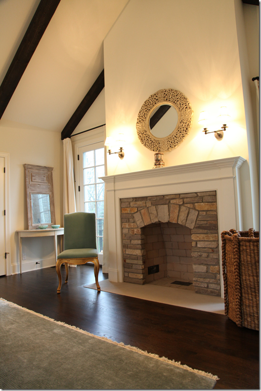
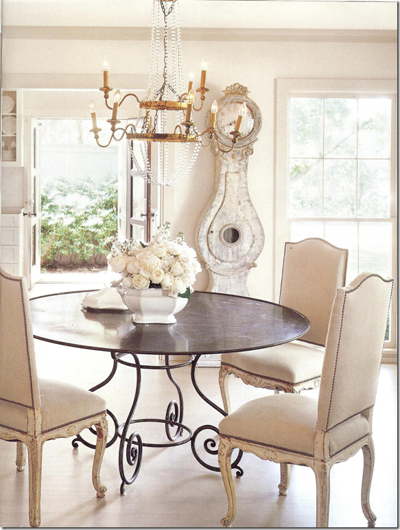
This house in Dallas filled with light painted Swedish furniture has dark, dark hardwoods.
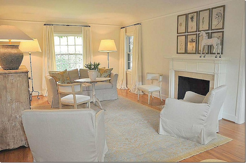
This house filled with painted antiques has a light wood floor – a little lighter than mine are now.
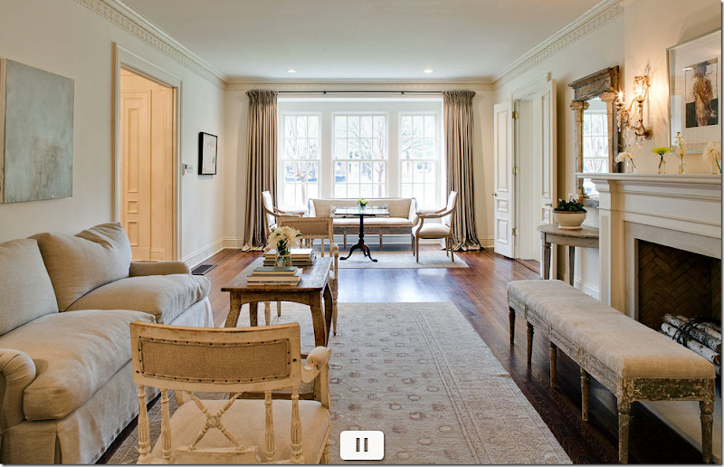
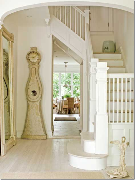
This house has very light stained hardwoods.
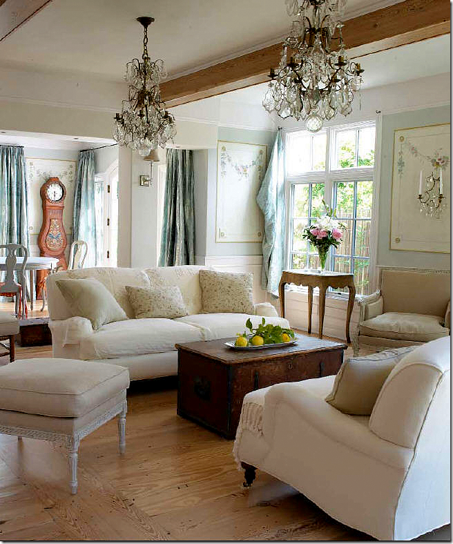
In their own home, the owners of Tone on Tone, the antique store that sells Swedish primarily, use a bleached wood look.
And this house – shown earlier – in Houston, used a light stain on their hardwoods.
Which is best? The light light 0r the dark dark floors? I’m completely torn between the two, but I think I lean more towards the dark dark. Especially with all the seagrass. I need you advice, so let me know in a comment what I should do. Help!!!


