Tuesday, January 31, 2012
Nip/Tuck's Dylan Walsh Divorces and Lists Former Family Home in Hollywood
LOCATION: Los Angeles, CA
PRICE: $1,425,000
SIZE: 2,480 square feet, 3 bedrooms, 3.5 bathrooms
YOUR MAMAS NOTES: Back in December 2010 all the gossip glossies and celebrity-obsessed blogs reported that Nip/Tuck hunk Dylan Walsh filed for divorce from his actress-wife of 7 years Joanna Going. Less than a year later Mister Walsh revealed to the people at People that his new, unnamed lady friend gave birth to a baby girl in late September (2011), his fourth child with three different women. Mister Walsh's personal life certainly ain't none of our bizness but for anyone who might care (and like to pass moral judgement) there's one kid with second wife—that's Miz Going—who gave birth in 2003 almost a year before they were married in 2004 and two shorties with first wife actress Melora Walters who gave birth to their first child just about a month after they were married in 1996. As our last college roommate and on-again/off-again confidante Sheila Sinn told Your Mama recently, "Life is complicated and sometimes things gets messy." Indeed, they do.
Given the state of things with the Walsh-Goings it's no surprise to anyone who understands The Four Ds of Real Estate* that the (soon to be?) divorced former couple have put a $1,425,000 asking price on their once happy family home in the very same upscale pocket of Hollywood that L.A. real estate people sometimes call Sunset Square and where Oscar-winning filmmaker Dustin Lance Black paid $1,455,000 in September 2010 for a 2,866 square foot 1924 Tudor (with detached garage converted to office space/guest house) and actress/style maven Selma Blair and her fashionista baby daddy Jason Bleick just this week put her/their house up for sale with a $1,780,000 price tag. Reality star turned mass market fashion designer turned interweb entrepreneur Lauren Conrad also owns a Spanish casa in the centrally located 'hood she bought in early 2008 for $2,360,000, no longer lives in, and has had on the market since September 2011 for $2,250,000.
*The Four Ds: Death, Divorce, Debt and Diapers. Generally (and unscientifically) speaking, four of the top reasons residential real estate is bought or sold, particularly by the notoriously real estate fickle rich and/or famous who are, let's be honest, more likely in a better monetary position to buy and/or sell a house every time they make a baby, dump their spouse and/or pass a God damn kidney stone.
Anyhoo, Miz Going's big Showbiz break came in the mid-1980s, then in her early twenties, on the long ago canceled soap story Another World. She went on to a number of tee-vee series (Dark Shadows, Going to Extremes) in the early 1990s before becoming a fairly busy bit part gal in a long list of television series (Spin City, CSI: Crime Scene Investigation, Close to Home) and made for boob-toob movies (Chasing a Dream, My Silent Partner). Miz Going has also been seen a couple of times on the silver screen (Tree of Life, Wyatt Earp).
Lantern-jawed and hairy chested Mister Walsh has also been catting around Tinseltown since the late 1980s and early 1990s when he appeared on a number television series like Kate & Allie and Gabriel's Fire with James Earl Jones. A long slog through the1990s and early Aughts brought in a lot of jobs in little-remembered movies and various television series but Mister Dylan's persistence (no doubt in tandem with his good looks and firm physique) finally paid off when he hit the big time in 2003 with a starring role as the existentially conflicted and often naked plastic surgeon Dr. Sean McNamara on the Emmy-winning series Nip/Tuck. In 2010, the same year Nip/Tuck was canceled, Mister Walsh starred on the big screen in Secretariat and he currently works his hard-bodied and often exposed stuff on the police procedural Unforgettable.
In November 2003, nearly a year before they sealed their love in the eyes of God and government in October 2004 and right about the time she gave birth to the their daughter, the now erstwhile couple coughed up $1,315,000 to purchase a flat-fronted, two-story Mediterranean style residence in a leafy 'hood smack between the Sunset Strip to the west and the touristy, stripper wear boo-teek-lined heart of Hollywood to the east.
Listing information shows the 2,480 square foot Mediterranean was originally built in 1923, extensively renovated by the current owners—that would be Miz Going and Mister Dylan—and contains a 3 bedrooms and 2.5 bathrooms plus a detached garage converted to a guest/nanny suite with bathroom.
The landscaping at the front of the house looks a little bit Grey Gardens in a mostly good way that Your Mama thinks playfully (if unintentionally) thumbs its figurative middle finger at the preponderance of obsessively-manicured yards in Los Angeles' more expensive zip codes. An unexpectedly spacious foyer, plenty big enough to house an antique-looking baby grand piano and large-scale faux-Rothko, has lustrous inky black wood floors softened with cement-colored walls and re-sharpened with gleaming high-contrast white trim work around the windows and doors. The front foyer, like the rest of the dwelling's lower level, lacks any sort of ceiling molding. Some of the children will undoubtedly see the lack of moldings as cheap, inexcusable, wretched (and retch-worthy) while others will see it as an acceptable architectural/decorative conceit that lends the vintage house a pared down contemporary aspect.
Although much of the "day-core" appears to have been stripped away in the not especially formal "formal" living room it retains a distinct (and decidedly ho-hum) Shabby Chic-ness with lots of white slip-covered furniture and a distressed star sculpture-thing hung above the wood-burning fireplace at the far end of the room. Get it, y'all? A star over the fireplace in the home of a couple of relatively low-wattage but bona fide stars? Pleeze. But whatever. Two sets of French doors open the long and narrow living room to a small deck that extends off the front of the house and was constructed thoughtfully around a pretty, thick-trunked and somewhat inconveniently located tree.
The chandelier-free dining room takes a delightful turn from the expected with a round (instead of rectangular) table for six or eight and opens directly into the somewhat compact but expensively equipped kitchen complete with top-grade stainless steel appliances, snow white Shaker style cabinets with glass-fronted uppers, polished concrete counter tops (or what appear to be polished concrete counter tops), and a sizable center work island with convenient veggie sink and single-stool snack counter.
Upstairs two family/guest bedrooms overlook the back yard and share a hall bathroom while the master suite, sparely but floridly dressed in white-washed and antique silver furniture and billowy white linens, faces the street. The over-sized frameless glass shower enclosure in the roomy attached bathroom injects a sleek modern edge to an otherwise vintage-inspired space with white subway tiles and free-standing soaking tub. The master bathroom, finished with some rather yummy looking jet black stone tile floors that would be even more delectable if equipped with radiant heat, also has double sinks and an exposed terlit set not particularly privately all but next to French doors that open to a Juliet-type balcony that overlooks the street. We're down with the bathroom's mixy-matchy vibe we just think it'd be a bummer to have to do the dirty bathroom bizness next to that window, especially at night when lights could cast embarrassing and incriminating shadows on the windows....
French doors in both the kitchen and the adjacent, teal-colored den/family room lead out to a dining deck shaded by a bougainvillea-draped trellis. The decks steps down to an oval-shaped salt water swimming pool sunk into a pale flagstone terrace surrounded by thickets of slightly unkempt-looking drought tolerant shrubbery. Heaven knows, no one loves an oval swimming pool more than Your Mama or über-agent Sue Mengers—may she rest in peace—but this one just seems a bit too big for the limited backyard area. Were this our pool to put in we might have opted for something slightly smaller (but still oval) and, natch, The Dr. Cooter would insist on the installation of a sunken spa, maybe one cut into the thin tip of the oval nearest the back fence.
Your Mama happens to like this part of Los Angeles—it has a walkability factor many neighborhoods in Lala Land lack—and the property seems, in our humble and entirely meaningless assessment, well priced right for the market given that the most recent transfer in the 'hood was just down the block in December 2011 when, according to property records, fashion designer Linda Loudermilk sold her 3 bedroom and 2.75 bathroom 1923 Tudor (with detached guest house) for $1,380,000.
listing photos: Sotheyby's International Realty / Los Feliz
Monday, January 30, 2012
Trading Houses
Beautiful antiques from Tone on Tone in Bethesda, Maryland. All the Swedish antiques in this story are from this wonderful store HERE.
Soon to be entering my fifth year of blogging, I have to confess it is sometimes hard to find new material to write about. I mean, how many times can I write about my formula for curtains (here?) Or why slipcovers were made for families with young children and pets (here.) Or about Grey Gardens (here and here.) Or Something’s Gotta Give (God, who knows how many times I’ve written about THAT house – but this story shows you how to get the same look here!)
So, always desperate for new stories, when someone gives me a tip, I jump on it and hope readers will be interested. Sweet Artie from Colour Outside the Lines has given me some great stories throughout the years. Why, I have no idea? But bless him – he comes through when I have no idea what to write about. A few days ago, he showed me a couple of articles about a house in Chevy Chase, Maryland whose interiors actually looked more like a Houston house. Artie thought it was a simple story about a house, but as I started delving into the story it was one surprise after another – the best kind in real estate sleuthing there is!!!!
The simple story begins with an article about a couple who bought a house in Chevy Chase. I’m struggling how to explain the story and tell it – should I should just lay it all out at once or let it evolve like I discovered it and allow the surprise to play out naturally. I think I’ll do that. So….let the fun begin:
House #1: The Gatehouse
This is the story is about a prominent couple who moved from Missouri to Maryland. Their home in Missouri was filled with English antiques, many inherited from the owner’s mother who actually built the house the couple lived in. Linda, the wife, wanted a lighter look in her new home but was stumped as to how to go about the change from dark mahogany furniture to the newer, brighter, more neutral interiors. Luck would come from a visit to Tone on Tone, an antiques shop in Bethesda that specializes in Swedish furniture. Together, owner and designer Loi Thai and Linda came up with a plan to first refurbish the house and then the furniture.
Much of the darker English pieces were sent back to their base home in Missouri where they eventually plan to move back to. Their new Chevy Chase, Maryland house was originally a gatehouse on a large estate, built in 1937. It had good bones – beautiful molding and tall windows which attracted the owners. Linda liked the cozy feel of the house and knew it could have more of the casual, country atmosphere that she now desired.
Meeting Thai brought everything together – the light, painted Swedish antiques he sold were unpretentious and had the patina she was seeking. As soon as the papers were signed, work on the house began. First, the dark hardwood floors in the house were stripped and whitewashed to a light color. Next, the walls were painted a soft gray. Thai kept a few of the wood pieces to anchor the rooms – most notably one of a pair of sofas and the dining room table. Light linen was chosen for the upholstery and a dressy gray silk became curtains – adding a sparkle, much like jewelry, in contrast to all the painted, peeling surfaces. Old, gray and whitewashed architectural elements were added, as were botanicals in lieu of oil paintings. Much of the silver and china, including a large collection of Old Paris was inherited from the mother-in-law and fit in perfectly with the new décor.
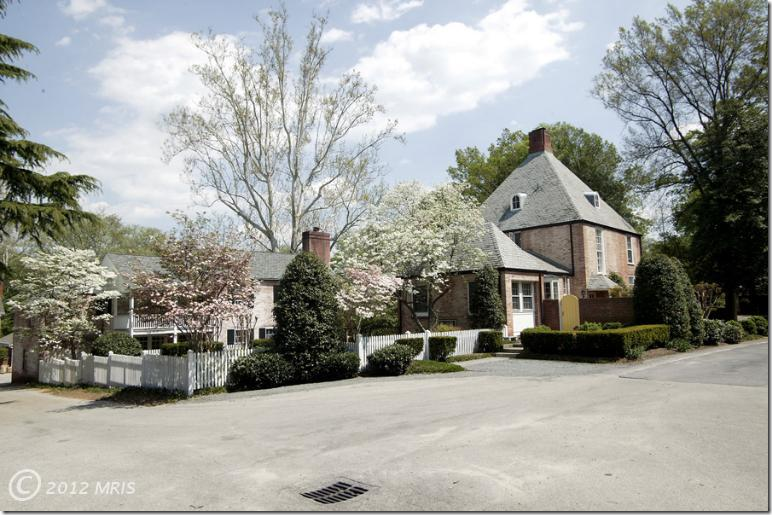
The 1937 former gate house sits at the top of a small hill.
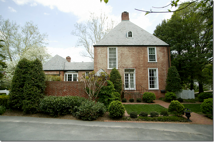
A side view of the house shows the decidedly French roof. Behind the brick fence is a terrace.
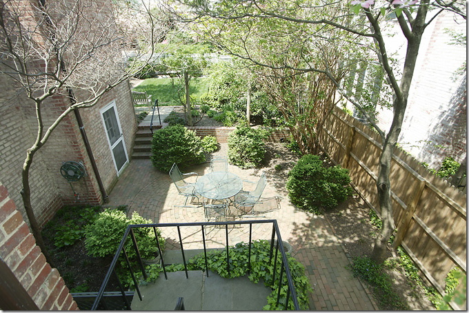
One of the brick terraces on the side of the house. There are several different terraces on the property.
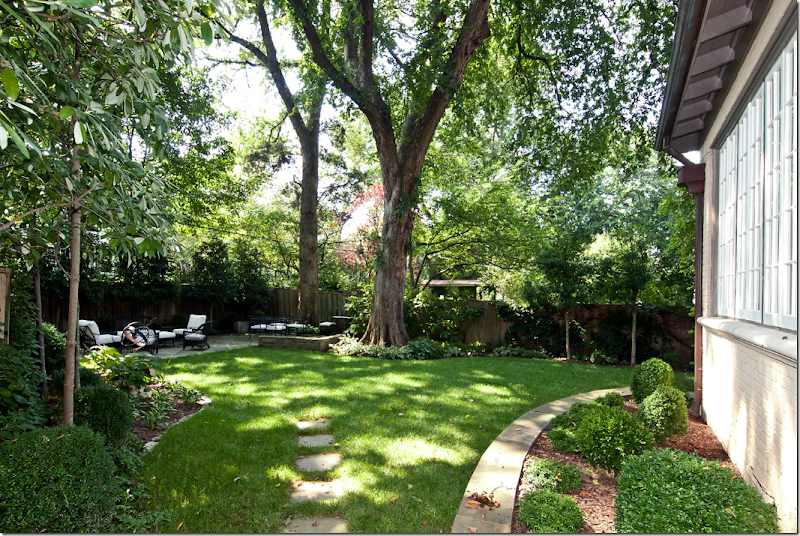
The back yard is set inside a white picket fence.
As luck would have it – I was able to find the original real estate listing for the Gatehouse – which shows exactly what was changed when updating the house.
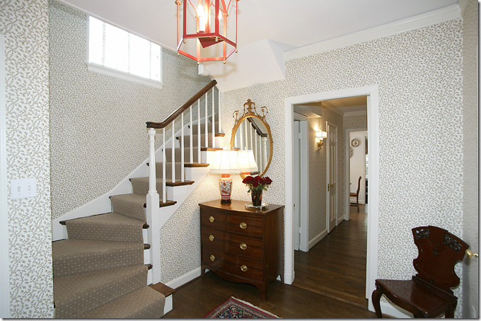
BEFORE: This is how the entry hall looked when the house was bought – dark hardwood floors, wallpaper, and dark English furniture. Pretty, but dated.
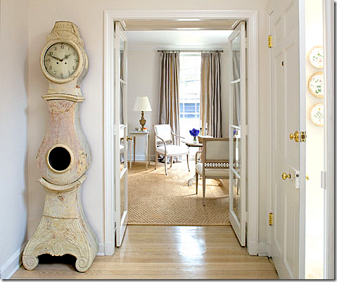
AFTER: Linda and Thai lightened the floors and painted the walls a soft gray. The antique Mora clock is the iconic piece of Swedish antiques. Here, glass French doors open onto the long living room. The room has several seating arrangements – the one seen here overlooks the front yard.
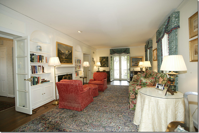
BEFORE: The living room is rather long and narrow. The fireplace divides the space. Traditional curtains with cornices hang at the windows and French doors.
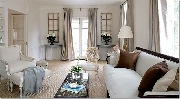
AFTER: Wow. What a difference!!!! The living room is updated with a textured diamond patterned seagrass rug. Gray silk curtains hang at the windows adding sparkle. Light linen covers the furniture. Antique shutters, salvaged from a Swedish castle, sit above Swedish demi lunes while framing the French door. The sofa, one of two (the other is in Missouri) anchors all the lightness. Dark brown pillows pop on the light fabric. I love the new décor with all the Swedish and French antiques. It’s so soothing and quiet – yet cozy at the same time. It really does look like a Houston house.
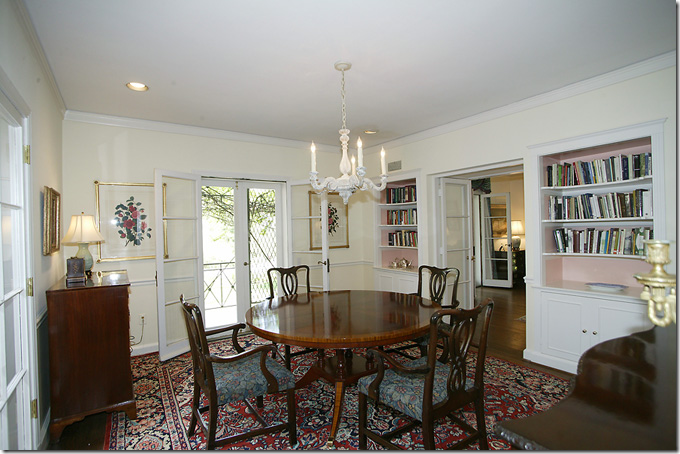
BEFORE: From the living room you enter the dining room with its French doors that open to a balcony.
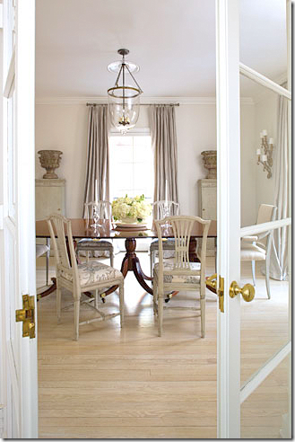
AFTER: The dining room with the original dark dining table is now paired with light Swedish side chairs. Tall columns with urns flank the window. Love those!!! And a bell jar chandelier gives off soft light, along with sconces.
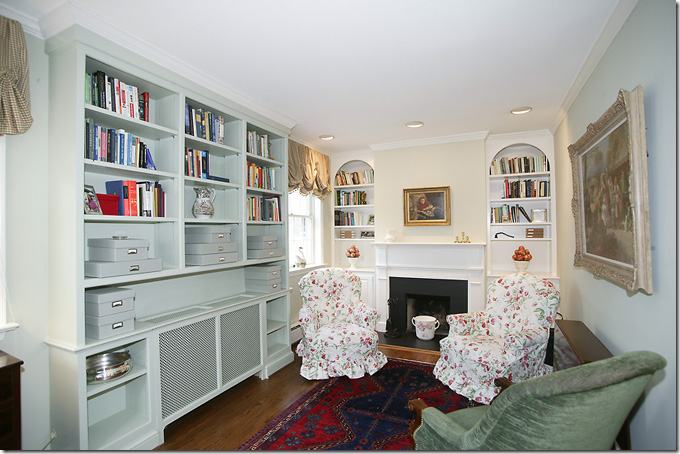
BEFORE: The library with built ins and a classic fireplace mantel.
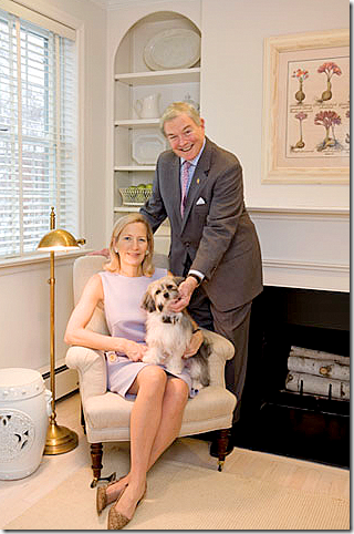
AFTER: The couple pose in the library – with its whitewashed floors and seagrass rugs. Above the mantel botanicals in light frames hang instead of oil paintings. White garden stools are used in different rooms instead of side tables – a great, economical choice.
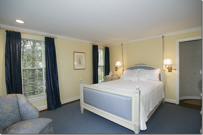
BEFORE: The master bedroom was blue and yellow.
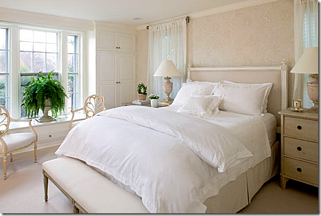
AFTER: The bed was placed on another wall, between the two windows. A Louis XVI style headboard is paired with Swedish antique chests.
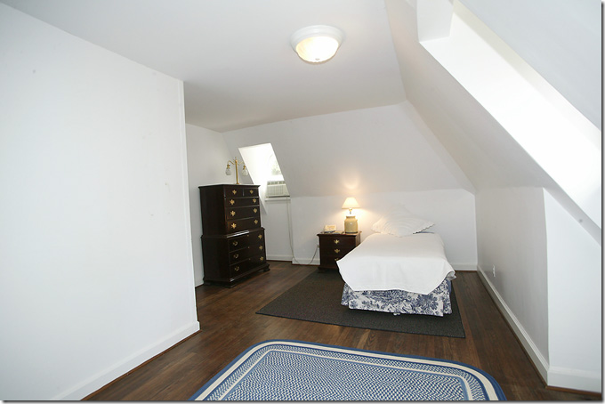
Before: the guest room with eaves wasn’t decorated.
AFTER: The once barren room is now a charming French styled bedroom with blue and white toile wallpaper. So cute! One all over pattern wallpaper is great in a room with sloping eaves. The pattern tends to camouflage all the strange angles – as you can see here.
Linda and her her husband happily lived in the Gatehouse for two years, but in 2009, a For Sale sign changed everything. Linda, who had had her eye on a nearby Tudor, saw the For Sale sign one day and quickly snatched it up. Moving to a new house just two years later made things easier – Linda contacted Thai at Tone on Tone to again help out with the new house. Just like before, the Tudor needed remodeling and some new furniture, though much of the same pieces were reused.
But, before we take a look at the Tudor, luck came into play, AGAIN. The couple who bought Linda’s Gatehouse in 2009, just put it up for sale again. Which means we can get a glimpse of how much the new owners changed Linda’s Swedish Gatehouse:
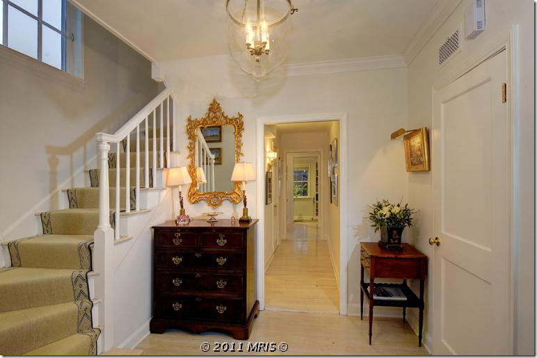
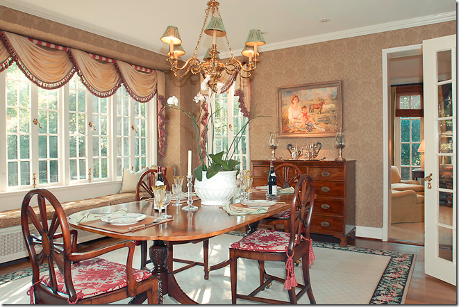
Here is how the Gatehouse looks today. The new owners kept the light floors and light walls. They changed out the stair runner and instead of light Swedish furniture, the house is once again filled with dark English case goods.
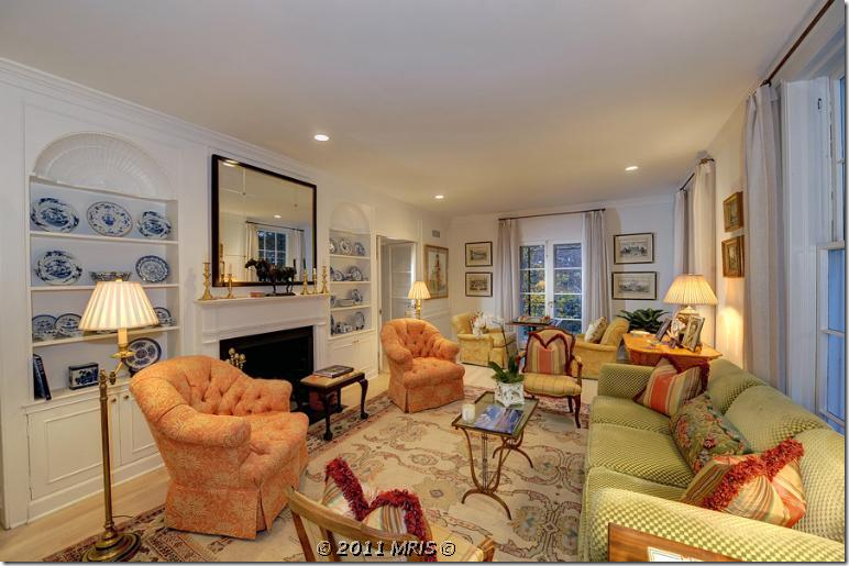
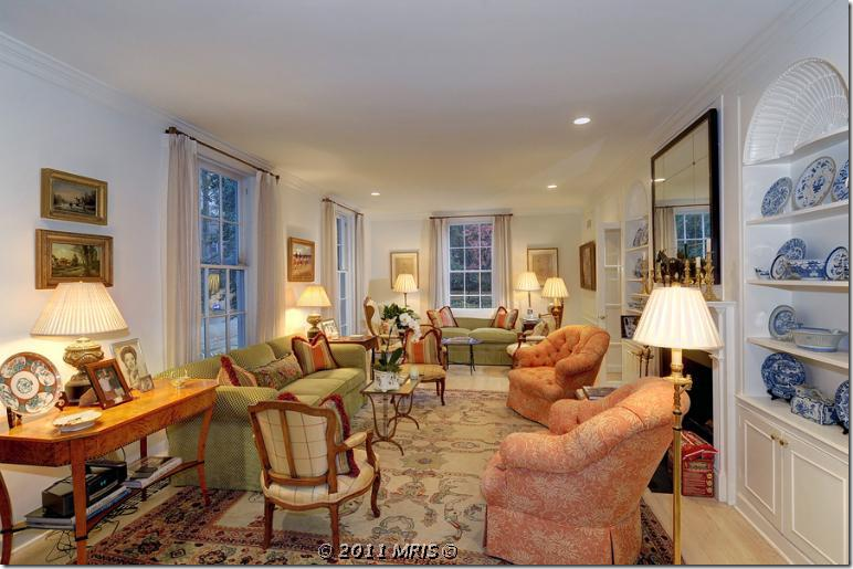
What a huge difference the living room looks with the new homeowners!!! It is now a riot of color with Oushak rugs and orange and green fabrics. Blue and white porcelains fill the shelves. The curtains are a plain linen – something of a surprise.
Looking the other way. What a difference from Linda’s Swedish interior. It is so bright and cheery. Beautiful burled wood side table.
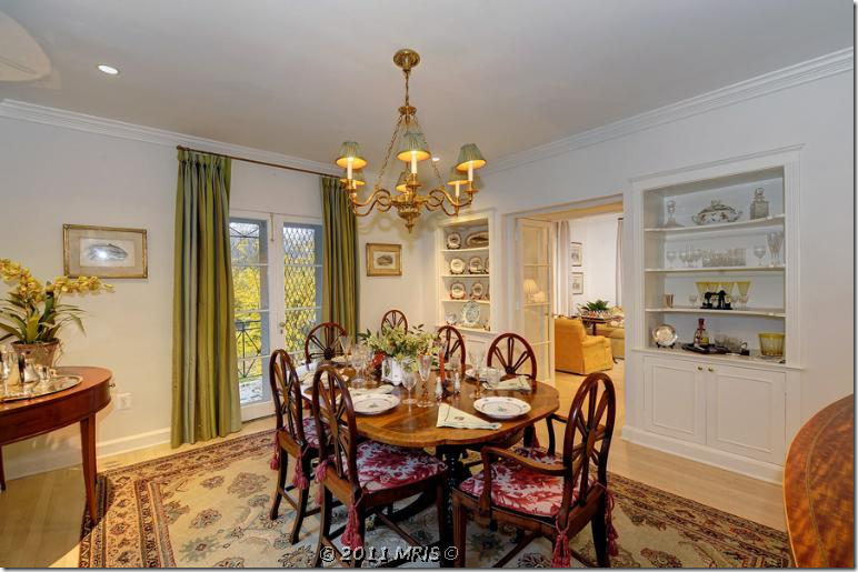
The dining room has another patterned rug and a brass chandelier. The curtains here are green stripes.
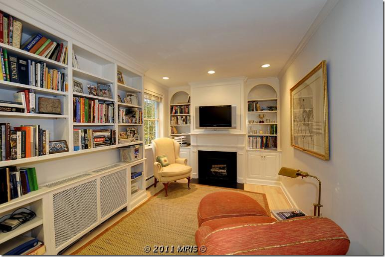
The tiny library has a seagrass rug and more orange and yellow fabrics.
The master bedroom is green and yellow. They kept the same furniture arrangement as Linda had it. They added a window seat cushion.
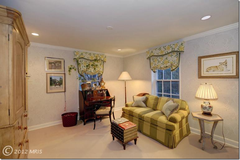
Off the bedroom is the sitting area with matching sofa and window treatments.
The den, which I have no pictures of from when Linda live here, unfortunately.
So…..which décor of the Gatehouse do you like best – Linda’s clean, light Swedish décor, or the bright, colorful English décor of the new owners? You know which one I prefer – but I also do like the colorful décor.
House #2: The Tudor
Now, where did Linda and all her Swedish furniture move to?
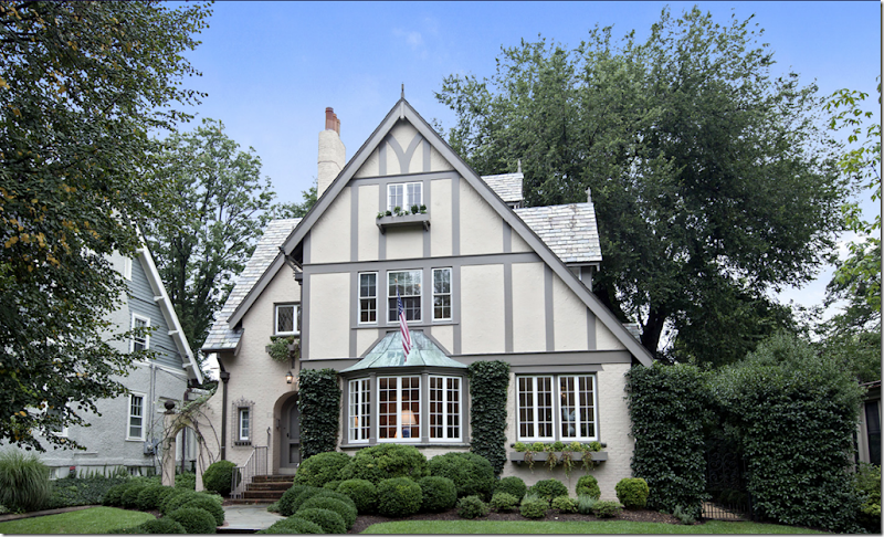
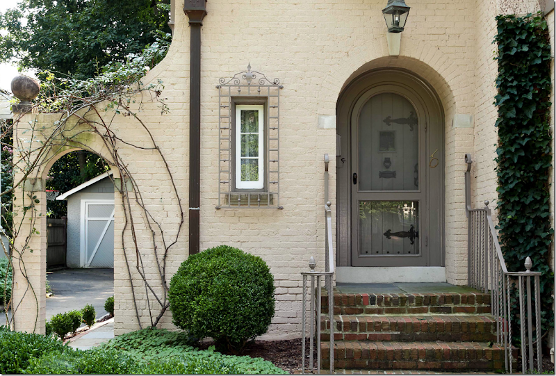
This is the 1920’s Tudor that Linda coveted before it was even put up for sale. Once the for sale sign went out – Linda and her husband bought it and moved in, after upgrading the interiors – which only took a month! Notice the charming third story window and window box and the beautiful patina covered copper awning. There’s an arch on the left side of the house and a vine covered gate on the right. Boxwoods are just the right simple landscape for a Swedish interior.
A view of the side of the charming Tudor with the basement windows on view.
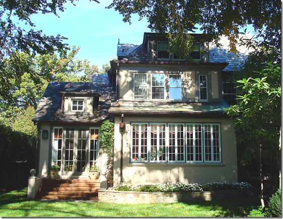
And the back view – with the many original latch windows.
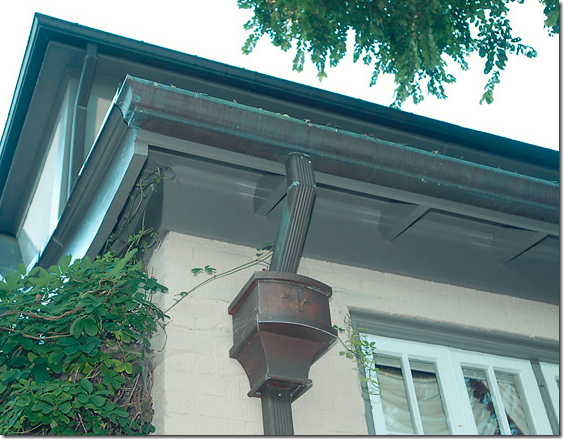
A close of the patina covered copper drains and gutters.
The front door is wood panels with original large hinges. Notice the charming window with its grill. On the left notice the cute new garage door that Linda installed. The Tudor is about twice as large as the Gatehouse, but, at 4 Ready to go inside? But, wait…..
As luck would have it yet AGAIN, I found the original real estate listing so we can see what the Tudor looked like before Linda and her husband moved in.
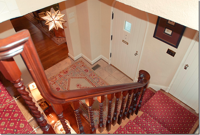
BEFORE: The entry hall with red patterned carpet and stone floor. Veddy English – including the star chandelier.
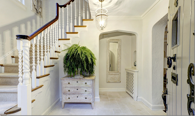
AFTER: “It was charming and unusual,” Linda tells why she was attracted to the Tudor. “There was no big addition, no kitchen-family room combination. It retained a lot of its original character.” The Tudor is also almost twice the size in square footage as the Gatehouse. Notice all the changes made – the gray paint, the lighter trim, and the painted staircase which really shows off it’s beauty now that it is painted white. The floor was replaced and is now a white limestone. A neutral carpet covers the steps. An antique Swedish chest and mirror finish out the new décor.
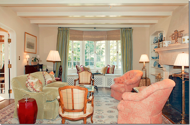
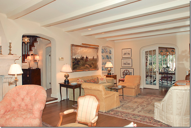
BEFORE: The living room – this room is also long and narrow just like the Gatehouse. So bright and cheery. Hmm…
And like the Gatehouse, it is broken up into a few seating areas. Gee, something seems familiar….
The view from the opposite direction. Something really DOES feel familiar here?????
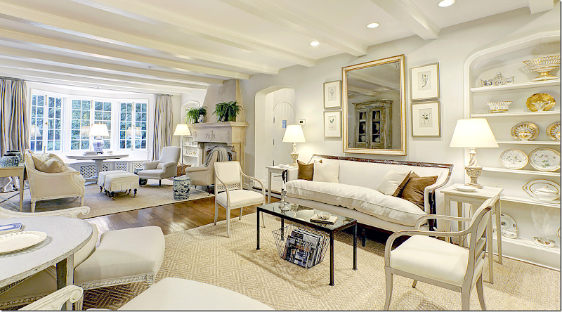
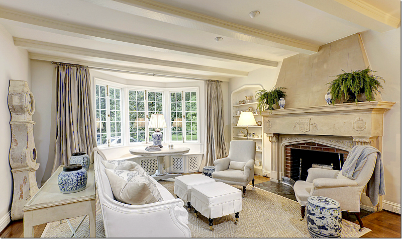
AFTER: The beautiful living room – Linda painted the walls, but kept the floors dark here! She used the same wood framed sofa and Swedish chairs. In order to make the same large rug work here – she cut it into two pieces. In the mirror’s reflection you can see another tall piece not previously seen before. Isn’t this just a wonderful room? Do you like this living room better than the Gatehouse living room? I do.
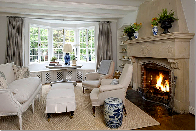
In the front part of the living room that overlooks the street, a white painted frame sofa sits in front of the beautiful stone fireplace. A Swedish console table sits behind it – as does the Mora clock. Two antique chairs flank the fireplace – with blue and white garden stools next to them. I love the table in the window – and all the blue and white used in this part of the room. Just beautiful!!!! Notice she used the same curtains here – she had to cut down some rods and also paint some in order to reuse them here in the Tudor house.
And,again, cute slipcovered ottomans take the place of a coffee table. Love the roaring fireplace.
Close up of the two antique arm chairs that flank the fireplace.
Linda poses in the opposite side of her living room. Notice the two demi lunes are now pushed together to make a round table. Some of the new fabric Thai chose for Linda is off white indoor-outdoor fabric that is a good alternative to slipcovers.
This bookshelf holds her mother in law’s collection of beautiful Old Paris with its white and gilt colors, so pretty with Swedish décor.
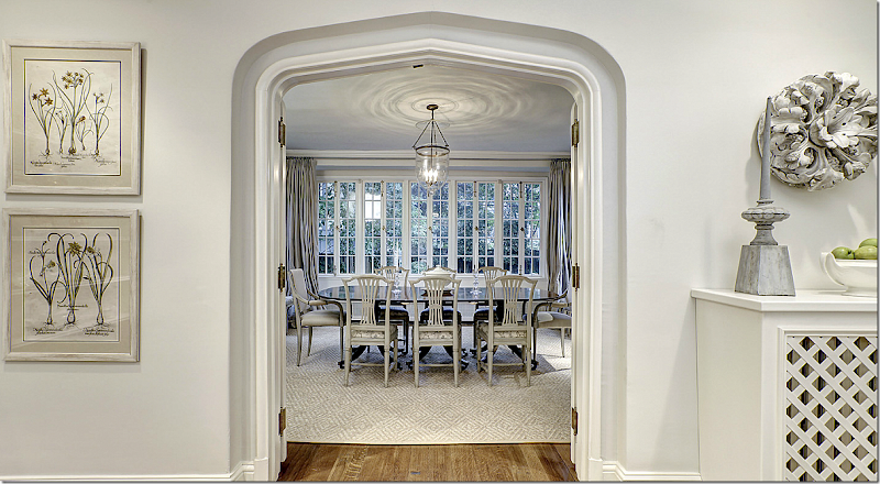
BEFORE: The dining room. Hmmm – does the light fixture and table and chairs look familiar? OK !!! I finally put it all together. The people who sold this house – the Tudor – toLinda, bought Linda’s old house, The Gatehouse!!!! Go look back at the pictures of the Gatehouse that is now for sale!!!! In other words, they traded houses. AND what is really strange – is that after only two years – BOTH houses are now for sale AGAIN!!!!! Do you have this all straight? I kept emailing Artie – saying, “you won’t believe this,” because he thought this was just about one house – not two – and certainly not two families who traded houses. It’s interesting to me how much prettier the colorful furniture looks in the Gatehouse – as opposed to the Tudor! Agree? It could just be the photography. But, I think they both made a good trade.
Picture a friend of yours in their house – and then, picture trading their house with yours. How would the two houses look with each other’s furniture? Can you think of someone you would trade with and vice versa. Well, I’d love to trade houses with Pam Pierce – but something tells me she wouldn’t want to!!! Plus, I would want to keep Pam’s furniture for myself. She can keep all my old furniture – have at it!!
AFTER: From the living room, the French doors open into the large dining room.
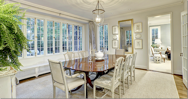
AFTER: I love the subtle fabric on the side chairs. The beautiful set of windows overlook the back yard. It’s all so gorgeous – I just love what Linda and Thai did with this house.
Another view showing the table set smaller, with less chairs around it.
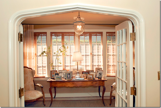
BEFORE: Off the living room is the small sun room, filled with French furniture and another bell jar chandelier. This chandelier ended up in the foyer at the Gatehouse.
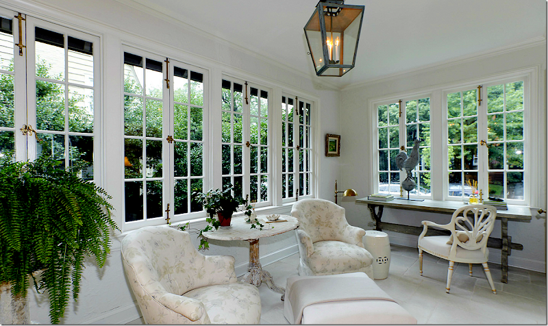
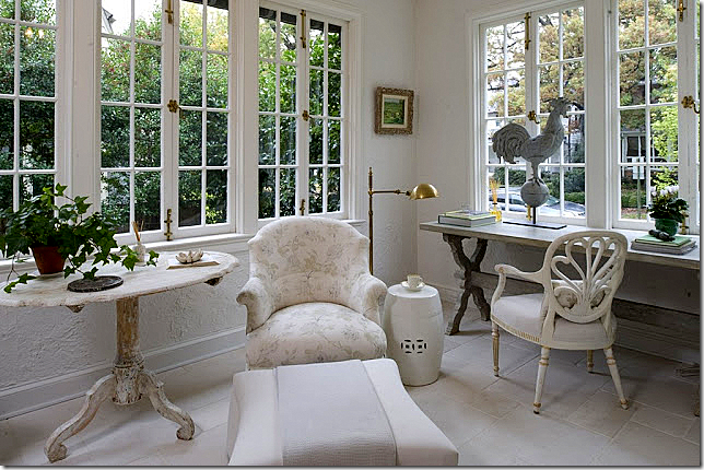
AFTER: Perfection! New white limestone floors set off the light Swedish furniture. The antique arm chairs are covered in a muted fabric with touches of blues and green – perfect to pick up those colors in the Swedish antiques. Beautiful lantern – just right for the sunroom – as is the zinc rooster.
Another view of the room – just perfect for morning coffee.
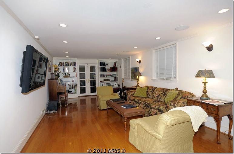
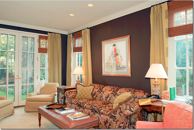
BEFORE: The library is painted a dark brown with gold curtains. Go look back at the Gatehouse to see where this sofa ended up. It doesn’t look as good as it does here though. The orange chair is in the library, remember?
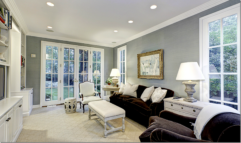
AFTER: The library has brown velvet furniture – perfect for major TV watching. Swedish chest and table flank the sofa – with wonderful urn lamps. The white garden stools reappear here. Patterned sisal rug.
The walls in the library aren’t painted – rather they are aqua colored grasscloth wallpaper.
BEFORE: The kitchen got a major remodeling. No way would Linda have dark stone and a yellow backsplash.
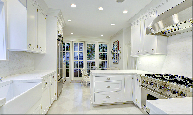
AFTER: The new kitchen was the biggest change. To save cost – Linda used builder grade wood on the floor, knowing it was just going to be painted over in a beautiful gray and white checkerboard pattern. White marble countertop and backsplashnand a farm sink, along with stainless steel appliances bring the kitchen into the 2010s.
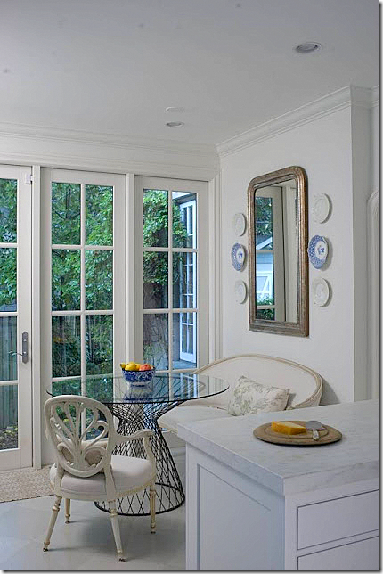
A French settee with a muted patterned pillow are paired with a contemporary wire table. Love all her mirrors surrounded by plates.
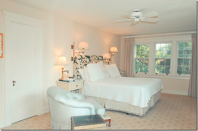
BEFORE: The master bedroom has the same headboard, but in a different fabric that is now in the Gatehouse. It looks like they used the curtains in this bedroom in the Gatehouse’s living room.
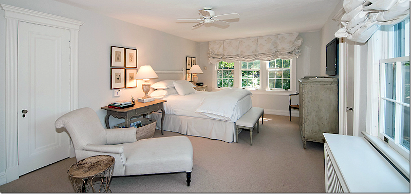
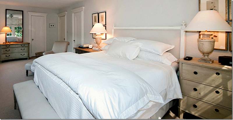
AFTER: An antique chaise sits in the extra seating area. Muted fabric is used on the windows. The bed is all white and ivory. Love the painted desk next to the bed and the two sets of four botanicals.
The bedroom from the other angle. Notice how pretty the molding around the doors is. Beautiful chest with mirror on the far left. Urn lamps – Linda really likes the urn shape – just like me.
The extra bedroom becomes a sitting room/office. Love the balloon shades. The walls here appear a little darker than most.
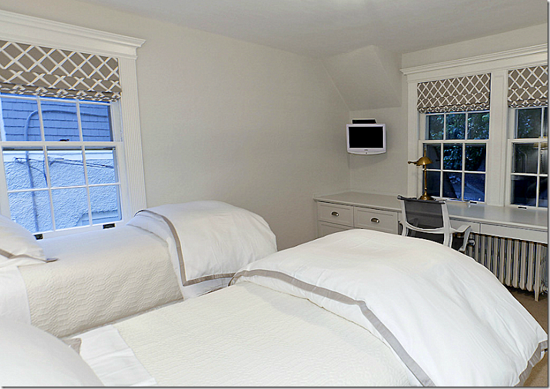
The blue and white toile is abandoned for white and grays in the guest room.
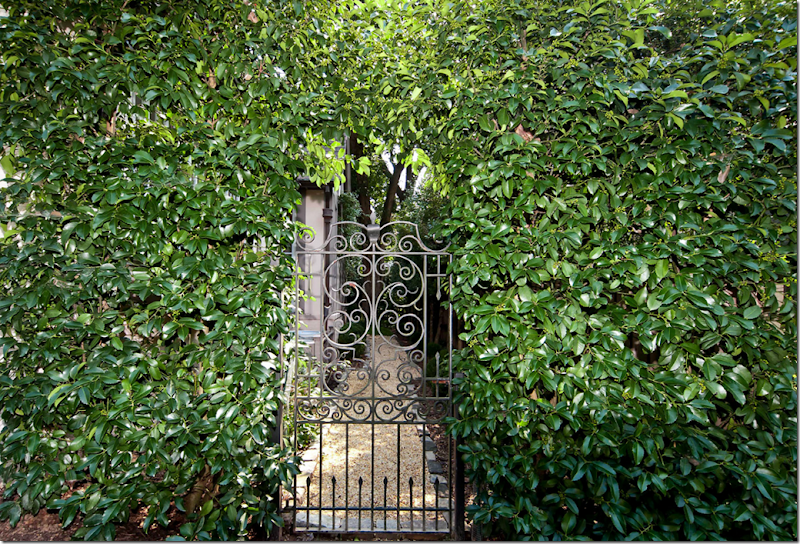
The vine covered iron gate leads to the side yard.
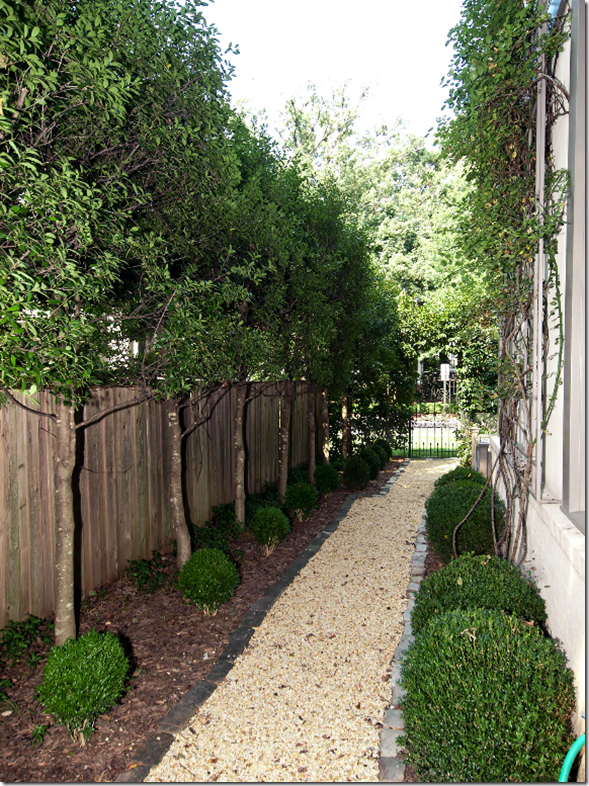
Perfectly manicured and landscaped side yard.
The shady back yard – the white covered fabrics tie in the outside with the inside.
The back terrace.
Both the Gatehouse and the Tudor house are now for sale, again. Linda and her husband are planning to move to a smaller space in Washington, since they are returning to their home base in Missouri. The other couple, in the Gatehouse – I have no clue where they are going. Maybe they will buy back their old house again? Who knows????
Swedish Decorating Tips from Linda and Loi Thai of Tone on Tone:
taken from the Washington Post article by Terri Sapienza.
If your house is dark and your color scheme is red and blue and yellow – how can you make the change to a light, neutral house easily?
1. Start small – if you are worried about making the commitment to such a big change, start with a small space in your house such as the entry hall or guest room.
2. Paint the walls in a lighter color. Thai’s favorite neutral colors are Benjamin Moore Classic Gray and White Dove and Farrow and Ball – Clunch. These two BM colors are used throughout the Tudor house.
3. To introduce Swedish painted pieces – start slow. Replace the furniture that you like the least, first. Thai says sometimes 1 or 2 pieces may be all you need to freshen up your space. If you like the look – keep changing into the more public areas of your house.
4. Don’t go overboard – too much Swedish furniture will eventually look dated. Mix Swedish with other styles – collect and mix. Mix painted Swedish with mahogany – Thai finds it more interesting.
5. If your sofa is dark, add light accent pillows and drape a neutral throw over the back.
6. If you have a matching set of furniture – break it up and use the pieces in different rooms.
7. Slipcover with light neutral fabrics, add patterns with pillows and throws (and drapes, says me.)
8. Linda uses blue-and-white French ceramic tiles instead of coasters – what a great idea!
9. Instead of built ins, use furniture like the sideboard Linda uses in her kitchen.
10. Kooboo wicker baskets are used everywhere – to hold towels and magazines and the dog’s toys.
Links to the stories above:
An interesting tidbit about the Gatehouse. According the Linda, the 1937 house was actually the gatehouse for either a larger estate – or the Chevy Chase neighborhood. When looking at the property on Google maps, I was stunned to see there were actually two identical gatehouses – on each side of the street. According to the real estate brochure, the Gatehouse is cited in the Library of Congress – as: “one of two Christopher Wren 18th century English architect residences inspired to function as a gatehouse to the courtyard and community within.” The gatehouses do look rather large for the neighborhood behind them, perhaps over time, it was made smaller by the highway expansion behind it.
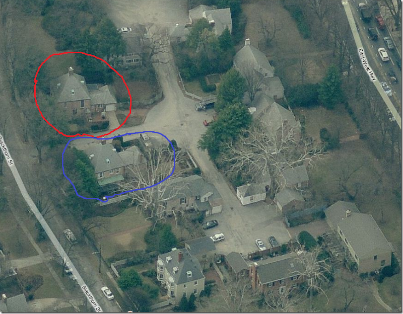
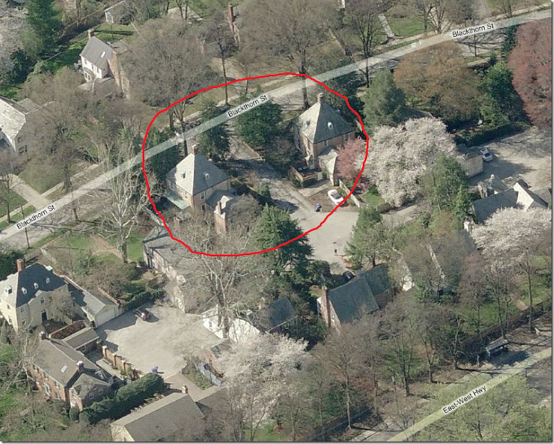
Here are the Google maps pictures of the two identical gatehouses! Hard to imagine what a luxury they were back in time.
The blue house is the Linda’s gatehouse that is now for sale. The red house is the identical gatehouse across the street. The back portions of both houses were probably added on at a later date.
This view shows the back side of the two twin gatehouses. You can see how the roofs are identical, as are the attic windows and fireplaces. The houses are called English, but they look more French to me. That’s all, folks! Hope you enjoyed this story of these two trading houses.
And if you live in Florida, or will be visiting, please be sure to mark your calendars for this event!!! I wish I could be there!!!


