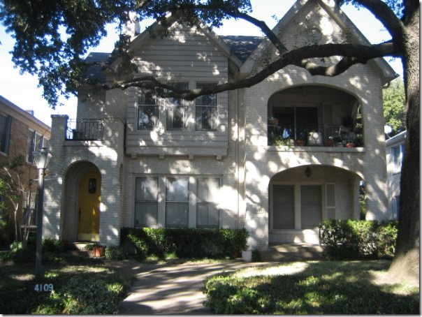
Before and After: Exterior of the duplex located in Dallas.
Through the blog, I get a few emails requesting design work. Unfortunately, many requests are for houses not located in Houston. Since the blog takes up so much of my time, I no longer am able to travel far from Houston for design work. When a reader doesn’t live here, I try to recommend a local designer, if I know of one. If not, I’ll recommend a designer who does online decorating. Such was the case with this one reader who wrote that she was moving from Houston into an 80 year old duplex in Dallas.
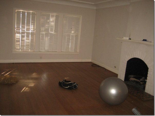
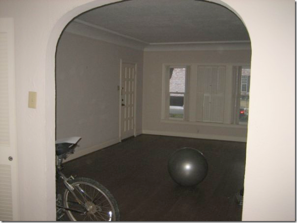
The homeowner sent me these pictures before she moved in to show me what she had to work with. The duplex had a lot of character - there were hardwood floors and a painted white brick fireplace.
Additionally, there were lots of windows and arched doorways, along with a health addicted former tenant. Despite the exciting challenge, I didn’t think it would be in her best interest to work with me – she needed someone in Dallas that could take her out shopping and then return to the duplex to bring it all together.
I referred her to fellow designer Emily Johnston Larkin of the very popular Material Girls blog HERE. Emily and her friend Lauren started Material Girls around the same time as Cote de Texas. Emily wrote about Dallas, while Lauren wrote about Houston. Today the blog has grown - there are now six Material Girls who write for it from all over the country. Emily and I had a special bond – both our spouses are named Ben and both are rabid University of Texas fans. We would email each other with tales of our respective Ben screaming into the TV over some football loss or win. So, when thinking of a designer to recommend in Dallas, I knew the homeowner would be a perfect fit with the beautiful Emily. A positive was that Sarah, the homeowner, and Emily are closer in age and probably closer in design aesthetics. After I made the referral, I didn’t think of it very often. I didn’t even know if they ever connected until a few weeks ago when Emily emailed me with photographs of the finished living areas! I was very pleasantly stunned – to say the least. Emily said she wanted to keep it all on the q-t until the job was over so that she could surprise me - and surprise me, she did.
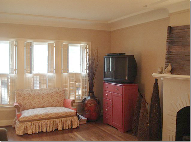
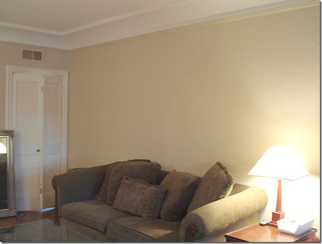
Here are the before shots of what the duplex looked like after Sarah had moved in and before Emily was hired. She owned a cute settee, along with a persimmon painted chest.
There was a green sofa in the living area.
After moving in, the one change Sarah made was to paint the walls a soft khaki color. Notice the pretty cove ceiling.
AFTER:
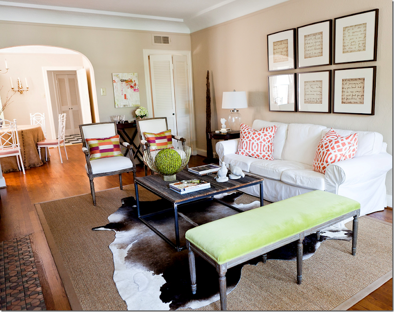
And here is what it looks likes today – thanks to Emily! What a transformation!!!! Wow.
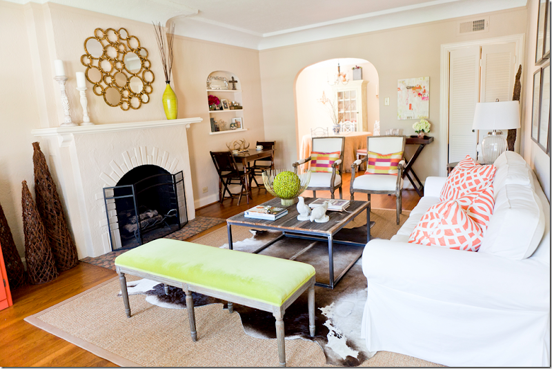
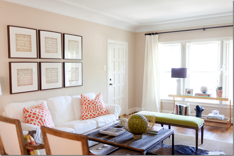
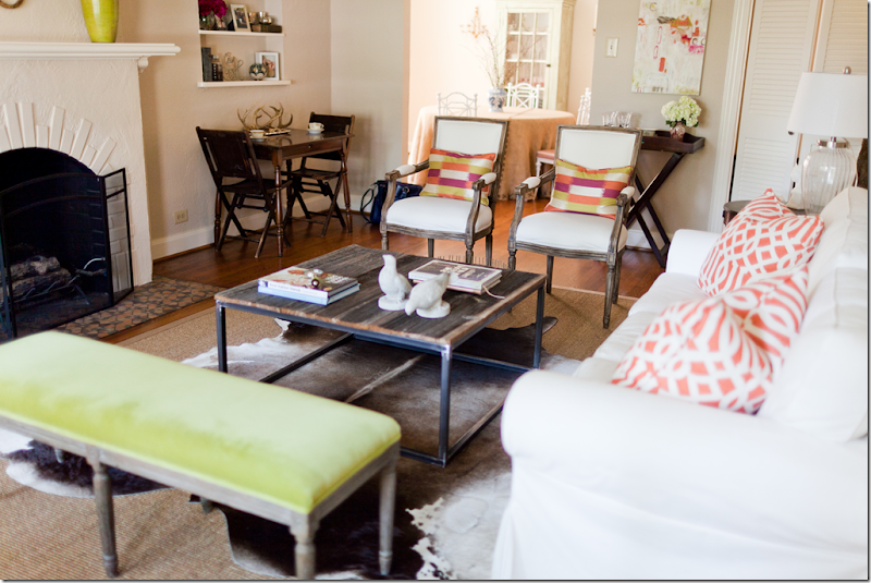
Another view of the living area and into the dining room. I love the color scheme – the white upholstery mixed in with pops of chartreuse and bright orange. The color choices makes the room look youthful and hip.
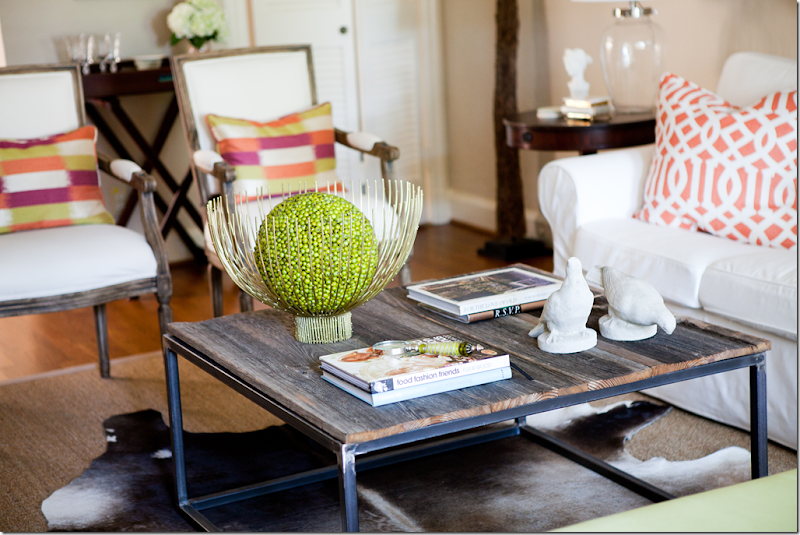
Here’s what Emily had to say about the design scheme. The homeowner, Sarah, didn’t have a huge budget, so Emily mixed high and low elements to get as big of a bang as possible. The cowhide rug was Sarah’s, so that was a plus. It was layered over a new sisal rug. Emily says that Sarah said she liked a “Cote de Texas” look – so she knew Sarah would love the sisal and cowhide mixed with a new white slipcovered sofa from….IKEA! Yes!!! The famous IKEA sofa. Look how good it looks here – at first glance, I didn’t even realize it was from IKEA, I thought they had slipcovered her existing sofa. But as Emily knows, slipcovering an existing sofa is twice the price of a new $389 IKEA sofa. Great choice. She added two new French inspired chairs from Palacek, along with off white curtains from Restoration Hardware. The French bench also came from Restoration Hardware which was recovered in a chartreuse velvet from Pindler and Pindler.
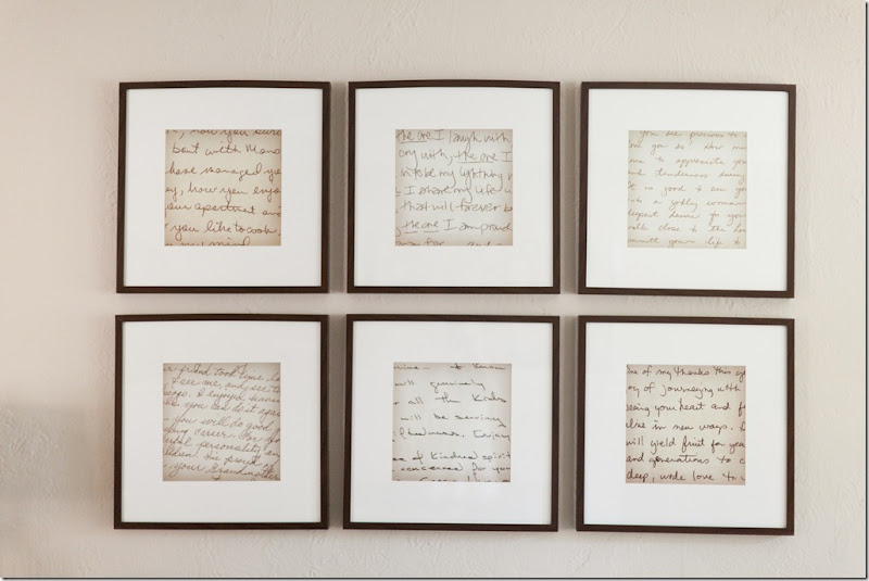
The artwork above the sofa are old handwritten notes from Sarah’s grandmother, mother, and teachers that she has kept all these years. First, she enlarged the notes on a copier, then she placed them in frames bought from IKEA. The notes are a wonderful idea – they add a personal touch to the space, plus they look like a big piece of art when framed and hung like this. Great idea!!!
Sarah really wanted a bricklayer’s table but didn’t want to pay a fortune for what is essentially a rustic piece. Her father came to the rescue and made it himself with the help of a welder.
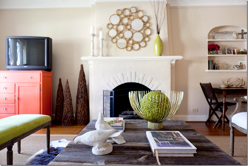
The modern gold bowl came from Stephanie Anne – a favorite store of Sarah’s in Dallas. This was one high priced accessory – most all other accessories came from Anthropologie and Home Goods.
Emily added glass knobs to the orange chest to dress it up a bit. Notice how all the greens tie in together. The orange of the chest is repeated in the pillow fabrics.
Restoration Hardware curtains soften the window side of the room.
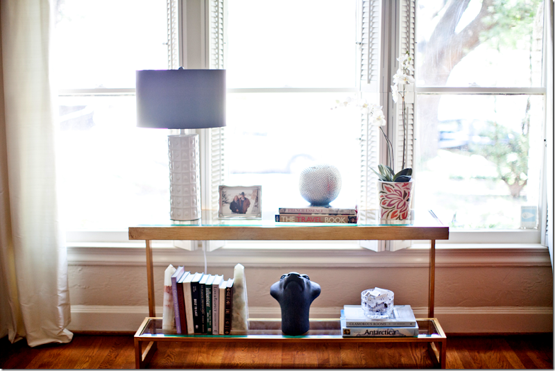
The gold and glass console adds a contemporary touch, as does the white lamp. I love the touch of lilac found in the shade.
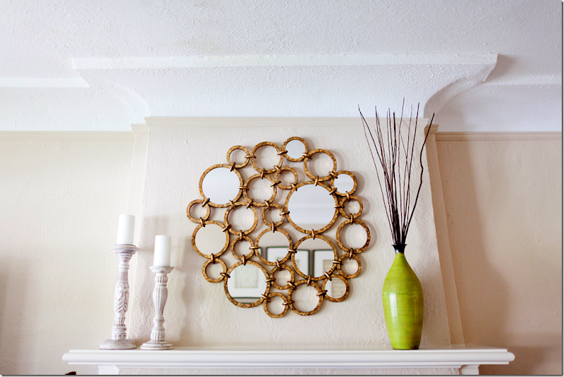
More contemporary touches is the gold mirror from Horchow. The vase brings in another touch of bright chartreuse.
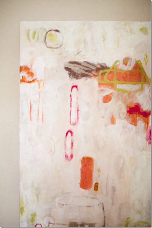
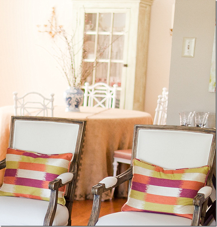
The bright pillow fabric ties in with the other pops of color. Behind the chair is a commissioned work of art.
One special touch is the commissioned canvas by Dallas artist Lindsey Meyer HERE. The art work brings in all the colors used in the duplex.
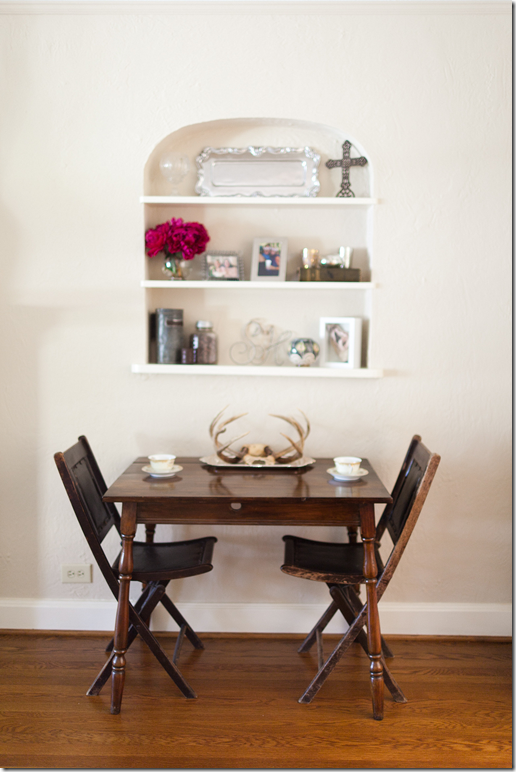
Sarah collects antiques at Round Top and had inherited some from her beloved grandmother – these were used to give the room patina and character.
More personal touches are the antlers resting in an old silver tray. I love this juxtaposition between fine and rustic.
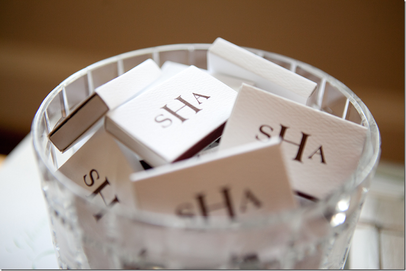
I really love monograms – a bowl of matches like this is handy for lighting candles and is a great guest gift. Other items to monogram are paper napkins, soaps and guest towels. Pottery Barn has a great selection of gift items that can be personalized with your monogram.
A glimpse into the dining area shows a skirted table with a painted white case, sconces and an unseen chandelier.
The burlap skirt is dressed up with X stitchery and white painted Chinoiserie style chairs. Cute black and white tiled floors lead into the kitchen.
Emily added this following story about the homeowner:
Sarah was very close to her 101 year old landlord, Katie, who passed away this past summer while we were working on her living room (Katie had lived in the unit above Sarah since the 1960’s!) At the urging of Katie’s friends, Sarah took ownership of both duplexes. The décor in Katie’s unit hadn’t changed since the 60’s so Sarah and her dad (through blood, sweat and tears J) renovated it. Once they were done, Sarah buried a letter that she wrote, under the floorboards of Katie’s former duplex that told Katie’s story. Her hope was that fifty years from now, another landlord would find it and know how special the duplex was to both Katie and Sarah.
To contact Emily Johnston Larkin, please visit her web site for all the details HERE. A huge thank you to Emily and Sarah for sharing the story of their before & after!
Thursday, January 12, 2012
A Material Girl Before & After in Dallas
Labels:
Emily Johnston Larkin
Subscribe to:
Post Comments (Atom)





No comments:
Post a Comment