Friday, September 28, 2012
Kevin James Throws It Down in Delray Beach
LOCATION: Delray Beach, FL
PRICE: $18,500,000
SIZE: 26,509, 8 bedrooms, 9 full and 3 half bathrooms
YOUR MAMAS NOTES: Thanks to a brief note from The Bizzy Boys at Celebrity Address Aerial—and a previously overlooked report by the intrepid peeps at the Palm Beach Post way back in mid-August (2012)—Your Mama has learned that Emmy- and Razzie-nominated stand-up comedian, sitcom success and low-brow comedy movie superstar Kevin James shoveled out some serious, unambiguously Tinseltown-A-lister type of loot for a humongous house in the somewhat unexpected and out-of-the-way Delray Beach, FL.
In late August (2012) Mister James and his part-time-actress wife and baby momma Steffiana De La Cruz shelled out $18,500,000 to purchase an honest-to-goodness, ding-dang celebrity-style doozy of a (sort-of) oceanfront residential compound in Delray Beach that sprawls across two lots that total 1.85 acres. The Palm Beach County Tax Man shows the main mansion has 12,808 square feet, as does listing information easily conjured out of the interweb. Listing information we peeped also states—it should be noted—the actual living spaces encompassed by the entire "Mediterranean Revival estate" spans a far more substantial, real estate baller-sized 26,509 square feet with a total of 8 bedrooms and 9 full and 3 half bathrooms.
Does it seem surprising or odd to any of the children that Mister James—a man whose professional shtick is pretty much summed up by portraying stupid but lovable middle class straight guys—can afford to acquire and maintain an estate of this magnitude? For chrissakes, the 2011 taxes alone, even after an 11.3% reduction, came to a nauseating $240,492, according to public records. Believe it or not, booter beans, that's a hefty and even prohibitive annual tax nut for a just-regular-rich person, especially since the taxes don't cover the—likely to be exorbitant—costs associated with property insurance, staffing and security, landscaping upkeep and swimming pool maintenance. The utility bills—we can only to imagine—could probably choke a middle class Clydesdale and quickly drive a run-of-the-mill millionaire to the poorhouse.
Luckily for Mister James, he's not just a run-of-the-mill millionaire. See children, for his Showbiz efforts and talents he is extraordinarily well compensated and, more importantly to his future working opportunities, Mister James pretty much mints money for movie studios. In 2007 it was reported his salary for the final years of the now heavily syndicated sitcom King of Queens was upwards of $400,000 per episode, and possibly as much as $500,000 per episode for the final season. That's a lot of damn chicken scratch, you know. Rudimentary calculations on our bejeweled abacus indicate the professionally charmed Mister James very well may have hauled in over four million clams just for the abbreviated 9-episode final season. And that's not counting the piles and miles of greenbacks, one imagines, he earns in residuals. Not bad work if you can get it, right?
Since King of Queens went dark in 2007 Mister James has steadily built his professional reputation as a comedic movie star who can deliver prodigious profits with a handful of starring roles in sophomoric, fart-humor movies like I Now Pronounce Your Chuck & Larry, Paul Blart: Mall Cop, Grown Ups and Zookeeper. Your Mama freely confesses that we've never seen any of these movies so we can't and won't speak to their quality as cinematic entertainment but we can tell the children that hordes and swarms of people paid good money to see them. Just those four movies, according to Box Office Mojo, have a total of $810,648,293 in worldwide box office receipts. The residuals from non-theater revenues must also, one imagines, boggle the brain.
Now it makes perfect sense that Mister and Missus James can afford a Wall Street fat cat-priced residence, right?
The nearly two acre lot isn't directly on the beach but sits across the street. The location allows for plenty of direct and oblique ocean vistas from the house, for sure, but, unless there's a a tunnel we don't know about, actually getting to the beach requires a mad dash across a probably not usually very busy two-lane road and a trek across a short stretch of rolling dunes.
The cavernous formal living room, with massive fireplace, lighted built-in display niches and soaring beamed ceiling, has three, exceptionally tall arched French doors that open out to an ocean side loggia. The baronial formal dining room has yet another massive stone fireplace as well as a series of arched French doors separated by tall, Macedonian stone Doric columns.
Other spacious and luxurious entertaining spaces include a mahogany-paneled billiard room with inlaid stone floors and built-in wet bar, an adjoining, carpeted "club room" with another fireplace, and a bookcase-lined library with—you got it—yet another fireplace.
The colossal and expensively equipped eat-in kitchen has an undulating, barrel-vaulted brick ceiling, all the top-grade appliances money can buy, both butler's and storage pantries and a walk-in fridge/cooler. The nearby family room contains—yep—a fireplace, built-in bookshelves and a trio of towering arched French doors that connect to a second outdoor living loggia that overlooks the swimming pool complex.
Upstairs five family/guest bedrooms each have access to a private bathroom and share a separate playroom/den. The house-sized master suite has a column-encircled entry vestibule and a behemoth bed chamber defined by a rather monolithic wood fretwork panel. The suite opens privately to a deep covered terrace with fireplace and ocean view. The suite is complete with an adjoining meditation lounge, a pair of "wardrobe rooms" and a titanic bathroom with his and her areas plus a free-standing, egg-shaped soaking tub set on an inlaid, free-form bed of stone in the center of the room.
The luxury appointments and accouterments extend down into the extensive finished basement area where, according to listing information, there are staff quarters, a wine room, a game room, a fitness room, and a professional-style spa with hydrotherapy tub, massage area, shower space and steam room.
In addition to the sumptuous main house, the double-gated, resort-like seaside estate contains several motor courts and parking areas, an underground 8-bay garage, fairway-like lawns, stone pathways that meander through lush tropical gardens, several shaded porches and loggias for escaping the relentless south Florida sunshine, a slightly sunken sport court with viewing platform and a separate guest house that overlooks the saltwater swimming pool and semi-circular spa. A monumentally-scaled, stone-columned poolside cabana is outfitted with a colossal carved stone fireplace, pool bath and summer kitchen.
In addition to his dee-luxe new digs in Delray Beach, Mister James still owns, according to our resources, two homes in the, like, oh-muh-gawd, ur-suburban Los Angeles community of Encino (CA), both of which he bought before he was married. In May 2002 he dropped $1,450,000 on a 5,386 square foot mock-Med mini-mansion in an itty-bitty gated enclave just a couple blocks north of Ventura Boulevard and in August the following year he forked over $3,200,000 for a far more substantial 10,042 square foot mock-Med mansion with 7 bedrooms and 11 bathrooms tucked privately up a shared drive and behind gates in the foothills a few blocks south of Ventura Boulevard. Your Mama does not know an oscillating fan from a palm tree so we really can't say what plans Mister and Missus James have for their west coast abodes but as of this morning, based on our brief and unscientific research, neither home appears to be on the open market.
listing photos: via Zillow
Thursday, September 27, 2012
Brother, Can You Spare A Dime?
Remember this beautiful townhouse that I showed you a few months ago? Decorated by Ginger Barber and located in Houston, the house was designed in neutral shades of soft colors that defy labels.
The house was truly gorgeous and I was just a bit tongue tied as I toured it. Overwhelmed, might be a better word. I was soaking up every detail – and there were so many details to soak up, I could barely get a word out. I was intrigued by how Ginger had used closely matched colors to create interest, and then used the different weights of the fabrics to create texture. The effect was so subtle - it reminded me of brush strokes on a fine oil painting. Each stroke of different colors blends together with the thickness of the paint to create a finished canvas – and this is exactly how Ginger used the layers of hues and fibers to create these interiors.
I used the time spent with Ginger to listen and learn and when I left, I felt like I had taken a master class. To her, it was nothing, just another job very well done. To me, I was the eager student, lapping up every word she uttered.
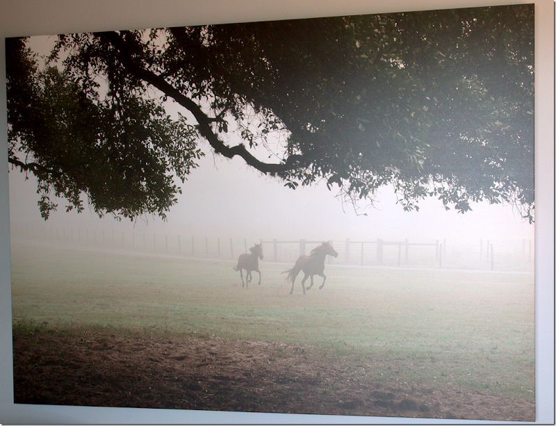
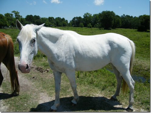
Photograph of horses, by Skeeter Hagler
And while all I wanted to talk about was interior design, Ginger, I soon found out, had different interests – mainly horses, and mainly abused horses – starved almost to death, mistreated, and abandoned. Her involvement with these forgotten animals started a few years ago when she came upon one such starving and abused horse, locked up in a stable near Galveston. After calling the police, she was directed to the rescue organization Habitat for Horses, who gladly took in the horse and nursed him back to health. Instead of forgetting about her unfortunate escapade, she developed a near obsession with the organization and began volunteering for them – mucking out stalls, gathering hay, and also, raising funds.
Throughout the day we spent together, Ginger kept talking about Habitat for Horses and proudly showed off a photograph of horses in a field taken by the Pulitzer Prize winning photographer Skeeter Hagler. Hagler had generously agreed to donate photographs for a future fundraiser that Ginger was planning. She asked if I would like to talk about the cause on the blog – and of course I gladly agreed to.
I don’t know about you, but a starving horse, or dog, or cat affects me to the core. Imagine being chained up and unable to go find water or food – the very basic necessities of life. It’s too horrible to even think about, yet it happens to these forgotten horses more often than one knows.
Habitat for Horses was started in 1997 with just one horse, a horse that was being starved to death down the street from the good Samaritans who wanted to save him. Back in those days, law enforcement didn’t take action against owners of these large animals – they were placated when often told, “he’s old, that’s why he’s so skinny,” or “we were just going to get him feed.” Once Habitat for Horses alerted the necessary agencies that they were now offering these abused animals sanctuary, things began to quickly change and they were routinely called by officials to come take a look at yet another starving horse. After they obtain the necessary court orders, the horses are brought back to health and then hopefully adopted out. If they are unable to be adopted, they live out their lives on the property that Habitat for Horses is located on.
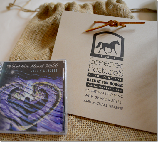
With the huge success of this organization – there have been growing pains. The original leased land is no longer large enough to sustain the operation and a hunt was begun to find a larger and permanent tract of land for Habitat for Horses. To this end, Ginger Barber and Jill Brown, owner of BROWN, along with Skeeter Hagler and Kathy Oliver, another noted photographer, are hosting “Greener Pastures – A Land Fund for Habitat for Horses.” The evening event will take place at Brown on November 8th, 2012 at 6:00 pm. Entertainment will be provided by Texas musicians Shake Russell and Michael Herne.
Space is limited, so if you would like to attend this event, please go to www.habitatforhorses.org/shake.html or by email at tickets@habitatforhorses.org.
If you are not from Houston, or are unable to attend, please, please consider making a donation to the cause. Any amount you would be willing to donate would be very much appreciated. To donate, simply go HERE.
With donations from people like you, Habitat for Horses has been able, since 1998, to save 5,178 horses from starvation and neglect. They have adopted out 4,660 of these rehabilitated horses. For more detailed information of what they have accomplished – please see their web site at www.habitatforhorses.org
And since this is a design blog, I wanted to share with you the darling Press Kit announcing the event that was delivered to my house! It always amazes me how creative some people are:
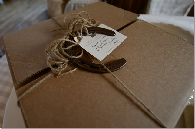
The Press Kit came in a plain cardboard box, wrapped with twine and a horseshoe. Ginger wrote a personal note to me, hoping to make the next blog story – a personal note is always such a nice touch.
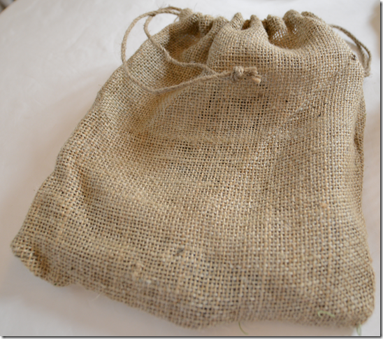
Inside, lying on a bed of florist moss was this large burlap bag.
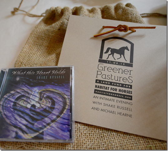
And inside was the Press Release, along with a CD donated by Shake Russell, the much beloved Texas musician. What a cute invitation- you’re not likely to forget an event when you get something like this! And that’s the point. I popped the CD into my laptop to listen to while I wrote this, getting into the mood.
To listen – double click on the arrow:
Aw, Shake Russell! Nothing makes me think of days in Austin at college more than listening to this song “You’ve Got a Lover.” How many times did we see him and Dana Cooper at the Armadillo, back in the early 70s? The words to this beautiful song are really so bittersweet, you wonder whatever happened to the girl he wrote this song this about?
So, whoever designed the Press Kit really did a great job, making me all nostalgic for Texas music and Texas Lone Star, and Austin, and the Lake, and horses.
Sweet Captain, my daughter’s horse that lives in Chappell Hill at my brother in law’s ranch. He has the easy life - he’s happy, he’s fed, he’s loved and is rarely even saddled up anymore - which makes it so hard to understand how someone could abuse such a gentle, kind animal.
Look at this cutie! Not all horses at Habitat for Horses are adopted out. Some remain at the ranch forever – these are their sanctuary horses. This horse, Pete, was their first rescued horse - it took one entire year for him to heal up from his injuries, and another to become acclimated to other horses. Now, they say he is a very spoiled, much loved horse.
Here is a group of other sanctuary horses. Notice the eyes on the horse at the far right – so beautiful!
Other horses, like Wolke, are available for adoption. On the web site, there are pictures and extensive histories of all the horses ready right now for adoption. If you can’t adopt a horse, you can always sponsor a sanctuary horse!
There’s a special place in heaven for people who donate their time and labor to helping the less fortunate. Habitat for Horses is run by such people, like Ginger and others, who volunteer their time, helping out at the ranch and trying to find others who want to help too.
If you can, please think about attending the Greener Pastures event. Or, if you are able, please consider donating to Habitat for Horses. Every little bit helps.
To purchase tickets to the Greener Pastures event, go to: www.habitatforhorses.org/shake.html or by email at tickets@habitatforhorses.org.
To donate to Habitat for Horses, simply go HERE.
To visit the Habitat for Horses web site go HERE.
Thank you so much for allowing me to talk about this with you.
Update: Diddy's Digs
At that time there weren't images included with online listings but we happened to notice today the addition of a treasure trove of jaw-dropping photographs that depict a sassy, supuh-swah-vey pied-a-terre done up pretty much exactly like what Your Mama imagines ordinary, non-VIP club goers imagine the invite-only VIP room of a swank Las Vegas nightclub looks like. Yes? No?
We don't know who's responsible for the chatoyant white lacquer ceilings, the thick, cement-colored wall-to-wall shag carpeting, the cushioned Lucite furniture or the disco ball-inspired column in the living room but it looks to Your Mama like maybe musician turned interior designer Lenny Kravitz done got nightclub-like decorating claws up in there. We're not hatin', we're just sayin'.
Anyhoo, just to recap, the 2,292 square foot spread—set 700-feet above the street with stomach-dropping Central Park and city views and equipped with a state-of-the-art home automation system—was originally designed with 3 bedrooms and 3.5 bathrooms, but two of the bedrooms were re-purposed into a media lounge with deep, black velvet sofas and a piano room with well-stocked wet bar and a glitzy, Lucite baby grand piano.
Mister Combs, who owns homes in Miami (FL), Alpine (NJ) and East Hampton (NY), acquired the sybaritic aerie in 2005 for $3,820,000 and is (allegedly) on the hunt for a much more substantial piece of the Manhattan residential real estate pie.
listing photos: Prudential Douglas Elliman
Chris Meloni Does It in the C.T.
LOCATION: New Canaan, CT
PRICE: $4,381,000
SIZE: 8,063 square feet, 5 bedrooms, 5 full and 3 half bathrooms
YOUR MAMAS NOTES: The children may recall that former Law & Order: SVU man-hunk actor Christopher Meloni—who was, dare we say, even more sizzling in the steamy prison drama Oz (1998-2003)—and his lady-decorator wife Sherman Williams-Meloni put their 60th floor Midtown Manhattan condo-crib on the market in March (2012) with, as you'll soon see, an in-hindsight-rose-tinted $12,000,000 price tag.
Mister and Missus Meloni's three bedroom and 4.5 bathroom high-floor Big Apple perch—located in the same, slender, smoked glass tower where Sean "Diddy" Combs recently put his higher floor three bedroom into two bedroom party pad up for sale for $8,500,000 and New Age guru Deepak Chopra has a even higher floor apartment with two bedrooms and two bathrooms listed for $3,595,000—remains unsold, but with a shrunken but still astronomical asking price of $9,950,000.
Luckily for him and his family, the well-compensated, Emmy-nominated actor—he reportedly took in $395,000 per episode in his last season of L&O:SVU—doesn't need to unload one multi-million dollar residence to acquire another; The hard-charging property gossip gal at the Post revealed today that Mister and Missus Meloni decamped—or will eventually decamp—for the bucolic and affluent enclave of New Canaan, CT where in late August (2012) they dropped $4,381,000 on a fully-landscaped, four-ish acre estate anchored by an unquestionably luxurious but perfectly ordinary two-story proto-suburban mansion with 8,063 square feet of expensively but blandly finished interior space.
Listing information Your Mama easily squeezed out of the interweb reveals the 16-plus room residence was built in 2006 and sits on "one of the highest elevations in New Canaan" with "extraordinary views to Manhattan." There are, according to listing information, total of five bedrooms, five full and three half bathrooms plus four fireplaces, an attached three-car side-facing garage with direct entry into the kitchen's service area, and a convenient pair of typically New England mudrooms.
The double height entry, with under-stair powder pooper, gives way to a spacious, step-down living room with fireplace and semi-circular wall of tall, arched windows that overlook the back yard. A quartet of clustered rooms, situated off the foyer, include a fully-paneled billiard room with built-in wet bar, an also fully-paneled library/media room with fireplace flanked by built-in bookshelves, a somewhat useless southwest-facing sun room with long curved wall of windows, and a secluded office with private half bath and yet another built-in wet bar.
Less formal family quarters are accessed directly from the foyer or through a compact butler's pantry that links the dining room to the expensively equipped but stylistically ho-hum center island kitchen complete with walk-in pantry, wine room, half bathroom, white raised-panel cabinetry and gray-veined green counter tops that are probably granite or marble or some other high-cost material. The breakfast area off the kitchen steps down into a semi-circular family room with fireplace, built-in bookcases and backyard access.
Front and rear stairs connect to the second floor where one guest/family bedroom has direct access to a private bathroom and a second makes use of a roomy hall bathroom. Two more guest/family bedrooms, each with private bathroom, occupy a wing of their own and straddle a sitting room with built-in bookshelves and media center.
Double doors open from the upstairs landing directly into the decent-sized and wall-to-wall carpeted master bedroom with brass-accented fireplace and semi-circular wall of multi-pane windows. French doors lead out to a petite loggia where a spiral staircase twists tightly down to a lower level covered porch off the library/media room and corkscrews up to a small roof terrace with pastoral, if knee-knocking, wrap-around views.
The large but hardly excessive, attached master bathroom has inset marble tile flooring, double sinks, soaking tub for two and separate stall shower. The adjoining walk-in closet/dressing room appears on the floor plan included with marketing materials to be larger than all four of the guest/family bedrooms. This spatial imbalance may (or may not) make it crystal clear to resident children, other family members and/or overnight house guests that their creature comfort ranks lower on the square footage food chain than the Louboutins and John Lobbs owned by the master and mistress of the manor.
The tree-ringed grounds include long driveway and baronial circular motor court with additional parking around the side by the garage. There are acres of gently undulating lawns, a newly-built six-stall horse or car barn, and a stone terraces that extends off the rear of the house and steps down to surround a free-form swimming pool and elevated spa set into a man-made bank of boulders and mature landscaping.
If she hasn't already Your Mama imagines Missus Williams-Meloni will soon roll up her interior decorator sleeves and get to work on a transformation that will turn this ho-hum house into a publication-worthy showpiece—like their Manhattan apartment, as seen in the March 2008 issue of Architectural Digest. Mister Meloni will do his part to fund his fortunate family's multi-million dollar lifestyle with upcoming silver screen roles in 42 (with Harrison Ford), the next of the never-ending Superman movies (Man of Steel), the comedy They Came Together, and the in-production drama Small Time.
listing photos: William Pitt Sotheby's International Realty
Wednesday, September 26, 2012
Iconoclast Comedienne Phyllis Diller's Digs
LOCATION: Los Angeles, CA
PRICE: $12,900,000
SIZE: 9,266 square feet, 8 bedrooms, 5 bathrooms
YOUR MAMAS NOTES: Your Mama knows we're a little late to this particular celebrity real estate rodeo but we figure better late than never in the case of the long-time Los Angeles, CA residence of outlandish and recently deceased comedienne Phyllis Diller that was recently pushed on the open market with a star-style $12,900,000 asking price.
In what may or may not be a coinky-dink, Miz Diller—may she rest in peace—was born and bred in Lima, OH, the same small Midwestern town where that motley group of teenagers on the super-gay hit tee-vee program Glee sing and dance their way through the trials, tribulations and humiliations of puberty, young love and high school. A classically trained musician from her youth—she could tickle and tinkle the ivories with the best of Tinseltown entertainers of her era like, say, Liberace—Miz Diller didn't pursue music as a career, but rather became an advertising copywriter and mother of five.
Sometime in the early-1950s, at a time when polite society considered it ludicrous and downright undignified for a lady to do stand up comedy, a nearly-forty year old Miz Diller did just that; She put on a fright wig and a pair of mid-heel ankle boots and bravely took a totally bizarre but inspired twist into the male-dominated, dog-eat-dog Showbiz arena of stand up comedy. Somehow, in that glowering, buttoned-up climate, she killed it with her punishing parody and and brutal self-deprecation.
She honed her wickedly sardonic, high-camp housewife schtick and distinct, open-mouthed guffaw throughout the 1950s and '60s with regular appearances in comedy clubs and on television programs such as What's My Line and Rowan and Martin's Laugh-In. Her professional salad days came—some might argue— in the late 60s and 1970s when she cut a broad and lacerating swath through one of Comedyland's to-date frothiest heydays of game-changing, cutting-edge comedy.
The iconoclast joker never really laid down her microphone and performed—nay, chewed up the damn stage—well into her eighth decade with her vicious, typically dead pan delivery. She was and will always be one of the greats, a zany but whip smart insult comedy trailblazer and Tinseltown tour de force who paved the way for a slew of funny, sharp-tongued women who include (but are hardly limited to) Joan Rivers, Roseanne Barr, Kathy Griffin, Chelsea Handler, (newly slenderized) Lisa Lampanelli and Whitney Cummings.
For the younger children who may not be familiar with the comedic stylings of Miz Diller, we offer a few examples of her doing her thing:
Here she pretends to smoke—she never actually smoked— while she verbally slices and dices her faux-husband, Fang, on The Ed Sullivan Show in 1969.
Here she is in 1977, as she tears into Fang's profoundly fat—and hopefully mostly fictitious—mother in a five-plus minute barrage of scathing and scathingly hilarious bon mots.
Here she is in 1978, briefly and brilliantly roasting Joan Collins in a pink fright wig, and here she roasts Ronald Reagan in what appears to Your Mama to be the early 1980s.
And finally, here she is, in her late 80s, serving it with razor blade sharpness in a short, but searing dress down of herself in regards to her own advanced age and advancing decrepitude.
Good stuff, kittens, good stuff for sure, but, anyhoo, let's get back to the real estate matter at hand, shall we?
Current listing information states the 9,266 square foot residence sits on 1.23 gated acres with 8 bedrooms and 5 bathrooms and was originally built in 1914 for steel magnate/U.S. Senator Lawrence C. Phipps from Colorado for use as a vacation home. A 2002, Ruth Ryon-written profile in the Los Angeles Times reveals Miz Diller acquired the roomy and faintly gloomy, English Country-style manor house in the fall of 1965 and, over the nearly 50 years she occupied the premises, named many of the mansion's 22 rooms.
The ample, vaulted and beamed main living room—dubbed The Bob Hope Salon after her mentor who gave her a large oil portrait of himself that stands on an easel next to a picture frame-laden concert grand piano—has wood floors, a fireplace, and a Gothic, paneled seating nook lined with leaded- and stained-glass windows. There's a second fireplace and some pretty awful swagged gold braid drapery in The Sarah Siddons Room—that would be the formal dining room—and a third fireplace in the wood-paneled and vaulted salon Miz Diller called The Bach Room and used as an memento-filled office. The tile-floored and red-walled room shown in listing photos is presumed by Your Mama to be the loggia mentioned in Miz Ryon's 2002 article in the L.A. Times as a passageway between the front door and the bar.
A room with a pump organ became, of course, The Pump Room; a mirrored telephone closet was designated the John Wilkes Booth—after Lincoln's assassin, natch; and a powder room was christened The Edith Head, after legendary costume designer Edith Head.
Listing information describes the (clearly dated) kitchen with its red brick wall(s) and black and white tile flooring as a "Classic stainless still [sic]," but it was dubbed by Miz Diller as The Scarlet Scullery for its blood red cabinetry. Last week Miz Diller's son, Perry Diller, told the L.A. Times the kitchen was the "center of their family life" and that Miz Diller was a capable cook who would whip up culinary concoctions she gleefully saddled with unappetizing names like "garbage soup" and "heart burn salad."
We're not sure what nickname Miz Diller gave to her own bedroom—one can only imagine—but some of the guest bedrooms that open off the picture-lined upstairs gallery were, according to Miz Ryon's 2002 article, denominated The Canary Suite for its yellow day-core, The Giuseepe Verdi Suite for its green day-core—verdi means green to the Italians—and The Lincoln Bedroom was once furnished with Lincoln-era things and later used by Miz Diller as an office.
A couple of rooms were given over to Miz Diller's vast collection of beaded and bedazzled costumes and famously extensive (fright) wig collection.
The partly campy, partly Old-School correct and partly perplexing day-core and contents of the house will be auctioned, according to Miz Diller's son, Perry, in an article in The L.A. Times. We don't know if the wigs will go up for grabs but lawhrd have mercy on the auctioneer if they do because Your Mama imagines every drag queen and wig-wearing wacko from Sydney to Singapore will stuff themselves into a tacky beaded baby doll dress, slap on a pair of cha-cha heels and high tail it to the auction house where we should all expect a stiff and shady bidding process that could easily turn into a show-down/ho-down of world record-breaking proportions.
Although we can't be sure, it appears to Your Mama's boozy eyes that there may be a number of fake plants and flower arrangements throughout the residence. Rule No. #8 in Your Mama's Big Book of Decorating Dos and Dont's is emphatic that fake flowers and/or faux-greenery should be scrupulously avoided in all circumstances. No flowers, so the rule reads, are better than phony flowers. However, children, we just can't seem to stick this rule on Miz Diller because, even though we know her eccentric stage presence was a persona and not really her, it just makes perfect sense this wonderful wackadoodle would have fake flower arrangements. Yes? Are we right? They're perfect! They are!! For her!!! And that, hunties, is what real and fearless personal style—as opposed to publication-worthy perfection—is all about.
The house was built around a central courtyard that looks like it's maybe seen better landscaping days and a wide screened porch on the southwest facade overlooks broad if somewhat tired-looking lawns and gardens dotted and shaded with numerous mature specimen trees. The property does not currently have a swimming pool or tennis court. That seemed odd to Your Mama until we figured Miz Diller probably wasn't much into exercise or getting her head wet.
So then, Your Mama wants to know, what do the children think? Will Miz Diller's nearly 10,000 square foot digs be razed to make way for a substantially larger new residence with such new-fangled luxury-living necessities as, say, a fitness studio, panic room and walk-in in humidor, or will someone opt to update and upgrade the existing structure?
1. 2. 3. Go.
listing photos: Bruce Nelson & Associates
Yes, I have updated!

For some reason, I am having technical difficulties. But, yes, I have updated! Please go to the next story to read it – “Bait and Switch.”
Hopefully technical issues will resolve themselves and I will have a new story up on Thursday.
Joni
Bait & Switch
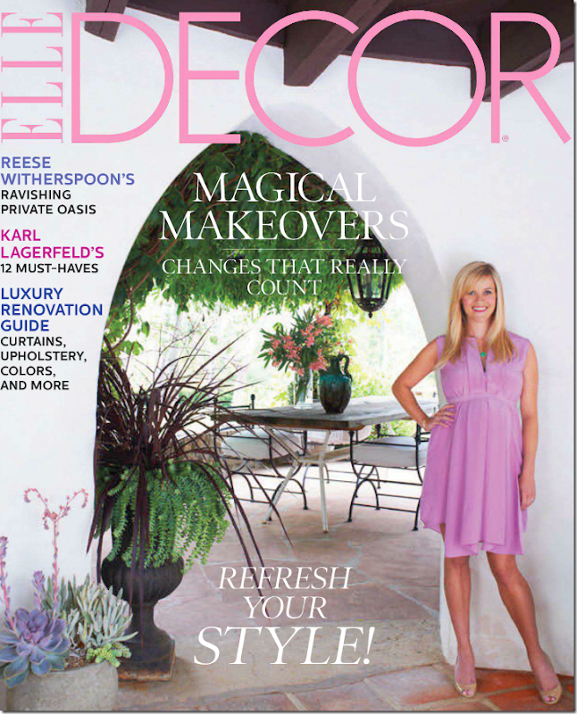
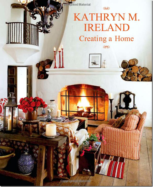
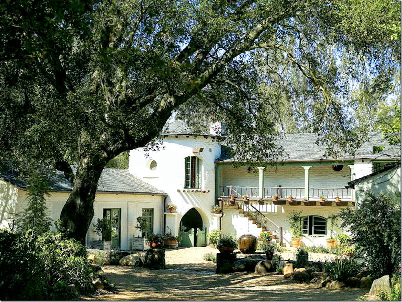
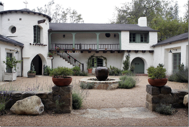
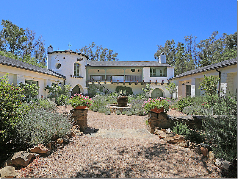
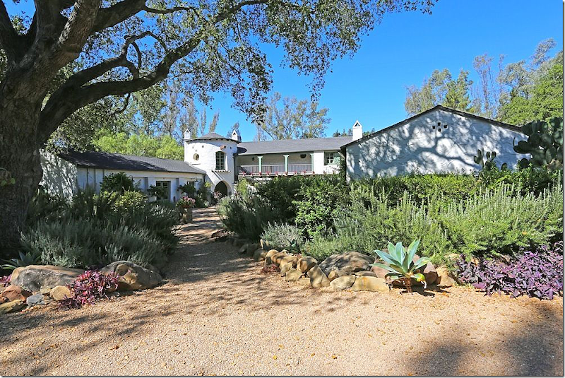
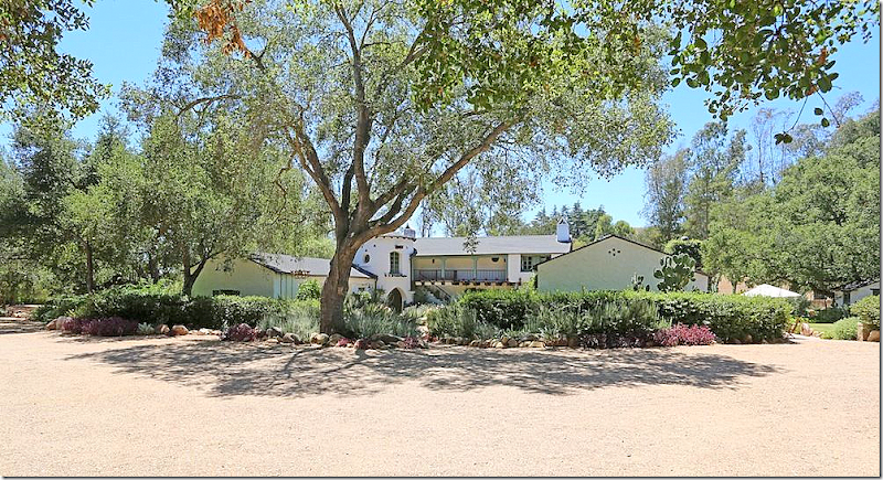
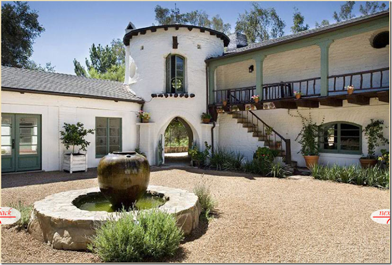
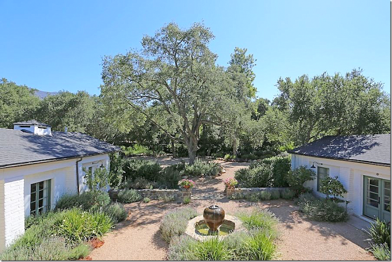
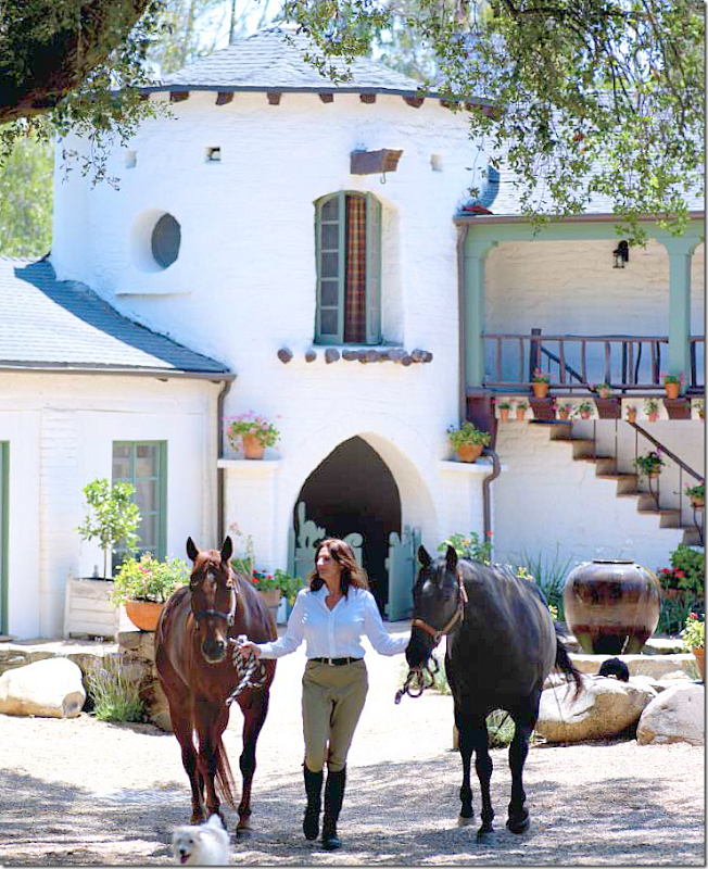
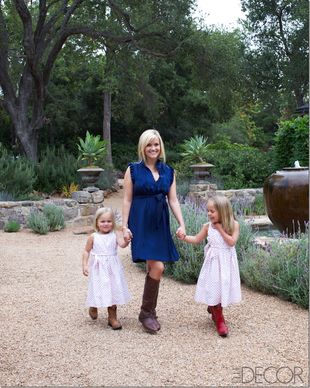
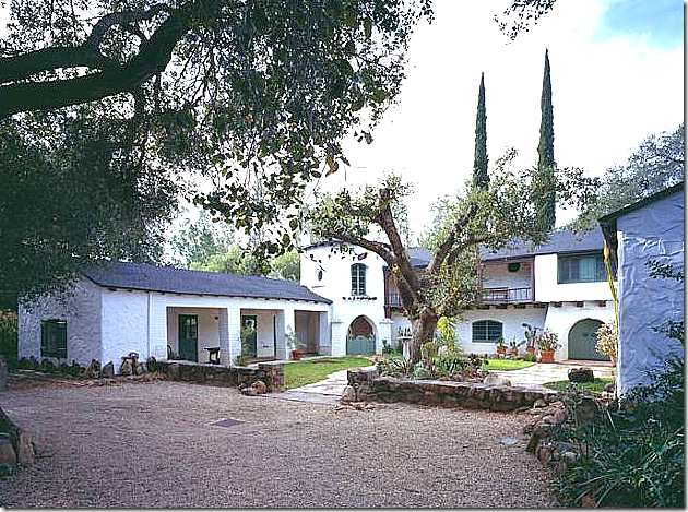
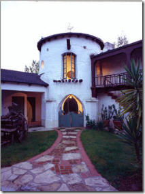
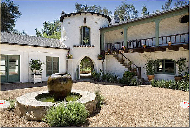
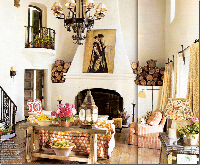
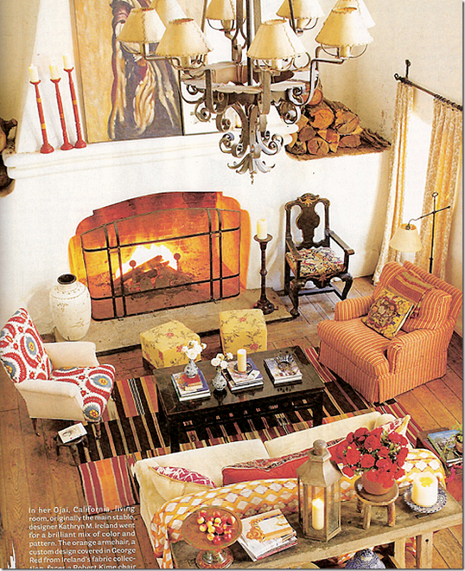
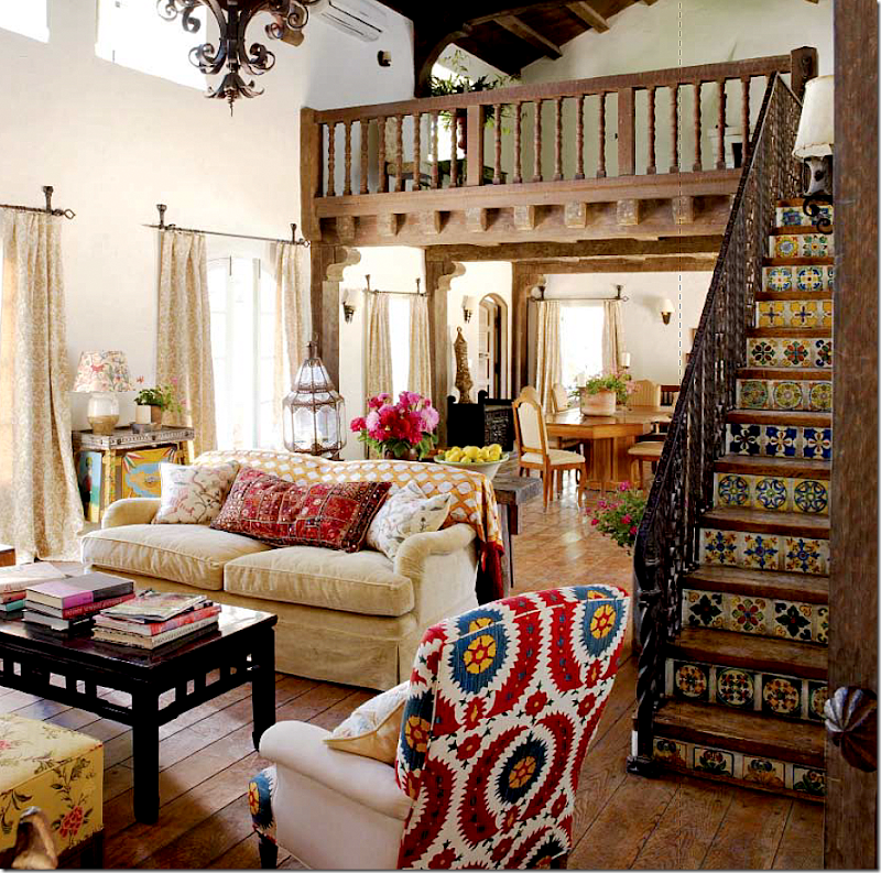
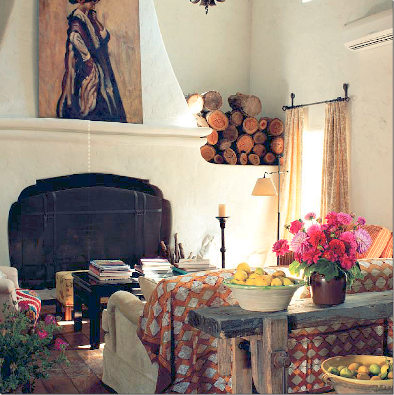
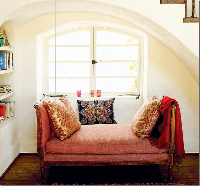
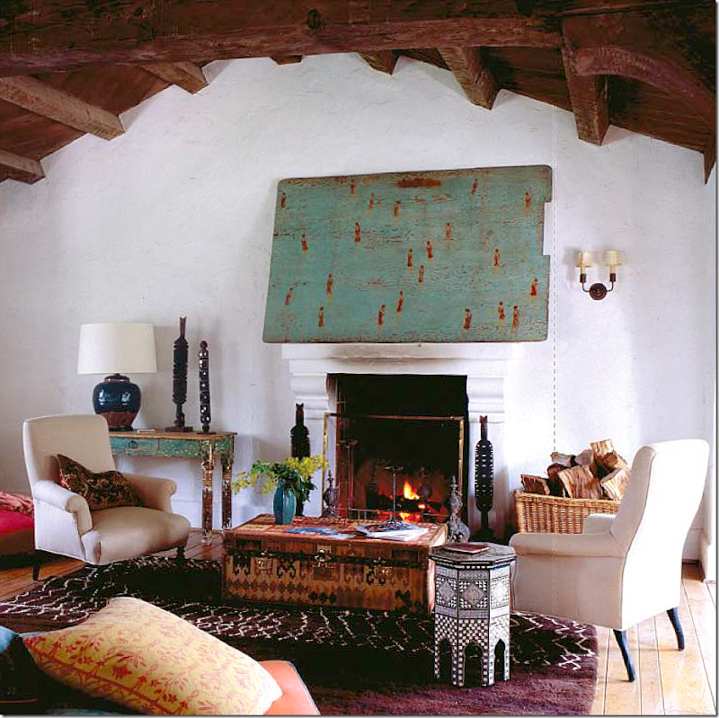
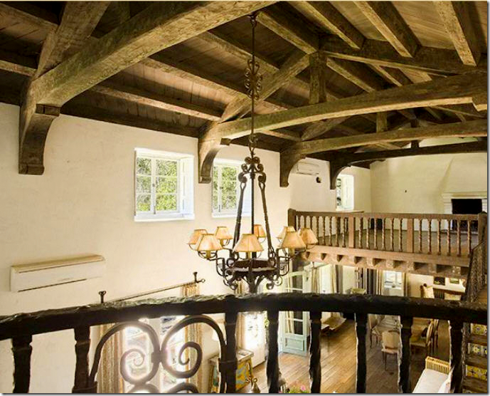
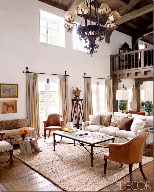
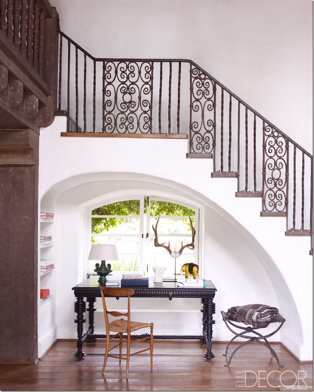
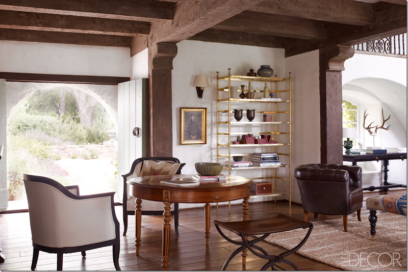
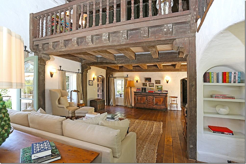
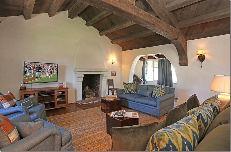
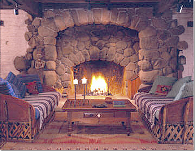
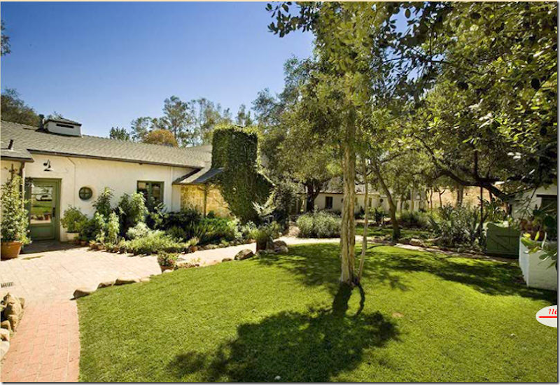
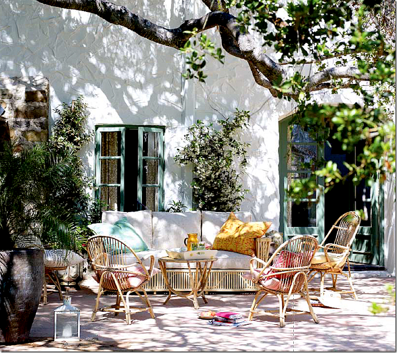
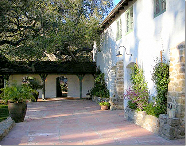
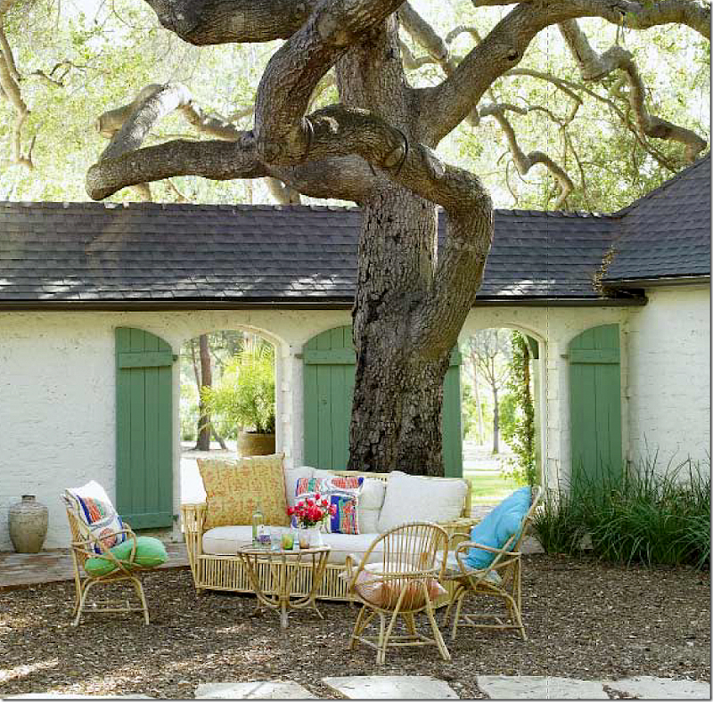
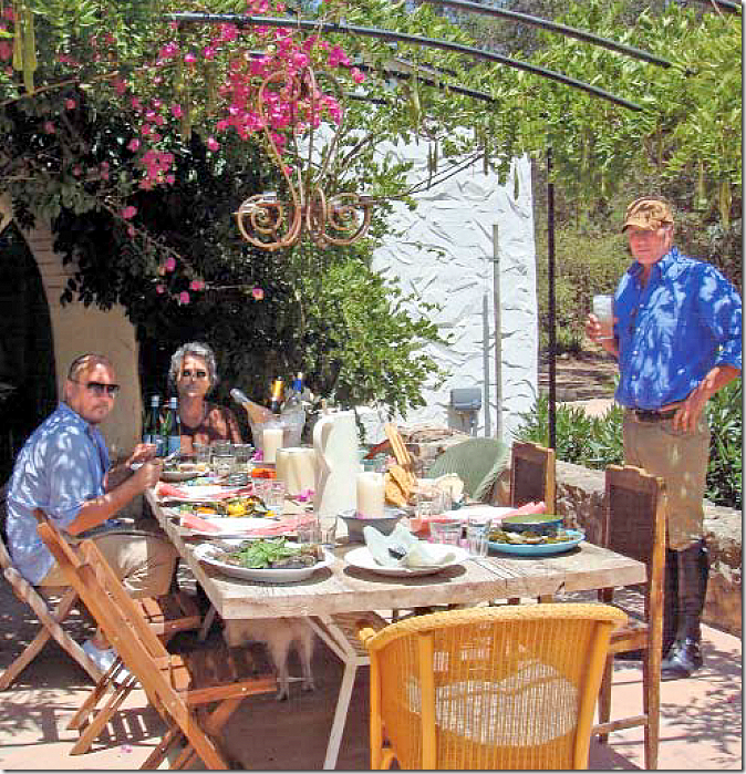
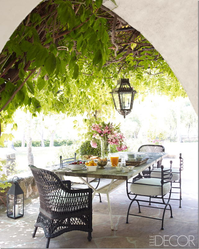
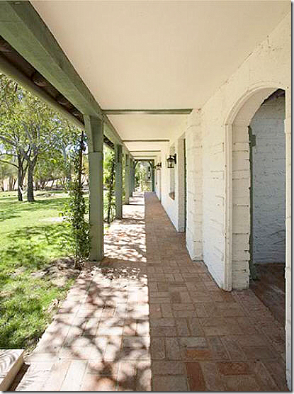
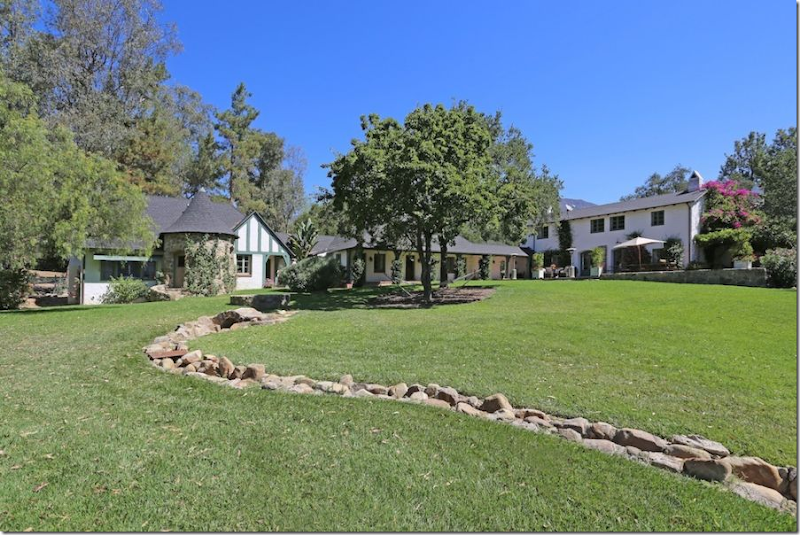
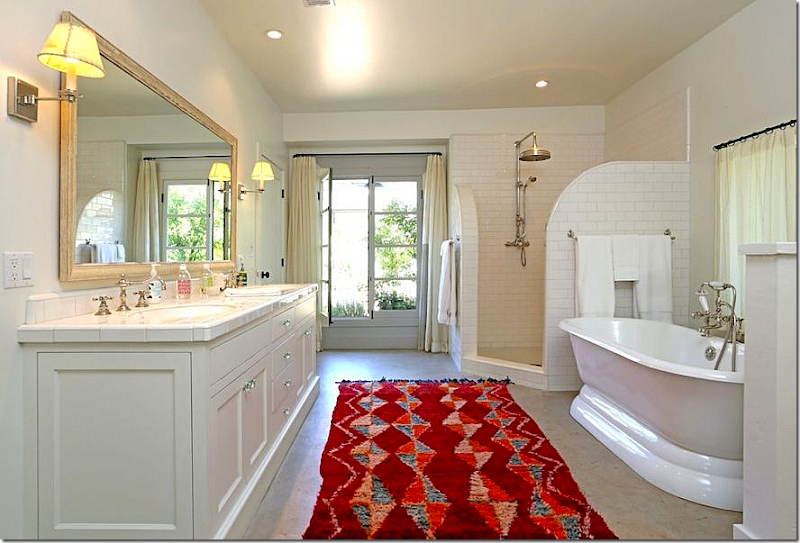
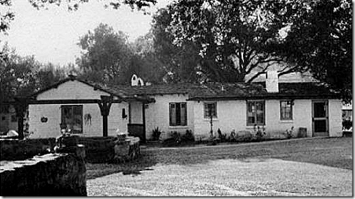
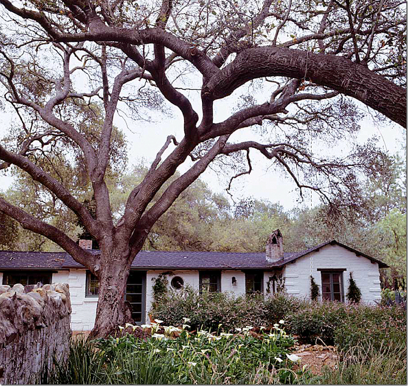
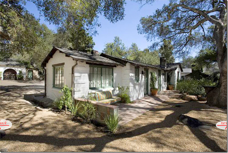
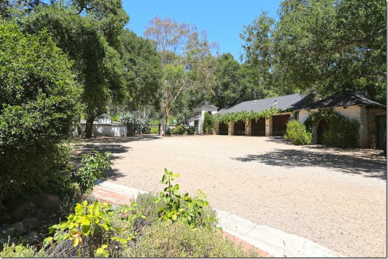
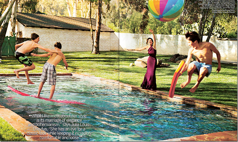
It’s déjà vu all over again. Just a few weeks ago, Reese Witherspoon splashed her historic Libbey Ranch in Ojai on the pages of Elle Décor. Declaring it a "work of art” that she is just a caretaker of, the ranch is surprisingly now for sale for a cool $10,000,000. That’s quite a gain from the $5.8 million she paid Kathryn Ireland for it in 2008. Though Kathryn lived there, restored it and wrote a book about the ranch, rumors are that she never actually owned it. Reese bought the ranch furnished, but she was quick to hire L.A. decorator to the stars, Kristen Buckingham, to rid the interiors of anything that looked like Kathryn, or so it was said. The photos from Elle Décor showed a completely different looking estate from when Kathryn lived there – it was now sophisticated and cool in neutral tones – long gone were Ireland’s vibrant and colorful fabrics (or so it seemed in Elle Decor.) Antiques and mid century pieces mixed together to make it all very hip, very today. While I absolutely loved what Buckingham did, readers of Cote de Texas mostly disagreed with me and in the comments section, Ireland won the contest, hands down.So why is Reese selling? In the Elle Décor article, Reese states that she wanted the ranch in order to give her children the same experience she had growing up in Tennessee. She wanted her children to get “muddy” and play outdoors with all the animals. Towards that purpose, she brought in horses, ponies, donkeys, pigs, chickens, goats and four dogs – all for the benefit of her two children and her baby, soon to be born. Reese told Elle Décor she felt relaxed the moment she drove through the gates – where the phones don’t ring and there is no access to email (maybe that is why she is selling, no email would drive me insane!) Within an hour of arriving, she would be sleeping on the big couch. Doesn’t sound like someone who is close to selling, does it?The same sell off happened to Kathryn Ireland. In a snarky way, I reported on the event on the blog - after appearing in two major magazines and writing a book, Ireland put the estate up for sale. Were we, the readers, now expected to be targeted customers in a high stakes real estate war? Was there anything wrong with magazines pimping out their readers as potential clients? Did it matter?That whole magazine/book episode with Ireland seemed highly manipulative to me at the time, but I’ve since noticed it seems to be a trend. Many times an interior designer or actor will show off their home in a magazine as a prelude to putting it on the market. Reese doing it shouldn’t be so surprising, but she did sound rather sincere in the interview stating how much at home she felt at the ranch. Maybe the decision to sell had nothing to do with the timing of the magazine spread. Perhaps Reese agreed to the magazine spread just to show off the work of Buckingham – and it does deserve to be seen. Still, does it make a difference if the article was only to show the interior design or to show off the estate to perspective buyers? Is it a bait and switch? Is the article really saying – come inside my house, it’s beautiful – look at the way I live my life, and oh, by the way, this TOO can be YOURS, all for a cool $10 million.And then there is the subject of the bait and switch furniture. Seeing the rooms in the real estate brochure, you will see that Reese’s house looks little like it appears in Elle Décor. The difference between the two is quite shocking. The magazine shows you rooms that really don’t exist. The more I looked and studied the differences, the more manipulated I felt. I’m curious if you will feel the same way. When you look at a magazine, do you expect the house to look something like the pictures? Or does that not matter to you? I must say, that I think it does matter to me. I don’t mind the stylist adding flowers and pillows, but when they totally redo an entire room just for the magazine shoot, it goes a little beyond the pale. Just admit it – be honest about it. The readers of magazines that cost over $5 deserve as much.Another thing that hit me while looking at the photographs from the real estate brochure, is how talented the photographers who work for the magazines truly are. Under their eye and the careful work of the stylists, they can make a shack look like the Palace of Versailles. The photographs in magazines are works of art and nothing will drive home that point more than a real estate brochure with their photographs taken without the help of a trendy stylist. And it’s not just the stylist that is important – so is the sun. Landscaping looks so much more appealing when the sun is out brightly shining or is dappled through the shade of a large tree. And even inside a house, the interiors show off so much better when natural light is streaming through the windows. Who would think one house for sale would create so much to ponder?And then there is the real estate brochure itself. Suddenly, there are pictures of rooms and rooms that have never been seen before! I honestly thought I would never write about the Libbey Ranch again. But, seeing all these new photographs of rooms never shown before piqued my interest and hopefully will interest you too. People must still be interested in this ranch – Kathryn Ireland’s book is now out of stock at Amazon!One more point in driving the desire to write about it again is there is a lesson here to compare the magazine photographs with the real estate photographs to learn how to take better photographs. I know I’ve picked up a few tips myself. The appearance of a room in Elle Décor compared to how it really looks is startling, begging to answer, what is true – what is real? So, indulge me one more time with this look at the Ojai Ranch – until the new owners decide to open their doors to House Beautiful or World of Interiors.Enjoy!William Waldron took the photographs for Elle Décor. I have no idea who the photographer for the real estate agent was.The listing agent is up for a guess. The property seems to be listed with several agents. My advice is just to google it to find a realtor if you are interested.The house is described as Spanish, built in 1923, in excellent condition with views of the mountains. There are 9 bedrooms! Five full and 2 1/2 bathrooms. I can only count 7 bedrooms, so 2 must be hiding somewhere.The Libbey Ranch as photographed for Kathryn Ireland’s book. Notice how charming it looks with the gates, windows and French doors all open – as if welcoming you inside. The sun is bright, yet the tree provides dappled shade. The house looks romantic and beautiful.Now, notice in this real estate photograph taken for Kathryn Ireland, the charm is somewhat diminished. The gates and windows are now closed. The large tree is mostly cut of out of the photo. The angle of the photograph is not as appealing as the one above, taken for the book.And here, without the bright sun, the courtyard looks almost dismal. This really shows how important the sun is when taking pictures of exteriors.By comparison, the real estate brochure for Reese shows the importance of the landscape – now overgrown and much more lush than when Kathryn planted it. Again, the sun makes it all look bright and cheerful. But where is that atmospheric tree? This less skillful photographer didn’t include it in the photo.Ah, here it is. Reese’s real estate photographer pulled further away and now shows the tree.
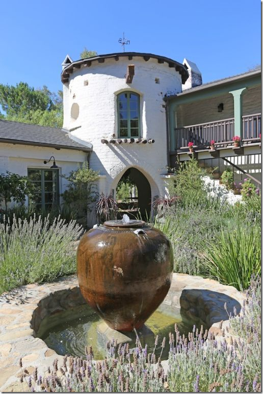
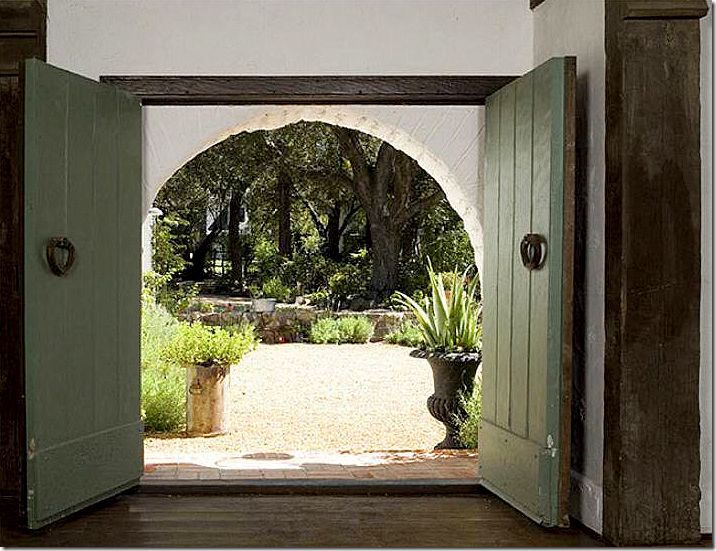
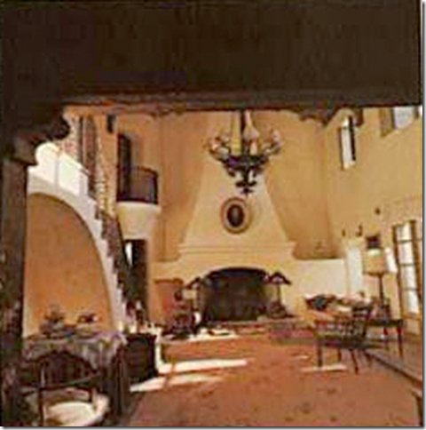
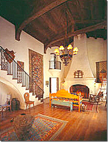
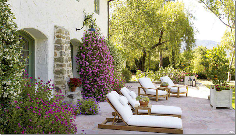
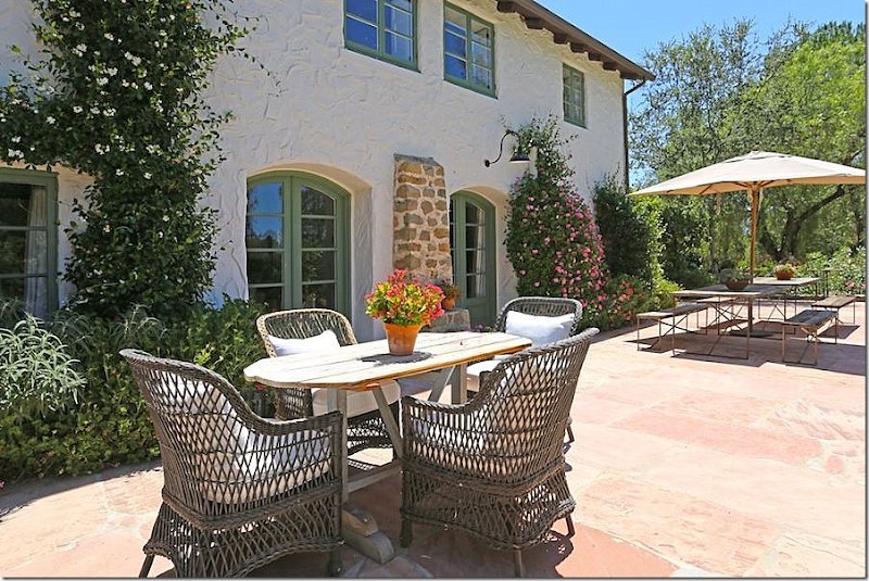
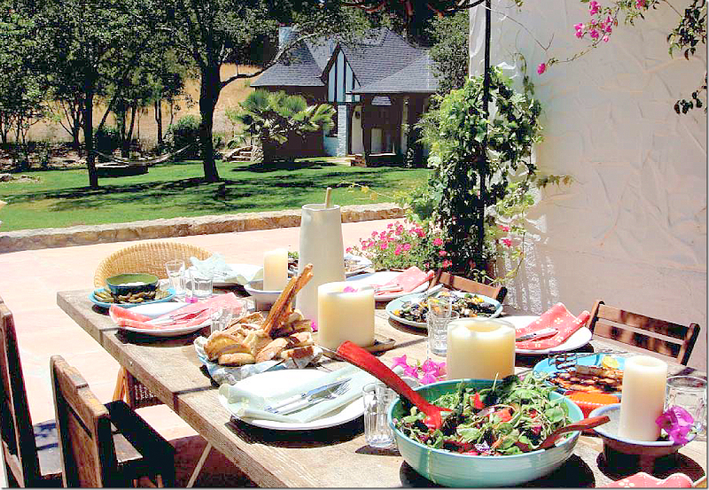
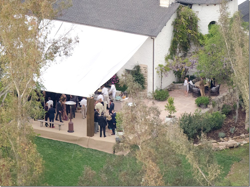
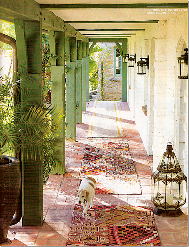
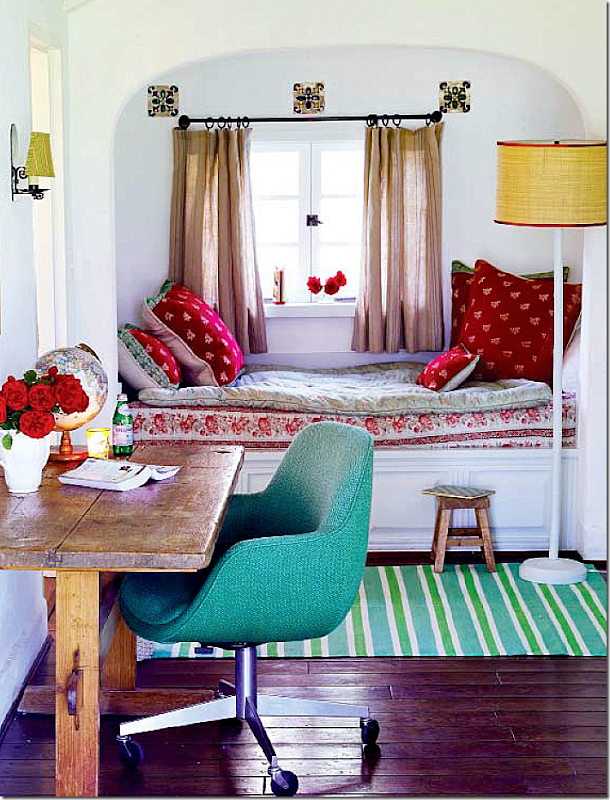
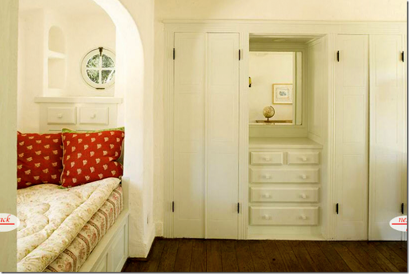
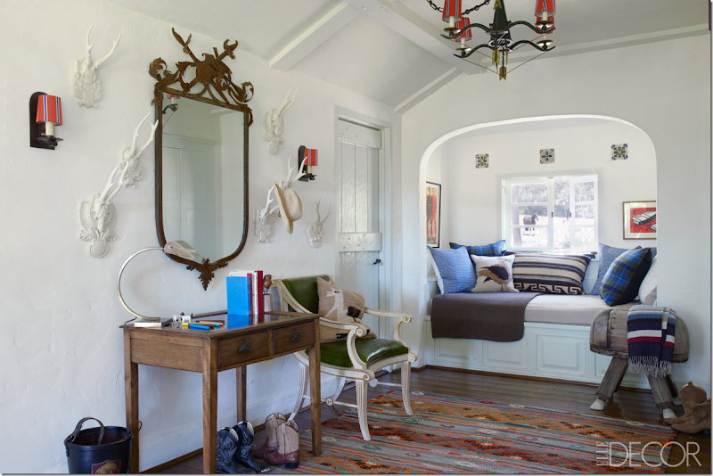
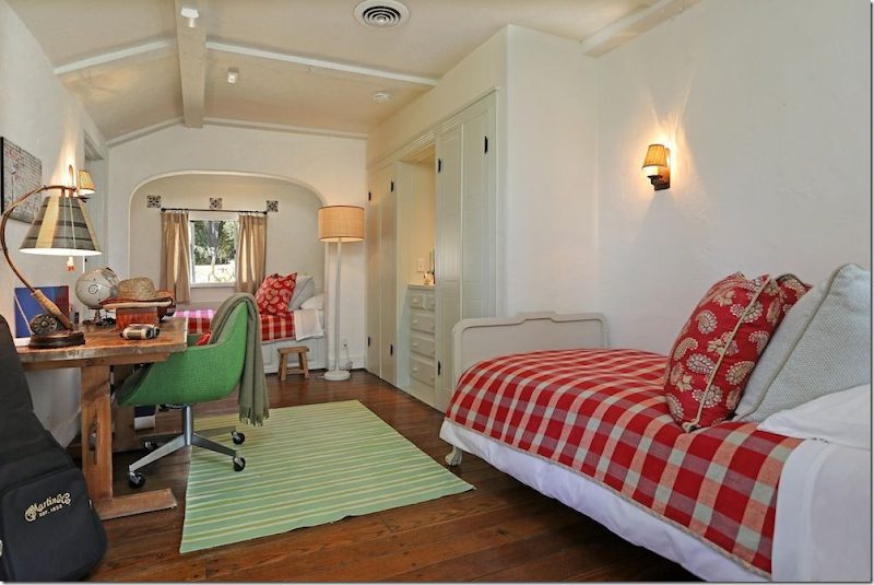
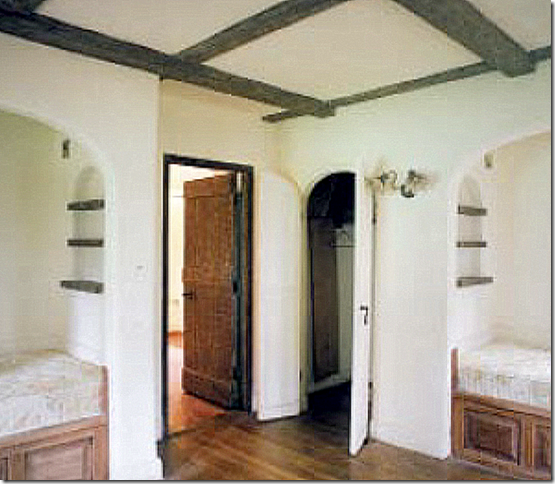
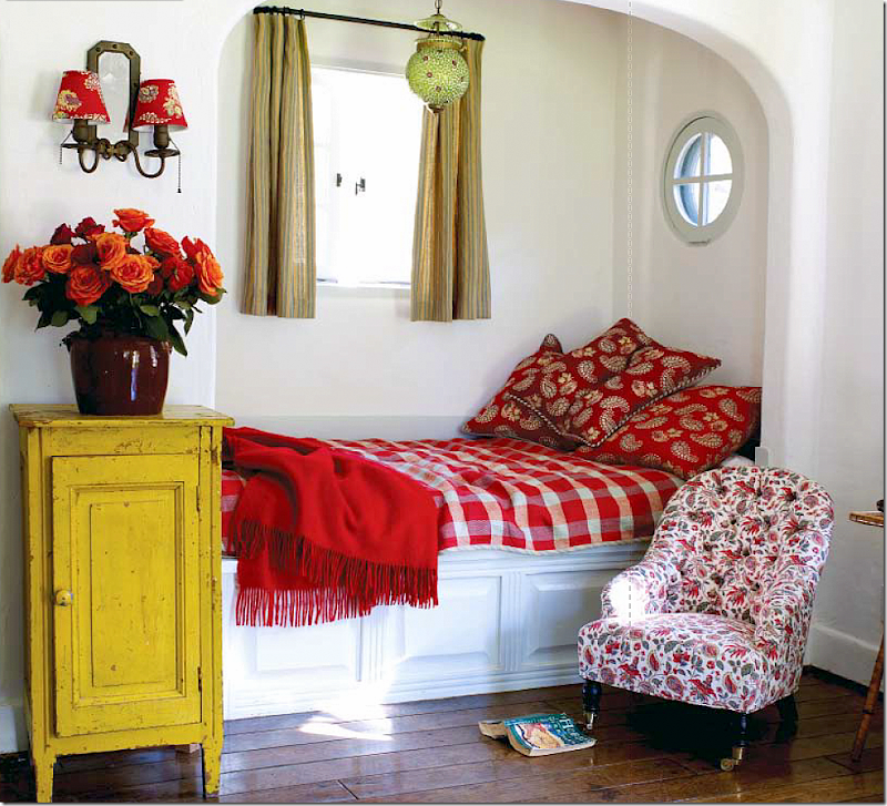
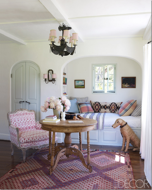
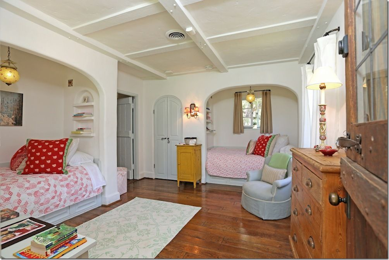
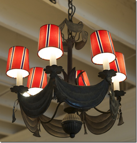
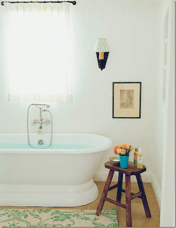
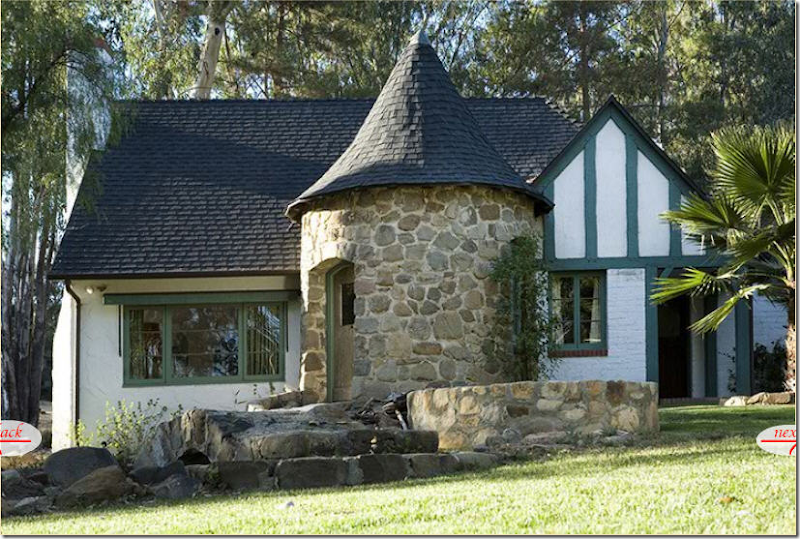
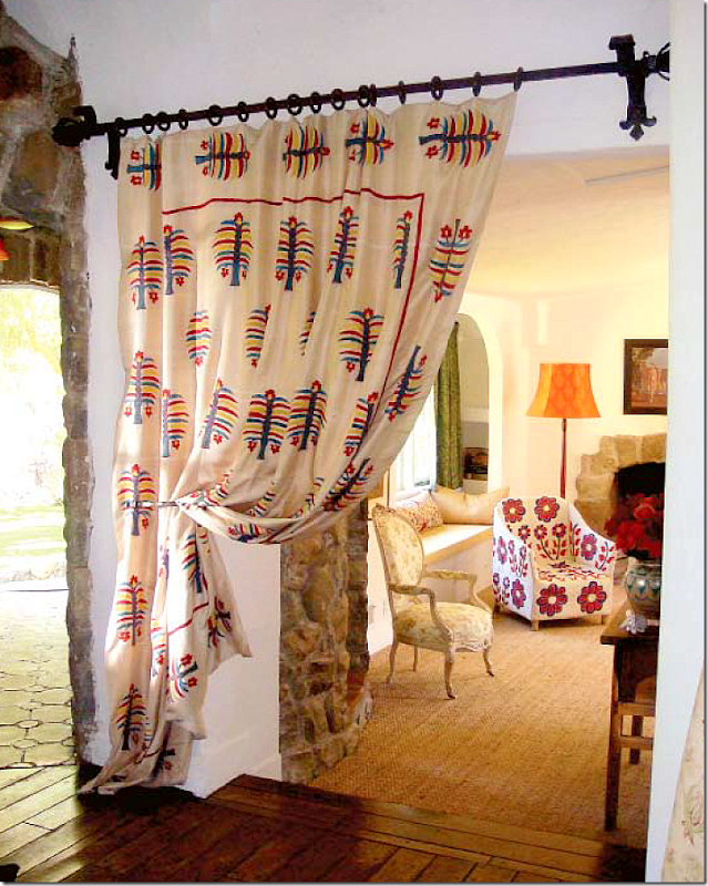
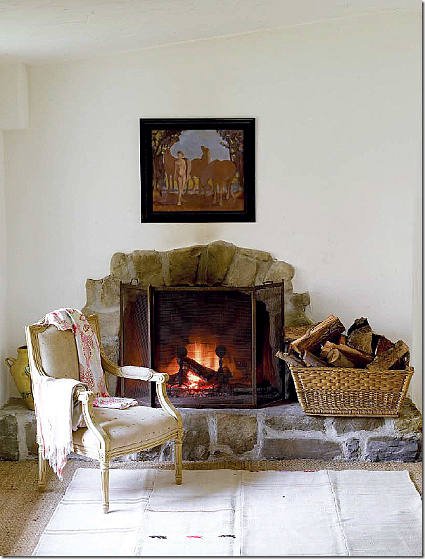
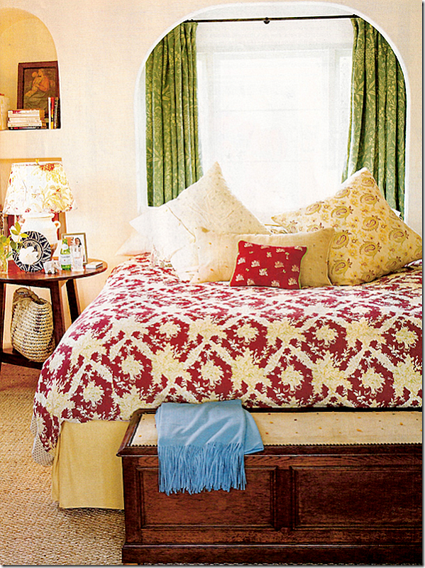
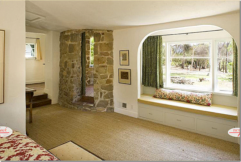
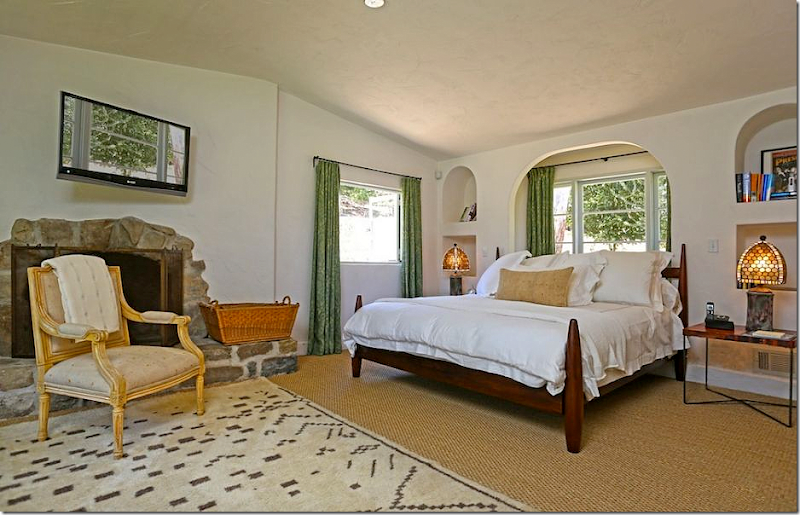
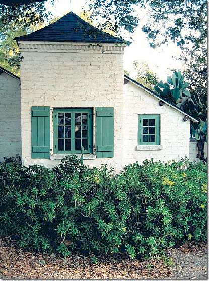
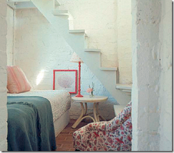
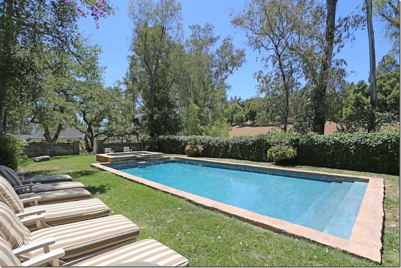
And even further away – the first photograph of the house where you can see the front side of both wings at the same time. Beautiful gravel driveway.When Kathryn listed the ranch, this photograph showed off the courtyard.Reese’s brochure shows the courtyard from the balcony, a slightly better and much more interesting view.For her book, the photographer caught the courtyard teeming with life – two horses, and a running dog – it all looks inviting and lovely. He also captures the flower pots on the stairs and the curtains blowing in the wind. (Remember those plaid curtains, they show up later.)For Elle Décor, an equally nice photograph, but notice the sun is not shining – and it makes everything not quite as welcoming. Had there been some dappled sun behind them, it would seem so much more atmospheric. Great stylingIn this rare photo, you can see how the courtyard looked before Kathryn bought the ranch. There was a dead tree in the middle of the courtyard – and two tall cypress on the back side that were all removed. Inside, the courtyard was flagstone and grass – all removed by Kathryn. Instead of a fountain, there was a birdbath in the middle of the courtyard. The entire wing on the left had to be renovated – and it was turned into one luxurious guest suite. The Harold Ramis’ lived here at this time. Without the beautiful landscaping, the courtyard doesn’t look nearly as lush or manicured – the curb appeal is lacking.And another view of the real estate brochure that shows how the ranch looked when Kathryn bought it. Notice the walkway and grass where there is now a fountain and gravel. Kathryn replaced all the flags and grass with French styled gravel. In France, the gravel keeps owners alerted to robbers – whose footsteps loudly crunch in the stones. I can attest this is true! I can always hear the gardener before I see him – his noisy, crunching steps give him away.And here is how Kathryn’s real estate brochure captured the tower and fountain. Nice enough…But Reese’s photograph is the best – the tower and fountain are tightly cropped – the photographer shows the water in the pond and the lavender surrounding it. The shot looks good enough to be in a magazine. It is definitely a more pleasing shot than Kathryn’s. Good real estate photographs are especially important in the internet age. If the photographs aren’t appealing, you can lose hundreds of potential buyers.Kathryn’s real estate pix of her front door shows off lots of chipped paint.Reese’s more tightly cropped shot shows the doors looking much more fitting for a $10 million ranch. And the view of the courtyard is gorgeous!Inside the main room: A rare look at how it all began. The large medallion shape on the tall mantel was copied by Kristen Buckingham for Reese. There appears to be a large area rug, and not much furniture except for a couch on the right wall and a few chairs. A dinner table is set under the stairs. Notice the chandelier is here – and remains at the estate today. Technically, Reese could claim the chandelier as her property and not sell it with the ranch. I do wonder if she will sell the property furnished.And these two rare pictures, above and below, show the real estate brochure from before Kathryn Ireland’s time when the Ramis lived here. Notice the same light fixture. Also, the house looks like it was decorated in Mexican chic with lots of serapes, which is actually fitting for the ranch. It seems very similar to Kathryn’s vibrant interiors.And here, facing the fireplace with a Spanish bench instead of a sofa.Kathryn’s living room was styled several different times for magazines and her book. But always, her room was bright and cheery and ethic looking. Here, the stylist added flower pots to the rotunda room’s balcony. There was always stacked wood on each side of the fireplace. Fabrics were from her own new line and from Robert Kime, whose fabrics she once sold in her showroom.A slightly different view, from the loft room. Here she added an antique chair, a rug and different styling on the console.And here, looking towards the dining area where her more formal meals were eaten – across from the front door.A closer view showing the large fireplace with its old screen. Not sure why they didn’t light the fire?! Fireplaces do look prettier when they are lit.For the book, it was styled with red flowers and red candlesticks – on the cover of the book, the large painting was removed in order to leave room for the book’s title. Missing are the plants on the balcony. Can you spot other styling differences between the photos?Now – look at this photograph for the real estate brochure. Is it even the same room? Yes, it is – and actually most of the furniture is still here, but the quality of the photograph is so bad compared to the book photographs – it looks like it’s been stripped bare. There’s no welcoming fire, the plant is not in full bloom and the photo is taken from so far away – it’s hard to see details. What a terrible photograph. Why do the agents take such bad shots? They should try to sell the house, not deter buyers!The book’s photo of the area under the living room’s stair shows a French bench with Fortuny pillows and a throw. There’s also a blue pillow, along with colorful glasses on the sill – and an area rug is barely seen. Simple styling additions can make a huge difference.For the real estate brochure – all the pillows and throws, rug, and glasses are long gone. Were they returned to the shop? Why? Look how empty the space looks without the benefit of the stylist’s extras. Now, some real estate agents will edit a room to make it less personal, and therefore more inviting for a prospective home owner. They want the buyer to be able to imagine themselves in the space. But, when a house doesn’t really need editing or cleaning up – why change it, like they did in this photo? It’s possible that this is how Kathryn really lived in this space – without all the extra accessories that were brought in for the photoshoot. I think that is probably the real truth here.For Kathryn’s book, she filled up the upstairs loft with furniture and art and then lit the fire. The rugs and pillows and exotic accessories add depth and texture to the room. But this was all for show. The furniture probably all went back to the shops the next day.For her real estate brochure – all that furniture in the loft is now long gone. Again, returned to the shop? When your house is placed on the market, you don’t know how long it will take to sell, so why remove all the furniture, unless it wasn’t there to begin with. Bait and switch. Now, let’s see how Reese’s living room fared under the lens of the real estate photographer:Here is Elle Décor’s photograph of Kristen Buckingham’s beautiful interior design. Looking at this room again – I am struck by how truly beautiful it all looks. I love it. A textured rug anchors the room – as does the back to back sofas with the two green lamps. The lamps are so stunning- they become the focal point of the room. I wasn’t crazy about these lamps at first, but on second look – I really like them now. A tufted banquette sits by the curtains and a large coffee table anchors the setting. I especially love the pedestal with the metal sculpture. Ready????And here is the same room in the real estate brochure. The rug and lamps and pillows remain, as do the two leather chairs. But the coffee table is gone – back to the store? And the pedestal and sculpture are also gone. And it’s a wonder no one ever tripped on that exposed lamp cord and killed themselves. How could such a beautiful room now look so….ordinary?The gorgeous photograph as seen in Elle Décor – with the round bust on the fireplace and the much maligned plant at the right of the fireplace. There’s a handsome chest – and notice the beautiful trestle desk between the two sofas. One thing lacking in the Elle Décor pictures is the sun. It must have been overcast that day. A bit more sun streaming through the windows would have been so beautiful. But, still, this photograph is gorgeous (even with that stupid plant!) Ready?Ouch! Really. No medallion here – that is long gone, along with the coffee table. The desk remains, thank God! The tall French chair remains but this room looks nothing like it did in the magazine. Photographer or Stylist? What is missing? And notice, in real life, Reese uses Kathryn’s firescreen, but in the Elle Décor pictures – there is no screen. I guess they didn’t like it as much as I did.In Elle Décor, under the stairs, there is a beautiful desk with a lamp and accessories. The photograph is perfectly cropped - showing just the arch of the stairs.And here in the real estate picture you can see – the desk is gone, but the stool remains along with the two new urns. Also, here you can see that the chest and the tufted banquette remain next to the fireplace, but the plant is long gone. This view also shows the second sofa and arm chair with the large ottoman that you couldn’t see in the Elle Décor pictures. This real estate photograph looks better than the others, probably because there are features that are closely cropped – like the beams and the wing chair.And in this beautiful photograph in Elle Décor, you can see the center table with two chairs, the controversial brass étagère and the leather club chair. The black desk under the stairs is also visible. This is such a pretty photograph. Notice how the space where is étagère really needs a tall piece there. Rather you like the brass or not, the proportions are perfect. Ready?And in this real estate photograph, you can see the center table and beautiful chairs are long gone, as is the leather club chair. And if you look very closely – you can actually see the black desk is there in the same space where the brass étagère was!!!! You can just barely see it’s leg. So, for the Elle Décor photoshoot the stylist or Buckingham – moved the black desk to make room for the brass étagère that Reese maybe owned or maybe didn’t. This was a good decision because that area does need height in that corner. You can also see how much the center table and chairs added to this room. Without them, the space in front of the door looks empty. Again, the talent of the Elle Décor photographer (William Wendon) is really evident when you compare his photos with these real estate photos.And in the real estate brochure, we now have a chance to look at Reese’s room above the living room, which was missing from the Elle Décor layout. Ikat pillows in blues and line greens mix with a moss green velvet sofa and blue sofa and club chairs. Below is a textured rug. At the window are blue curtains. A great room for watching football games – right? Just like what is on the TV! And that’s a great tip for flatscreens. Instead of having a big black empty box, turn the TV onto to something pretty, if possible. Or photoshop a painting onto the screen.Now, this is where the questions begin. This is the small rotunda room that overlooks the living room with its Juliet balcony. Here is how Kathryn Ireland furnished it, with cane chairs and sconces and an ethnic rug.And here is how it looks in Reese’s real estate photographs. No way that Kristen Buckingham touched this room. It has the same cane chairs and sconce that Kathryn used. And the curtains – you can see these same plaid curtains in the window in the photograph where Kathryn is with her horses. Even the same basket remains! So what’s the problem? I was under the impression that Reese had gotten rid of all Kathryn’s furniture – immediately. But as this room show, and others will too, this isn’t the case at all. UNLESS – certain rooms were photographed before Buckingham had finished decorating? But why would that be done? Also, I was under the impression that this room had been turned into a library by Reese. Nope. And notice that ceiling fixture – no wonder Kathryn didn’t ever photograph it!! It’s scary!! So, now begins the game of finding things that Kathryn left behind that Reese kept. Want to play?On to the right wing – where the kitchen and family room are:The kitchen, as Kathryn found it. She removed the upper cabinets and added the large refrigerator and a desk to the left of the side door. The island was made out of old doors, but wasn’t sturdy enough to house the range, so it was replaced. I like the old island. She also painted many of the beams white to make it brighter. This wing used to be the old carriage house. The fireplace was added when the wing was converted to the kitchen/family room.For the book and magazines, Kathryn styled the kitchen and breakfast area to look like a very colorful and lively place. The sun outside was bright, as were the interiors inside. She draped textiles over chairs and placed colorful dishes and pottery around. Above is a classic iron fixture, probably antique. Notice the original tiled floor. Kathryn had to add new tiles in the kitchen area that didn’t match, but meshed instead. This is a perfect photograph – inviting and fun! You want to join in a grab a glass of juice or sit down at the laptop.Now, here is what the kitchen really looked like – when it wasn’t styled! Wow. So different! Isn’t it amazing what a good photographer and stylist can do to a space!??!! It looks like a different kitchen. And here you can see the tiles that Kathryn laid in the kitchen. Should she have removed the old tiles to match the new ones? Or put wood down here instead of trying to match old vs. new tiles? I would have put wide planked, aged wood down, but no one asked me.And here is how Kathryn styled the family room at the other side of the kitchen. Long sofas with slips, club chairs, and an ethnic door made into a coffee table. Lots of pillows wearing her fabrics were added, as were colorful accessories like the two stools on the hearth. Again, a perfect photograph – one where you would love to join in.And, the same space on the real estate brochure- without the attractive accessories or pillows or throws or rugs. At least the fire is going. I wonder if this how it really looked day by day – or not? It looks positively depressing compared to the other photograph.Now, here is what the kitchen looks like in Reese’s real estate brochure. It does seem much more colorful and lively than Kathryn’s real estate kitchen. But that may be due to the red stools. At least they opened the windows and doors to look more welcoming. Now, get ready:Remember this gorgeous photograph of the dining room from Elle Décor? It featured two custom banquettes and an assortment of Swedish chairs and wing chairs – all antique. The Swedish chairs were period antique. I remarked this was the prettiest room – and it is, in this photograph at least. And notice the lighting in this picture. Not too bright – instead it’s rather moody with just a bit of sun streaming through the window. You can’t really tell the color of the banquettes – or they green or gray or khaki? The curtains look soft and full in this light. Just perfection. Now get ready for a huge, huge disappointment…The same room!!! OK – it’s the same dining room table (I guess) and the same banquettes, but the period Swedish chairs – gone. The gorgeous wing chairs? Gone. Probably the chest is gone too. Instead she is using Kathryn’s old tacky breakfast room chairs with some ugly schmatte on the table. Even the curtains look limp and boring. I could CRY!!!!!!!!! See what I mean about a talented photographer making a shack look like the Palace of Versailles? No, I’m not saying this is a shack, but it certainly looks nothing like the photograph in Elle Décor. Besides the bait and switch furniture, there is the lighting of the room that is so important. I had no idea! Notice how gorgeous the room is lit in the Elle Décor picture. Oh, seriously, I could cry looking at this mess compared to that gorgeous Elle Décor photograph. I’ll bet it took them hours to take that one picture. Hours. You know who else cries when she see this? Buckingham. Honey, I’m right there with you.I barely want to continue on. Well, this is cute. Cute striped ottoman. I like the chairs and the brown sofa. I like this. Of course they didn’t photograph this. And those red bar stools in the kitchen? They don’t go with anything. At all. Why are they there?Well, it could look like this – this is how it looked when the Ramis lived here – Mexican sofas – actually this is cute. My sister-in-law Shannon would love this!!And here, in Kathryn’s real estate brochure – you can see the back of the kitchen wing. The large fireplace is covered in ivy. To the right is the bedroom wing. Let’s see how they really lived on the outside terrace:On the terrace outside the living room Kathryn Ireland styled this photograph for the book – how darling is this? I love how she adds all the pillows and lanterns and textiles to her photographs. Of course, I shouldn’t be fooled that she actually live this way.Here is how the terrace really looked when Kathryn live there. Quite different.I should have known it was all fake. She schlepped the same arrangement all over the ranch – including here, out by the bedroom wing. I even spied this sofa in the living room in one of the real estate photos! See if you can spot it there too. OY! This is worse than the moving flower arrangement. That happens when there is only one vase of flowers and the stylist will move it from room to room for a photoshoot. It’s called Spot the Vase of Flowers. Here, Kathryn plays the same game with furniture. By the way, this sofa is for sale on her web site. Don’t even ask how much. AND, this gorgeous tree? It’s gone now. Looks healthy to me, but it must have died.Don’t think Reese didn’t fake us out with her terrace. Remember this to-die-for photo from Elle Décor. Those white covered teak lounges against the hot pink and purple flowers = gorgeous! At least the photographer got some sun for this photo. Absolutely breathtaking!!! GORGEOUS.And here is reality via Reese’s real estate photos. Now, I’m not going to argue against Kooboo chairs, and this looks pretty cute, but it can’t compare to the styled photograph. Even the flowers look dull compared to the Elle Décor photo.Before it was a second home, the ranch was really a barn for animals. Here is the back side of the rotunda – where later Kathryn would add an outdoor eating area.And here is how she styled that area for the book. Again, a perfect photograph. Bright and cheery and most certainly an invitation to join in the meal. Across the back terrace, you can see her master bedroom house.And another view – you can see the arch of the rotunda. She added the iron pergola to shade the table. There is no photo to show how this really looked, when the photographers weren’t there.And how it looks under Reese’s ownership – she kept Kathryn’s table and added new chairs. Again, a beautiful photograph. Well, she added the wicker chairs. Those metal chairs? They are for sale on Buckingham’s web site. Price wasn’t listed, but I can only imagine how precious they are.In reality – here is how that space looks – taken at Reese’s wedding. It looks like the table and chairs that are shown on the terrace are actually used here – with the wicker chairs. The pergola isn’t quite nearly as full and lush, but it is still a pretty spot for an outdoor meal.Here’s how Kathryn decorated the walkway outside the bedroom wing – lots of antique rugs and lanterns and even a cute dog!!! Yeah, right. Still, a beautiful photo even though it is nothing like the reality.Of course, this is how Kathryn really lived – with the bare necessities. All the stylist’s tricks are gone, returned to their real home, in the shops. You can see here how Kathryn planted vines around the columns – below you will see how full those vines are now.Reese’s real estate brochure captured the main house, the back terrace and the bedroom wing where the children’s rooms are. Reese’s and Kathryn’s bedroom is in the house on the left. Notice the vines around the columns – so full. And there are now vines crawling up the rock turret too.The two children’s rooms in the bedroom wing behind the back terrace – were decorated for Kathryn’s three boys. Here is one bedroom – with a trestle desk, a green chair and a cute mattress with red pillows – all dressed up in Kathryn’s fabrics. Of course, this photograph taken for the book is highly appealing – bright and welcoming.And here is how it really looked – on Kathryn’s real estate brochure. While the bedding is the same, it just lacks that perfect styling. You can even see the same globe in the mirror! The photographer chose the worst angle from which to take his photograph. So dreary. Why would anyone want to sleep here? Why would anyone want to buy this? And the lighting – see how important it is in a photograph? This room looks hospital drab instead of bright white.The very same room – decorated for Reese’s son. People remarked on that chair – from Bunny Williams’ line – saying how expensive it was to be in a kid’s room. Reese obviously agreed with you. Such a wonderfully decorated room for a boy. The colors are great – browns and blues with a hint of green. The light fixture and sconces are darling, along with the saddle chair and cowboy boots. What a lucky boy! Too bad he never got to claim this as his own. BTW, notice how the horse just happens to standing outside the window. Hmm. That must have been one really lucky photographer! haha Ready to see the truth?Here is how the room REALLY looks like - in the real estate brochure. Reese kept the bedding left by Ireland and even used the same desk and green chair and rug and curtains and globe!!! In the Elle Décor shoot – there isn’t one thing that is in this room – including the Bunny Williams chair. They must have spent days styling this room for the photoshoot. They even put up new lampshades on the sconces and a light fixture. Well, they did a great job – the Elle Décor room is certainly cuter than the real one – thanks to Buckingham. Notice too, again, how important lighting is. Compare the lighting in this photograph with the Elle Décor one. It makes a huge difference. Again, the Elle Décor photographs are like works of art.In the second bedroom – this is how Kathryn found the room, with dark beams and dark wood on the bunks and doors.And here is how she decorated it for the book – more reds and plaids and yellows. And notice that chair. It shows up again and again.And here is the same room – decorated for Reese’s daughter. Well, this is how it looked in Elle Décor, decorated by Kristen Buckingham. So cute – we all agreed. In fact, many of you felt this was the cutest room in the house! The bedding, the chairs – the fabrics! That light fixture, the rug – that table --- soooo darling and soooo fake! Even the wicker dog is fake.And here is how it REALLY looks – poor Reese’s daughter. I mean it’s cute and all, but nothing like it looked like in Elle Décor. Reese used the same light fixtures, the same pillows, the same and even the same yellow chest! That rug even came out of one of the bathrooms. BTW – that cute chandelier in the Elle Décor bedroom? It’s for sale on Buckingham’s web site. Yep. Except it’s wearing the red shades found in the boy’s bedroom. See:At first the kids bedrooms really confused me – and I thought that maybe these real estate pictures were taken before these bedrooms were remodeled. But, the more I thought about it – I really think that no, those Elle Décor rooms were just styled for the magazine. Why would you take real estate pictures and then remodel? It just didn’t make any sense. Now, if I am wrong, I’ll let you know. But I really think that the Elle Décor shoot was done knowing the ranch was going to be put up for sale and they wanted it to look really good, hence all the extra styling to make the house look like it really doesn’t. And here I thought that kind of entire house restyling didn’t go on anymore. That’s what the editors and interior designers keep telling us on the Skirted Roundtable. Snort.Here’s a bathroom, styled by Kathryn for her book – you can see the same bathmat that is now in Reese’s daughter’s bedroom. I love how Kathryn uses the small wood stools as tables in her bathrooms. And notice the cute shade on the sconce – it’s covered in her fabric.The master bedroom is in this cute house – located at the end of the bedroom wing. Kathryn expanded that window on the left and cleared out brush and trees so that she could see the distant mountains while lying in her bed! While the main house looks Spanish and French inspired, this cottage looks like it belongs in the Cotswold's in the English countryside. And you can see where she started the vine on the turret – that is now much fuller.Inside the room off the entrance rock turret, Kathryn used her fabric to make portieres. Her master bedroom was styled several different ways for different photoshoots. Here is one way with that French chair (remember that chair, it shows up later.)And the fireplace was styled more serenely for another photoshoot – using a different chair – that shows up later.Here is the bed in the master bedroom – styled one way – all with Kathryn’s own fabrics, of course. I love the bedroom this way – so Kathryn! Of course all these photographs are wonderful - professional, and it shows.And yet another way, with a suzani bedspread.The master bathroom was completely renovated – with an old mirror and that French chair – it really gets around. Kathryn’s fabric on this chair is one of my favorites of hers. Love this bathroom.The interior design great Barry Dixon used the same Ireland paisley print in his own guest room – which he calls the Kathryn Ireland Bedroom – beautiful! I love the plates around the gorgeous canopy. And notice the headboard! So wonderful!OK, OK – let’s get back to the ranch and see what Kathryn’s bedroom REALLY looked like:And here it is – that wonderful, full of life bedroom as it really looked like – without the styling and the fancy photographers. As you can see, all the charming chairs and rugs are gone. You can just make out the quilt in this picture. And notice that windowseat. Please – when you make a window seat – use down wrapped foam or pure down, NOT just a long piece of straight foam. It looks awful. A window seat should be inviting, it should be full and comfy looking – beckoning you to come and sit down on it. This looks like a piece of plyboard. Never, ever do this, please!!!!! Terrible, terrible photograph. Again, why would anyone be enticed to view this property as a potential home looking like this?Reese’s bedroom was not shown in Elle Décor – but here it is. A new bed, with all white linens, but she did keep Kathryn’s green curtains, the French chair and even her fireplace basket. Again – notice the flatscreen. It doesn’t look like a black hole, but instead it is reflecting the outdoors. Wonder how he did that? This is the only photograph of the bedroom that shows how the bed is flanked by two archways. I hadn’t seen that before. Very pretty. And Reese added a rug from Morocco. I will assume Kristen helped her with this, it’s very nice looking – using bits of Kathryn’s décor mixed with hers. But, I could be wrong!In this view, you can see that Reese kept Kathryn’s curtains and even the portieres! Well, she must be a bit blind to have kept that window seat with a pillow that doesn’t even match! On second thought, Buckingham would have NEVER approved this! And that rug? It should be placed 3/4ths or 1/2 the way under the bed. I remember worrying about where Reese would put the baby – even thinking she could put her in that room up the steps – until she or he is older, at least. Guess they don’t have to worry about that now!And as seen in the real estate brochure – nothing was changed – not even the chairs or the wood stool. There’s a new bathmat though.And now, to the guest suite – located on the left wing. We have even more new pictures, never seen before. This entire section of the house was redone by Kathryn – it was formerly horse stalls and then storage. This would be a great place to stay - you could walk across the courtyard for meals or through the rotunda to enter the main living room or out back to the terrace and outdoor dining area. OK, I’m ready – just invite me!And here is the left wing, which now houses the main guest room, as Kathryn found it – an unfinished room. Here you can see all the dark brown trim that Kathryn painted what she calls “Ojai Green.” I like the green so much more than the brown. It reminds me of what is known as Messel Green – a paint that Oliver Messel used on all his houses on the island of Mustique. If interested, read my extensive study of Messel HERE.Kathryn designed the main guest suite to function also as a master bedroom. She said this was the most preferred guest room on the estate. Her new fabric line looks great here.And here is the bathroom as redone by Kathryn.Here is the guest suite – now redecorated for Reese. Not shown in Elle Décor – this probably was designed by Kristen Buckingham, but I have no way of knowing for sure. It is all new though – and quite attractive. Through the front door – you can see where the room enters the rotunda for quick access to either the main living room or the back terrace. The outside eating area is also through the rotunda. Very pretty!!
And again, the guest suite’s bathroom. Also, very nice! I love the French windows here that open up to the courtyard. And I love how Kathryn designed the open shower stall. She certainly used wonderful fixtures here in both the shower and the tub.The Caretaker’s House was built to house workers while they renovated the ranch, turning it from a place for farm animals into a place for humans. On the other side of the house, you can see the huge tree that is still standing.And the Caretaker’s House as it looked while Kathryn lived here. Here is the tree that predates the ranch. The house is past the bedroom wing and is closer to the swimming pool and stables. I believe this is also what is called the Guest Cottages. Notice all the flowering bushes in front of the house and the plants around the tree. This is all now gone for some reason. This photograph taken from the book, shows the caretaker’s house at its best.And the reality – the same house as seen in Kathryn’s real estate brochure. At the left you can see the Forge and at the right, you can see the massive ivy covered fireplace in the kitchen. At least the photographer had a sunny day which captures the tree’s shadows.And, the same Caretaker’s House or Guest Cottages as seen on Reese’s real estate brochure. Notice the empty beds where all the bushes were – and around the tree, where all the iris were. I wonder why they were pulled out? This photograph is not quite as appealing looking as the photograph in Kathryn’s book.Inside the caretaker’s house is the first of the guest cottages as decorated by Kathryn Ireland. Here she again uses a mix of all her different fabrics. The windows and ceiling are both so charming. In her book Kathryn says the guest cottages are close enough to the main house to not feel like you are in Siberia, but far enough from the main house to have privacy. I would gladly stay here!One of the bathrooms in the guest cottage – it has it own fireplace! So romantic.And, here the same guest room, as decorated for Reese, shown in her Real estate brochure. It looks like she kept it exactly the same, even down to the pillows, although she did add one. I love the windows here – it’s nice that the real estate photographer thought to open them up for the pictures.
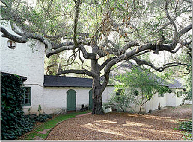
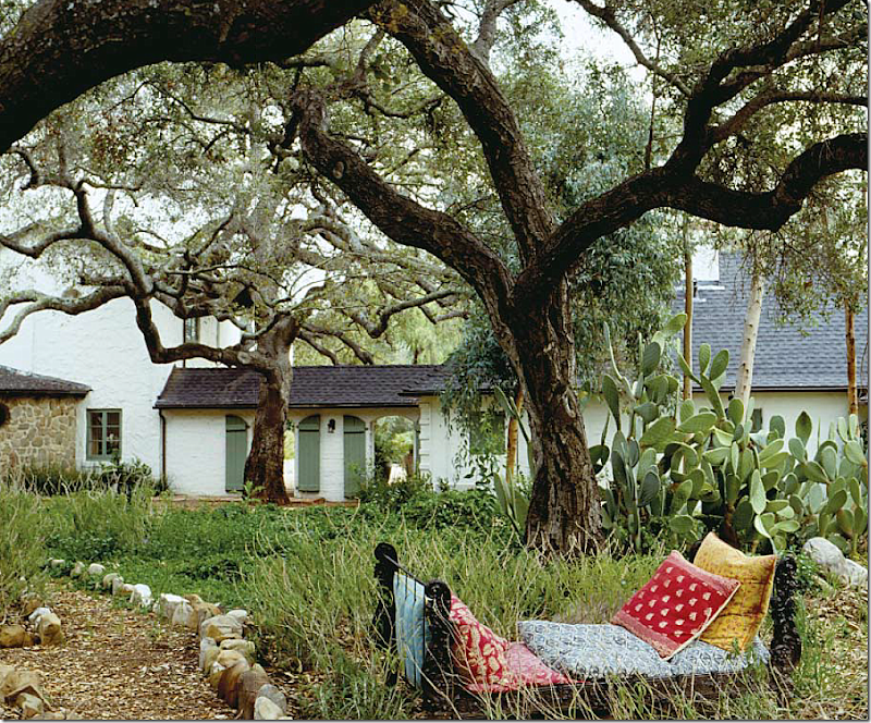
The only picture of the second guest room in Kathryn’s book – shows how it was before. She probably dug the trench to make room for plumbing pipes. Notice the Kiva fireplace in the corner. There are several of these types of fireplaces in the different estate buildings.And the same guest room as it looks today – under Reese, seen in her real estate brochure. Not sure if that is the bedspread Kathryn used, but the curtains certainly are – those are from her fabric line. And remember that chair in the children’s room, it turns up here. This is another charming room with the beamed ceiling and French doors and windows.For her book, Kathryn captured the tiny Gatekeeper’s house. It looks so charming. Inside is a small guest room – complete with a sleeping loft.The only photo of the tiny guest room – and oops, there’s that chair again! This is how it looked under Kathryn. There is no photo from Reese’s stay.Capturing all the buildings on the property in a good photograph is subject to the sun, the way the plants are blooming on that particular day, and the photographer’s skill. This photograph taken before Kathryn – during the Ramis’ stay – shows the huge oak tree outside the bedroom wing and the main house that Reese had cute down. You can see how the property wasn’t really landscaped.Here for the book, Kathryn shot the same area behind the main house and the bedroom wing. She used this iron bed in several settings. Notice how the photographer placed his camera to get both large trees in the picture.And during Reese’s time – the huge tree is now gone! What a shame!!! Instead there is a large empty flowerbed and newly laid brick walkways that lead from one outbuilding to the next.And from the paparazzi helicopter, during Reese’s wedding, you can see the tree is definitely gone and replaced by the beautiful brick sidewalk.
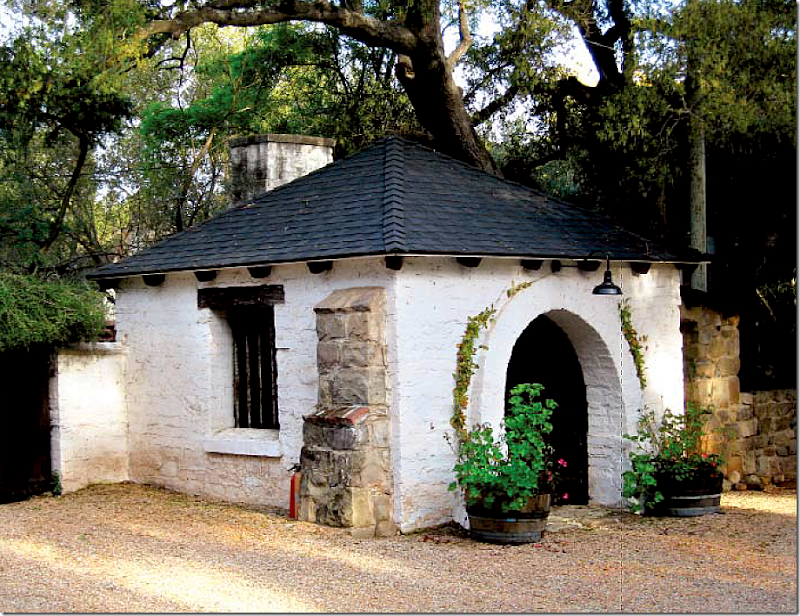
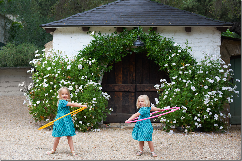
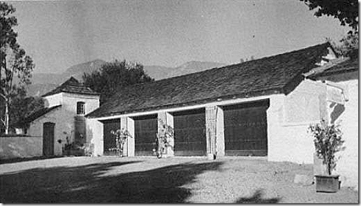
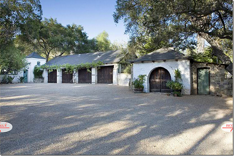
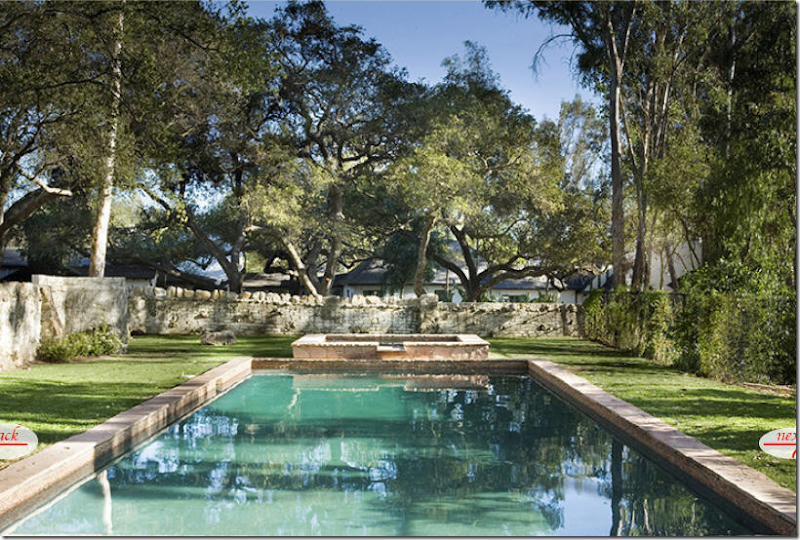
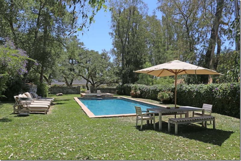
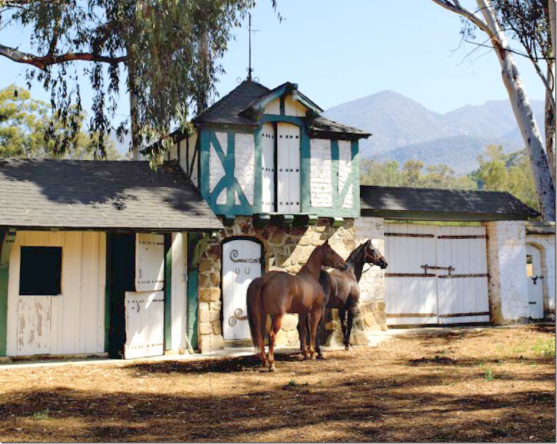
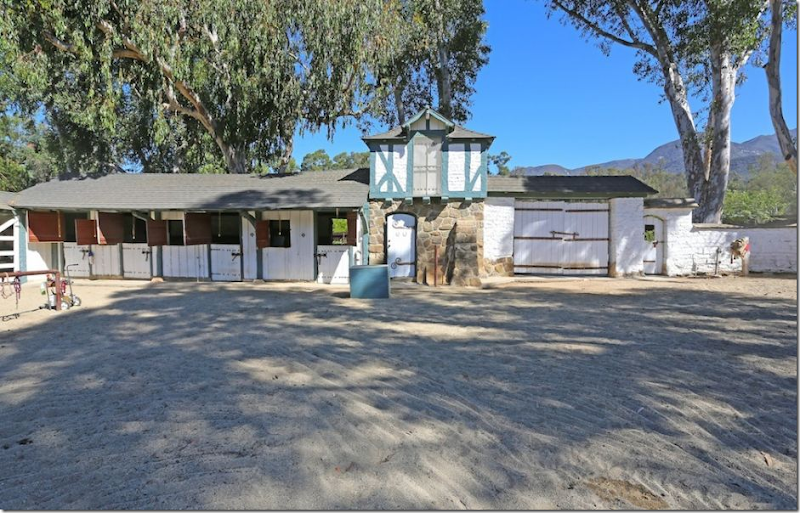
For Kathryn’s book, she took a picture of the charming original Forge where much of the hardware, the nails, the doorknobs, sconces, etc. was fabricated.But, the Elle Décor photograph of the same Forge, is the winner. The overflowing tubs of white flowers and the softening vines – add much to the photograph. But it’s Reese’s two nieces who really steal the show. Again, there’s nothing better than a professional photographer and his trusty stylist.A rare, original photograph of the carriage house and the gatekeeper’s house. Even way back then they tried to grow vines to soften the wood doors.Kathryn added a iron pergola for the vines over the garage doors. And she painted the gatekeepers house Ojai green, along with putting in a charming light above the door. This is where the secluded, tiny guest room loft is located. But, this photograph – taken on an overcast day is lacking. Plus, a professional photographer would never leave that hose laying on the ground like that!Kathryn’s real estate photographer took a better show – with the sun streaming, he captured the forge along with the carriage house and gatekeeper’s house.Reese’s real estate photographer took a poorer picture – he is so far back, you can barely see the gatekeeper’s house and the forge is hidden in shadow. Not sure what he was doing here, but the picture can’t compete with Kathryn’s. Notice though, how much the vines over the pergola have grown since Kathryn planted them!! I wonder if she has ever visited the ranch again and seen how her landscaping looks now that it is all grown out. I would think that she would love to see it.For the magazine shoot, Kathryn styled the pool, using her sons as props. Again, such a charming picture – it makes you want to jump in and join them, which is the power of the photographer who captured this particular moment in time.But, for her real estate photographs, the pool looks a little worn and boring and frankly unappealing. Many of you commented on the wire fence and why it wasn’t replaced. What you didn’t notice is that she had planted vines which hadn’t yet grown up over the fence.Now, in Reese’s pictures – the pool looks clean and blue, not green. The furniture and umbrella soften the hard edges of the stone fence. And notice the purple flowering vines that completely hide the wire fence now! All gone. The pool area looks very appealing now. BTW, Reese also installed a white picket fence all along the back of the property.At first I thought these benches might be the white chaises seen on the terrace of the Elle Décor photo, but these are completely different. White arms and striped fabric – so charming. The white chaises must have been borrowed for the photoshoot. Here you can see how thick the vines truly are – and she has also added a few tubs of flowers. Nearby there is also a trampoline and a ladder that leads to a tree house, all added by Reese for her children. I wonder who will be enjoying them now?The stables are so cute, it would be hard to ruin a picture of them. This photograph, professionally taken for Kathryn’s book shows the charming stables with the two horses perfectly placed. Someone is probably standing off to the right offering them apples. Luckily the sun is shining, dappled through the beautiful eucalyptus trees. Must smell wonderful there with all the eucalyptus around. And, notice the gorgeous mountain range in the background. What a beautiful piece of property this is!Reese’s real estate photographer closed the gates to set the scene. Another beautiful, sunny day for him.
He captured the entire stables, but didn’t think to add the horses in with it. And in another missed opportunity for him – by standing where he did, he didn’t get the mountains to their best advantage. If a prospective buyer was looking for a good view of the mountains he wouldn’t think this ranch had one – but it does! Compare this view with the photograph that Kathryn took of the stables.Kathryn’s real estate photographer took these pictures to highlight the mountain view on the property.And here again, someone viewing Kathryn’s real estate brochure would know that the property came with beautiful mountain views. These photographs probably are what enticed Reese to take a look at the ranch, and to buy it – just a few short weeks after Kathryn had listed it! I wonder how long the property will stay for sale now. The price may deter a quick sale, but for a celebrity who wants to hide out, this is the perfect place – as Rob Pattinson no doubt knows! (had to get that one in.) Reese’s real estate photographer did capture the view in this photograph – although if he had stepped over to the right some, you might see more of the mountain range.And that’s it. I have to say, I really had my eyes opened with this one. The Elle Décor photoshoot seems so phony to me now. Rooms styled just for the shoot, other rooms changed so much they aren’t recognizable anymore. They shlepped so many props and furniture for the shoot – do they always do that????? On the Skirted Roundtable, we’ve been told by magazine editors over and over again that those days are over.What they owner has is what you see – but that obviously isn’t true.I wonder, do you felt taken or used by Elle Décor? You were shown a house that really doesn’t exist as they said it did. Does that matter to you? Would you rather see a beautifully styled room than what it really looks like? Bringing flowers and accessories, maybe pillows and throws is one thing, but to totally remodel a room just for the shoot is something different altogether. Are you surprised at how the house actually looks compared to how Elle Décor portrayed it? I was. Totally shocked.


