Here’s a new family room project I just completed. First, the before pictures:
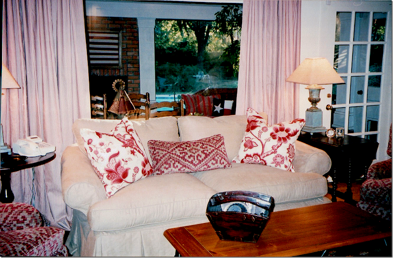
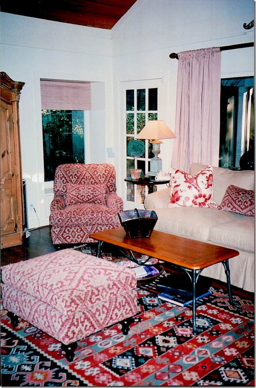
BEFORE: These pictures are really old – they aren’t even digital!! My associate Monica, of Custom Creations by Monica took these and scanned them to me today. About 12 years ago, I designed this room – with a linen slipcover and an English printed fabric. The sofa was the clients and the coffee table was theirs, too. I added the gate leg table and the English arm chairs, along with those great urn lamps that James Farmer made for me. The curtains were a red and white ticking. Behind this room – was a large screened in porch – with its own brick fireplace. Out in the porch – we did wicker furniture with Ralph Lauren fabrics and a Spanish styled breakfast table that the owner had had growing up.
I added a kilim rug and those chairs covered in a soft chenille. The pine armoire was another piece that the owner had had since he was young. Looking at these pictures really brings back memories from so many years ago! Monica and I were laughing tonight – because, to find these pictures, she had to go throw ten photo albums of old design work we have done together. Monica has worked with me on every single job I have ever done – since my first one! We got the giggles because she said all my 0ld work was always toiles. She used to call me the Toile Lady. All the pictures were of rooms done in either red toile, or blue and white toile, or yellow and red toile. So, seeing this really takes me back.
About five years after I had completed this room - the owners tore down the wall between the family room and the screened in porch and made it into one large room. At that time, they also gutted their kitchen and installed a new one and added on a large master suite – across the courtyard from this room. The master suite is the same size as this space for symmetry. I did their bedroom suite at that time – seven years ago. When the time came to furnish the new family room, the owners didn’t have much enthusiasm to really redecorate it. So, we did a quick fix:
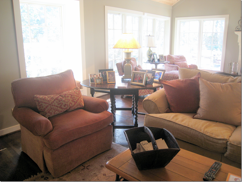
BEFORE: We got rid of all the red because the walls were now a green that matched the adjoining kitchen walls. I added two new chairs in a rust colored chenille, along with a few new pillows, and a new darker slip on the couch. We also added a muted rug on this side of the room.
I moved the other chairs into the new section and that was about all we did. The owners didn’t want any curtains and they loved having only a few small rugs that showed off their new wood floors.
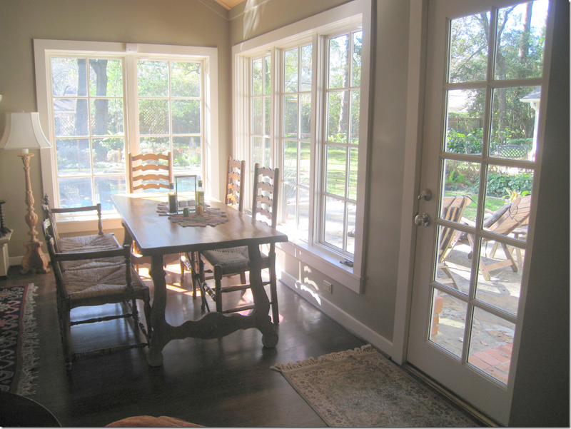
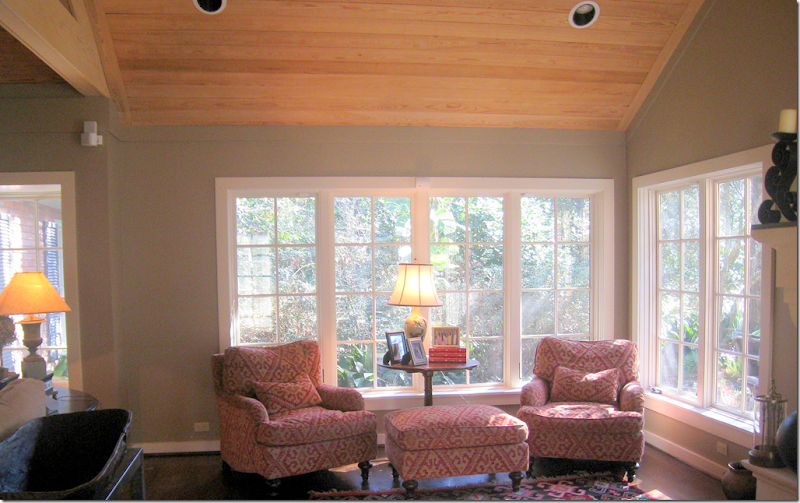
The table, from the owner’s childhood that was in the screen porch area, was moved here in a space near the windows that was designed for it.
And, on the other side of the former screened in porch are these chairs and the kilim that were moved over here.
Seven Years Later:
I was thrilled to get a call from the owners telling me that they were now ready to do a complete update in the family room. I was excited to get a chance to design the room from the start instead of having to piggy-back off an old design. This time the owners were much more amenable to redoing the entire room – and replacing some of the furniture that had come from his childhood home. They also were more open to things they weren’t too keen on before – such as shades and curtains and one rug instead of two. In fact, they were very easy to work with. The best kind of clients!!!
So, this is what I came up with:
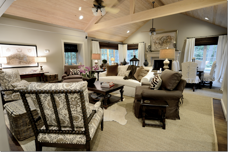
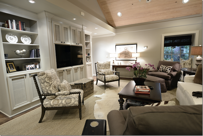
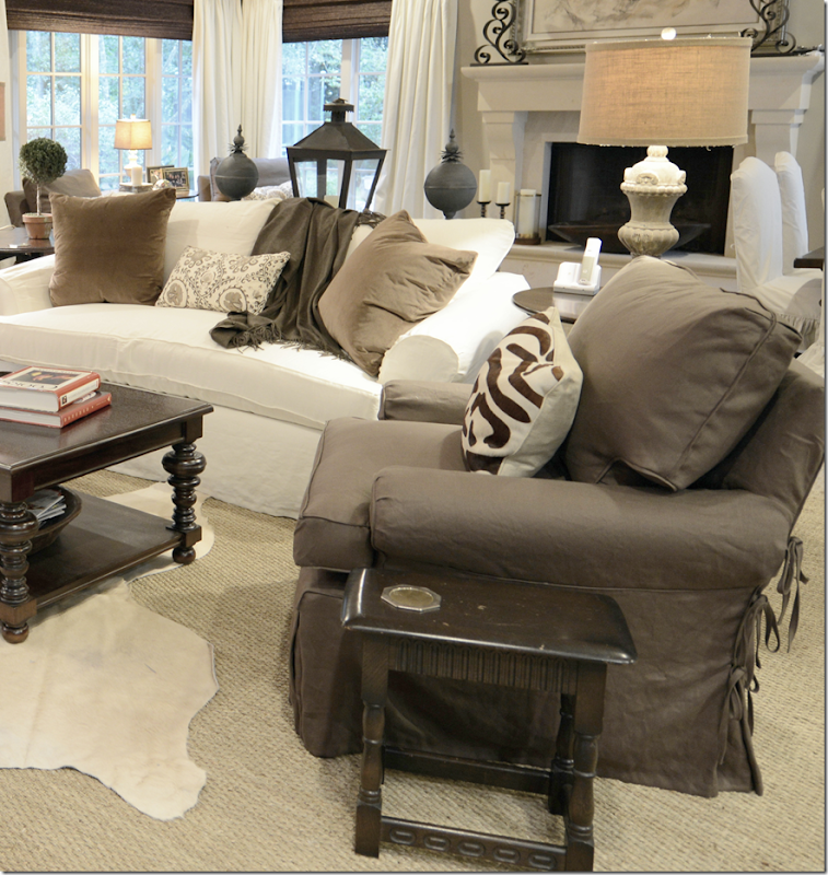
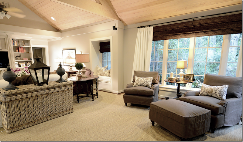
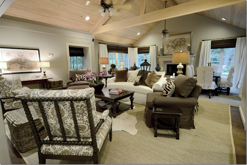
First, we lightened the walls – taking the green to a more grayish side (Sherwin Williams #7037.) Then, I added the large seagrass that extends throughout the two areas – making it seem more like one space instead of two. We kept all four club chairs and sofa, just updated them with linen slipcovers. And we added curtains and shades which really made the large room much more cozy and warm. Since the room was so large, I wanted a lot of contrast, a ying and yang energy so that the room would be more lively than sedate and quiet.
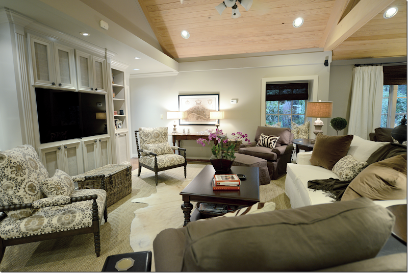
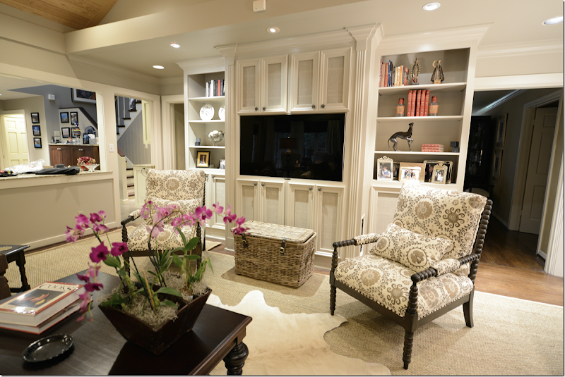
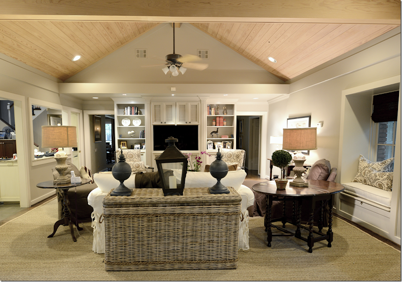
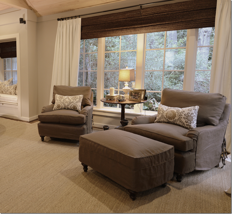
We bought two new Bobbin chairs – from CFC and covered them in Oxus, the Carlton V fabric – in the gray colorway. This fabric was our starting off point and everything else came after this fabric was chosen. Since the background of the Carlton V is rather creamy and not white, the sofa and curtain fabrics are more ivory than stark white to blend with the print. We ordered a new coffee table from Noir. And against the back wall, we got rid of the repro pine armoire and added a wood console instead, which really made that area come alive. Before, it was a dead spot with the dullish armoire. I also had the shelving unit repainted – soon Leslie from Segreto will faux it, along with the ceiling. More about that later in the story.
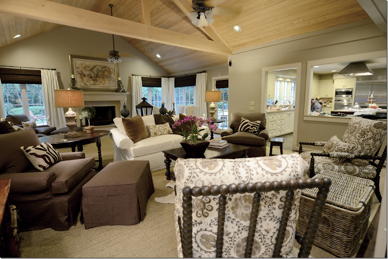
From this view, you can see into the kitchen – which was totally gutted and redone when this room was enlarged 7 years ago. I can see Monica’s behind in there! (She is going to be so furious with me!) And here you can see the beautiful fireplace mantel that was added during the renovation. The painting is of running horses – from the owner’s collection - and is in tones of browns and beiges and grays which determined the color scheme for the room.
When flatscreens first came out, I designed this bookshelf for the owners. Originally this wall was the back of the fireplace that is in the living room, which is on the other side of the family room. This wall was brick and it stuck far out in the middle with sheetrock on both sides of it. There wasn’t a fireplace – it was just the back of it. The house is rather old, an original ranch from the late 40s, and I think that this family room was probably built as an addition a long time ago – therefore, the back of the fireplace was once on the outside of the house. So, we built the bookcase to hide that – the middle section is really very shallow. The speakers and equipment are hidden inside the cabinets – which are screened instead of solid to let the air and sound come through. At the time we thought they had the biggest flatscreen they would ever want, but you know how that goes, and recently they bought a new one. We reworked the middle section to make it fit in perfectly. Well, Raul reworked it!
I added the creamy cow skin rug to break up the large expanse of seagrass. And I bought them the set of 3 baskets from Artesia Collections to hide all the flotsam and jetsam that was previously hidden in the armoire. Plus, now the largest basket serves as a drinks table for the two Bobbin chairs. I am so in love with Bobbin chairs ! They are light enough that if someone wants to watch tv, they can just pick it up and turn around, but that probably will rarely happen. I put the orchid in the Chinese rice bucket, but this will usually house all the clickers. Not sure why I didn’t turn on the living room lights or clear off Monica’s things on the counter, but I was a little tired at the time I took these pictures. The installation lasted from 8:30 – 4:00 pm, mostly because they fabricated the rug on site.
All the lamps are new and all came from Aidan Gray. I added the two zebra lumbars from Mecox Gardens and the two pillows on the sofa are velvet. All fabric besides the Carlton V is from Pindler. We needed bolts and bolts of fabric, so Pindler’s friendly price points were very welcomed.
Hien Lam reworked the sofa – updating it with one bottom cushion and two back cushions only. Plus, they made all the slipcovers.
I didn’t get a good shot of the fireplace – but here you can sort of see it. I’m not sure where they got the painting from – who the artist is – but it fits the mood of the room perfectly. The candlesticks on the mantel are theirs too.
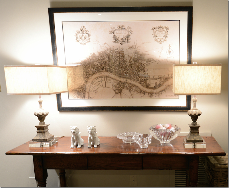
I replaced the pine armoire with this console table from Hien Lam Home. And I bought this reproduction of the antique map of London from All Posters. I also bought the one of Paris and wanted to stack them, but there was this beam in the way, and everyone vetoed the second print! Everyone included Monica, James – my helper, and the seagrass installers = all design mavens.
Here’s a close up of the Aidan Gray lamps – these are really pretty with the acrylic bases and finials. And the box shaped shades lend a slight contemporary touch. BTW, the Aidan Gray house search continues. We will probably be announcing the winner in about two weeks or so. We are going over all the entrants now. So – you still have a few days to enter – but hurry!!!!
And looking from the back of the sofa. I added a new console which is actually a huge basket from Artesia. On the right, is a small window seat. I love these lamp shades made of burlap which brings out the color of the seagrass. And, I added the lantern and the zinc balls on the console.
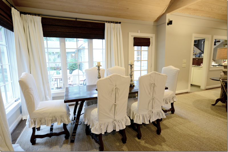
The owners childhood dining table had Spanish styling and was actually quite pretty. So, I had it restained a dark, rich brown. Before it was a light color that looked faded from years in the sun. The old chairs had seen better days, so we bought these French chairs from Hien Lam and stained them dark – and slipped them in a ticking stripe. I chose the dark window shades to go with all the brown linen and dark woods and the curtains really pop against them. They will probably never be lowered, so not much light or view is blocked – since the shades are actually only covering the dead space between the window and the rods.
There was only one hitch in the project when the lady of the house called to say she didn’t want or need the shades. I was stunned. “No, no, you have to have them. The whole room was designed around the shades. No. I insist. Please!!!” I was literally begging her. I think she was surprised since I usually don’t insist on anything that strongly. But, thankfully she changed her mind and I quickly ordered them.
And looking from the main seating area to the breakfast area. I added the candlesticks from Aidan Gray and the large clam shell.
Across from the breakfast area, are the two club chairs with an English arm and carved legs. I discussed doing a back to back sofa here, but with the dining area, there just wasn’t enough room. Then we discussed moving the breakfast table in the middle in front of the fireplace, but that would leave two big holes on each side. Then I thought that maybe I would add an antique chaise or bench along each side, or even a Mies chaise with the dining table in the middle. At this point, the owner looked at me like I was crazy. I also thought about four chairs instead of two, in a circle, but in the end – it was just too much and I left it the way the architect intended it with the breakfast table in the right bay and the chairs in the left.
Their backyard is really large and beautiful – the house is in wooded Memorial – and it was once considered way out west Houston, but now it’s rather close in. There is even an old stables in the back. Now, they have a beautiful pool with a fountain – so the views out these windows are fabulous. Of course, I didn’t take any pictures of it! I forgot! What can I say – I’m not a professional photographer! But, – did you notice this is the debut of my new camera – the Nikon D800 that I was on the wait list for six months for? The camera takes extra wide shots which is great for interior photographs. So - an improvement? Or is it back to school, pronto?
OK, back to design. One thing I like in this room is the contrast between the dark brown linen and the ivory curtains and the dark shades. The print is just enough pattern without overwhelming the room or dating it too quickly. IMO! Which is why I was really so dead set on ordering the blinds. I think they made a big difference in the room.
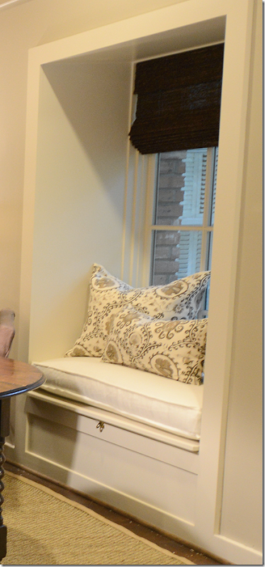
And this is the window seat that remains from the when the room used to end right here. Monica facilitated the down cushion and pillows, of course. And all the curtains, too.
In the end – there is only the ceiling left. While at first I did love that the seagrass balanced out the light wood ceiling, I saw something that Leslie of Segreto had down on the ceiling at her new office. After we met with Leslie, she agreed that the ceiling would look fabulous treated the same way.
Leslie has just remodeled a tear down into her new beautiful offices. You HAVE to see how cute it is HERE. And, here is a picture of her new office’s ceiling which is the treatment we want to do on this ceiling.
Here is the treatment for the ceiling, it looks like rustic barn wood and has a grayish tone. We are set to do it in a few months. The ceiling is so gorgeous! It will really tone down the yellow color of the wood and will be much softer looking!
So, that’s it! Thanks for looking at all the pictures.
FINALLY:
Our sponsor Lewis and Sheron Textiles is offering their very first online coupon!
The coupon is good for one online purchase and it is worth 20%off. The coupon is in effect through the end of September. To receive the savings, please add the code "LSFABRICS FIRST"
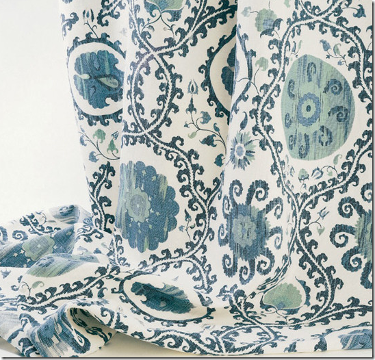
One interesting note – if you like the fabric I used on the Bobbin chairs – the Oxus by Carlton V – it also comes in the popular blue colorway:
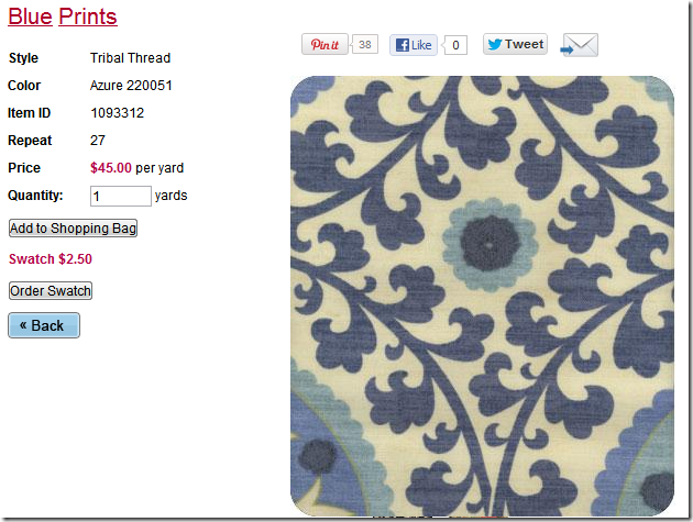
This fabric is rather pricey – but Lewis & Sheron have very similar one called Tribal Threads in the blue colorway.
They don’t have one in the brown/gray colorway that I used, but I did find this one on the bottom of the stack that looks similar:
In fact any of these Lewis & Sheron fabrics would be a good substitute!
Remember, the 20% off online-only coupon is good for one purchase through the end of September. The code for the discount is "LSFABRICS FIRST"
Monday, September 17, 2012
WEBB DESIGN: A Redesigned Family Room
Subscribe to:
Post Comments (Atom)






No comments:
Post a Comment