Like I said last week, the Houston market is a true Seller’s Dream. Houses that are reasonably priced go option-pending so quickly, especially the cuter ones and especially those in my zip code 77005. So many of these 77005 houses that are listed for sale actually have contracts already. I found four houses in my neighborhood that I like – and all but one were already spoken for. But, it’s obvious why. They are all furnished nicely and all have great curb appeal.
And also, the houses I chose to show today are obviously owned by younger couples.
Rather than sophisticated houses filled with fine accessories and rare furnishings collected over many long years – these houses are obviously owned by younger couples with décor that is fresh and up to date. They don’t have that cluttered look that comes from living in a house for 20 or more years. These houses make me want to edit and then go back and edit so more. There’s something refreshing about rooms that aren’t filled with books and knick knacks, paintings and chairs in every single corner!
See if these four houses don’t motivate you, like me, to clean up and clear out. OR, instead, they may make you realize that you really appreciate all you’ve accrued over the years and look forward to adding even more!
Enjoy!
House #1
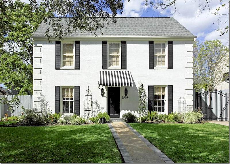
Located in the University area, close to the Medical Center, this house was built in 1939, it has 2 bedrooms and 2.5 baths and is just under 1,590 sq. feet. The asking price is $739,000 – and it’s a sale pending after being listed for barely a month. I can see why. The listing states that Chandos Interiors did the design work for this totally renovated house. Well, no wonder it’s so pretty! Chandos is known for their beautiful interiors. It’s not often that a house on HAR is professionally decorated by someone of this caliber – so when they show up, it’s a thrill.
The façade is the definition of “curb appeal” – with its black and white color scheme. The stripe awning adds so much charm!
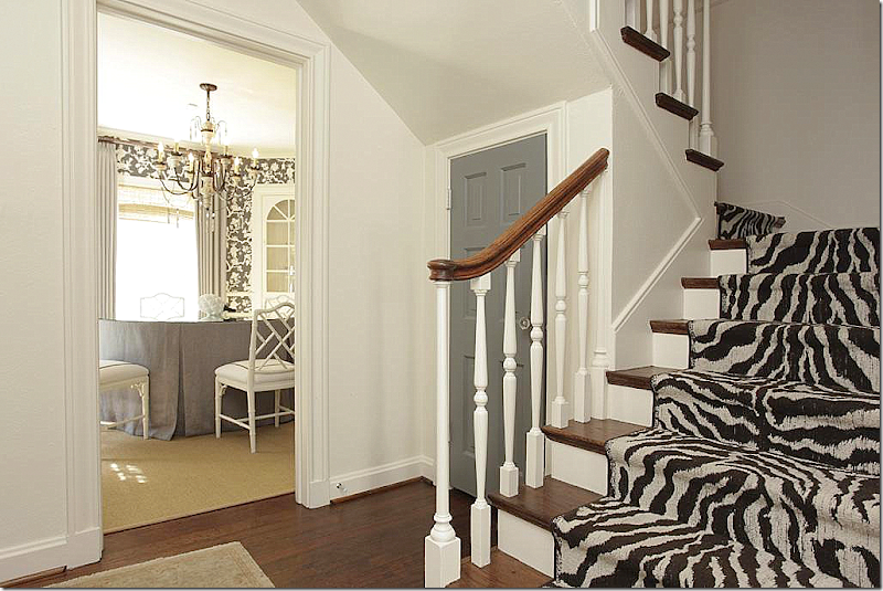
The front door opens to the foyer with the zebra print staircase runner. I love the gray door – I usually advise to paint builder’s grade doors in black, but if your house is painted white or light gray – a darker gray door can be just as effective, if not more so. Especially with a crystal doorknob that acts like a piece of jewelry. Beautiful! Dining room to the left and living room to the right.
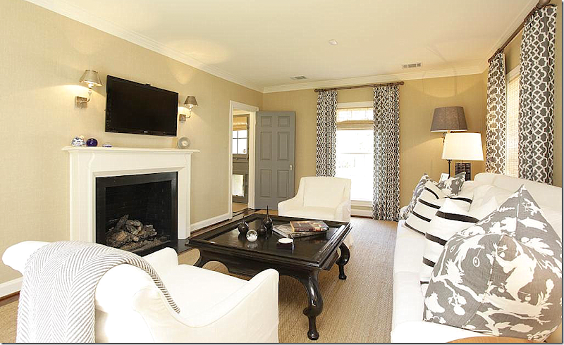
The living room – from Chandros’ web site. White slip covers with beige walls and custom cut seagrass. Typical “Houston Look” – but with a more youthful and contemporary twist – there’s high contrast with patterned curtains and pillows in both a reverse toile and stripes. Modern end tables and lamps and mirror.
And looking the other direction, there’s a fireplace with the flatscreen over it flanked by contemporary lights. No doubt this is a young couple who lives here – albeit one with great taste and style. Again, gray painted door that leads to the kitchen.
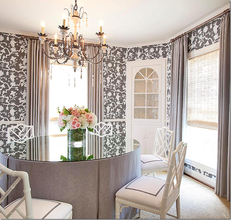
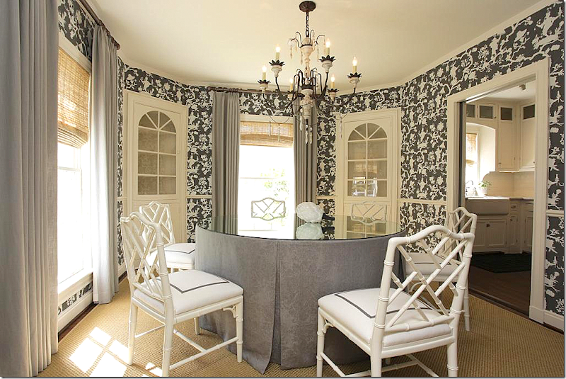
The dining room is so pretty – wallpapered in the same reverse toile with a skirted table. Love the painted chairs with the gray trim added to the white. The shades are high quality, and it shows. Pretty light fixture. Just a great, well designed room – love it! From Chandros web site.
And, another view – showing how large the room really is. The kitchen leads off to the right behind pocket doors. The wallpaper really makes a difference! In an older house, with well defined, separate rooms, wallpaper makes sense. In most new houses today – the rooms are so open to each other, it’s hard to use a paper like this.
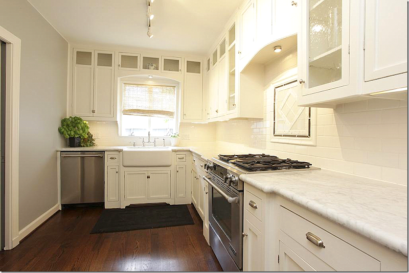
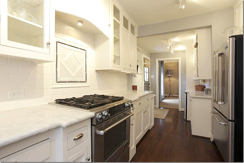
Totally renovated – white marble, farm sink, range, subway tile, with stainless appliances. Classic elements make up a classic kitchen. This design will be good for years to come.
And looking the other direction towards the living room.
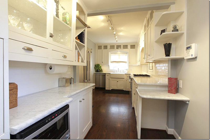
A butler’s pantry off the kitchen. I might have forgone the desk on the right and left the space open for a small table. But, they didn’t ask me!
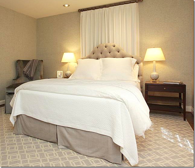
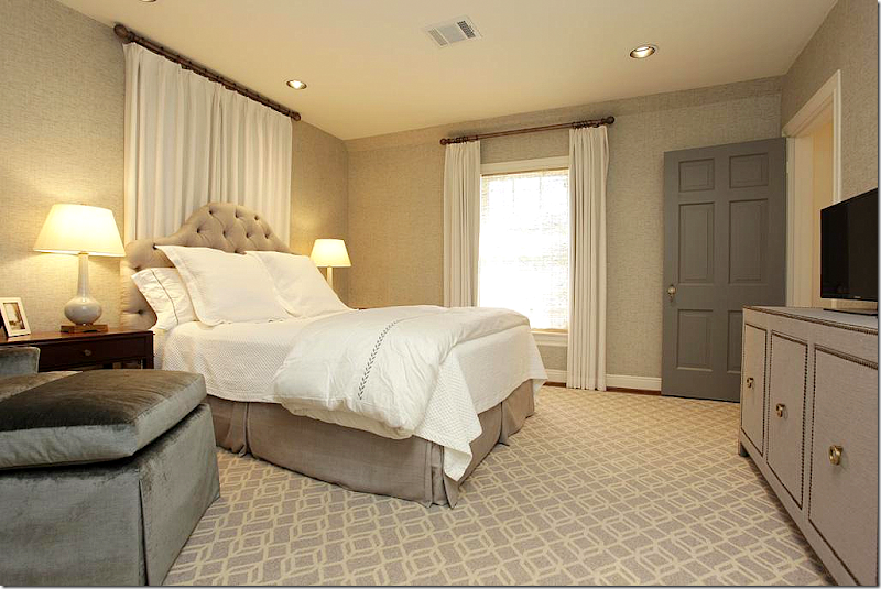
Upstairs, the master is done in beige – it looks like the walls are wallpapered, but its hard to tell. Pretty tufted headboard.
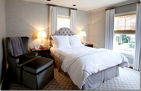
Love the flat, patterned carpet. Contemporary chest with nailheads. Putting a bed in front of a window is always awkward. I might have just closed off the window or made the curtains a little wider to extend past the bed.
Off the web site, here’s how it looks with the curtains open. Pretty.
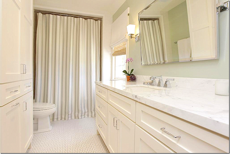
The master bath is updated with tile floors and marble countertops. Just perfect and again, timeless classic!
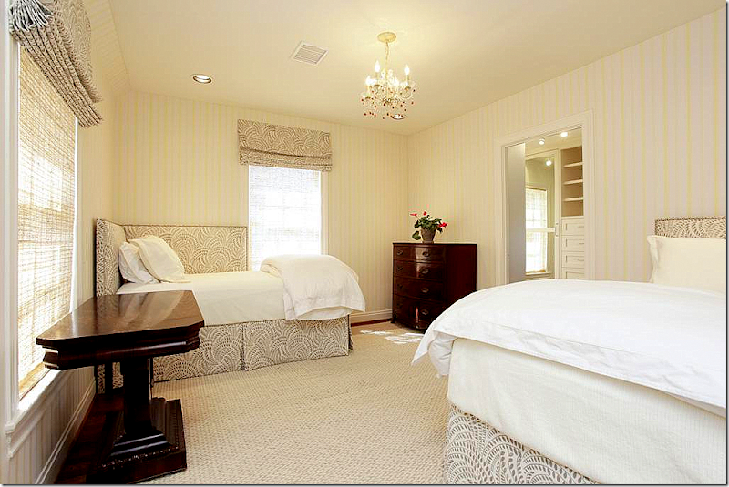
The guest room has two upholstered beds with matching shades and paneled walls (or wallpaper) and a textured rug. Love those beds!
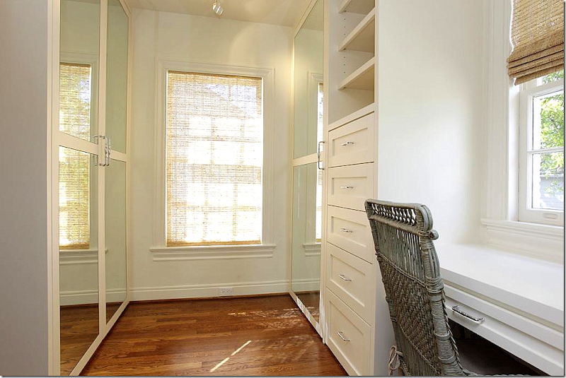
Off the closet is a small office area.
And the second bath with it’s classic charm. Very well done!!!
The back yard needs a little landscaping, but it’s so big – you can easily add on to the house and make it bigger and still have room for a swimming pool. Whoever put the winning bid down on this house is very lucky!! To see the listing, go HERE.
$739,000. Option Pending
House #2
This house was built in 1992 – a rather typical West University house – but, when interior designer Margaret Ann McEver and husband bought it, they totally erased all the builder grade choices – turning it into a sophisticated house with a décor to match. McEver owns MALI, a well known design firm HERE. The house is 4 bedrooms, 4 baths, with quarters over the garage. It is just over 3200 sq. ft.
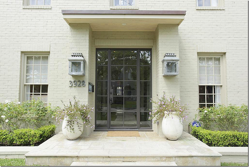
The front façade was totally updated by MALI – with a new steel front door, lanterns, a stone porch and walkway, and landscaping. The brick was painted beige. Love the new look – it’s slightly contemporary and lets you know that big changes have happened inside.
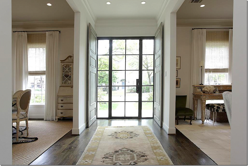
Inside, antique wood doors stand ready to be closed, if privacy is needed. Upon entering, on the left is the living room, while the dining room is to the right.
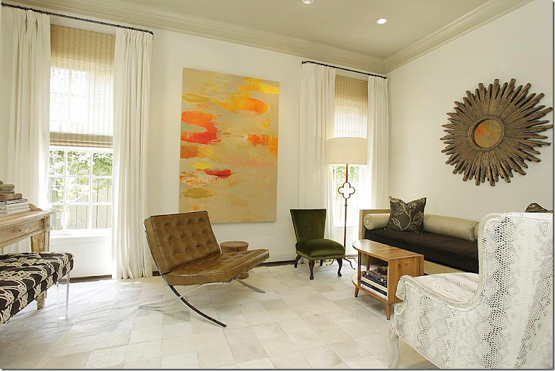
The living room is a blend of mid century modern mixed with antiques.
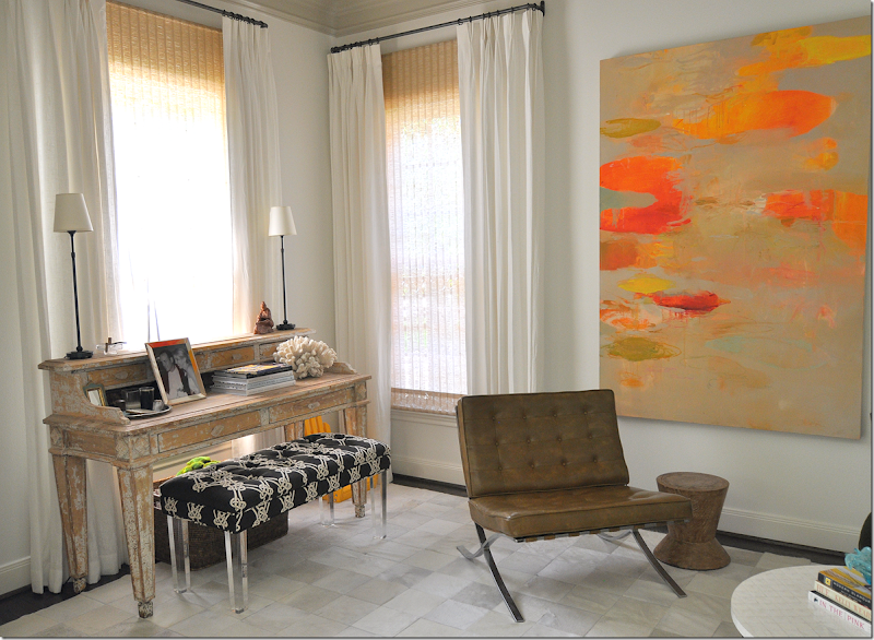
The focal point is a large contemporary oil painting.
And in the front window is a painted desk with a modern bench.
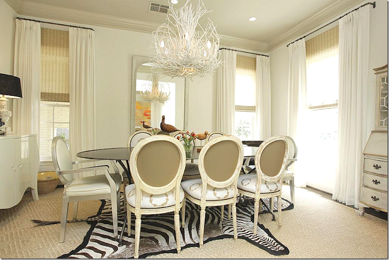
The dining room is an eclectic mix of French chairs with a zinc table.
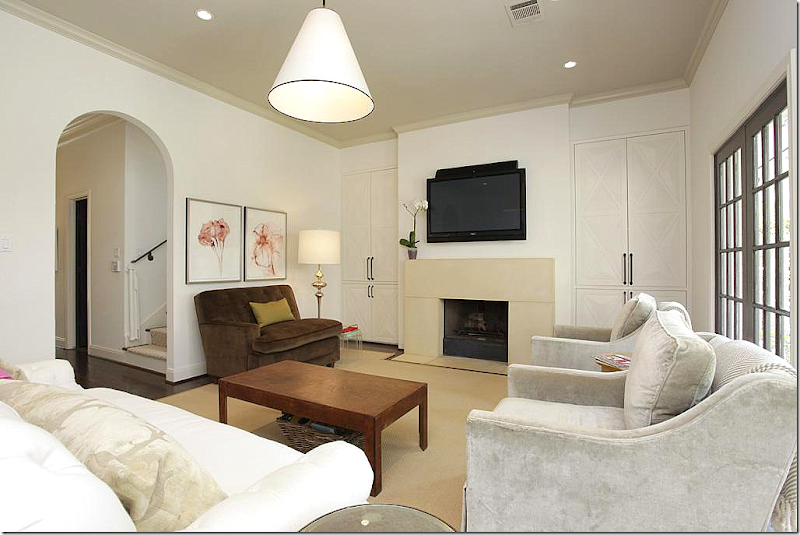
In the family room, MALI installed a new contemporary styled stone mantel. The shelves were closed off behind doors trimmed in an X pattern.
Here is another view of the family room. Through the arch is the staircase and library.
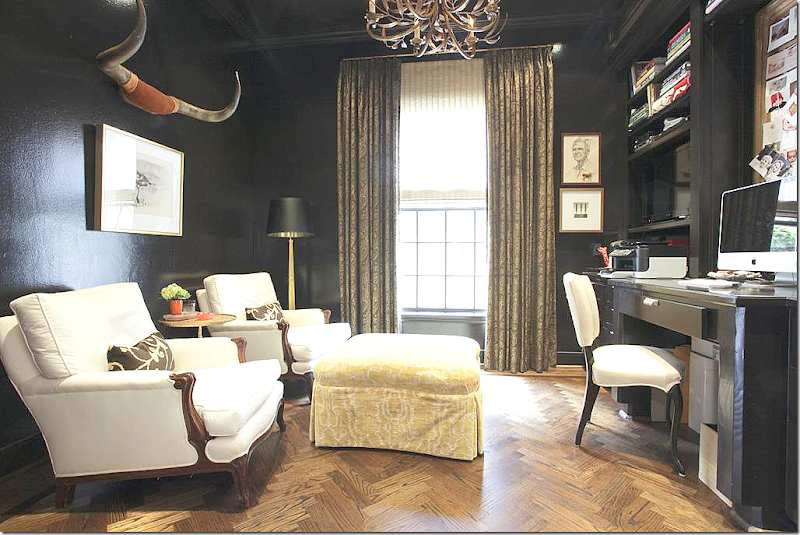
The library was painted a stunning black! Love it! Longhorns play up the masculine side of the room.
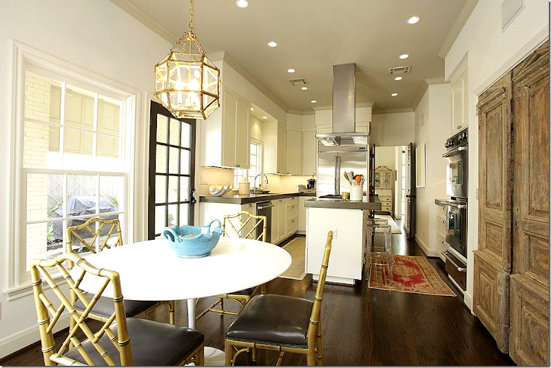
The kitchen was totally updated with new concrete countertops and appliances.
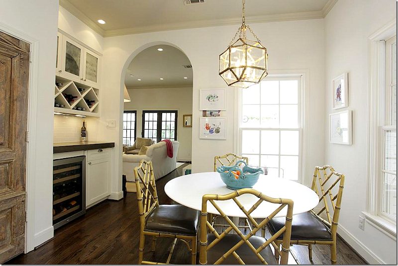
Antique doors hide the pantry. Love the Saariren table. I grew up with a table like this – wish I still had it!
View into the family room.
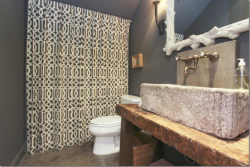
The powder room – great stone sink on rustic console. Love the floors. And hiding behind the fabric is a shower, a rarity on first floors in West U houses. Love the wall mounted faucets and love the dark gray paint!!
Upstairs, one of the bedrooms was turned into a playroom – with brown and white stripes. Love the orange contrast.
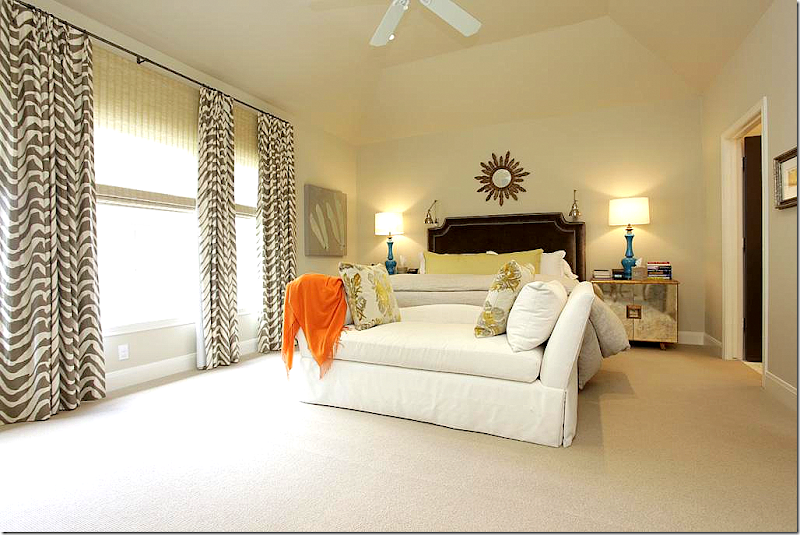
The master bedroom has a velvet headboard with nailheads and contemporary nightstands. The patterned curtains add a youthful touch to the decor.
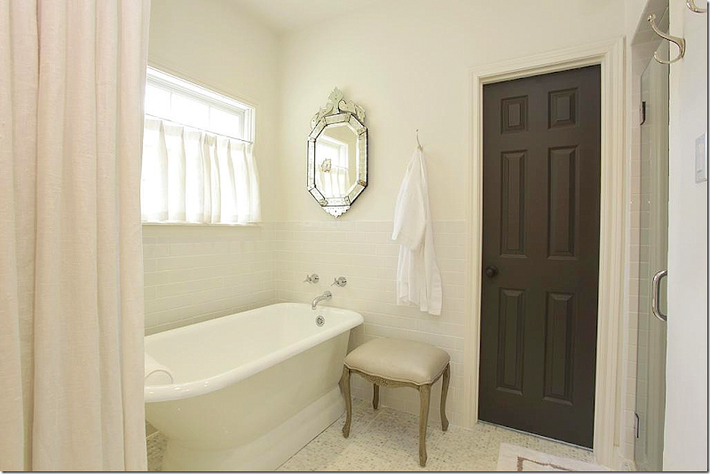
The master bathroom was redone with marble countertops and tiny mosaic floors. Again, love the dark gray doors.
My favorite! She added a portiere of white linen to close off the bath area for privacy, if needed. Plus it just softens the area. Great idea.
The boy’s room is taupe with touches of blue and orange.
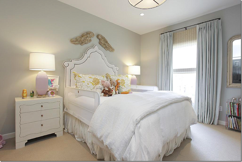
And the little girl has an icy blue bedroom with hints of lilac. Love the whimsical headboard!
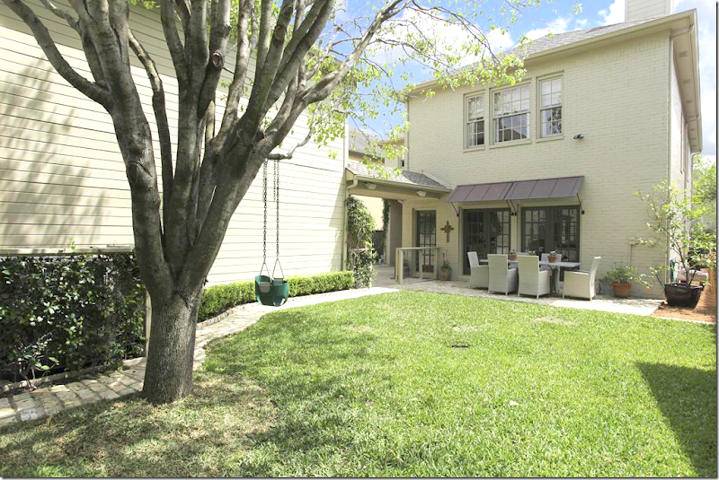
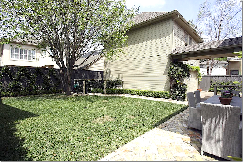
Metal awnings were added to the back French doors.
There is an apartment above the garage.
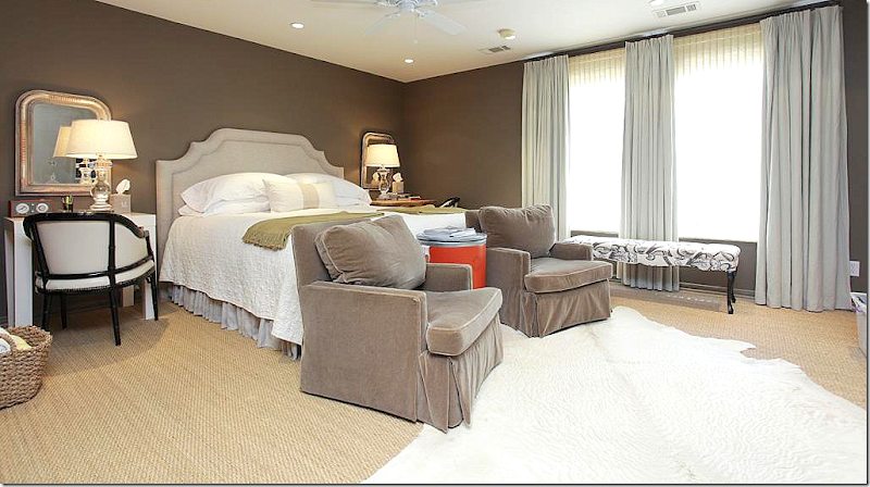
Brown walls and taupe velvet chairs. Love the matching small Louis Philippe mirrors. There is also a small kitchen in the apartment. Wall to wall seagrass.
I really like the ideas that MALI added to this house to make it more contemporary, and more special.
$1,225,000 – again, Option Pending
To see the listing, go HERE.
HOUSE #3
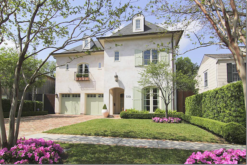
A few months ago, I showed a house for sale by Southampton Builders HERE and today is another one. I love the houses they build. They are all so charming! Great façade on this house with its painted garage doors and shutters and dormers and balcony and tiny windows and brick drive. What curb appeal!
Built in 2007, it has 5 bedrooms, 4.5 bathrooms, and is 5,584 sq. ft. And here is a daytime view of the house, so, so pretty.
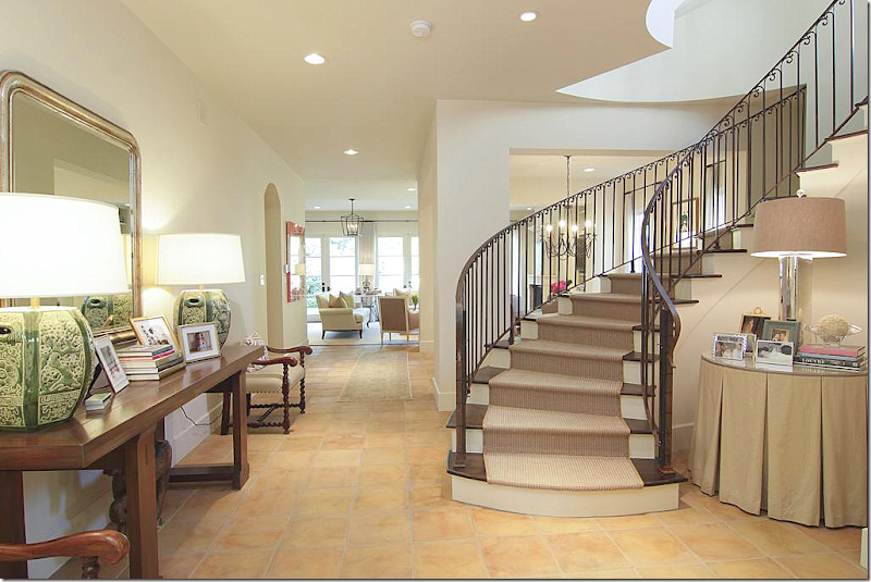
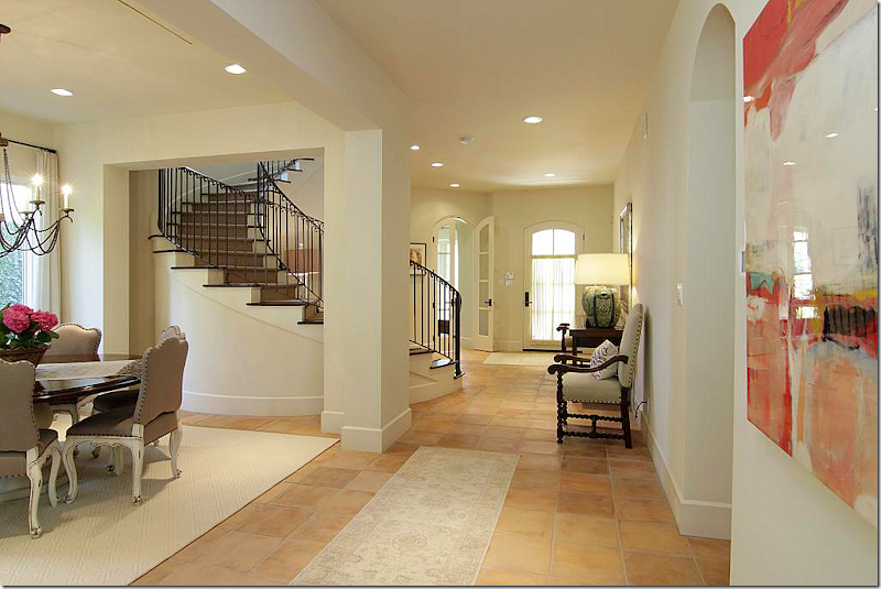
The floors are terra cotta tiles – which is unusual for this neighborhood. It’s very open with a winding staircase in the foyer. Love the skirted table with pleats and the console table with mirror and lamps.
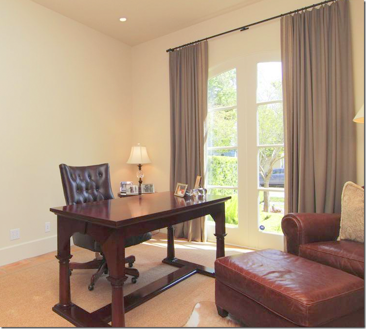
And looking back towards the front door, at the left of it is the study with its arched French door. There is no formal living room, which I do miss.
The study, at the front of the house. You could use this a sitting room instead if you prefer a living room.
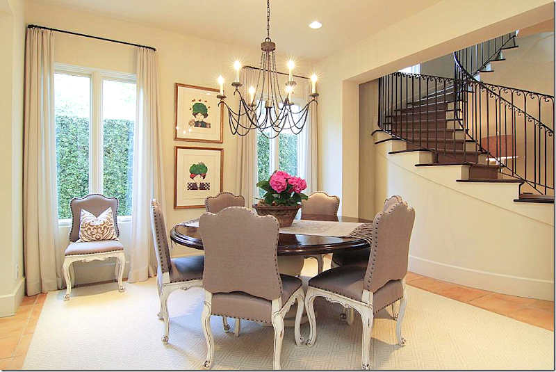
The dining room has a round wooden table with a painted base and painted, nailhead chairs.
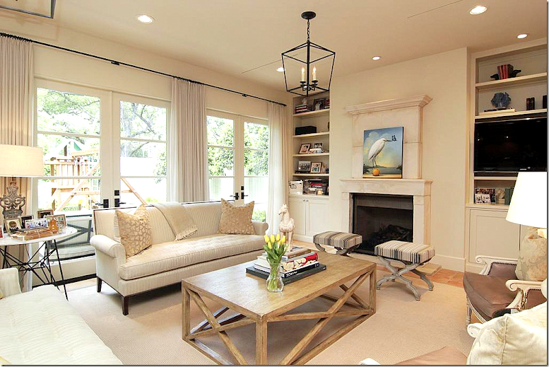
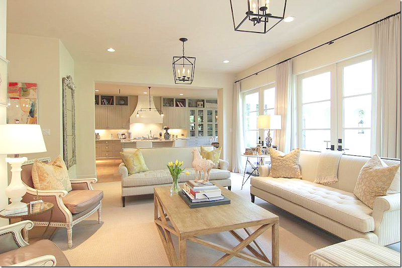
Past the dining room is the large family room and kitchen. Love the painted French chairs and the more Belgian styled coffee table.
The family room over looks the backyard. Notice the wonderful stone over mantel.
Two lanterns light the area. White linen curtains soften the French doors. Past the family room is the kitchen.
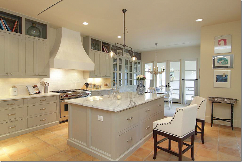
The kitchen has beautiful cabinetry with marble counters and a subway tile backsplash. Love the range and its stucco hood.
Looking the other direction to the wet bar and family room. Love the gray color on the cabinets. Farm sink.
A view into the bar.
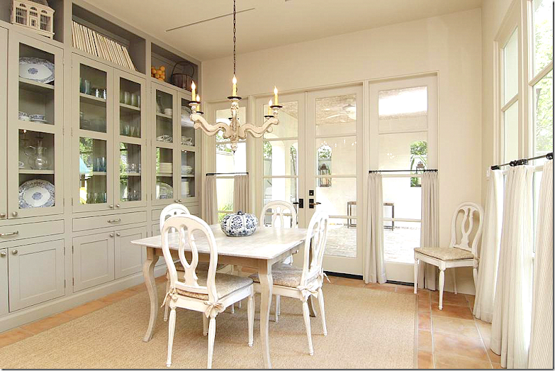
Past the kitchen is the large breakfast room.
Great built ins. Past the breakfast room is a covered terrace. I like the café styled curtains that are on the bottom half of the windows.
Upstairs, there is a large master suite that overlooks the back yard. Hardwoods and raised roof.
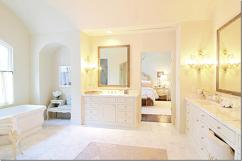
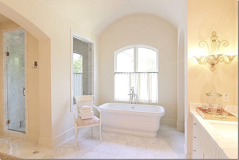
The bathroom is gorgeous with marble floors and venetian sconces.
So pretty!!
OK. This closet is to die for!!!!!!!!!!!!!!!!!! Can you imagine??!!! Looks like a boutique. Wow.
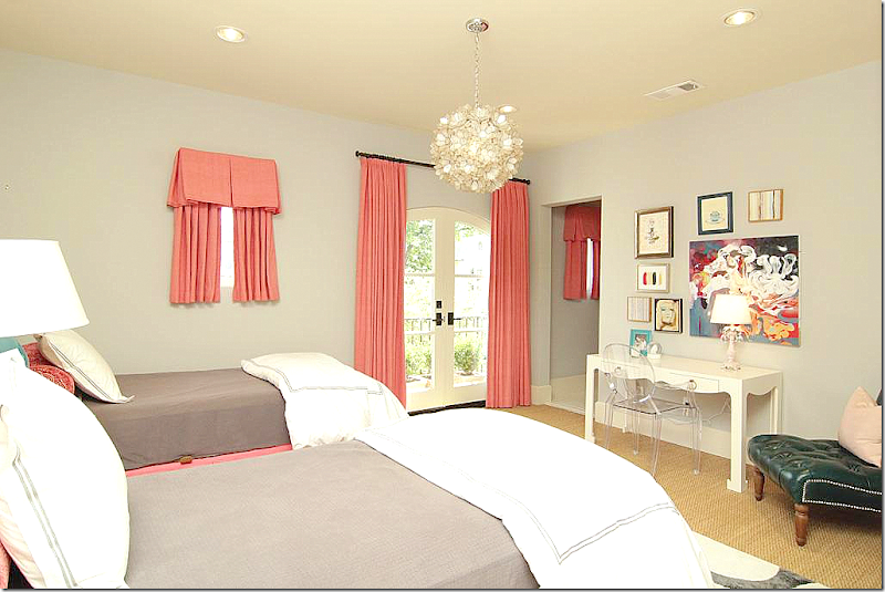
The little girls room is cute in coral and taupe. It’s balcony overlooks the front yard.
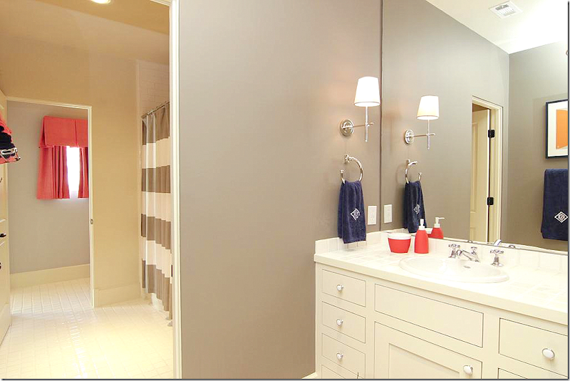
The Hollywood bath matches both bedrooms.
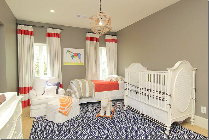
The baby’s room. Love the bright colors.
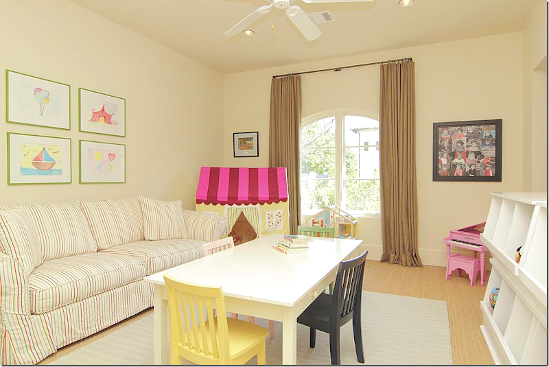
The playroom is set up in the extra bedroom.
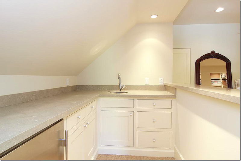
On the third floor is a separate apartment with a small kitchen.
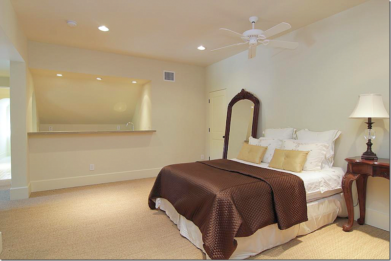
And two bedrooms.
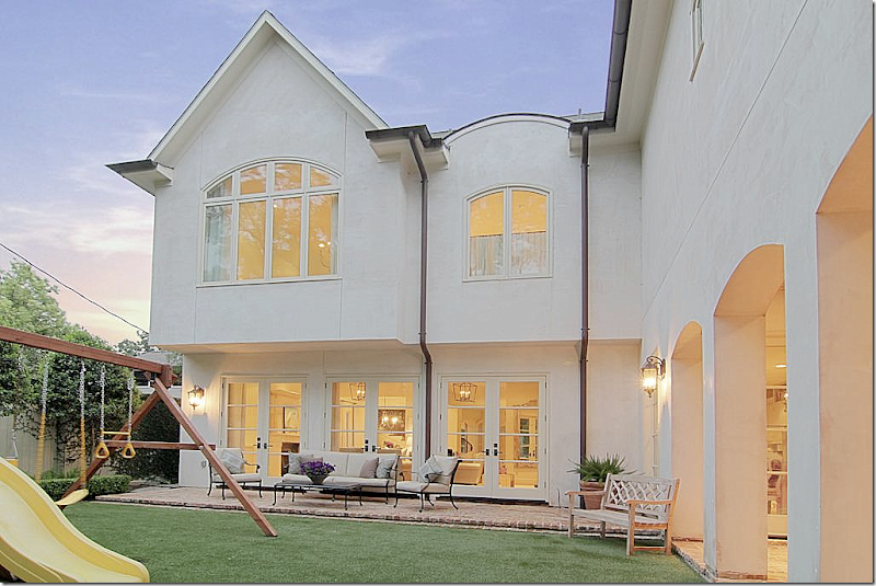
Outside, there is a brick terrace and a covered porch.
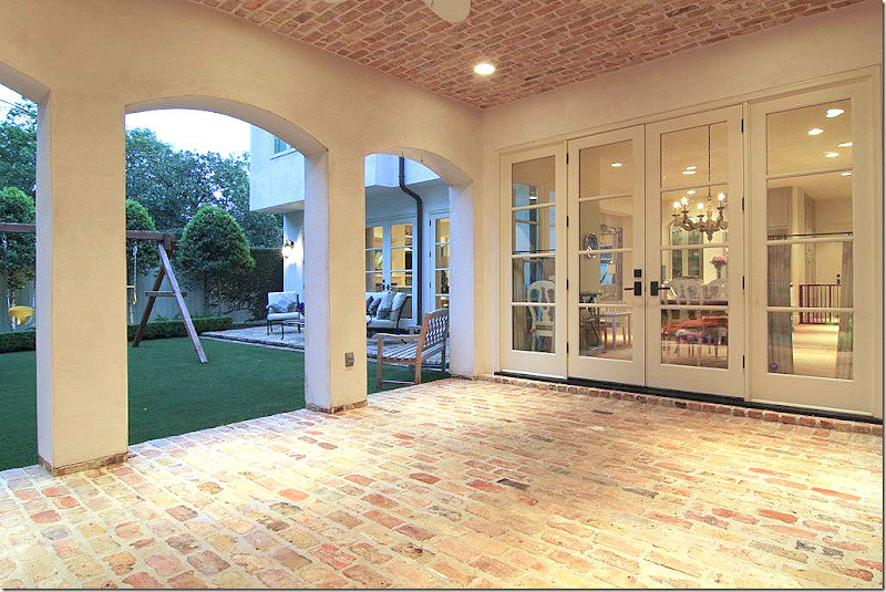
The covered porch – notice the brick ceiling. This is off the breakfast room.
And the terrace is off the family room.
At $2,250,000. it is the most expensive house shown today and the only one that is not a sale pending!
To see the listing, go HERE.
HOUSE #4
This house was a real surprise to me. It’s right down the street from me! I had no idea how cute it was inside. I’ve never even seen the owners and wonder who decorated the house – if they hired someone or if they did it themselves. The homeowner might be a decorator because the house has great décor. Again, a young couple lives here.
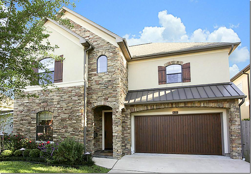
Stone façade is mixed with stucco and shutters. It was built in 2005 and is 3,600 sq. ft with 4 bedrooms and 3.5 bathrooms.
The front door opens to a long hall with the living room and dining room at the left. Love the sconces in the entry – and notice the homeowner framed some type of ceremonial clothing, which is a great idea.
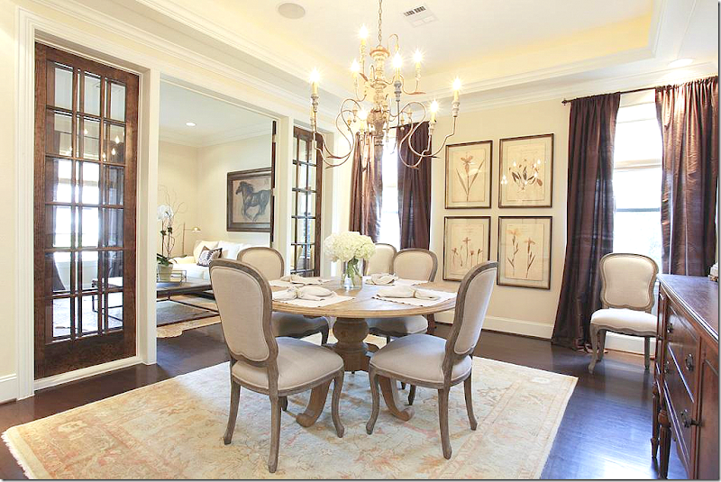
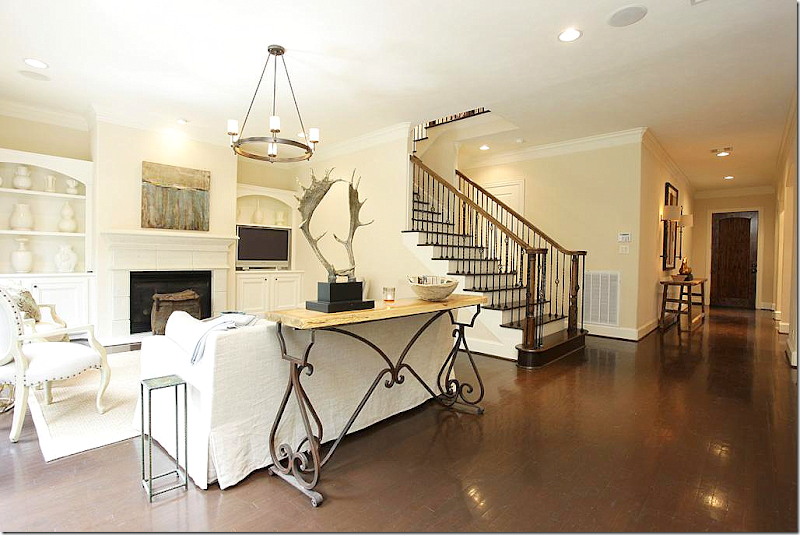
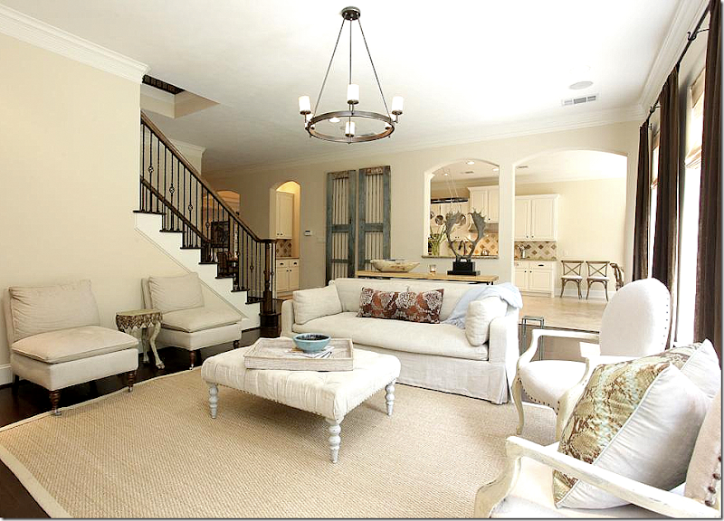
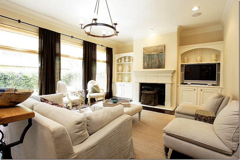
I love the dark hardwoods mixed with light walls. Brown linen curtains at the windows are found throughout the downstairs rooms. A simple contemporary white sofa mixes with a rustic bricklayers coffee table and cowskin rug.
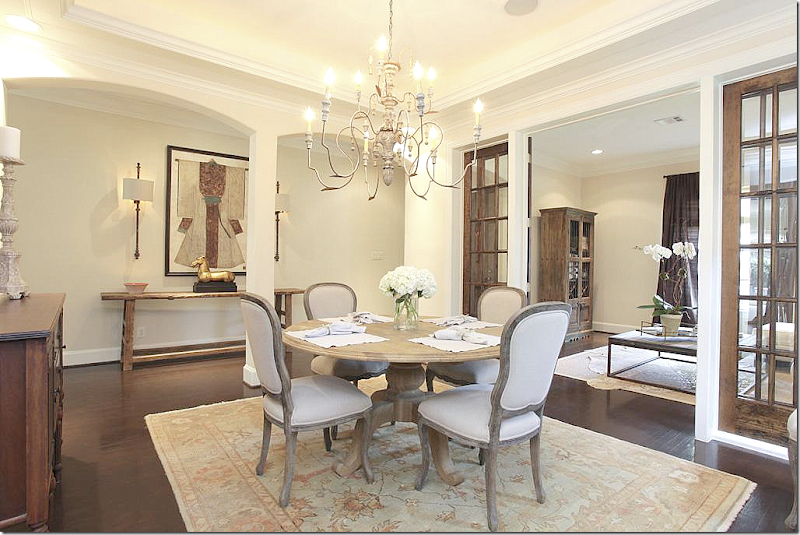
I love the wall of French doors between the living room and dining room. Love the dining room- with its botanicals and Italian wood chandelier. Pretty Oushak rug.
Past the spacious, long entry hall is the staircase with iron rails and the family room. Love the iron based console that divides the room – it’s great looking. Love the horns too.
A mix of slipcovered furniture and French styled chairs. Antique doors rest along the back wall.
Pretty stone mantel. The same brown linen curtains hang in the back windows too – making all the rooms blend , now’s the time to sell your house!
To see the listing, go HERE.
Four houses – from moderately priced to expensive. All owned by young families – and all houses showed a mix of contemporary furniture with antique pieces. The décor was edited and uncluttered, fresh and youthful. Seeing these houses makes me want to clean out my shelves and table tops and get rid of “stuff!!”
That is until I see a house I like that is filled with that “stuff” and books and accessories. It’s a vicious cycle.
Did these houses motivate you to edit? Did they motivate you to bring in more cotemporary pieces into your home? Did they make you want to bring in fresh fabrics and modern prints?
Or did it instead make you appreciate what you have all the more??? Perhaps motivate you to collect even more?
Do you prefer the edited look or the more collected look?
FINALLY:
Coming soon – another fabulous linens giveaway by Vero!!!
Wednesday, April 24, 2013
FOUR HOUSES IN MY HOOD!
Subscribe to:
Post Comments (Atom)

















No comments:
Post a Comment