I recently made a big change in my family room. While I was lo0king at all the old pictures of this room through the years, it was just a tad embarrassing to see how much the room has changed. But in my defense, I think most interior designers suffer from the same illness – the constant changing and updating of a space that never seems to end.
And, we have lived here almost 20 years so some change is inevitable and expected. …..Sure it is…!!
I started out with taupe walls, white trim, and a gray and white ticking stripe sofa and chair bought from some long ago closed discount furniture store. At some point, we got rid of that sofa and used a slipcovered khaki linen sofa – along with all red and black accessories and freshly painted yellow walls. The khaki slips later became white slipcovers – which are the first pictures I have of the room, below.
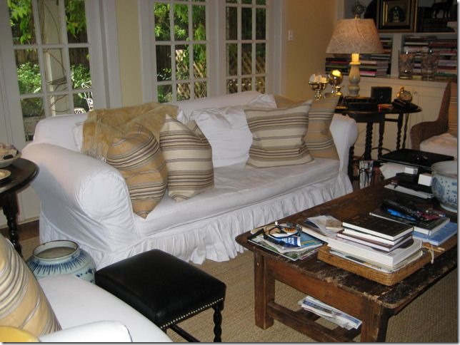
A long time ago – an old sofa with white pleated slips, yellow striped pillows, wicker chair, old coffee table.
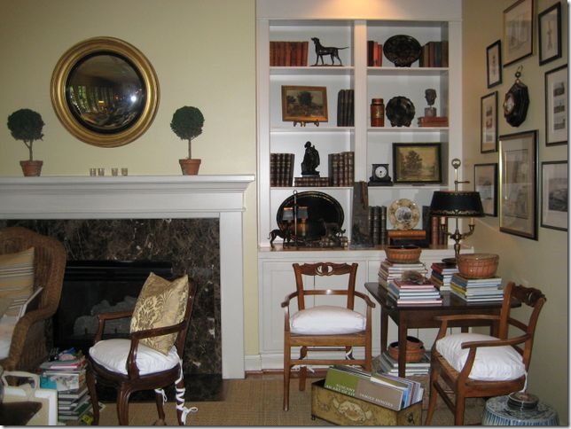
And across the room – the small game table and French chairs.
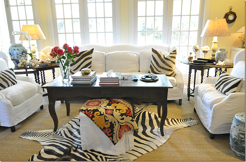
Several changes later – a new sofa and two wing chairs, along with an antique dough table from France.
Les Indiennes and brown velvet pillows.
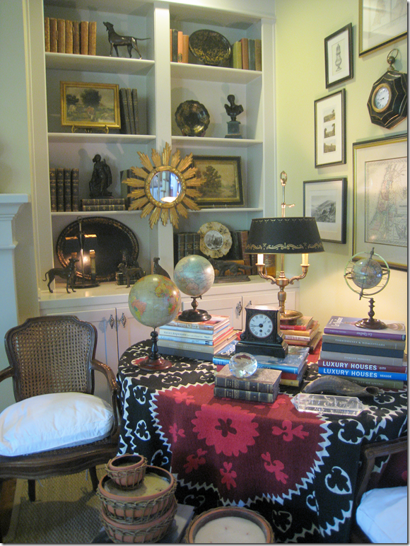
This suzani covered the wine tasting table that replaced the game table.
The next big changes: gray walls (Pratt & Lambert Feather Gray) replaced the yellow ones and new curtains were hung. The curtains were made of a taupe and white ticking stripe, very neutral, with just a hint of color.
The curtains ran from one end of the breakfast room to the family room. You can see the pattern in the fabric here – just very muted and quiet. Not sure why I just didn’t go with plain white linen which I love?
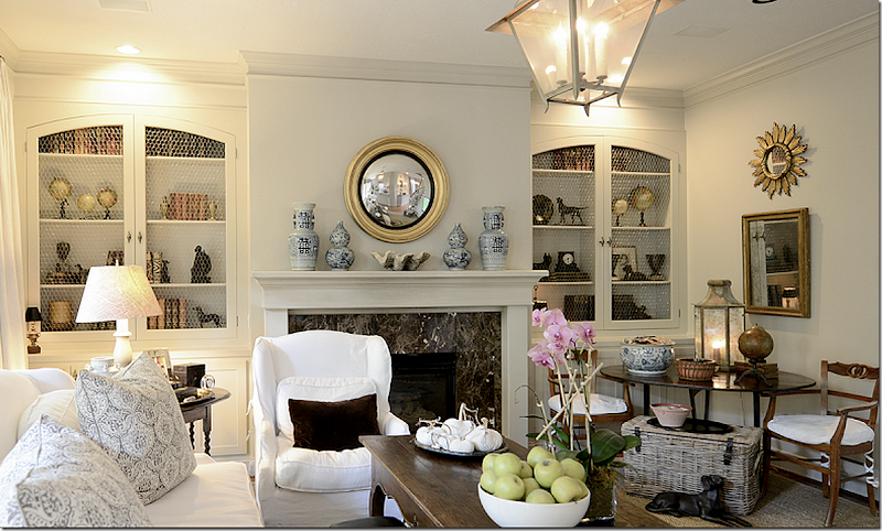
Another big change came when I added the arched doors w/chicken wire over the bookshelves – which I think helped tone down all the accessories on the shelves. The shelves made a big difference and, along with the curtains, helped quiet the room somewhat.
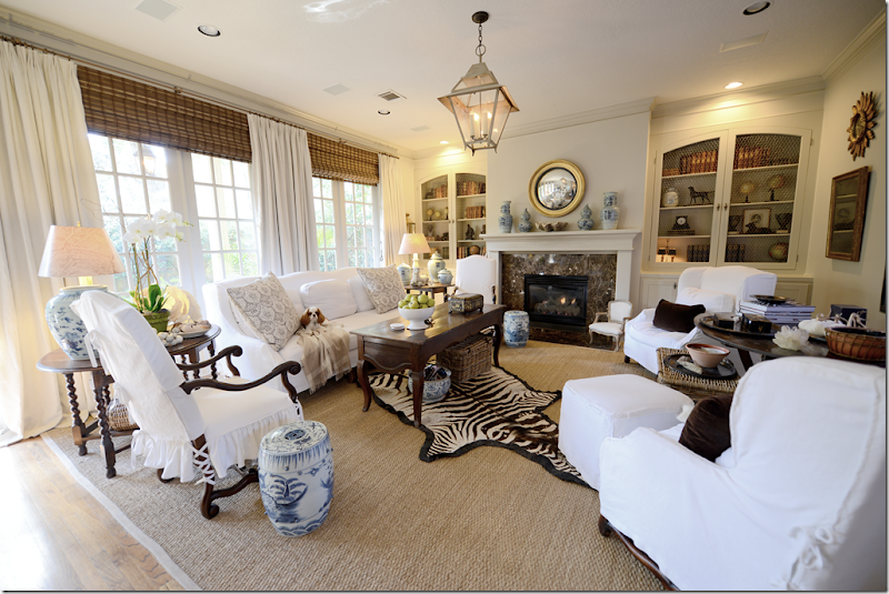
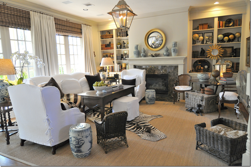
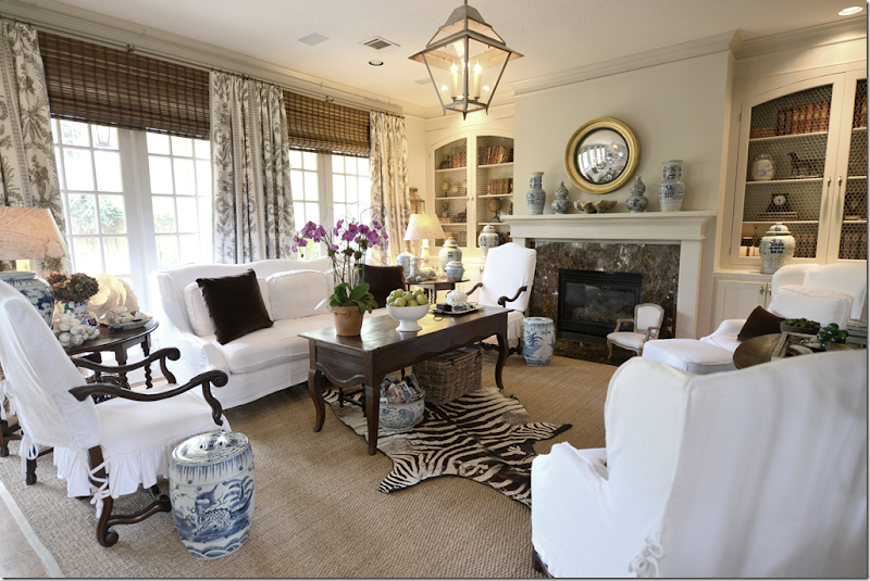
The last big change was getting the two new side chairs. Every time I showed this room on the blog – I would get so many negative comments about the furniture arrangement – “your wing chairs block the fireplace” or “the room is not balanced – you need to add something more on the right side” – and on and on. And, yes, I knew it was all true – so I finally bit the bullet and moved the two wing chairs across from the sofa, flanking the French wine tasting table – and centered underneath the flatscreen. The two new chairs I chose – from Hien Lam – were purposefully tall and narrow to create a variety of heights in the room. Their top is arched, just as the sofa and wing chairs are, and they have pretty French wood (Os de Mouton) legs. That’s sweet Tucker on the sofa!
Lucy, Tucker, and Micki!
But by far the biggest change in this room was the puppies. For the past two years – we have had 4 puppies here. First, we had Elisabeth’s Lucy, then our new puppy Micki and we also had two puppies who stayed here quite a bit – my nephew’s two puppies – Riley and Tucker. And all four are Blenheim Cavalier King Charles Spaniels! One of the puppies (not naming names!) chewed up the miniature wicker chair and the wicker dog bed, the zebra rug, and a host of wicker baskets, amongst other things. Plus, we have had lots and lots of puppy “accidents.” Thankfully seagrass is very price friendly, easy to clean and cheap to replace.
But, the biggest problem became the curtains. While I love a puddle on curtains of 3, 4 or 5 inches – so did the puppies. Day after day I would find the puppies laying on the curtain puddles and no matter what I did – I couldn’t break them out of this habit. After a while, it became a real problem – I had to have the curtains taken down and cleaned, more than once, which actually didn’t really help at all. They would return “cleaned” with all the puppy spots intact.
In order to stop the problem, the curtains needed to be shortened and as long as I was making a change, of course I wanted to make a BIG change – more pattern and color. Monica – from Custom Creations by Monica – whipped up new curtains in just a short three weeks – before I really even had time to think it all through!
And here is how the new shorter curtains came out:
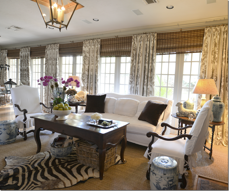
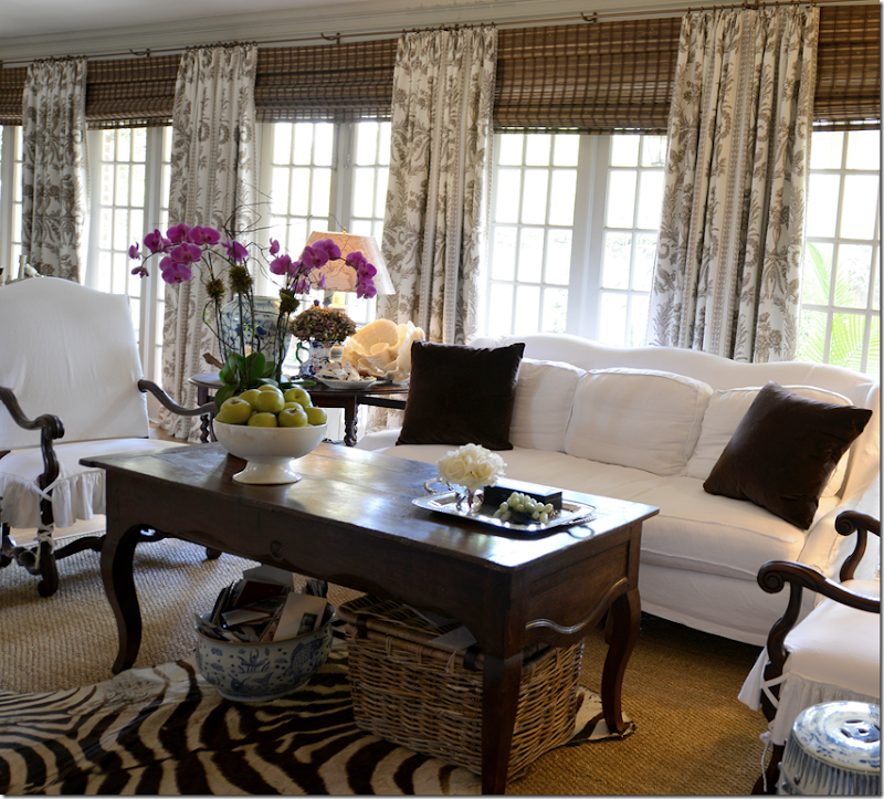
I chose a brown/gray/white toile from Vervain. I love the way the pattern is so vivid and it really warms up the room. I was just craving some pattern and color in this room – and the curtains gave me the perfect opportunity to satisfy that itch.
The difference the new curtains make is huge – though it’s not as easy to see in the pictures – and the entire room seems cozier, warmer, and more alive. It makes me want to use patterned curtains everywhere! I’ve tended to shy away from busy patterns on curtains, but doing this in my own house gives me the confidence to go with more pattern, more color in clients’ houses. So get ready!!! Here – you can see how the curtains cover the entire back wall - from the breakfast room to the family room.
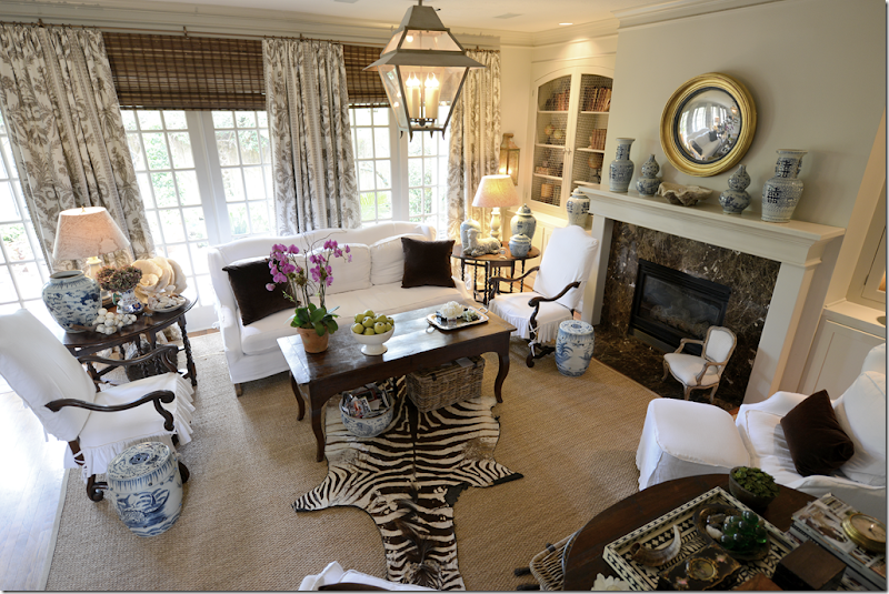
Looking down from the stairs to the family room. As always – I paired the curtains with shades – to hide the dead spot of drywall between the crown molding and the top of the windows. Also, all the curtains are lined and interlined with blackout fabric – which keeps the sun from showing through the fabric, allowing you to see the pattern vividly. Plus, the added weight of the blackout lining adds to the lushness of the curtains. We puddled these curtains only 1/2 inch – so that the puppies can’t lie on the curtains, yet they aren’t too short or skimpy looking. I don’t ever iron in pleats in curtains. I like them unstructured and loose and full looking – rather than two stiff looking panels of ironed fabric.
If I want to brighten up the room, I have hot pink linen pillows I could add, but I still like the brown velvet. Maybe next summer I’ll try the pink pillows.
The toile is Vervain:
The fabric is Vervain’s linen Doucette in Pewter HERE.
And speaking of curtains paired with textured shades:
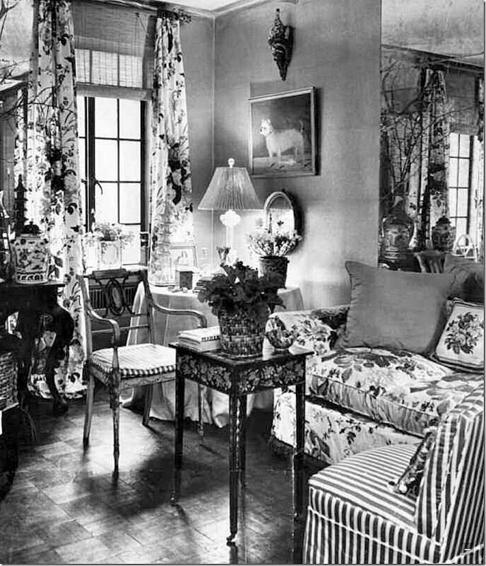
Mario Buatta’s 2nd Apartment from the early 60s.
While perusing Mario Buatta’s new design book, this image really struck a chord with me. It shows his second apartment for the early 1960s – done in all Rose Cummings chintz and stripes – and antiques. But, who wouldn’t want this as a sitting room today – with the gorgeous tea table, the beautiful antique chair, the silk covered skirted table, the plant stand? I would add a rug, and call it a day. Amazing that this photograph is now over 50 years old, and is it really that far off from something Miles Redd would do today?
Of course the curtain treatment really caught me eye – how perfectly Buatta executed them. Notice he brought the rod up over the window and placed it right under the ceiling – thereby elongating the view and fooling the eye into believing the window is taller and grander. He covered up the tell-tale drywall dead space with the ever-chic rattan shade. And for even greater effect, he recreated the shape and size of the window with the aged mercury mirror behind the sofa. By mimicking the window, he makes the tiny room look twice its size.
Antiques don’t date, and neither does good design. And this image just goes to show the anonymous commenter is way off his mark - who insisted that textured blinds are a product of the south, used only in Texas, by inexperienced designers like myself. Had to laugh seeing the New York born and bred Mario Buatta using textured shades in the same exact way we do in Houston, Texas.
Speaking of Mario, I mentioned that we interviewed him on the Skirted Roundtable last month – so be sure to give it a listen HERE.
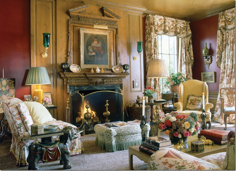
Buatta’s ageless and timeless look. His book shows over 50 years of his designs – and it’s hard to say which is his new work versus his older work.
To preorder Mario’s book – click on the book below.
double click the book to order!
And finally:
We have chosen the seven winners in the BROWN giveaway – after Labor Day Sale!!!
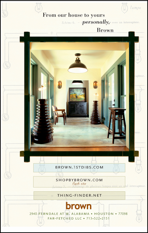
As you may recall, BROWN, that fabulous décor/lighting store in Houston hosted a large sale after Labor Day – and ran a contest searching for seven winners in honor of Cote De Texas’ 7th year of blogging.
Jill Brown – besides being so talented and creative – is also one of the sweetest, most giving human beings I’ve ever known. Truly, she is a doll and a real mensch.
Jill hand picked ten items for the giveaway – and here are the pictures below. The first place winner will pick the item she wants below, then the 2nd place winner will pick her item, then, the third place winner – and so on and so on until all seven winners have picked their prize.
The first place winner is : Patsy Fox
Patsy has her pick of any of the ten gifts below. Once Patsy picks, the 2nd place winner, Jeri Windrow gets to pick her gift – and so on, until all seven winners have picked.
Have I said how much I LOVE Jill Brown?
Here are the 10 prizes being offered by Brown – in no particular order:
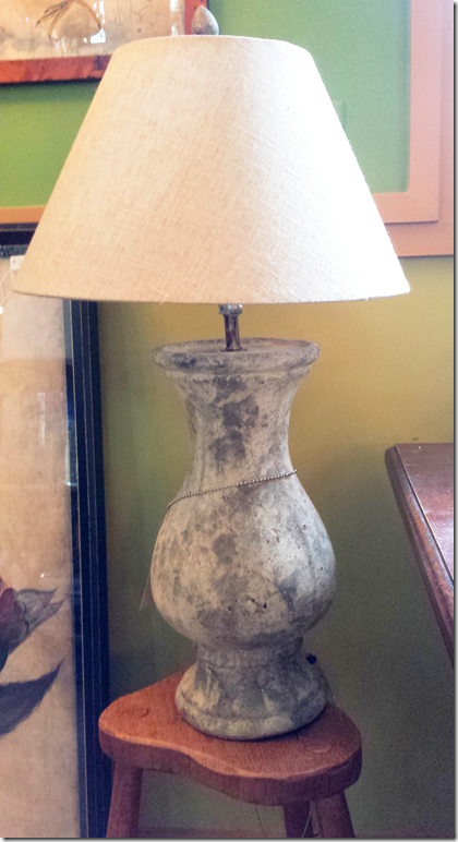
A pair of cream table lamps with their shades, valued at $450.
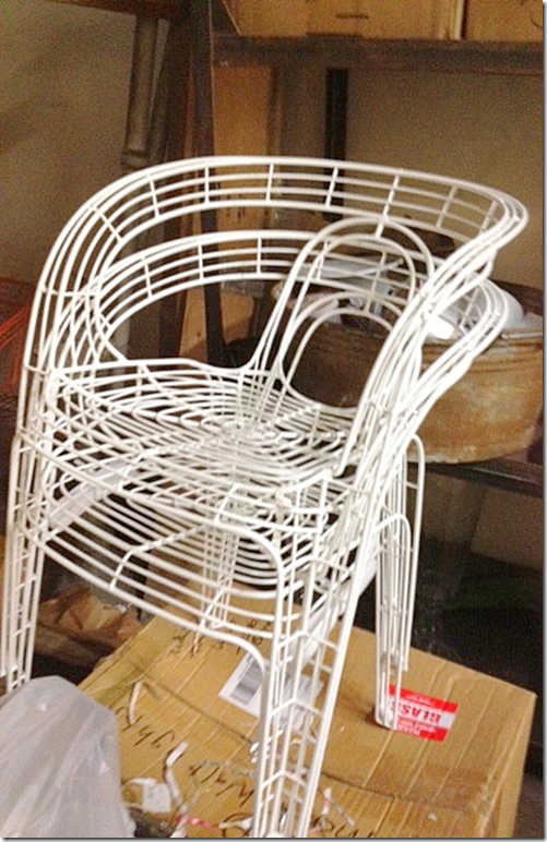
A set of 4 white Palacek outdoor chairs, valued at $1100.
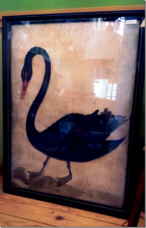
Black swan print valued at $750.
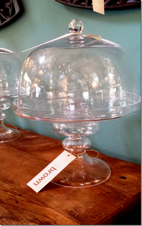
Glass cake plate with dome, valued at $235.
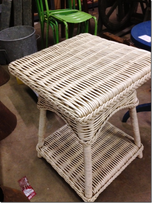
A pair of woven rattan side tables.
A large, geometric glass lantern.
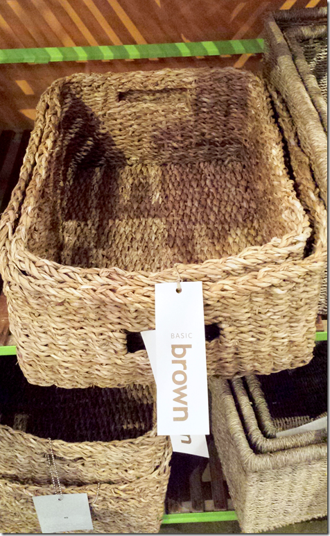
Set of Seagrass Baskets, valued at $100.
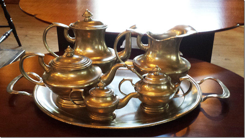
A pewter tea set, valued at $750.
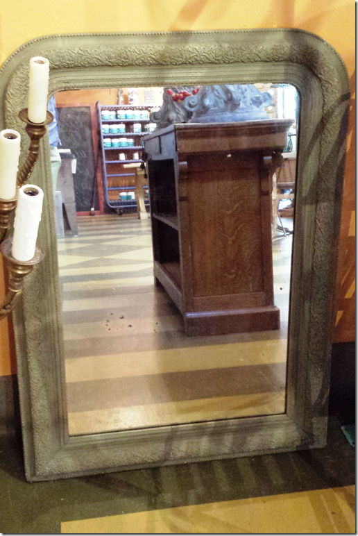
An antique mirror, valued at $975.
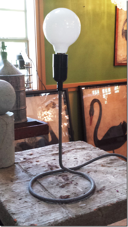
Charming coil table lamp, valued at $125.
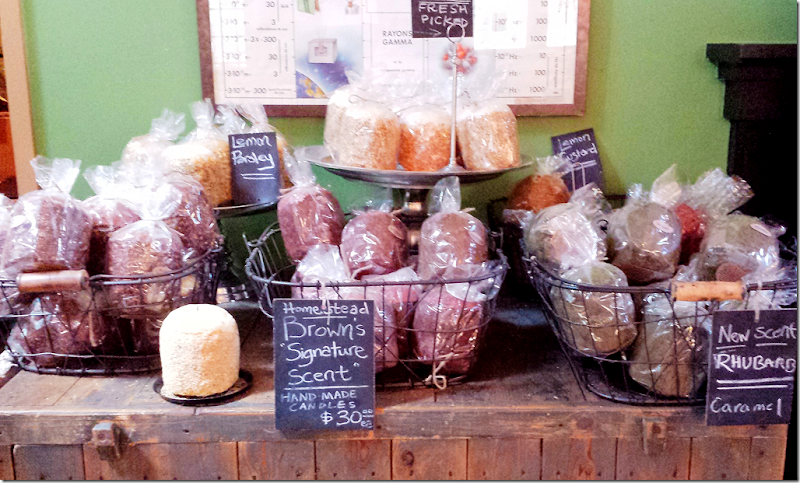
Six assorted hand-made candles, valued at $180.
So – as soon as I hear from the first place winner, we will then go onto the next six winners!
Visit BROWN HERE.





No comments:
Post a Comment