Here are two really adorable houses for sale in River Oaks. Although the houses themselves are typical for the neighborhood, their fabulous decor is what caught my eye. As you all know, well decorated houses are a true rarity on real estate web sites, so anything that looks half-way decent is a plus. These two houses are extra plus, IMO. Their decor just speaks to me: casual, warm, linen, antiques, seagrass, slips, lanterns, mirrors – all the design elements I love. The first one has been for sale for a while so if you are from Houston and you stalk HAR, you’ve no doubt seen it. Why is it still for sale? Myself, I would buy it in a minute (furnished, of course!) and have trouble figuring out why no one has. I guess it’s the economy, stupid. When looking at the two houses, try to imagine which one you would prefer to buy. The first one is twice the size of the second and it’s kitchen is nicer. The second one’s backyard is a knockout. Both are great family homes, though the second house would be a great empty-nester home too. Both have great locations, inside one of Houston’s best neighborhoods.
House #1
The first house was built in 1937 and has 4700+ sq. ft. There’s a downstairs gameroom, along with formals, family room, and 4-5 bedrooms, 4 full and 2 half baths. There are full living quarters with a kitchenette. The ONLY drawback I can see is no garage, but still…come on, someone – buy this!!!! It’s beautiful! Look how cute the front is with the striped awning, iron Juliet balconies and great landscaping.
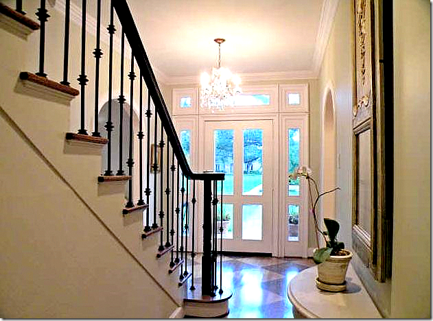
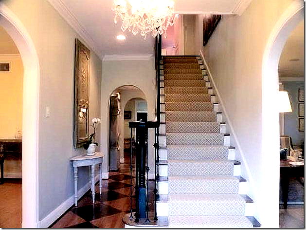 The real estate brochure says the house is “like a page out of Veranda Magazine” and it really is. I love the textured, patterned runner on the stairs and the painted foyer floor. There are antiques everywhere, like the gray painted trumeau on the left wall and the Mora clock further down the hall. I apologize about the pictures, but the owner didn’t ask me to come take my own pictures – though I would LOVE to, hint..hint. HAR needs to post better photographs.
Totally updated – I really like the front door, how bright and open it is.
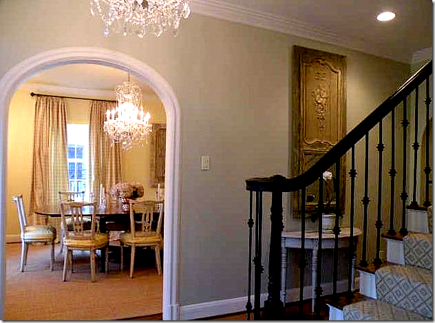
The foyer divides the dining room and the living room. I love the gray walls here – I would probably repaint the banister a little lighter, maybe a pewter color, but that’s just me.
Love the way this is decorated with the soft blue and white stripe fabric on the chairs and the silky striped curtains. Love it! Love the custom cut seagrass. Love all the dainty French chairs. Does anyone know who the decorator was - I’m dying to know.
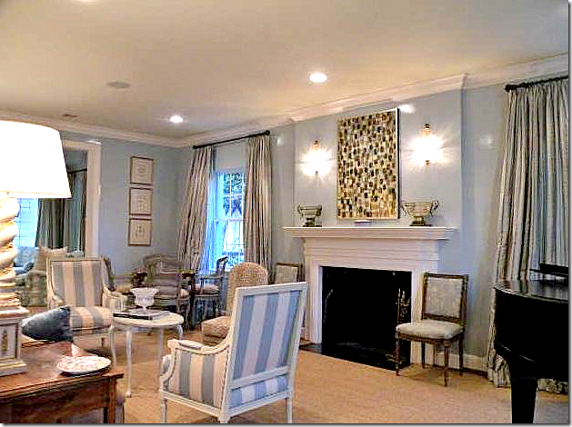
Another view of the living room. I love the animal print on the accent chair. Love the blue walls – you don’t see that much true blue lately, but it’s so fresh and calming and feminine. The whole house has a wonderful feminine vibe to it which is why I like it, I’m sure. You can glimpse the family room through here.
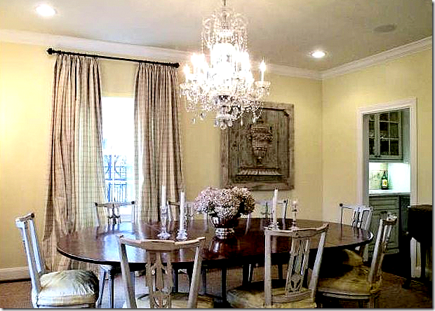 Oooh. gorgeous! I love the soft silky check curtains and the architectural plaque. Love the crystal chandelier. Love the chairs! To die for! This is my favorite room in the house, crazy for it.
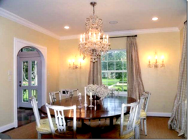 One more time. Of course the seagrass is perfect throughout – 2 inches, custom cut, the only way it ever really looks right. Apologies for the quality of the photos! HAR – let the realtors put larger and better photos on your site!!!
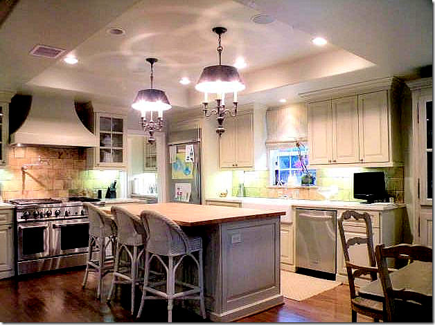 The dining room connects to the kitchen through the bar (seen next to the range). Love the range hood and the lighting fixtures. Love the painted cabinets. The back splash is from Chateau Domingue in Houston.
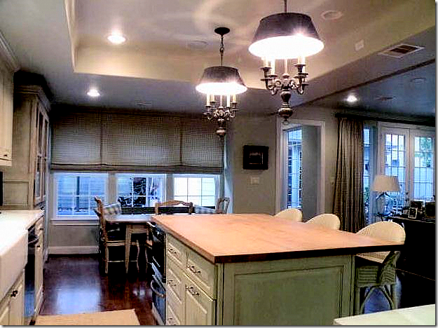 Looking towards the breakfast area and the family room. I would probably put white marble on the counter instead of wood if I moved here. Of course, there’s a farm sink. Not sure what the shades are made of, but I really like the style. And I would love to see the gray painted cabinet on the left. It looks fabulous.

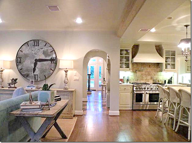 Looking from the family room and kitchen into the foyer. Love the way the arches are continued through the hall to soften the look and add an interesting architectural touch.
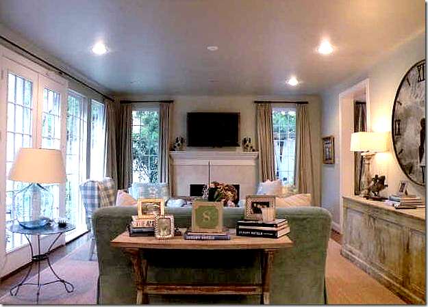 I wish we could see the chairs flanking the fireplace – it looks like they might be covered in a Colefax and Fowler linen, hard to tell. Love the check on the wing chair – that actually does look like a slipcover. Oh well…I would have taken pictures of the chairs if they would have only asked me!!
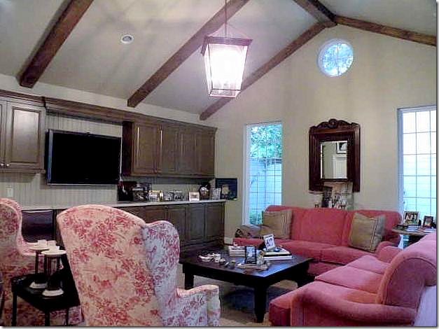 I THINK this is the game room which might be in the converted garage space, overlooking the courtyard, though I’m not positive. I love the color scheme here – raspberry. And I love the Brunschwig and Fils toile on the chairs. Great lantern. What a nice, large space.
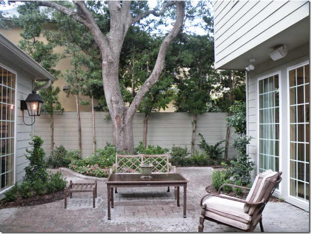 The brick courtyard. The family room is to the right. I believe the pink room is to the left. Another great lantern. What a nice outdoor space. Who needs a big backyard when you can have something so pretty?

House #2
The second cute house is also in River Oaks and is about $500,000 less than House #1, but, it’s 1/2 the size with only 2300 sq. ft., 3 bedrooms, 2 1/2 baths, and again, no garage – just a carport. BUT, add an additional 580 sq. ft. for a pool house with kitchen AND a pool. Built, again, in 1937, this house actually is option-pending.
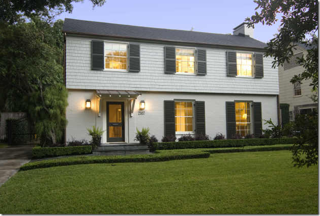
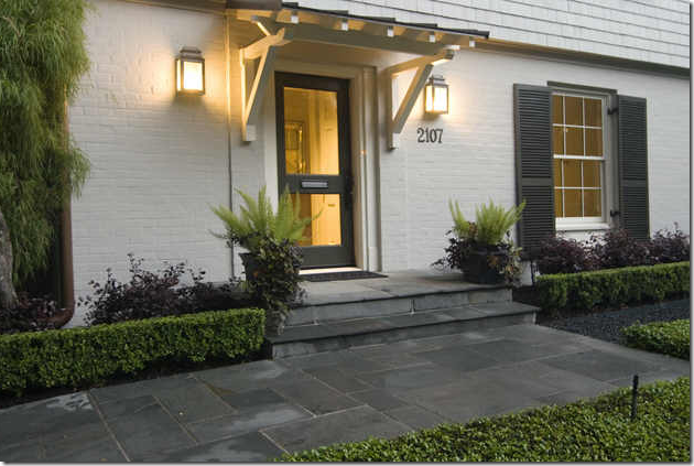
Nice curb appeal with landscaping and a slate porch.
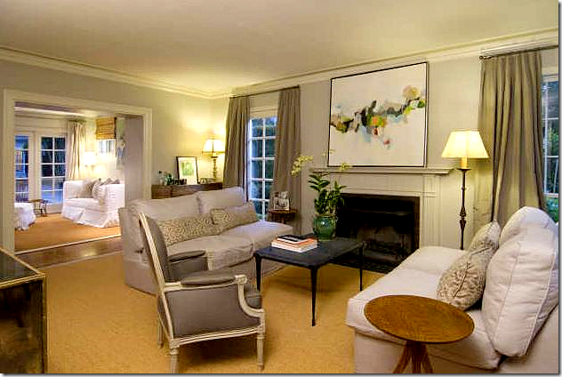 The living room is all shades of gray. Slipcovers, French chairs, and custom cut seagrass.
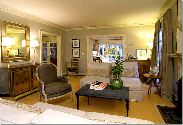 Another view, facing the back family room. Very pretty wall color – a grayish blue color. This decor has a more eclectic feel – with less antiques than house #1.
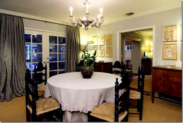 Dining Room: Great curtains – full and luscious. Perfection!
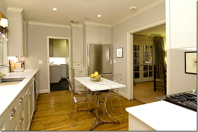 The eat-in kitchen is off the dining room. I like the antique iron and marble table with the lucite chairs. The kitchen is smaller than House #1, but it has wonderful marble counters and great appliances!
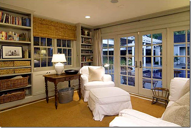 The cozy family room is all white slip covers, baskets, seagrass, and bamboo shades = love it!!! It’s perfect!
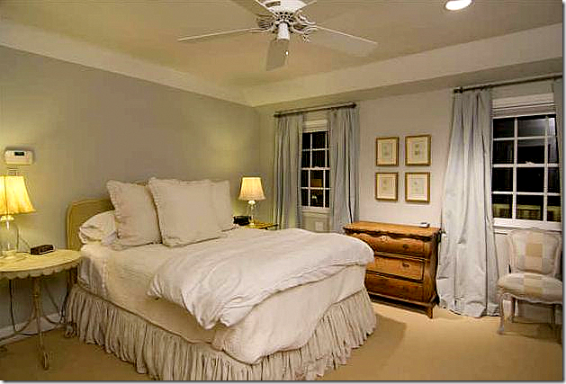 This must be the master bedroom with white linens and light blue curtains and walls. Again, a very pretty and soothing color.
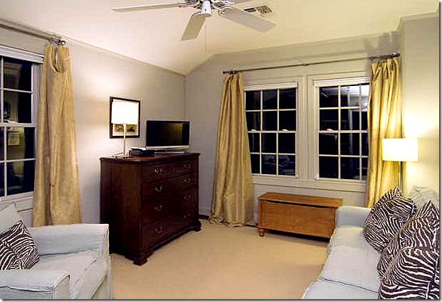 Love this room with the light blue slips and the zebra pillows. Love the khaki colored curtains.
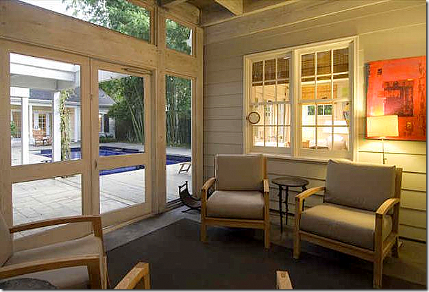
The screened porch off the dining room and family room overlooking the fabulous back yard.


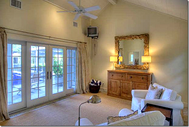 Inside the pool house – more white slips, linen curtains, seagrass. I would probably let this be Elisabeth’s room. It even has a bath and a kitchen. She could live her when she got married, too! Her father would love that. ;)
OK – here’s the question: would you buy house #1 or house #2? House #1 has twice the space, but no pool. House #2 is smaller, with just 3 bedrooms, but it has the fabulous backyard and pool. Hmmmm. This is a tough one. I might go for #2 since it’s so much cheaper, plus I would then get the great pool. But, house #1 has a better kitchen and so much space inside – you could always add a little pool or fountain in the courtyard!!! OK, here’s my choice: money no object: #1, money an object: #2.
Reminder: New Skirted Roundtable with Scot Meacham Wood HERE.


No comments:
Post a Comment