Since starting the Readers Kitchen series – sometimes I get a fabulous entry and wonder what the rest of the house looks like. And certainly, after seeing today’s kitchen – I was curious if the other parts of the house were as great looking. So, in order to show you entire Readers Houses – I’m starting a new series called, of course, Readers Houses. Send in your houses!
Today’s house is located in Frankenmuth, Michigan – where that is - I can’t even imagine!!! Sounds so exotic and just a little scary. Actually, the town is located between Flint and Saginaw, not far from the great lake. The house is located outside of town in the countryside, across from the Cass River. The owner is an interior designer, Angie Gren, who, along with her husband, built the house several years ago after moving there from Los Angeles. It was modeled after the 1930s and 1940s English styled houses found in the California. But, I think the house would look at home anywhere on the east coast, including the Hamptons. The warm and inviting interiors are a study in contrast with all white walls and dark hardwoods. The furnishings are a mix of Swedish, French and slipcovers – my favorite!!
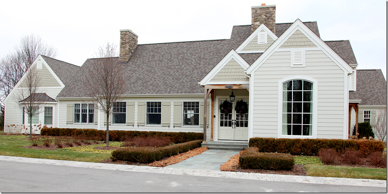
Located on a wide lot – the house has wonderful gray shutters. To the right of the front door is the dining room. The family room is located to the left. On the far left, with the bay window, is where the master bedroom suite is located. Inside, a long, wide hall runs along the backside of the house – connecting to the all the major rooms.
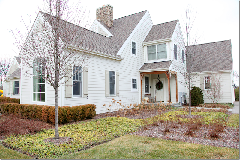
The side view – the dining room is on the left. The back door leads to the kitchen/breakfast room. The garage is to the far right.
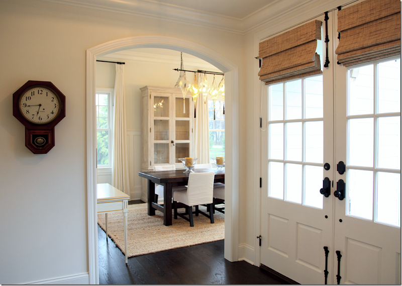
Entering the double front doors – major decorative elements found here are seen throughout the home: dark hardwoods, white walls, textured blinds paired with ivory curtains, and dark oil rubbed bronze hardware. All these elements create a contrast between light and dark, which is a decorative theme. The dining room, with its high ceiling and paneled wainscot, is to the immediate right through the arch. The light fixture is Fortuny, the table is custom, and the chairs with white slipcovers are from Quatrine. The wall color throughout is a custom mixed creamy white.
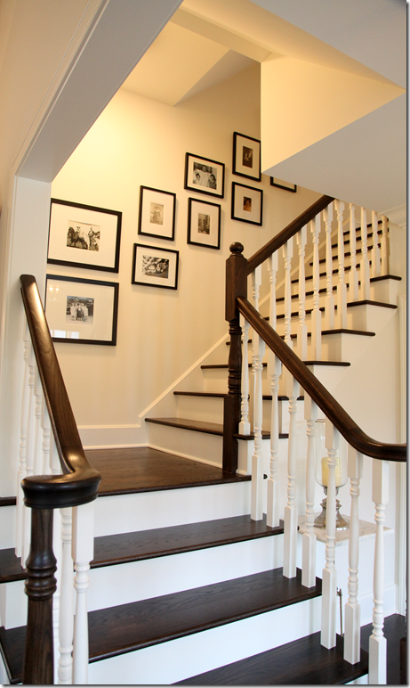
Facing the front door is the staircase leading to the second story. Throughout the house are family pictures – framed identically.
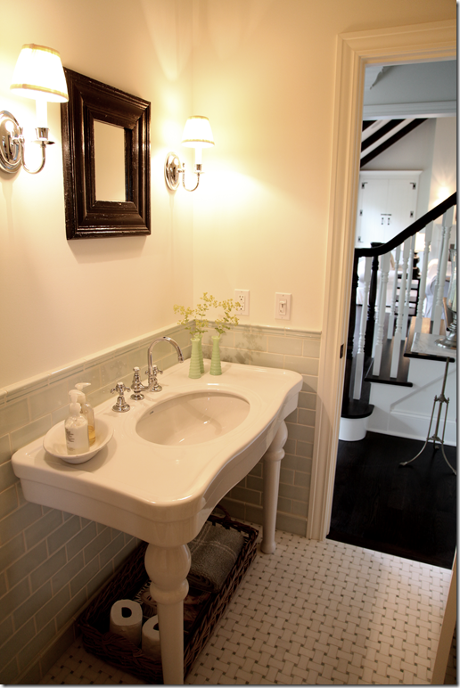
To the right of the staircase is the powder room with its pretty green subway tiled walls. You can see the living room past the stairs in this picture.
I’m crazy for this toilet.
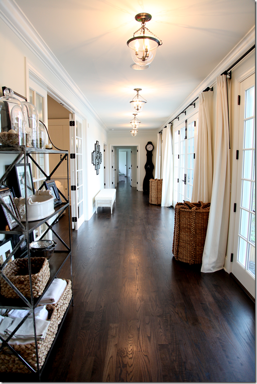
Architecturally, the back hall is a major element – it runs along the entire back of the house, overlooking the pool area. Bell jar light fixtures run along the hall, as do the ivory curtains. To the left is the living room room. Towards the back near the Mora clock is the master bedroom suite. The large baskets are from Pottery Barn, the Swedish clock from Lone Ranger antiques, and the vintage French bakers rack is from La Belle Maison in Ann Arbor.
A closer view – showing the back French doors leading to the master bedroom, closed. I love the oversized baskets – they are found throughout the house.
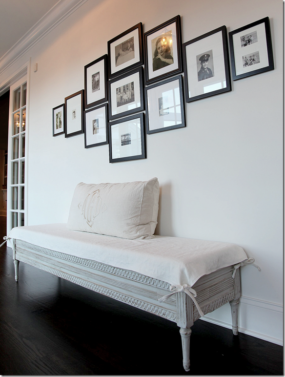
Closeup of the Swedish antique bench from Lone Ranger. The back cushion came from a monogrammed valance in a previous house. More family photos in identical black frames.
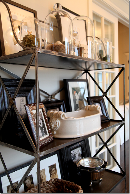
Closeup of the French bakers rack with cloches and bird nests.
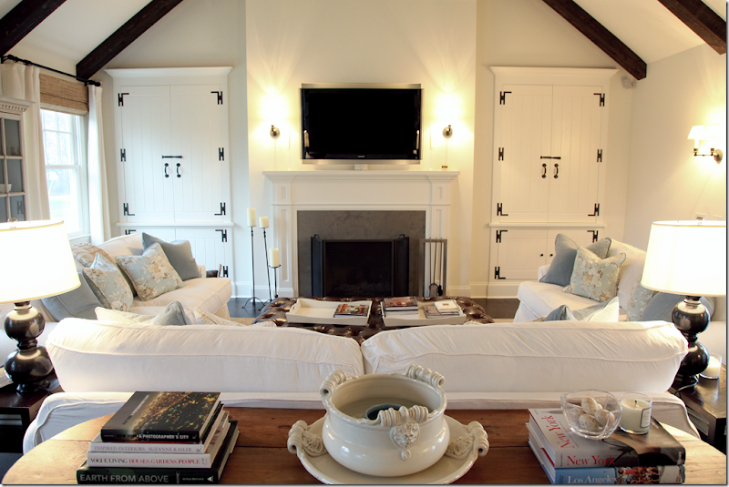
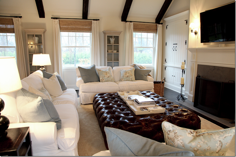
The main living area – the front windows are on the left and to the right through French doors is the back hall. This room, with its tall vaulted ceiling is filled with white slipcovered sofas paired with assorted light blue pillows. Notice the charming cabinets that flank the fireplace. The large, yet cozy, room is perfect for a house located out in the country!!
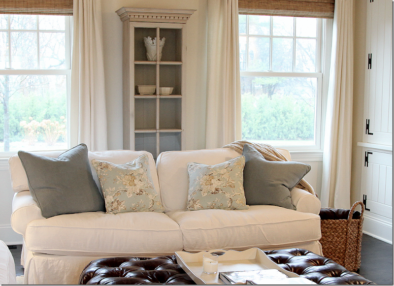
The large tufted leather ottoman is from Rachel Ashwell’s Shabby Chic in NYC. The three sofas are Mitchell Gold. The pillow fabrics are Barclay Butera. The two matching Swedish cabinets along the front windows are from Lone Ranger Antiques and are filled with the assorted white pottery that the owner collects. Underneath is a muted Oushak styled rug. I love the way this room is decorated – with the dark and white contrasts and the touch of light blue - just beautiful!!
Closeup of the pillows and Swedish cabinets.
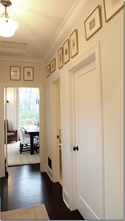
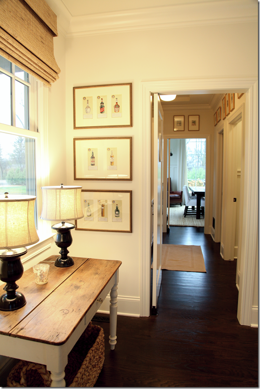
Connecting the kitchen with the dining room is this large butler pantry. Through the right door is the powder room which connects through its other door to the entry hall. Above the doors are a collection of vintage French advertisements bought in Paris. I love how all the hanging fixtures replace recessed lights.
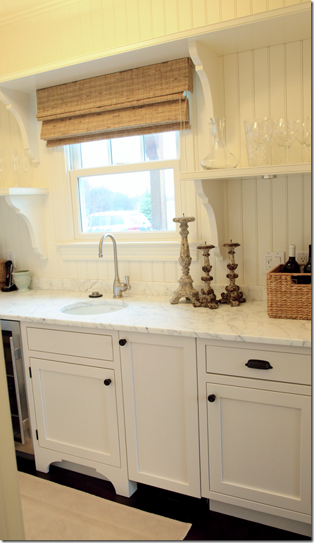
The butler pantry has white marble countertops and beadboard walls. Charming!
The butler pantry leads into the kitchen/breakfast room. Along the wall are vintage Alcohol prints from Paris. The farm table is from France. You can see the dining room at the end of the butler pantry.
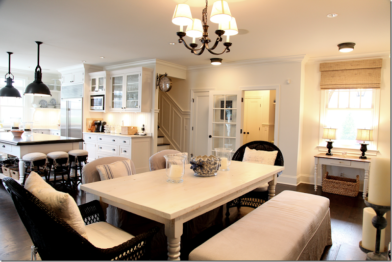
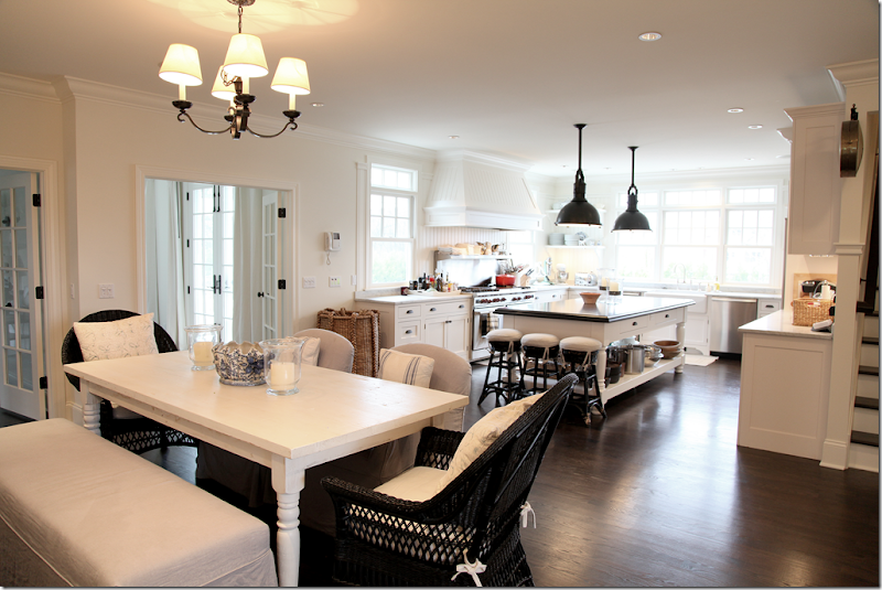
A view of the breakfast room and kitchen. To the far right is the area that leads to the butler pantry and dining room. The kitchen overlooks the back yard and on the left – the courtyard/swimming pool. Angie, the homeowner is a former chef – so the kitchen was designed just for her!
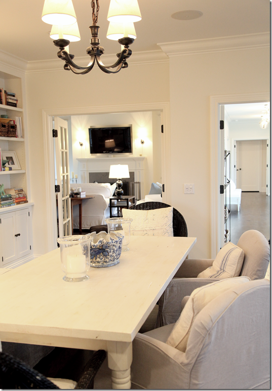
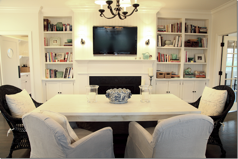
And looking the opposite way at the breakfast room with its own fireplace and beadboard backed bookshelves that house Angie’s extensive cookbook collection. To the back left is the butler pantry. To the right is the living room and the back hall.
The breakfast area – through French doors on the left is the living room. On the right, the French doors lead to the back hall and swimming pool area.
The wicker chairs are from Mainly Baskets. Originally they were aqua, but Angie spray painted them black instead. Good choice I think. The table, slipped chairs and slipped bench are from Rachel Ashwell Shabby Chic Couture. Notice the porthole window in the swinging door that leads to the butler pantry – so charming!
Here you can see the slipped bench. Pillows were made from vintage French feed sacks and Batik prints. The garage and utility area is through the French door on the right.
The view into the back hall through the French doors.
Angie says the kitchen was modeled after the one in Something’s Gotta Give. Just beautiful!
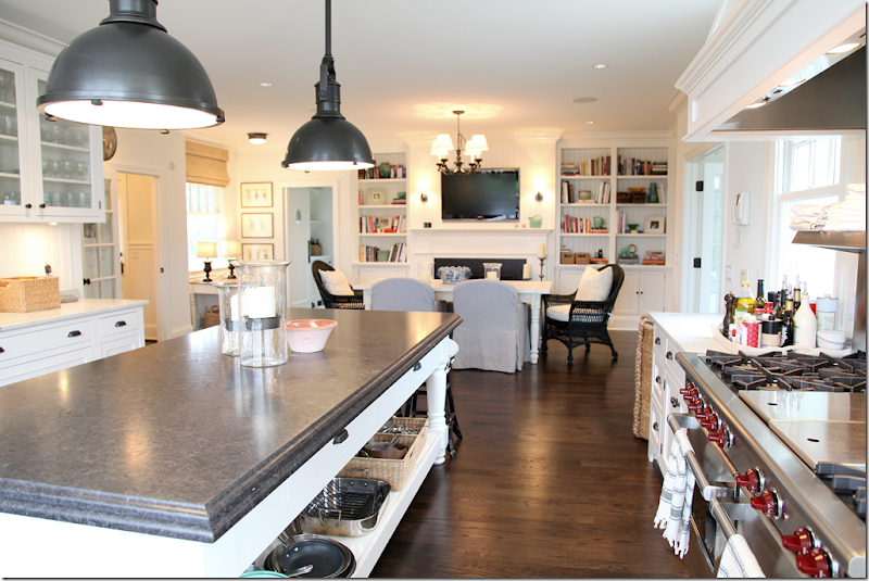
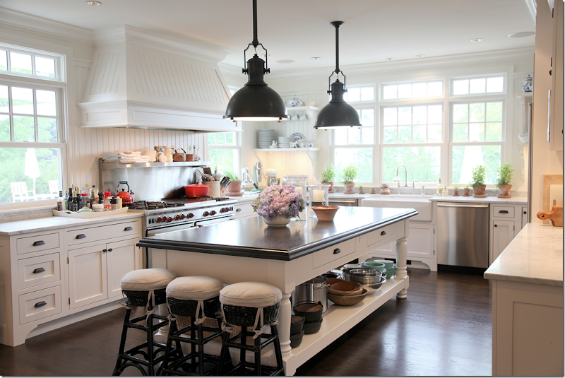
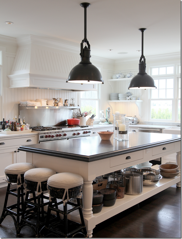
The homeowner modeled the island after a Swedish work table she had seen in an antique shop in the Hamptons. Topped with honed black granite, the bottom was left open for easy access to pots and pots. The light fixtures are from Visual Comfort.
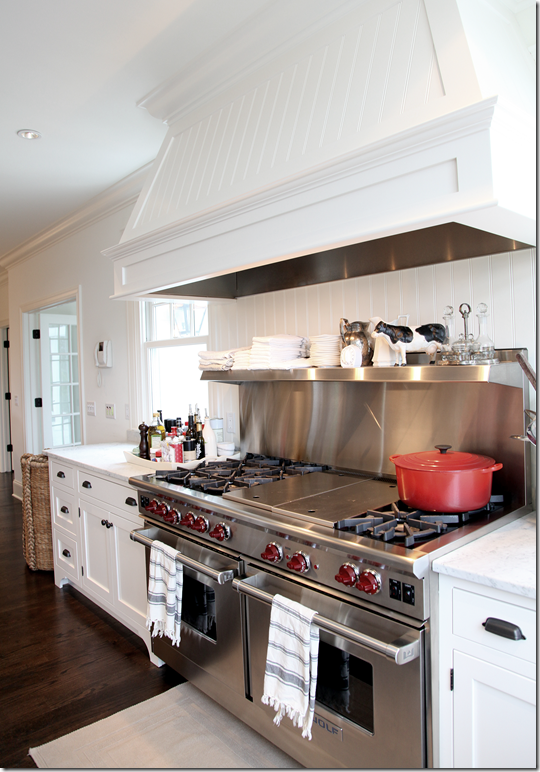
The homeowner wanted the kitchen to have an “old French working kitchen look.” She didn’t want the kitchen to have a polished look, so she opted for Carrara marble on the countertops instead of the dressier Calacutta Ora marble. The backsplashes are beadboard. The paint color on the cabinets is White Dove by Benjamin Moore. The cabinets were custom made on site. Open shelving at the back window keeps it all light and airy.
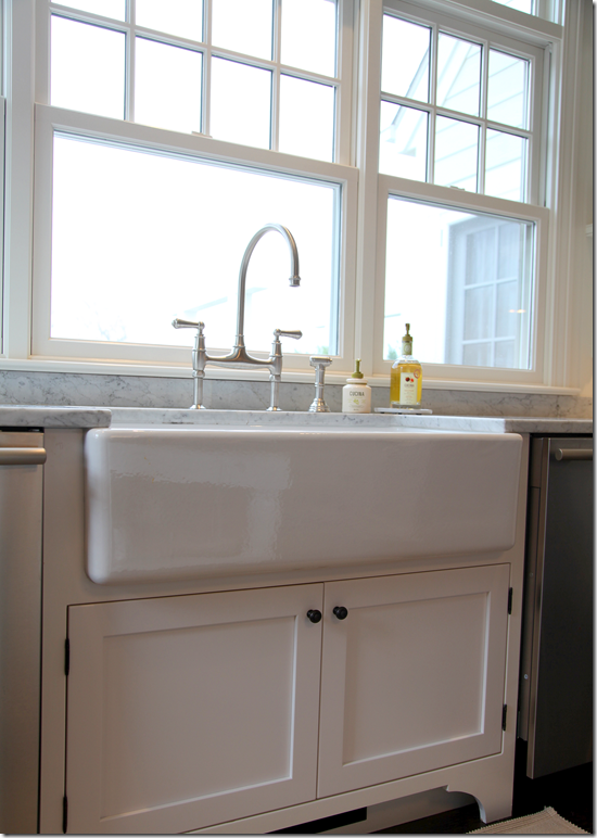
The farm sink is set between TWO stainless dishwashers – what a dream and it’s not even a Kosher kitchen!!!
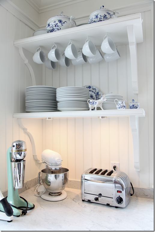
The shelves are filled with vintage Blue Onion dishes Angie received as a wedding present from her great uncle. The small appliances include a vintage malt maker which sees a lot of use. Love the turquoise color.
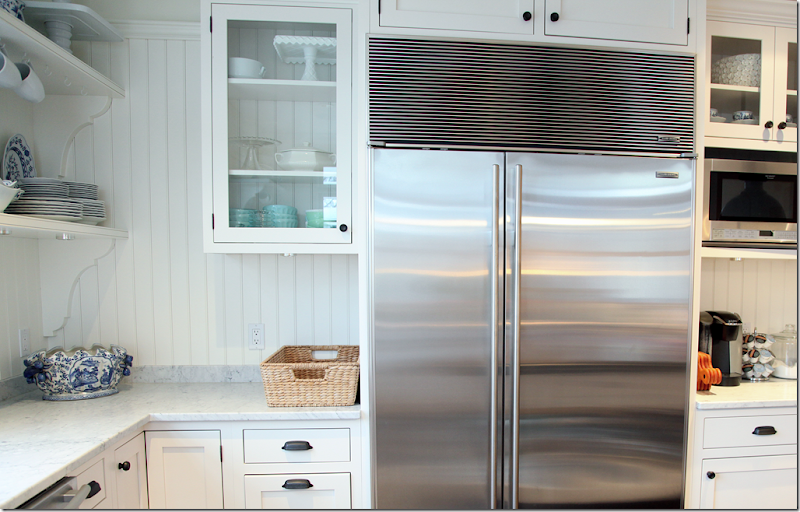
A view of the right side of the kitchen.
Wolf range. You can tell Angie is a former chef from all the cooking accessories she has.
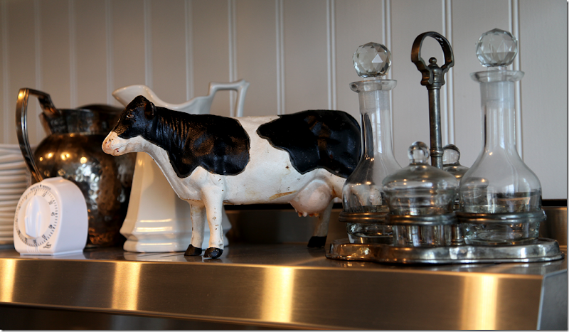
The antique cow reminds Angie of her new country roots.
My favorite part of the kitchen – the French clock from Maison Midi in Los Angeles. I want one of these sooo badly – and I have just the spot in mind!!
Leading to the master bedroom suite is this entry hall with its vintage dresser from Pom Pom in Los Angeles. The teapot is from Paris. The view is out the front of the house.
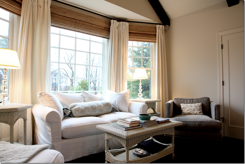
The master bedroom sitting area with its bay window that overlooks the front yard. The wicker pieces are from Mainly Wicker. Chelsea Editions and Belle Notte pillows. I love the window treatments - I like that they are the same throughout the house – it gives it continuity. I also like how the blinds are placed right under the rod – hiding the blank wall space. It’s so much more visually pleasing done this way.
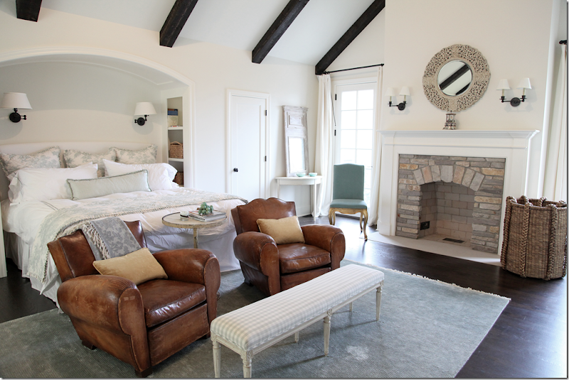
The master bedroom has the same vaulted ceilings as seen in the living room. The bed, with its Pottery Barn aqua Martine toile linens looks cozy set in the niche. In front are two vintage French leather chairs from Bountiful in Venice Beach, CA. The bench is Chelsea Editions, as is the demi lune table in the back corner. The rug came from Restoration Hardware. Lighting by Visual Comfort. The two windows flanking the fireplace overlook the backyard and swimming pool. I love this room!
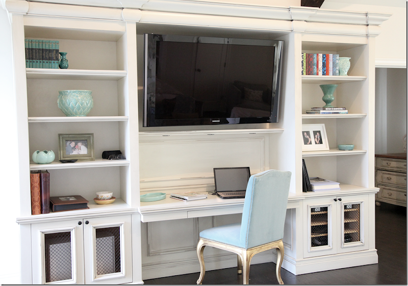
The media center/desk in the master bedroom. Chair is from Ralph Lauren – with vintage turquoise velvet. The turquoise pottery is seen throughout the house and is a great accent pop of color against all the darks and whites.
.
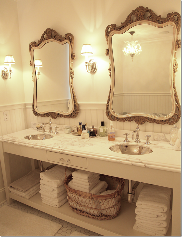
Master Bath: inherited vintage French mirrors are used with vanity from Waterworks.
The pressed nickel sinks are to die for!!!
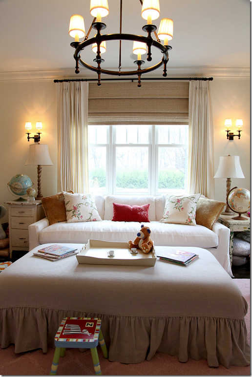
Between the living room and master bedroom, off the back hall is the daughter’s playroom with its practical slipcovered furniture. Once the kids are older, this will probably become the library.
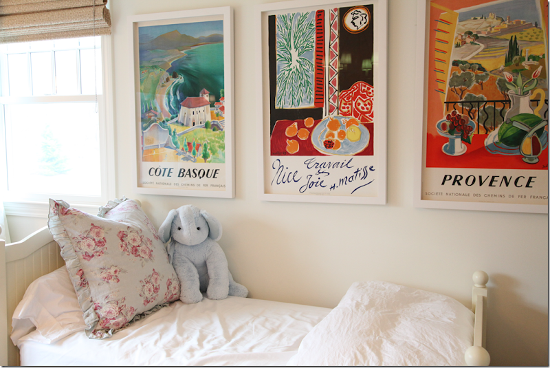
Her French posters are vintage, bought in Paris. I’m sure the daughter spends many a night in her playroom next to Mom and Dad.
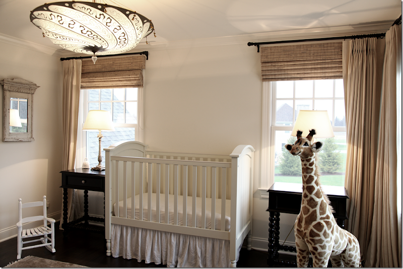
Baby boy’s nursery has a Fortuny light! OK – that’s a first! Lucky little boy. Custom linen curtains and Hunter Douglas blinds. Charming barley twist side tables from Portobello.
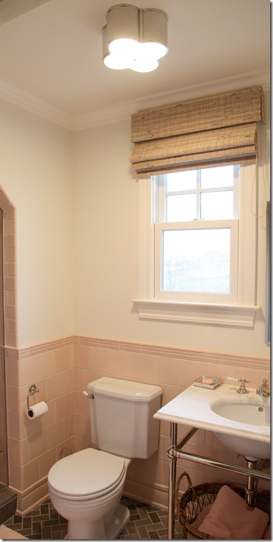
Such a darling pink tiled bathroom, with brown tiled floor. Visual Comfort Lighting fixture.
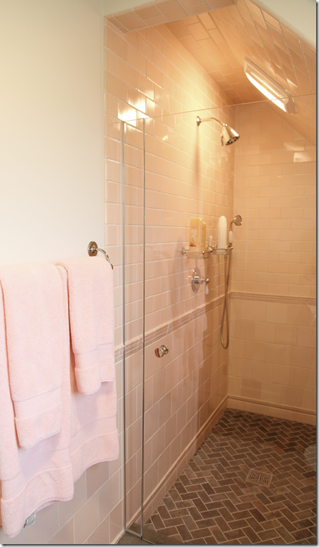
The shower, with its sloped wall. Tile and fittings from Waterworks.
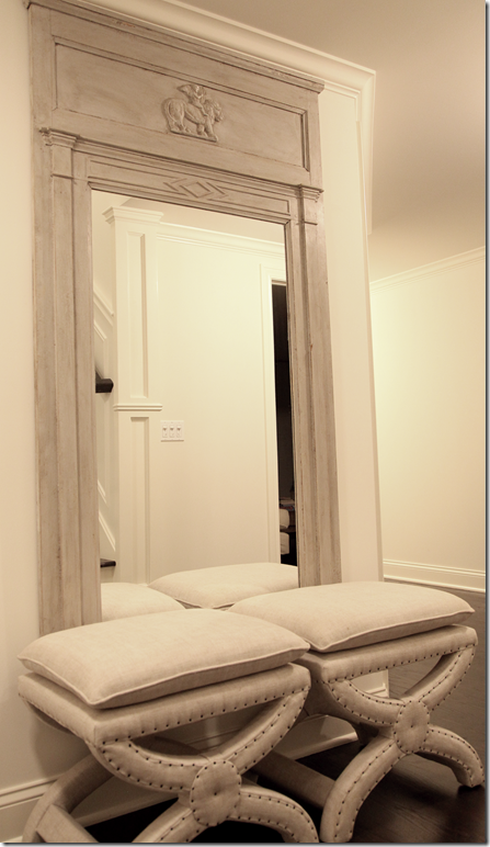
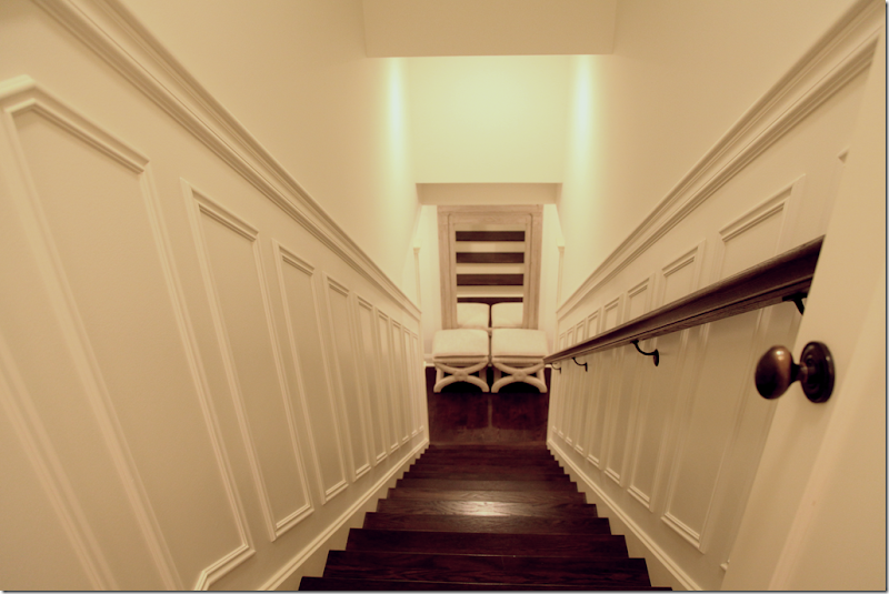
At the bottom of the basement stairs sits these stools from Restoration Hardware and an antique Swedish Mirror.
Even the basement stairs are beautifully finished out with paneled side walls.
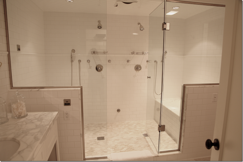
Check out the basement bathroom!!! Whoa!! You could have a party in that steam shower. Gorgeous.
I hope you have enjoyed the first in the series of Readers Houses! Be sure to enter your house!! To contact the homeowner, interior designer Angie Gren, email her at angi231700@aol.com
The Vero Linens giveaway was a huge success! So many of you entered. We have a winner – but I must say – I had to go through five would-be winners before I found someone with an email address! Be sure to always give me your email address if you enter!!!
As a special thank you for all the entrants, Steve of Vero Linen is offering a 20% discount, valid up to Valentine’s Day.
To obtain your discount, visit the web site at www.verolinens.com and when prompted, enter the code: verocote01 (that’s a zero one)











No comments:
Post a Comment