Today we have two readers kitchens to show. But as is usually the case, their houses are also pretty, so I thought you would enjoy seeing the other rooms and not just the kitchen. One house is in Austin, Texas and the other is here in Houston. And for those who say I only show white slipcovers – both houses are much more colorful! Enjoy!!!
AUSTIN, TEXAS:
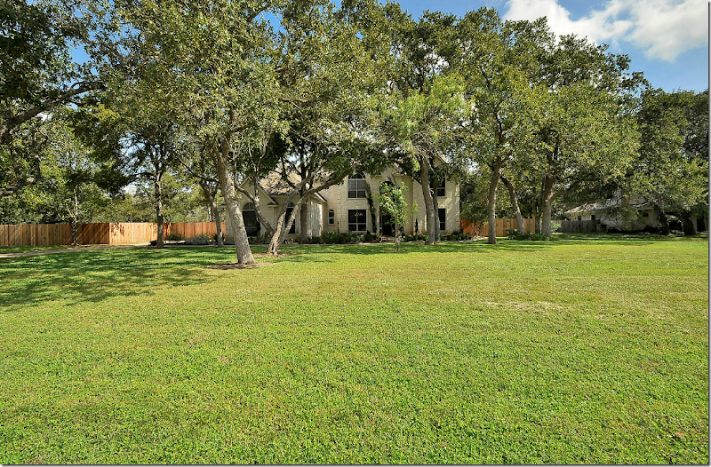
The first house is located on a huge residential lot that measures just over 1 acre. Look at the size of that front lawn! And the backyard is just as large. Can’t imagine how nice it must be to spread yourself out on all that land! This house was built in 1994 and the owners gutted the kitchen when they moved in. There was laminate flooring and carpet and brass hardware throughout, which the owners also replaced. The house is 4 bedrooms and 3 baths and is just under 4,000 sq. ft. It was placed on the market and they got a contract on the first day it was listed! Amazing.
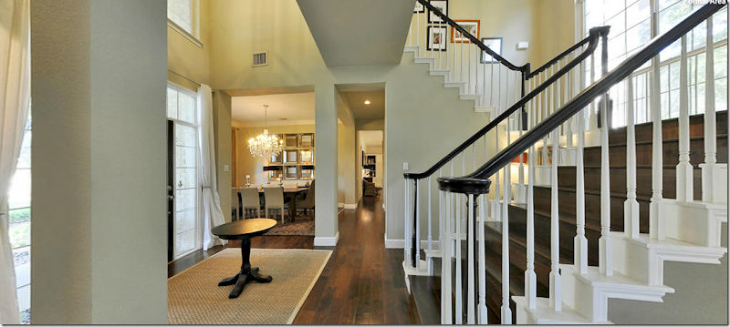
Walking through the painted black front door, you enter a two story foyer with a staircase that connects to a landing which spans the area above the entry. On the left is the dining room and on the right is the office and living room. Aren’t those stairs pretty?!
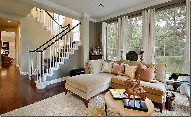
Looking towards the right at the office and the living room. The stairs have wood treads which makes it look so rich. And I like the black bannisters. I’m thinking of painting my stained brown ones black too. I keep seeing that look and really like it.
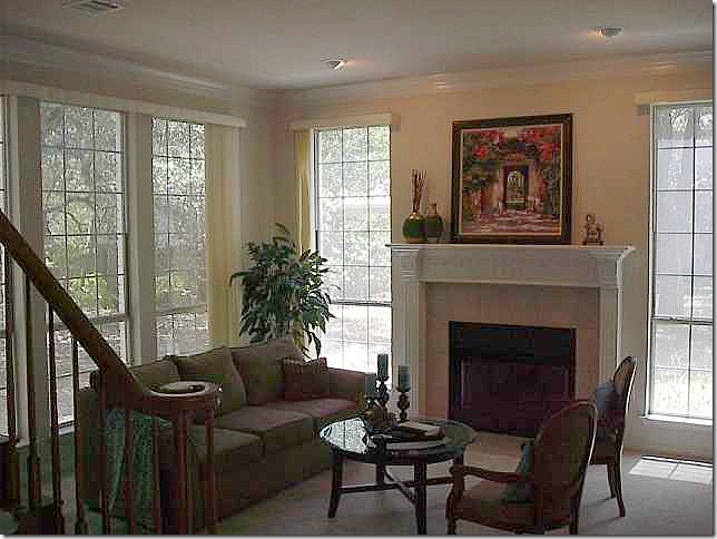
Here is the before picture of the living room. You can see the bannisters used to be brown before they were painted the rich black.
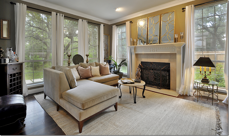
And after. The owners put down hardwoods throughout the downstairs and much of the upstairs. They painted the walls a deep green-gray shade and added a new fireplace screen.
Another view towards the staircase which is the focal point of the first floor.
And looking from the living room to the foyer.
The office, right off the front door, also now has hardwoods. Love those blue lamps with the red leather sofa.
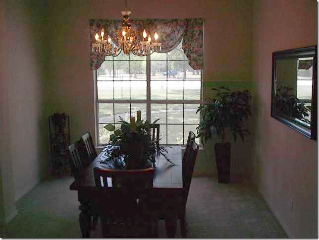
Before: The dining room was carpeted.
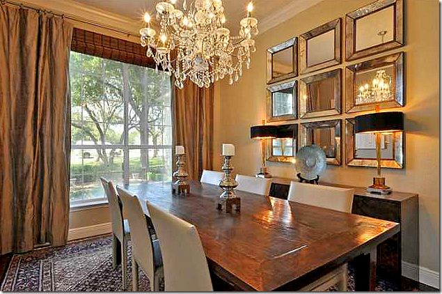
And after, hardwoods and moldings were added to the room, along with curtains and a crystal chandelier. Notice the grouping of small mirrors – that’s a good idea - use mirrors instead of the more usual series of framed prints.
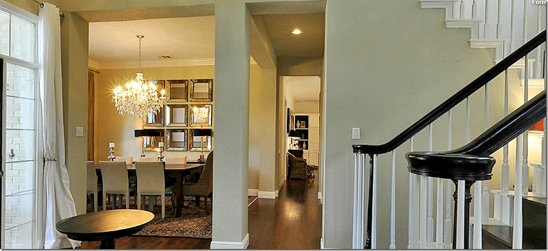
View of dining room off the main hall.
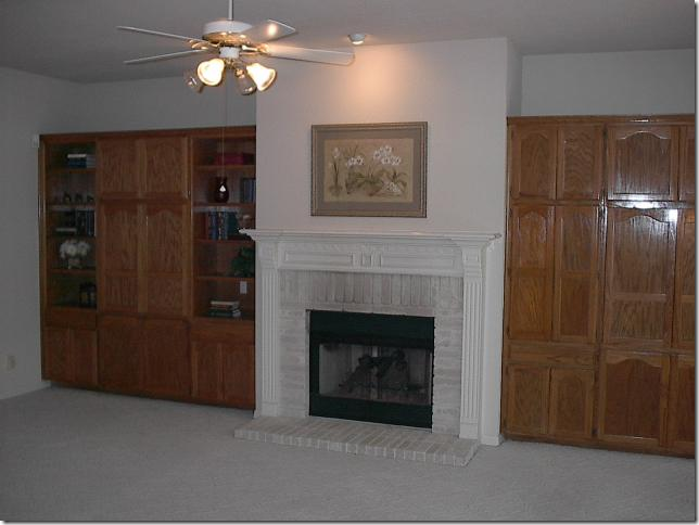
Before: the family room was carpeted and had brown stained cabinets, along with a ceiling fan.
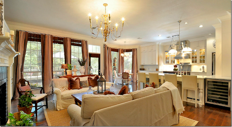
And after, hardwoods were placed throughout this area, including the kitchen and breakfast room. An Italian style chandelier replaced the ceiling fan.
And looking into the kitchen.
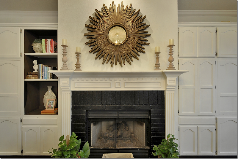
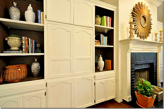
And after, the cabinets were painted white and the backs of the shelves were painted a dark brown for contrast. The white brick was also painted – black.
Notice the painted shelves – even the sides are painted, not just the backs.
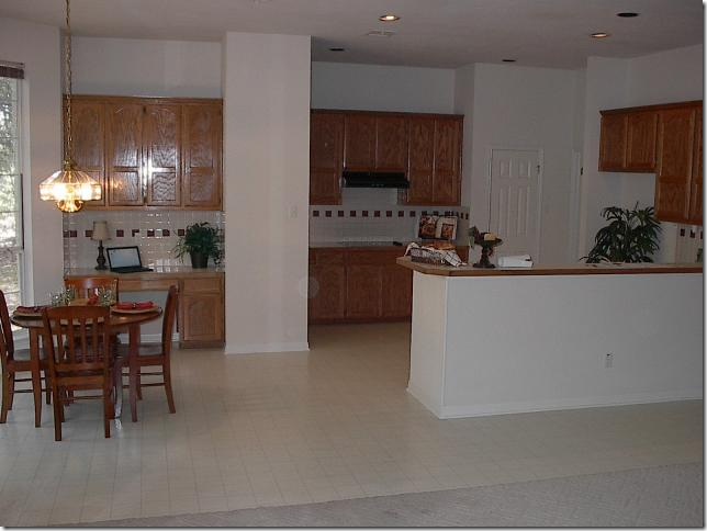
BEFORE: The kitchen was gutted, but the footprint stayed basically the same. The main difference is a breakfast bar was added and they removed the sheetrock wall between the kitchen and the breakfast room.
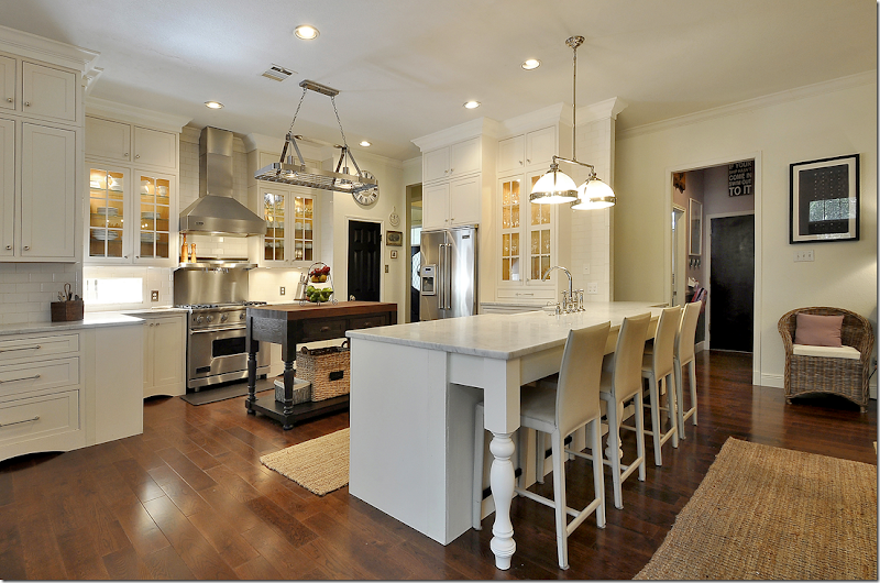
And After: The all white and stainless kitchen is now totally different looking! And so pretty, too! The large sheetrock divider between the breakfast room and the kitchen was removed to make a seamless connection. Restoration Hardware lighting fixtures, Rohl hardware and Shaw’s farmhouse sink. Love the breakfast bar.
Looking over the bar into the family room. Marble counters and white subway tile backsplash, along with Viking appliances.
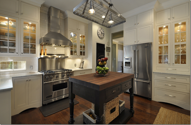
Notice the dark painted island with the wood top. The upper cabinets have glass doors. Cute station clock over the black painted pantry door. Notice the bottom of the cabinets – with the attractive arch. The owner painted her doors black, a touch which is nice and gives more importance to builders grade doors.
Overlooking the breakfast area.
Here you can see how the dining room is across the main hall from the kitchen.
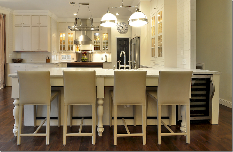
Notice the chunky carved “legs” at the bar.
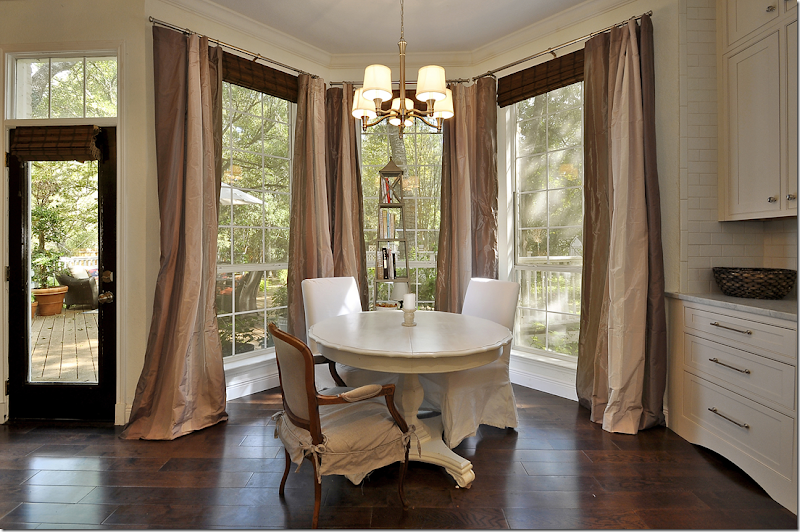
The breakfast room overlooks the back yard. I love the hardware on the cabinets and love the look of their hardwoods. Oops- just noticed the white slips on these two chairs!!! Sorry!!!
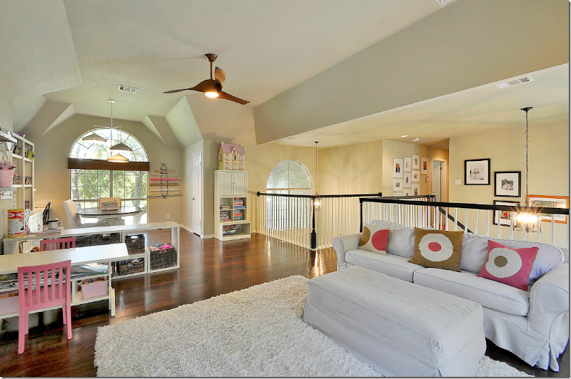
Upstairs is large family room for the couple’s daughter.
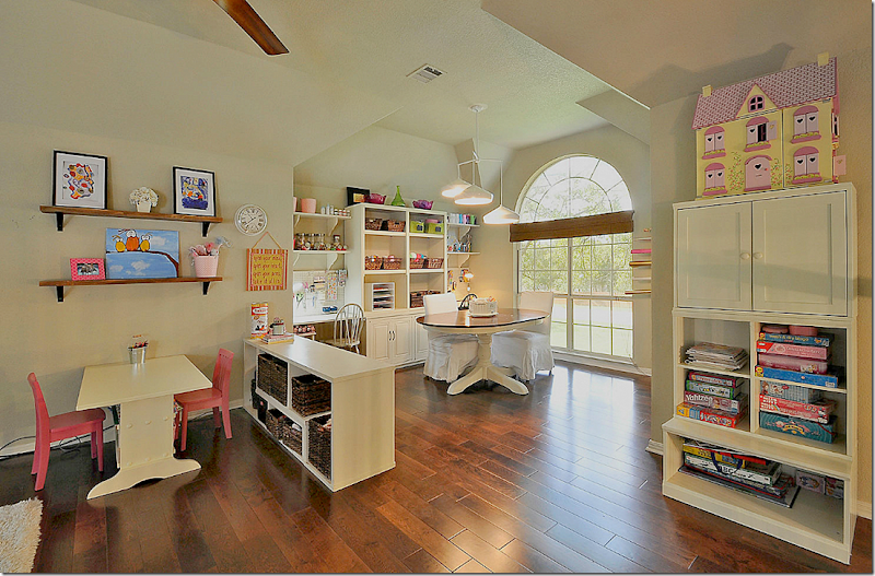
And a craft area for mom. This would make a great home school space. I think these hardwoods are really pretty. I really like the wide planks.
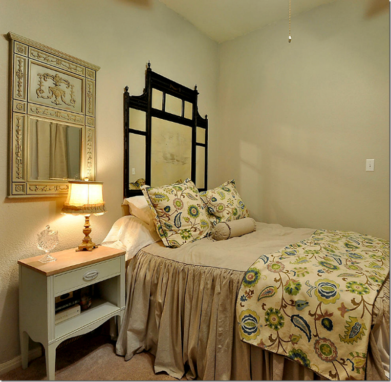
A guest room.
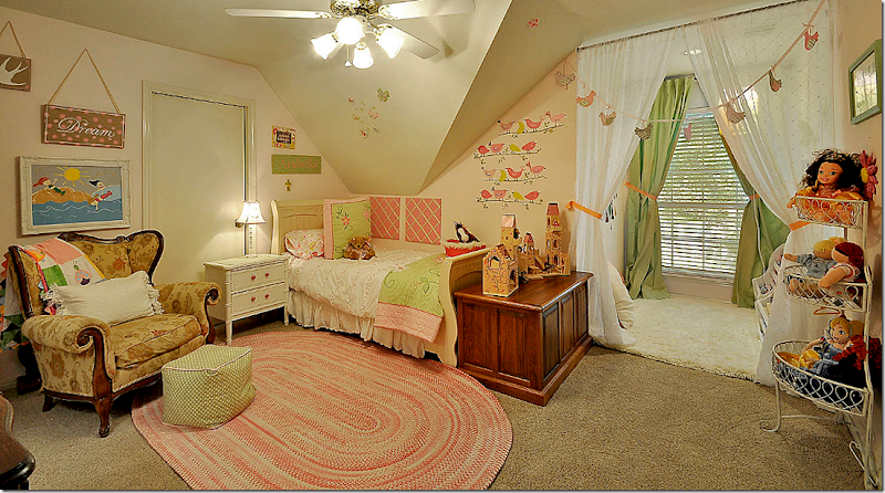
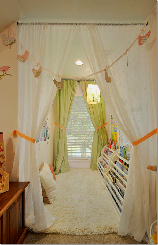
And the daughter’s room. Plus, look at the cute play area behind the curtains.
It’s a library for the daughter with a soft rug to lie down on the floor and read. What a great idea! I’ll bet the daughter develops a love of reading having her own library. No pictures of the master bedroom.
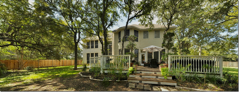
The back yard is something else. There’s a large deck off the house.
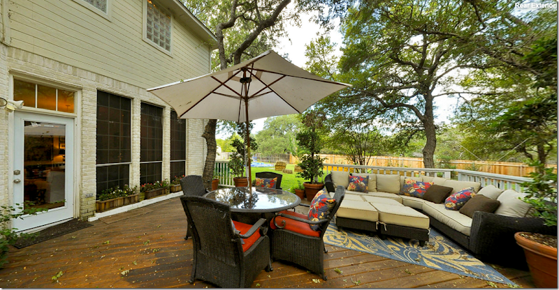
The deck is furnished with an outdoor couch and dining table.
Way back there is a dining terrace, a fire pit area, and a playground. Must be amazing. Hope they had dogs! No wonder they had a contract pending on the first day.
HOUSTON, TEXAS:
The second home is located in Houston, right behind the popular shopping area – Highland Village – near the upper crust River Oaks neighborhood. The area where this house is located is small and filled with empty nesters and young families who are tearing down the older, smaller one story houses and building new, larger two story ones. The reader who sent in these pictures did just that. She says they built their house and she designed the interiors, though she claims she isn’t an interior decorator. Could have fooled me!
The house was on the market when she sent in the picture and she said all her decorative items were stored away according to the realtor’s wishes. Plus the stylist insisted she leave out her toaster, something she doesn’t usually do. Funny!! She told me that she thought the readers would enjoy seeing her kitchen since people always comment on how much they like it. And I agree – it’s beautiful.
BUT, I know this house – I’ve driven by it a zillion times and it has masses of curb appeal. I’ve always wondered what it looked like inside, so I was thrilled to get these pictures. Why can’t that happen all the time?? Drive by a house you love and then you just happen to get the pictures of it in your email? That would be heaven! Yes, I do love the kitchen, but I also like the entire house – so I thought you would probably too. The house, built in 2008, has 4 bedrooms, 4 bathrooms and is just under 4,000 sq. ft.
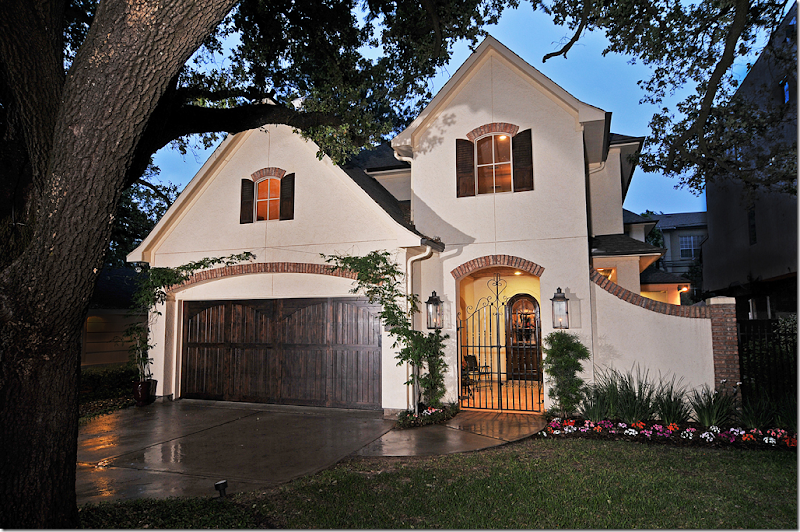
The house has tons of curb appeal with its white stucco walls accented by old Chicago brick. There is a front courtyard behind a charming gate flanked by gas lit lanterns. I just love the façade of this house – can’t you see why I have noticed it before!!
Notice how cute the front door is – with its arch and glass panes. The walls have a subtle stucco paint treatment which gives them texture and depth. I think that wall treatments like this add so much to a house.
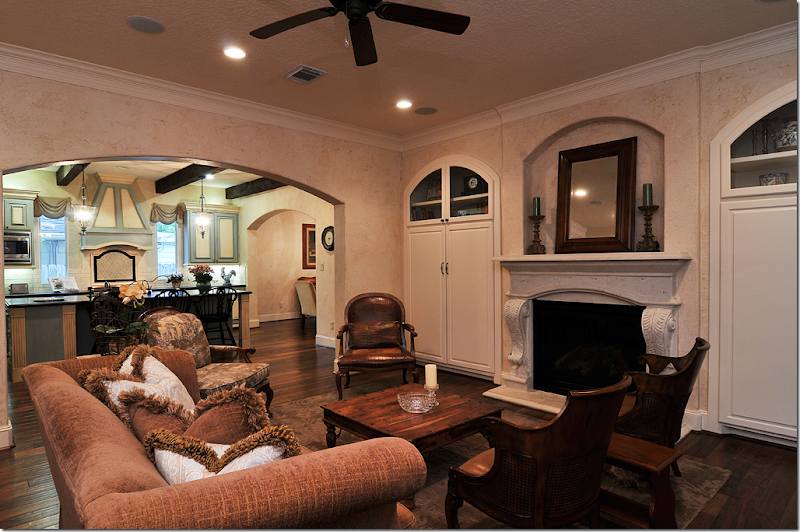
The stairs wind along the wall in the front hall. Towards the end of the hall is the family room. Notice the beautiful hardwoods. And notice the treads on the stairs – they were painted to look like stone.
According to the homeowner, the house was designed to be comfortable and family friendly. The large kitchen opens off this space, as does the dining room.
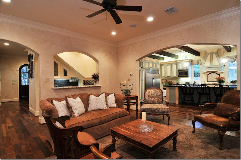
Looking back towards the front door. The wet bar is under the stairs and is open through a wide arch to the family room. I love all the arches.
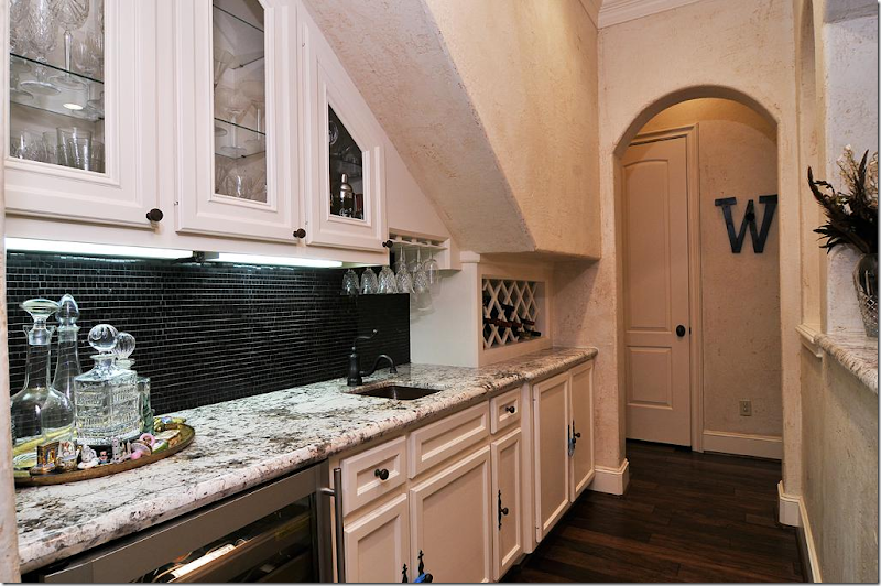
The wet bar – love those small tiles on the backsplash.
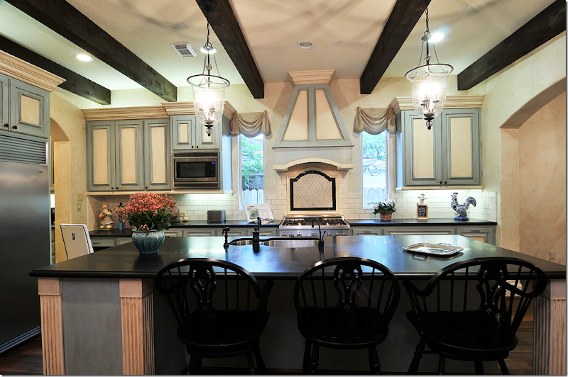
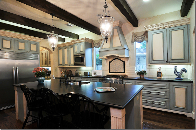
Off the family room is the kitchen and I think it is soooo pretty!! I love the colors – the blues and creams with the black honed granite countertops.
The creamy subway tile backsplash plays off the cream colored cabinets. I just love the way the cabinets are painted – blue and cream. And the stove hood and tiny window swags give it a touch of folly. I can’t tell if those are fabric shades or painted boards. Either way, I love the way they look.
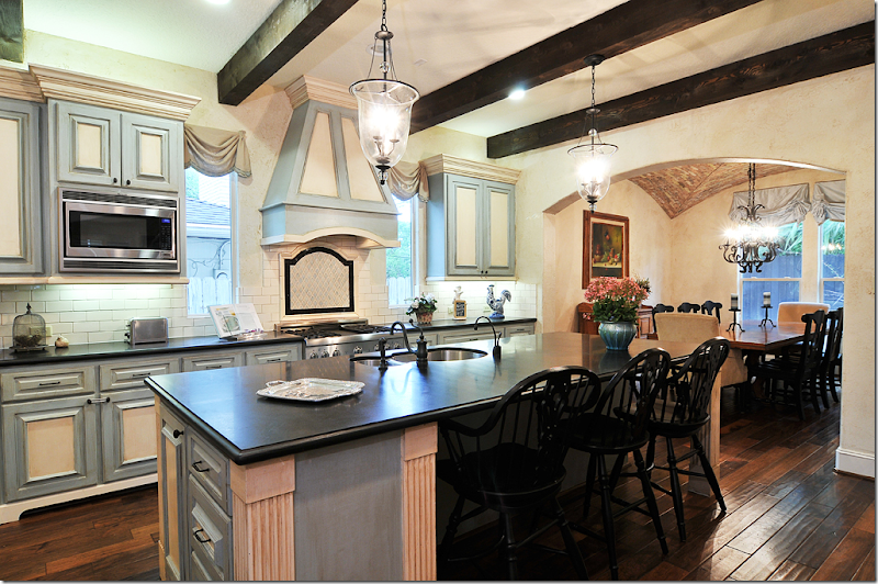
And notice how the dark ceiling beams play up the black countertops and the small touch of black accent behind the stove. Just beautiful. To the right through another wide arch is the dining room.
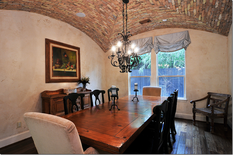
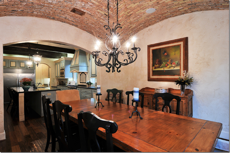
Off the kitchen is the dining room. The layout of the house is interesting – the rooms all open off each other which is great for entertaining. The owner told me she designed the house for having guests feel comfortable and I can see how that’s true. Instead of having a formal dining room away off in a part of the house that no one uses but for holidays, I can see how the family probably uses their dining room for everyday evening meals since it is located so near the kitchen and family room.
And that groined ceiling! Wow!!! It is made out of old Chicago bricks – and it’s a stunner. What an amazing detail – it adds so much texture and warmth to the room. The furnishings are perfect with the style of the house. It almost seems as if the house was in San Miguel de Allende instead of Houston.
And looking back at kitchen.
The powder room has a chest that is now repurposed as the vanity with a cloisonné sink. The walls have a handpainted damask pattern that is very subtle. Not sure who painted all the walls, but I love the different treatments. It makes the rooms all just a bit more special. Even the hand towel is so pretty!
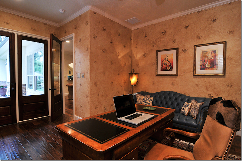
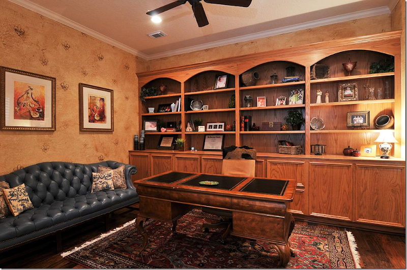
Off the family room is the office/library. The walls are hand painted with a raised fleur de lis pattern.
That’s a really pretty sofa, the soft blue tufted leather. There are touches of blue that are carried from the kitchen, to the study and up to the master bedroom.
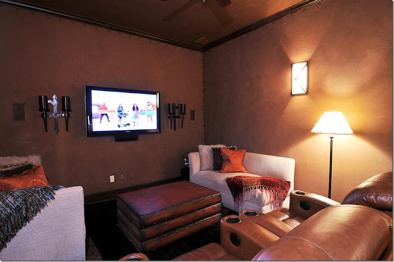
The media room has another interesting wall treatment with nailheads that give the appearance that the walls are leather! Another great idea. And instead of lots of stadium seating, they added two comfy chaises, along with a coffee table made of faux leather books. Love the way she designed this room. It looks like a great place to watch a movie.
Upstairs, the master bedroom highlights the golds from throughout the house and the blue color found downstairs.
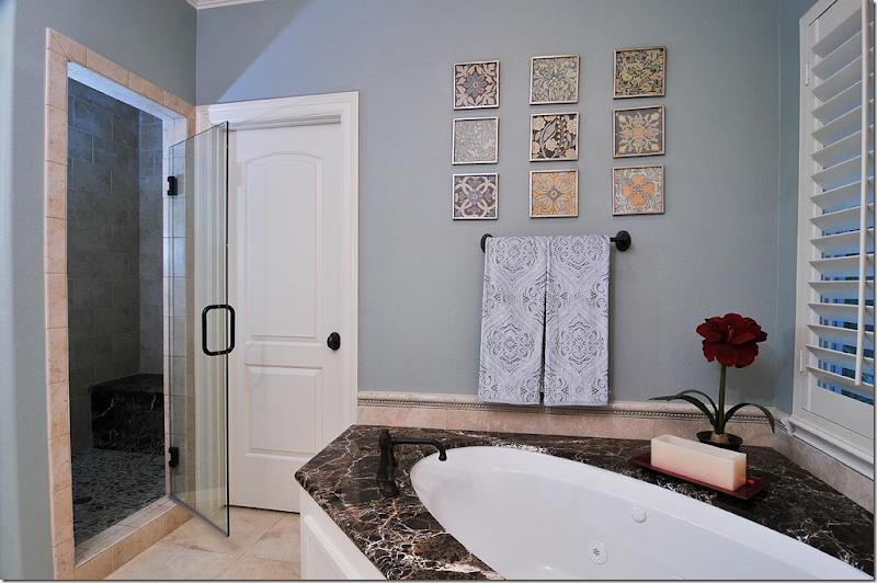
And the master bath combines the browns and light blues together – such a pretty combination. The marble is especially pretty!
I hope you enjoyed seeing both readers’ kitchens! Even though they actually submitted their kitchens – and both are so pretty - I thought you would enjoy seeing more of their houses. And I know you enjoy seeing a pretty house from Houston that isn’t white and doesn’t have slipcovers and seagrass!!
NOTE:
The finalists for the Aidan Gray contest have been submitted to owner Randal Weeks. Hopefully, we will know the winners soon. I can’t wait to find out who won myself! AND, I can’t wait to start showing you all the entrants.
AND, FINALLY:
If you are in Houston, CdT sponsor Memorial Antiques & Interiors (MAI) is having an anniversary open house this Wednesday:
At the open house, Bryan Batt, star of “Mad Men” and interior designer, will be on hand to sign his new book, “Big Easy Style.” Besides his successful acting career, Batt and his partner own a décor store, Hazelnut, in New Orleans, where they offer their interior design services. The just recently published book is filled with photographs from houses in New Orleans. It features Batt’s colorful designs and others – including the popular blogger The Visual Vamp.
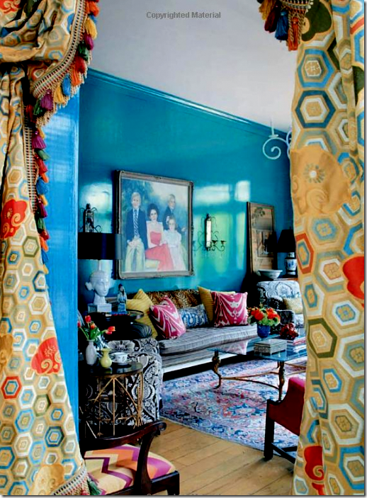
Big Easy Style is filled with pages of colorful interiors in New Orleans, such as this house with its vivid blue lacquered walls.
While at MAI, be sure to visit Pruitt and Littleton’s space which showcases their beautiful artistry. Their work is also seen in Batts’ “Big Easy Style” and they were instrumental in bringing Batt to Houston for the signing.
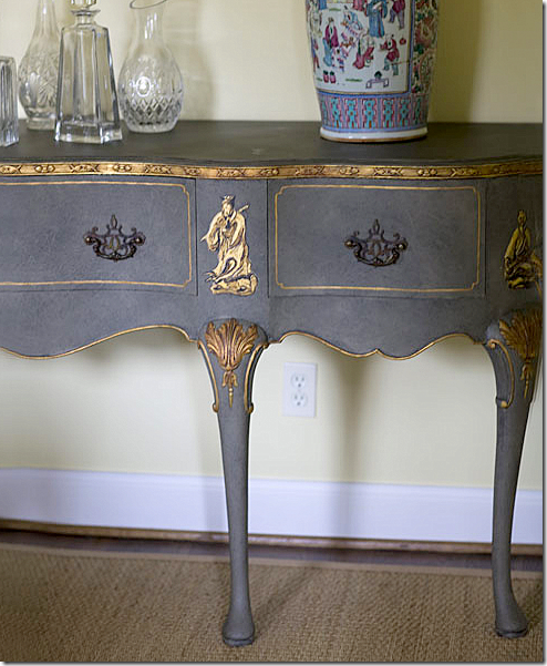
A console, formerly stained brown, becomes a beautiful painted chinoiserie piece under the talented hands of Pruitt Littleton.
And also while at MAI, visit CdT sponsor’s 2 Lucy’s booth.
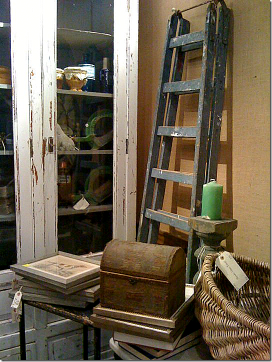
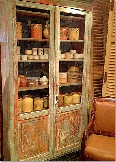
They have a HUGE assortment of French and English antiques hand picked in Europe. Their booth is jammed packed with wonderful items – too many to choose just one, which is always an antique lover’s problem. Last time I was there, they had good selection of oversized station clocks, if you are in the market for one.
And more. They have tons of confit pots if you are looking for those!!
Can’t make it to the signing? Click on the picture to purchase Big Easy Style from Amazon.

















No comments:
Post a Comment