"A Girl Writing," Henriette Browne (1829-1901)
Kristi writes in with today’s question:
Hello Joni-
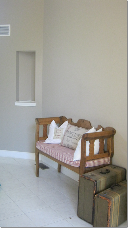
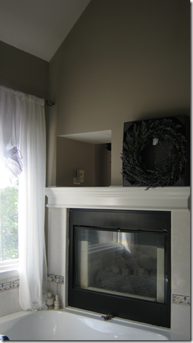
I am definitely stuck on a design dilemma....I normally can be pretty creative with a space...but this one has me stuck. We recently moved to a new house. All the trim in the home is white, wood floors everywhere, and so many windows all along the back side of the house! The design problem: the house is 15 years ago and there are little nooks - I have 2 of these spaces currently, one in the entry and one half way up the stairs. The other "nook" type place is in the master above the fireplace. It is actually a hole in the wall made for a TV....now we know what types of TV's were around 15 years ago... and they were the fat large big tubes. So I have this hole between the bathroom and master bedroom...and I just can't figure out for the life of me what to do with it. It's not an option yet to fill the space in.
I feel like these nook areas should stand out with some amazing pieces or something very creative. And maybe I just don't have anything that would work....maybe you can direct me on this?? As well as the hole in the master??
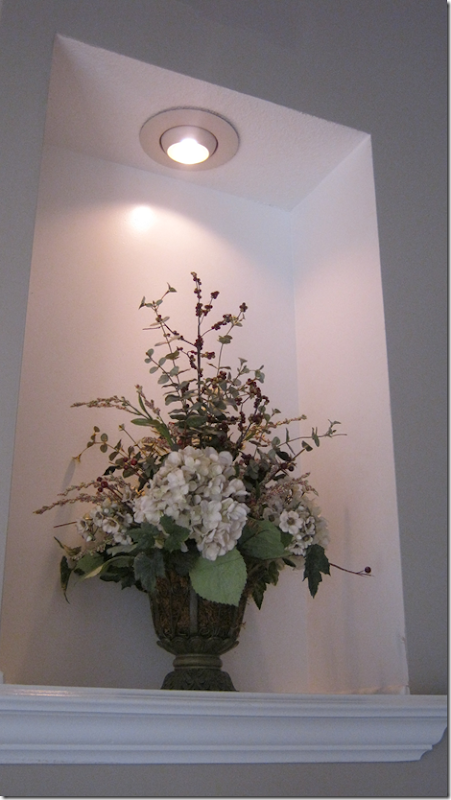
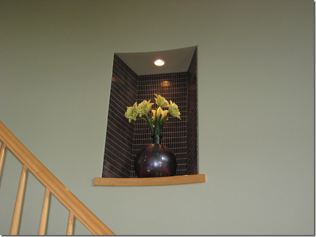
The nook on the staircase has overhead lighting in it...and currently I have a floral arrangement ...that quite truthfully the only reason that it is there is because I didn't have anywhere else for it nor did I know what to put in this nook. My style is French ...whether it's shabby/country or whatever I just love the look of French and Belgium Swedish style.
I have attached pictures of the areas I am talking about....and I am so hoping that you can assist me in coming up with something creative or finding some affordable "somethings" to put in the spaces! I hope all is well and can't wait to hear what you think!
Dear Kristi,
Art nooks, or niches, really are a problem for a lot of people, or so it seems judging by the amount of chatter about them on the internet. It seems that all the new houses have one or two of these niches going up the stairs and some even have niches high above in rooms with two story ceilings. I have to be honest, I am not a huge fan of art niches, probably because everyone just sticks an arrangement of fake flowers there, or they put some contemporary art glass in the nook – both things that are just not on my list of favorites things!!
The reason why I decided to try to address your problem on the blog is that I think there are a lot of people out there who are living with niches and aren’t quite sure what to do with them. So, I am hoping that others may find some help too!
Researching your issue on the internet, there just aren’t many ideas I can show you with a picture. The web site Houzz has over 13,000 pictures of the ugliest solutions to this problem that you can find! Seriously, check out that link if you don’t believe me! So, without the help of any visual pictures, I tried to think, what would I put in a niche if I lived with one? And here are a few ideas that I came up with.
To start, let’s look at your art niches:
First, you have this tiny niche in your entry hall. I love the casual way you decorated this area with a bench and trendy pillows, along with vintage suitcases.
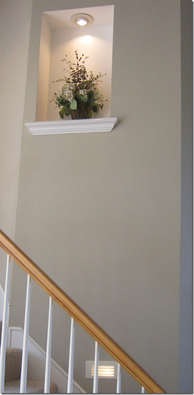
And then, you have this larger niche that is lighted – in the staircase wall.
It’s actually quite high up there – or so it seems!
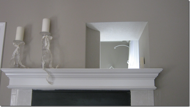
Finally, you have this niche, or really a former TV spot, that is open over the fireplace in your bedroom, to….
the other side of the wall, which is your bathroom.
So, lets tackle the issue of Art Niches
Did you know that niches were first added to Victorian house’s staircase walls to allow coffins to be carried from the upstairs to the downstairs? Neither did I, but apparently this is a story that is widely believed!
The history behind niches known as “coffin corners” is that people usually died upstairs in their beds and then had to be brought back downstairs in a coffin. Niches were built into walls of Victorian houses’ staircases so that the pallbearers could insert one corner of the coffin into the niche and make the turn at the landing. Because of this, niches for years were called “coffin corners.” It isn’t known if this is just a myth or if the story is based in fact.
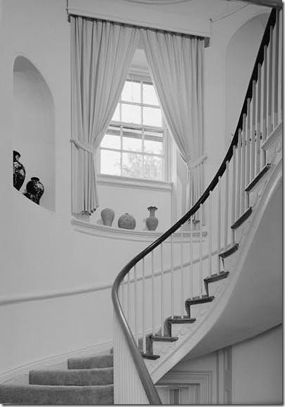
The truth is probably more like this – niches have been around for ages. Mostly they were used to exhibit art work or statues, such as these niches that were placed above the doors in a large Irish entrance hall.
And another niche, placed at eye level. These niches were beautifully constructed with carvings and graceful, curved walls. Niches like these show little resemblances to those found in houses built today.
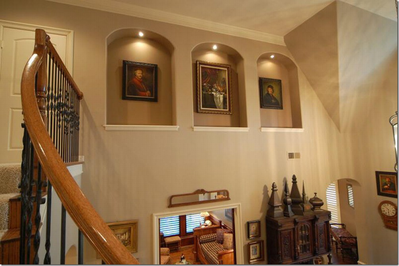
For instance, there is no architectural reasoning for these niches – they are just three arched holes placed high above the wall. There is no carved wood, no curved wall – just an indention in the drywall. And whatever happened to art work being placed at eye level where you could see it?
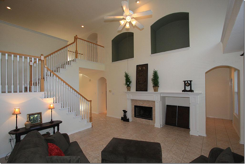
And again, typical niches found in newer homes today have no architectural basis. These aren’t even lined up with the fireplace and its fake twin to the right (what IS that, by the way?) Painted black, the holes are focal points in the room, for all the wrong reasons.
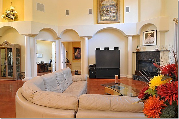
This owner wrote into an internet web site asking for ideas of what to do with these art niches and columns found in her new house. Besides all the arches, columns, and niche above the TV, there is another niche on the far left. Most commenters advised her to try and just remove all the columns and arches and niches and start over. Good advice, I’d say.
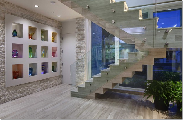
In contemporary houses, typically a collection of modern glass will be displayed in art niches – such as this. At least these niches are pretty and do seem to be thought out by a designer, rather than just be a cutout in the drywall.
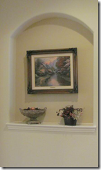
Most niches found are simpler versions like this, arched holes in the wall decorated with flowers and art work.
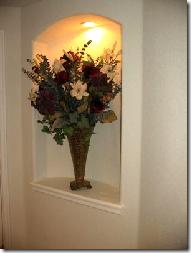
Some are lighted for dramatic effect.
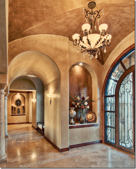
And some have painted backs for even more dramatic effect. The look is often supposed to resemble Tuscany. This house has arched niches, arched doorways, columns, and another arched niche at the end of the hallway.
The quest for answers of how to decorate an art niche is found all over the internet. There are videos on You Tube with solutions. I’ll spare you those. And there is even a Facebook group for “how to decorate your art niche” – seriously this might be the biggest problem Americans are facing today!!
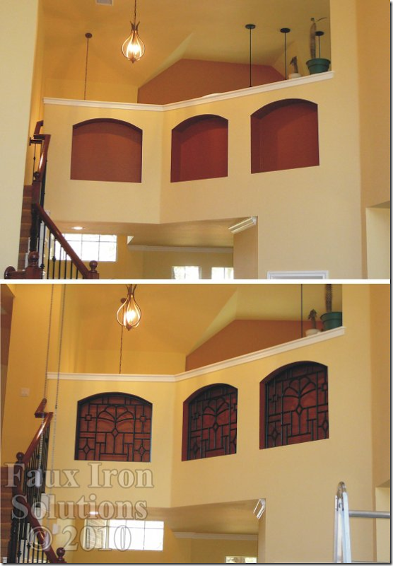
OK, quit laughing! Faux Iron Solutions, not even real iron (not sure what faux iron is exactly?) says their solution for these three gorgeous niches is faux iron! My solution – dry wall those niches up and move on to other problems, like those light fixtures.
A reader of The Lettered Cottage asked Layla for help with her large niche. She has a casually decorated house and her niche has stumped her. She stuck this Venus in there, but it doesn’t go with her décor at all. Here’s what Layla suggested she do about her niche problem:
Layla advised her to add shelves, turning the niche into a useful area, filling it with baskets and books. I think Layla came up with a great idea, functional and casual – read the story HERE.
The owners of this niche had a similar idea – adding shelves AND shutters and making it useful instead of just decorative.
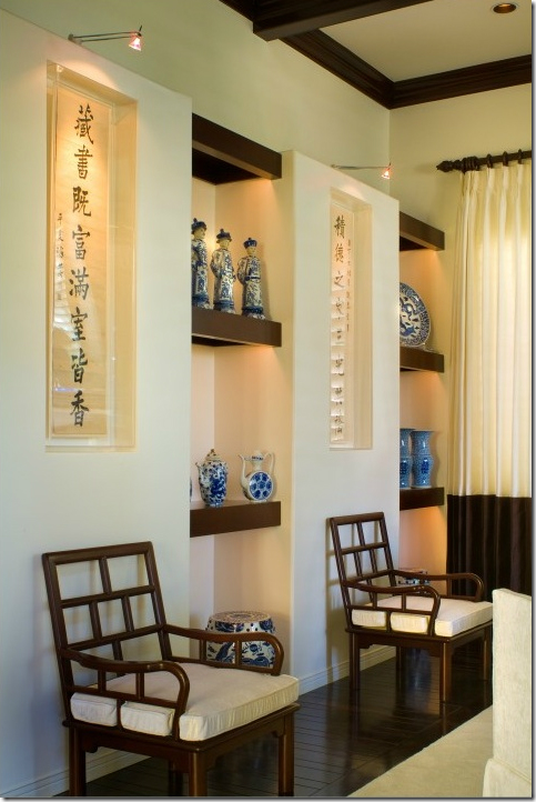
These shelves allow the niches to display a large collection of blue and white porcelain. The shallow niches show off oriental calligraphy.
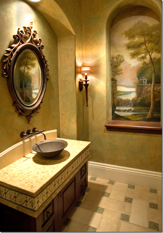
Some people commission a mural to be painted in their niche.
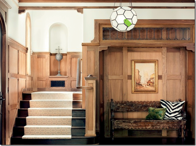
This niche is architecturally designed, and it shows. The paneling continues into the niche, making it seamless. The arch of the niche is repeated in the window and the niche is visually balanced by the niche on the ground floor. I also like what they used for display – a tall piece of sculpture, rather than a fake flower display.
This niche is also very pleasing. It serves as a focal point along the way up the stairs. And again, a simple statue in black – which matches the railings – is pleasing and attractive.
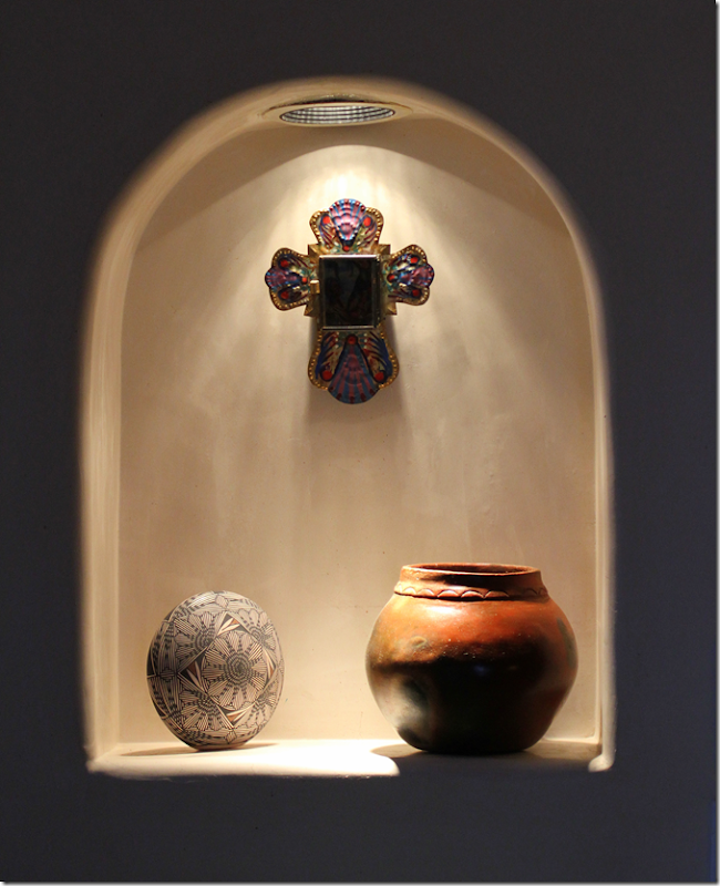
I also like this display of artifacts in a niche. All three pieces are different, yet seem related somehow – perhaps they are all Southwestern in origin. Very pretty.
So, let’s go back to Kristi’s entry hall with its art niche. She likes casual design, warm and cozy and trendy – judging by her pillows and vintage suitcases. The niche is rather shallow and tall. I looked at Wisteria and Aidan Gray for some inspiration and came up with this:
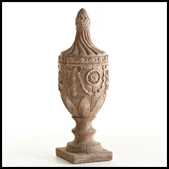
Wisteria makes these great urns. They are rather tall, so Kristi would have to check the measurements, but I love something like this for her niche.
Or, go with a tall candlestick by Aidan Gray. They have a large assortment to chose from – maybe she could even put two in there, one short, one taller. Add a cream colored fat and short beeswax candle on top.
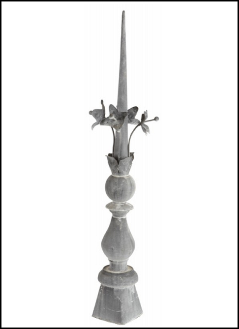
I love this zinc piece from Aidan Gray. Tall and thin, it could be the perfect fit and it’s got that trendy look – and the zinc is warm and casual.
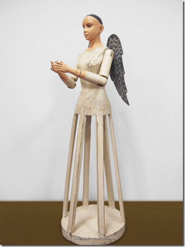
A Santos – old or new – could be a good look too. Check out the Santos on CdT sponsor: Eleanor Brown Boutique HERE.
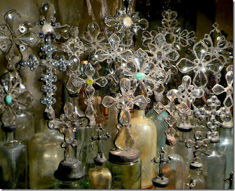
Or pair a tall and short cross top bottle from CdT sponsor Greyfreth HERE or…
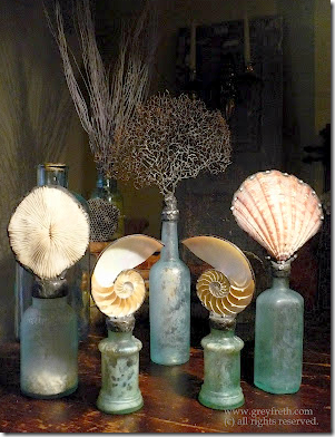
Pair a short bottle and a tall one from Greyfreth’s sea inspired creations. Great look!
For those who have a more common art niche – wider and taller than Kristi’s - here are a few more ideas:
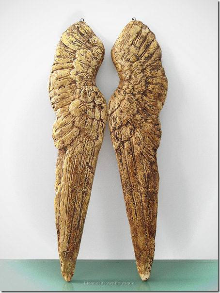
Angel wings are popular today – and they would be perfect in a typical sized art niche. Available at both Eleanor Brown AND Greyfreth, above.
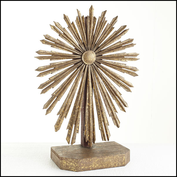
Wisteria’s new sunburst display, which I love.
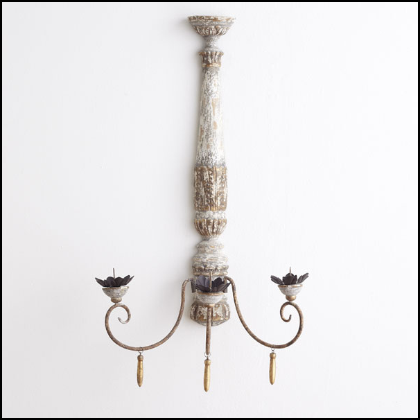
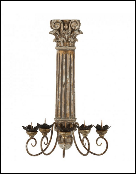
Instead of a painting, hang a sconce, lighted or just add candles. This one is from Wisteria – love!
Another nice sculptural sconce is this one from Aidan Gray.
Also new from Wisteria – I would use two of these, one large, one small in an art niche.
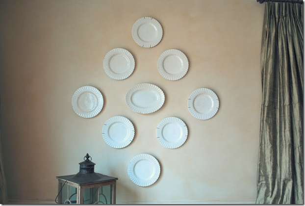
Or hang plates instead of a painting. Neutral ironstone would be a subtle choice.
Or hang a collection of black and white French transferware from Ebay. Then layer the display by putting two plates on stands in front of the hanging ones.
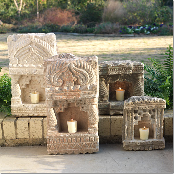
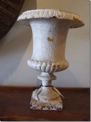
Use two garden urns in front of a display of plates, or alone.
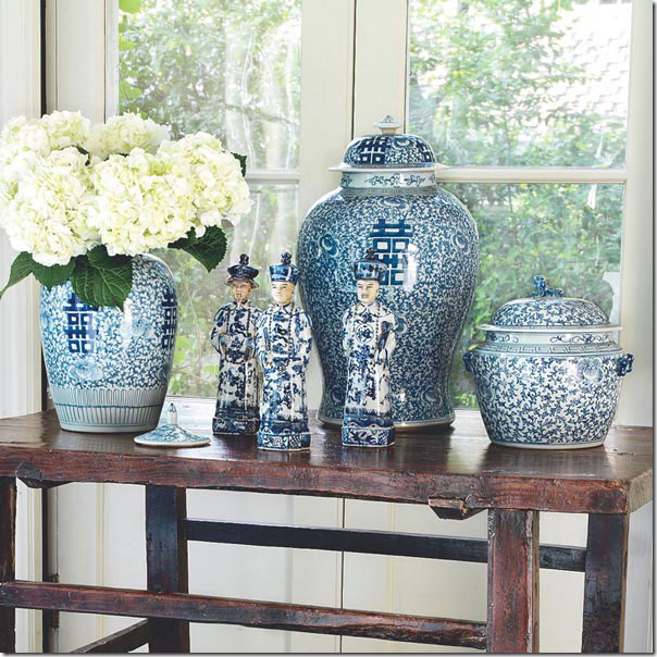
Or mix and match blue and white porcelains from Wisteria.
Kristi’s second niche is more of a problem in that it is so high up. You don’t’ want it to be too much of a focal point – so I would try to keep it simple.
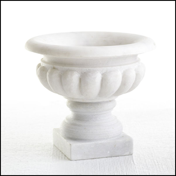
Wisteria’s new marble urn would be pretty there, with a white ironstone platter hanging behind it.
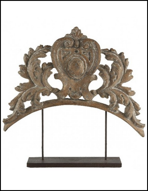
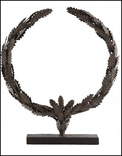
I like this fragment from Aidan Gray for the niche.
From Aidan Gray, this piece is simple and sculptural.
And again from Aidan Gray, this is really pretty for that space.
Just promise me Kristi that you won’t do something like this!!!!
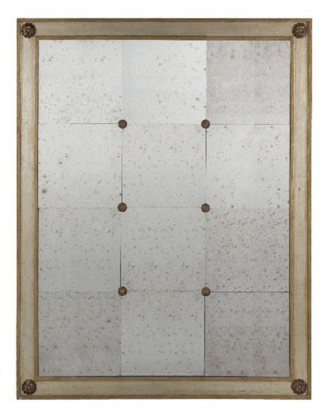
And finally, for your pass through hole, former TV space in your bedroom and bathroom, you should really just sheetrock over this. If not, then the only thing you could possible do is find a painting or a mirror and place it on the mantel to cover the hole. Before you place the object though, I would find a piece of cardboard, cut it out to fit right over the hole and paint it the same color as the wall. Velcro it to cover the hole – so that if the mirror or painting is leaning a bit on the mantel, light won’t escape from the hole and it won’t be as noticeable.
The bathroom side.
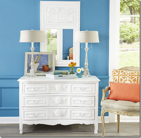
Wisteria has this pretty trumeau that could go on the bathroom side.
Or try this mirror in either room from Aidan Gray.
Consider a photograph with a slightly feminine bent, from CdT sponsor My Art Habit HERE.
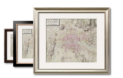
Allposters.com have great reproduced antique maps, like this one of France.
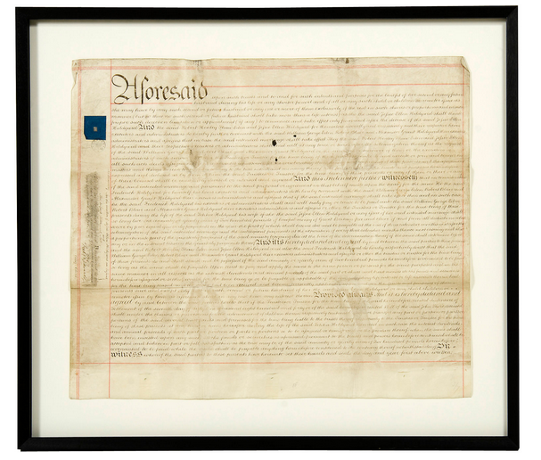
At CdT sponsor Greige, they have these framed antique French wedding documents that are interesting. HERE.
Kristi, I hope I have given you enough ideas that seem more “today” than just fake flowers. I tried to keep all the choices very price friendly, as you asked.
But, as usual, I am wondering if any of the readers have a better idea of what Kristi could do with her niches – ???? Let me know in the comment section if you do!
If you have a Dear Miss Cote de Texas question, please submit it. If you already have and I haven’t answered it yet, I will try to eventually get to them all. If you already asked a question and need an answer asap, just let me know and I’ll try to email it to you faster!
Thanks!
Monday, October 1, 2012
Dear Miss Cote de Texas
Subscribe to:
Post Comments (Atom)
![[image[166].png]](http://lh4.ggpht.com/_t8-Y4w1UKrc/TF30pxVLjaI/AAAAAAAA17k/tbtqNnVkfSU/s1600/image%5B166%5D.png)
![[image[82].png]](http://lh4.ggpht.com/_t8-Y4w1UKrc/TF30weolhmI/AAAAAAAA18E/EPiWimUtrHI/s1600/image%5B82%5D.png)









No comments:
Post a Comment