1
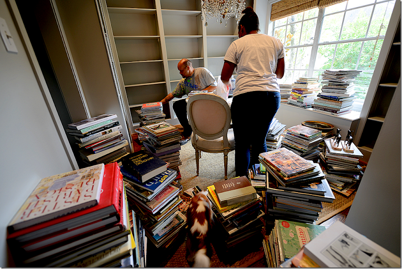
As I told you as few months back, the driving force behind creating a library was that I had too many design books. These beautiful, large, decorative books had overtaken my house. There were stacks of them everywhere – they were under every table, hidden in every basket, getting dusty in stacks in the garage, and even lining the steps on the staircase. It was driving me insane and made the house look even more cluttered.
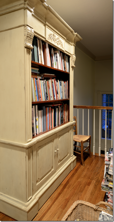
We had outgrown the built-in bookcase years ago and had starting stacking books on the floor in front of it.
When Halo Styles shipped me this bookcase by mistake, I kept it, hoping it would stem the tide. Nope. Even the shelves underneath were jam packed. Besides the space issue, was the organizational issue. I could never find that one book I needed for research or just to enjoy. It was the proverbial needle in a haystack when I needed to find a certain title – forget it. Sometimes I would get so desperate I would reorder a book from Amazon knowing that what I needed was hidden away somewhere. So ridiculous.
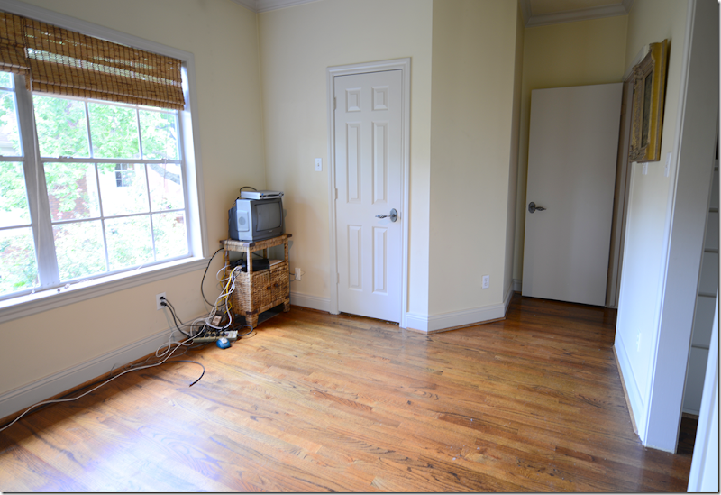
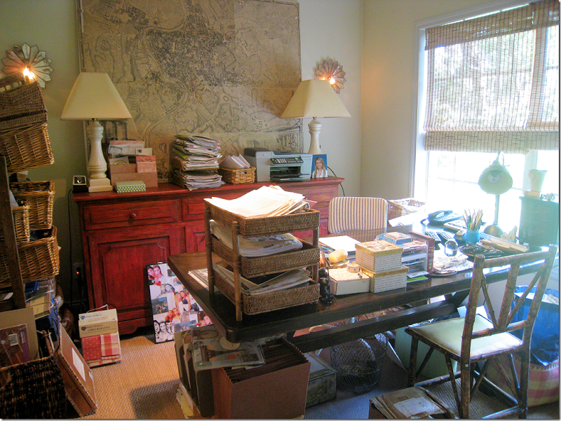
Even more ridiculous was my yellow office with that horrible red console. Before the blog I spent a lot of time in here – I took on a lot more clients back then. But, in the past six years, business has changed, a lot. I never look in a catalogue anymore – it’s all on line. Fabric houses are online too. Emails and computers take the place of paper records and files. I just never really used my office anymore. All my fabric books were neatly stacked in bins in the garage, and this space was just wasted. For the past few years, I’ve been thinking I should built shelves in here – but the whole job seemed so overwhelming, I just kept putting it off.
But, one day, I succumbed and called James, who works for Ben, to come clean it all out. Oh, the junk! So much junk! Drawers and cabinets filled with things like old printers and computers, typewriter ribbon, old manuals and stationery, past due bills from a decade ago – just trash. I can’t tell you how many super sized garbage bags were filled up. The rest went into bins in the storage closet, along with client files where I can easily reach them.
And looking the other direction. That gorgeous door was added when we moved in – this room used to be Ben’s full time office. It was so noisy in here – we added that solid core door to cut down on the noise and had the room wall to wall carpeted too! It helped lessen the noise, but eventually Ben got serious about work and moved out to a real office and about 10 years ago, I had the carpet taken out when this became my office.
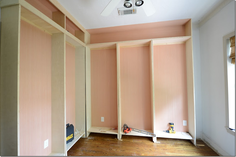
I hired an elderly retiree to do the construction. He was slow as molasses. It took him weeks and weeks to get anything done. I almost pulled my hair out, along with his remaining strands, too!! It was a big mistake hiring him – but he did do a great job in the end. I painted it all gray – and after much discussion here in the comment section over the merits of spraying versus hand painting, Raul sprayed all the shelves. It was fine. You can hardly see the paint on the shelves for all the books – it wouldn’t have mattered either way.
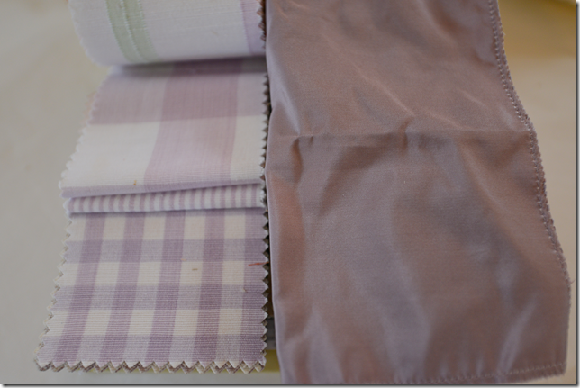
I showed you these fabrics I had chosen, but it turned out these checks were discontinued. So, I picked another taffeta and a beautiful lilac check from Chelsea Editions. That was all fine and dandy until the design books starting going in on the shelves and were soooooooo colorful! My quiet gray space became a cacophony of color!! I spent a weekend in hysterics over the already bought fabric. There was no way I could put in lilacs with such vibrant shelves. It took about two weeks to settle it in my mind. Back and forth, back and forth. I wanted lilac but knew it was wrong. I knew I just needed to keep it neutral. I even thought I should just cover all the books with cream paper or turn the bindings around? What??? It was typical hysterical time. In the end, I ordered an off white taffeta and linen, along with the gray check from Chelsea Editions. Ssssh. Don’t tell Ben!!! One day, the unused lilac fabrics will go in my guest room unless I find a client who wants them before then.
Once the fabrics were decided on, again, I started thinking about the rest of the room. The very first thing I bought was an old Macaroni beaded chandelier on 1st Dibs, along with a faux antique library ladder from “Paris” – sure!! Someone is making a fortune off that scam! The Lone Ranger Antiques sold me two demi lunes and two chairs and surprised me with a gorgeous gilt wall clock!!! I was stunned at his generosity, and most grateful! Bringing the books into the room took several weekends with help from James and his niece, but then I had to realphabetize them all over again when I realized they had put them in order by the publishers. Yep! And finally Monica from Custom Creations By Monica installed my shades and window seat and Anthony (713-861-3000) brought out a fresh new seagrass rug. And so, here it is:
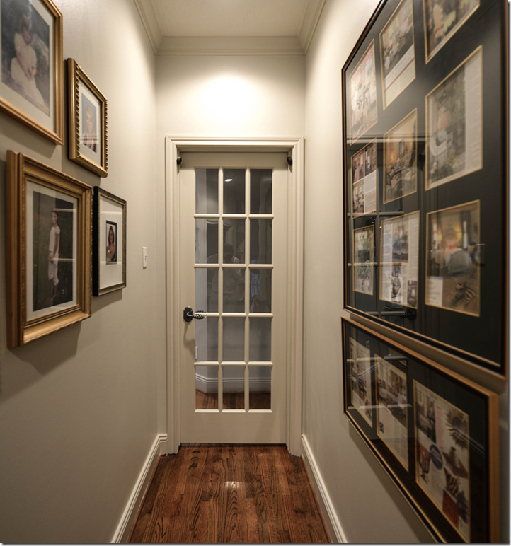
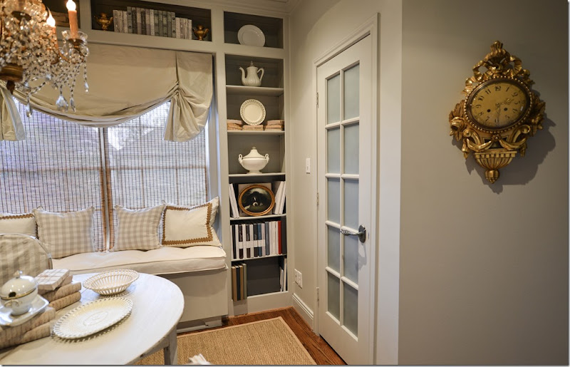
The library is located upstairs off the back hall. I have all my framed photos of Elisabeth here from baby on and some framed magazine photoshoots on the wall. The solid core door was replaced with this French door, which drove Ben insane – “that solid core door was so soundproof! Why?????” Well, look at it! It’s kind of cute!
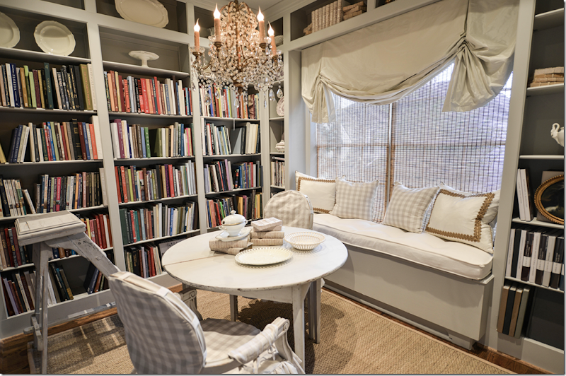
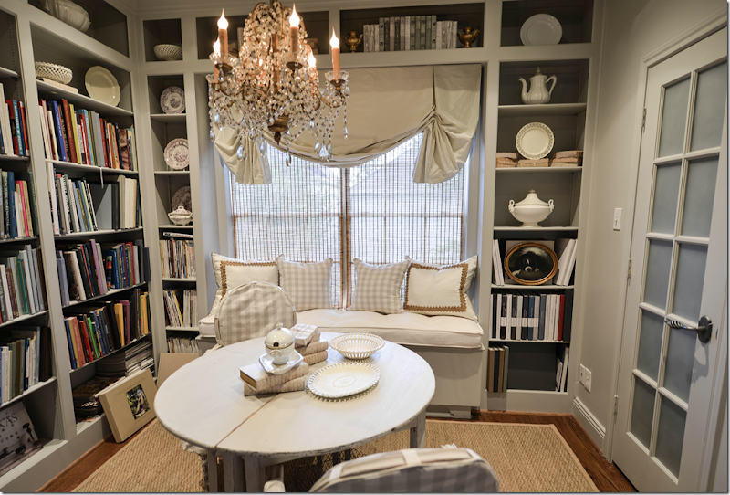
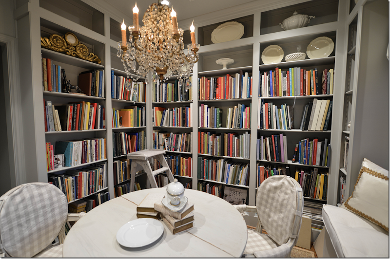
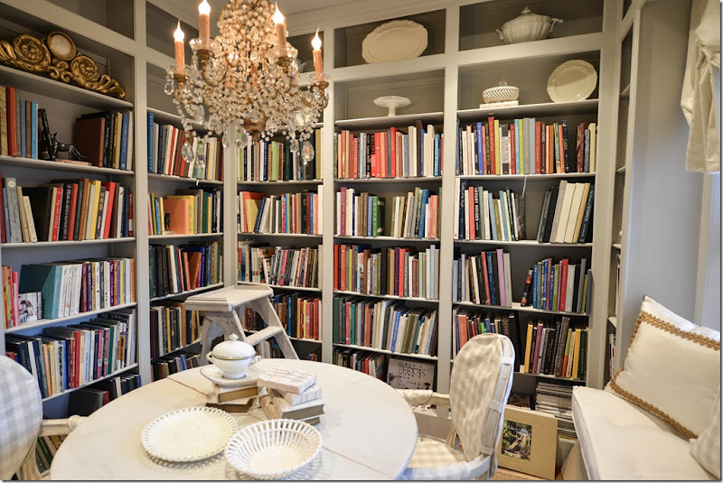
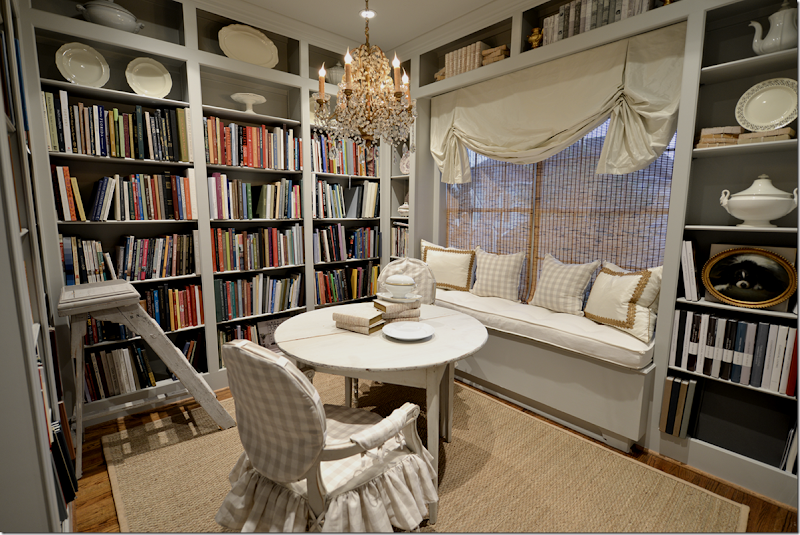
And here it is!! See how colorful the books are and why I was so scared of putting lilac in here? I think the cream and gray check from Chelsea Editions was the right choice.
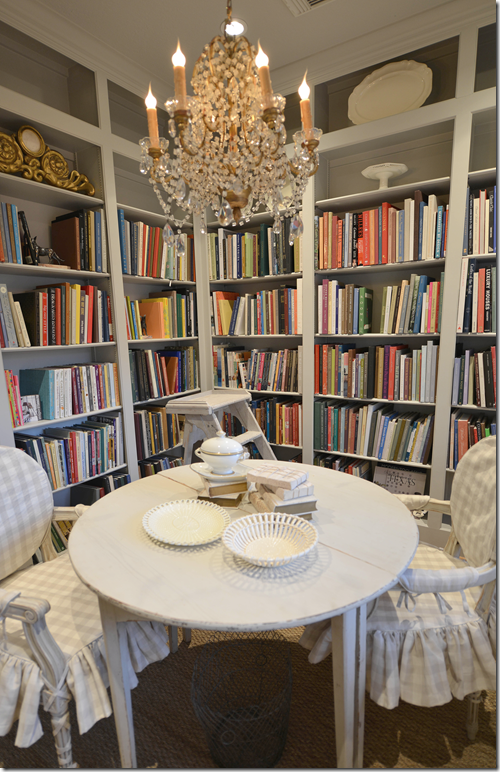
The chandelier is vintage with macaroni beads. The demi lunes and chairs both came from The Lone Ranger.
I filled the empty shelves with creamware and ironstone mostly.
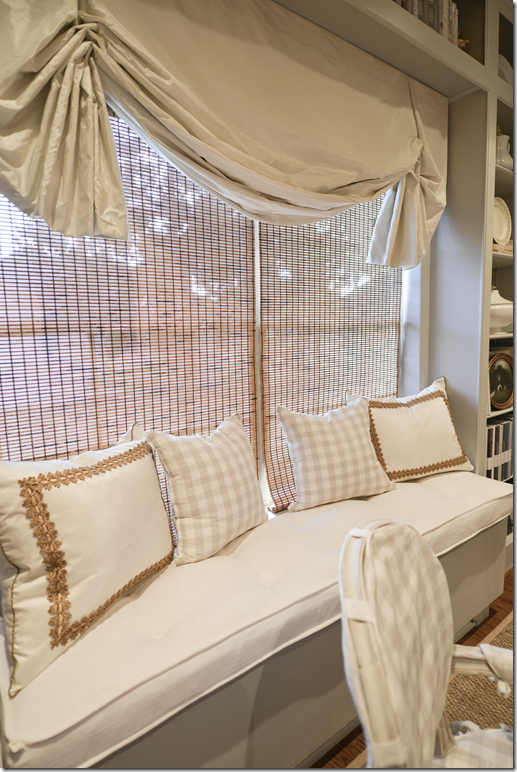
The shade by Custom Creations By Monica is silk taffeta by Schumacher and so are the two pillows. We added some gold trim from Samuel and Sons to dress them up a bit. The window seat is linen. The tortoise shades are a left over from the office. I was going to take them down, but actually the color picked up the color of the seagrass and the trim so I kept them. Plus, the sun is so hot in this room that it really needs shades. I probably should get just one shade, but enough is enough!!!
The closet door got a small French door too. To custom order one with frosted glass was going to be a long wait AND it was expensive. Instead Raul used this spray on frosting that worked out great and kept the price WAY down. The frosting isn’t perfect, it’s a little mottled in areas, but it’s good enough. It’s not the White House, and it’s not for a client so it doesn’t have to be absolutely perfect. I’m easy. The frosting works perfectly though and hides all the junk inside the closet. To the right of the door is the vintage clock from Sweden via The Lone Ranger. He sent this to me on the truck with the delivery – I was shocked and sooooo excited!!! Thanks L.R.
I wanted the shade to be really full and fluffy. In fact, my entire design scheme was meant to be very, very feminine, Swedish or French in feel, quiet and a bit elegant. I love the cool colors of the gray, the creams and the whites. And I love the touches of gilt throughout the tiny room. The gold and the chandelier gives it that dressy vibe I was after. This is definitely a girl’s library and that’s what I wanted. All of Ben’s books went on the built in bookshelves on the landing, finally organized for him, also.
The best part is how functional it all is. It takes me just a minute to find any book I want!
In the corner is the “antique” library ladder from “Paris” via 1st Dibs. Snort. It’s great to reach the high shelves. I elected not to put books on the highest shelves, but if I find I am running out of room – I can always move the books up there. I’m thinking about putting a small TV on the wall by the door and letting Elisabeth use this space when she has friends over. They can sit around the table and on the window seat and have some now sorely lacking privacy. Plus, this room connects to hers through the bathroom. It would make a great mother-in-law suite one day, we could move the table out and put in a chair and ottoman instead. Or, if I ever wanted to use it again as a full blown office, I could work on the table or exchange it for a desk if needed. So, there are lots of possibilities for the space down the road.
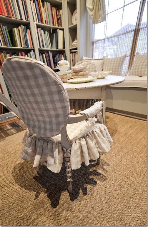
Hien Lam made the slipcovers with a ruffled skirt and tied on arm covers.
There are cute ballerina ties on all the legs – I love that detail. Notice the slipcover comes in 4 pieces – the back, the seat, and the two arm covers.
One of my favorite parts of the library is all my Beta Plus books (all 33 of them!) are finally together – on the right, the bottom three shelves. Some of them are bigger and so they are stacked front-ways, but it doesn’t matter. It’s just great to have them all together in one place. I also organized the books in separate sections – such as French design, English Design, Italian Design, Californian Design, Classical American Design and Interior Design, Country Design, along with window/curtain, bedroom and bathroom design, which again makes finding books super easy! And finally – at one point I was going to put sconces either on the sides of the shelves or above them, but in the end, I thought it was just too-too much. Instead, my electrician added tiny ceiling lights around the perimeter of the room, on a dimmer, which makes the room either very bright or atmospherically dim, take you pick.
From this:
To this!
Better?







No comments:
Post a Comment