Remember the Aidan Gray contest that we ran last year? About 60 of you entered it hoping to win the prize where Aidan Gray owner, Randal Weeks, would bring a houseful of his furniture into your home to photograph his newest catalogue. I narrowed down the applications to just around 20 (just!) and from those, Randal picked the six winners. Recently I heard he had been photographing some of the winning houses – but hadn’t heard the outcome - until the other day, that is, when I got an advertisement email from Aidan Gray. Imagine my surprise when I noticed the backdrop of the ad was one of the contest winner’s house!!! I was so excited!! Randal was sweet enough to send me the photographs from the two houses in Dallas that he has photographed. I found it so interesting to see how his furniture changed their rooms and I thought you would like to see the final results too!
Both houses that have been photographed so far are located in Dallas. This house shown above won 2nd place in the contest. It is an older home, and rather large – having been added onto several times over the years. The house is located in beautiful and historic Highland Park.
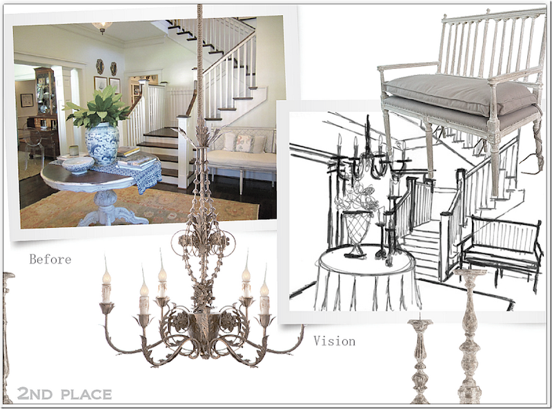
The front door opens to this wonderful, old world feel entry and stair hall. A large, welcoming foyer is, unfortunately, often missing in the newer houses of today. This space with its white moldings and dark brown hardwoods caught Randal’s eye.
He envisioned changing the room to look like this – with a skirted table, a chandelier, an AG bench, candlesticks and wire baskets.
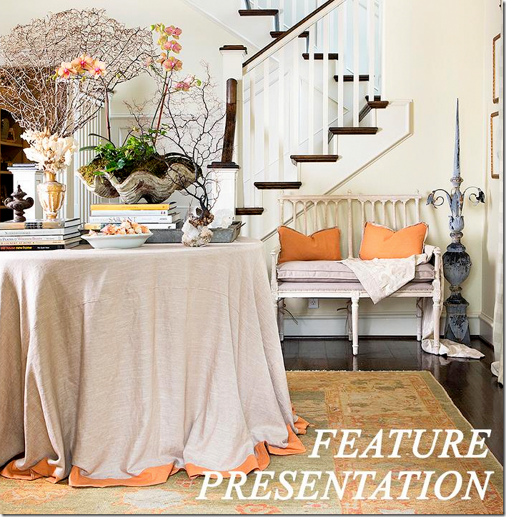
And here is the first advertisement from the 2nd Place winner! Using their rug, Randal brought in more orange through the pillows and the trim on the skirted table. He used his own bench – the Coyle Love Seat. The Coyle also comes in a larger size. Randal put a few of his accessories on the table. But, as you can see the plans for the chandelier were canceled as were the candlesticks. I can see where he didn’t have the room the chandelier. The clam shell came from the homeowner. I just love how this looks – I think it’s really pretty. While I like the way the foyer usually looks – I also like it here, with the AG furniture.
Off the entry hall is the living room and further down is the library which leads to the screened-in porch. The area open to the right of the sofa is the dining room – but the homeowner didn’t send any pictures of it with her entry.
The living room is filled with French styled furniture.
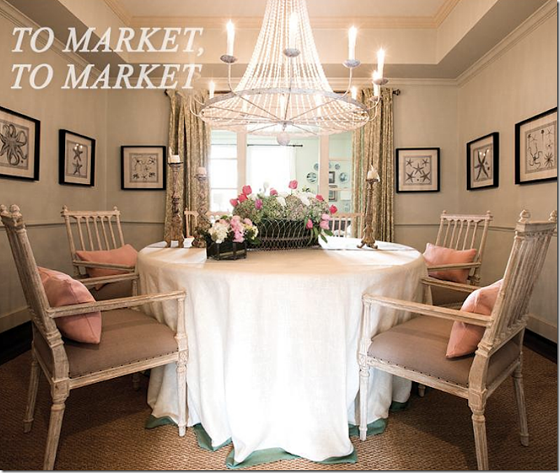
And here is the Aidan Gray promotional photograph of the dining room. He brought in another skirted table and added four Coyle dining room chairs with arms. Overhead, he hung the beaded Naples chandelier. On the table are Aidan Gray candlesticks and basket. I really like the Coyle family of seating. Again, I like what Randal did to the dining room- but I can’t compare it to what it normally looks like since we didn’t get a photograph of the room.
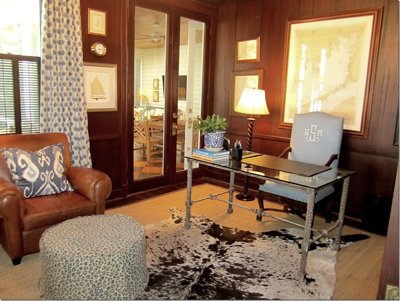
Next to the living room is the husband’s office that connects to the screened-in porch.
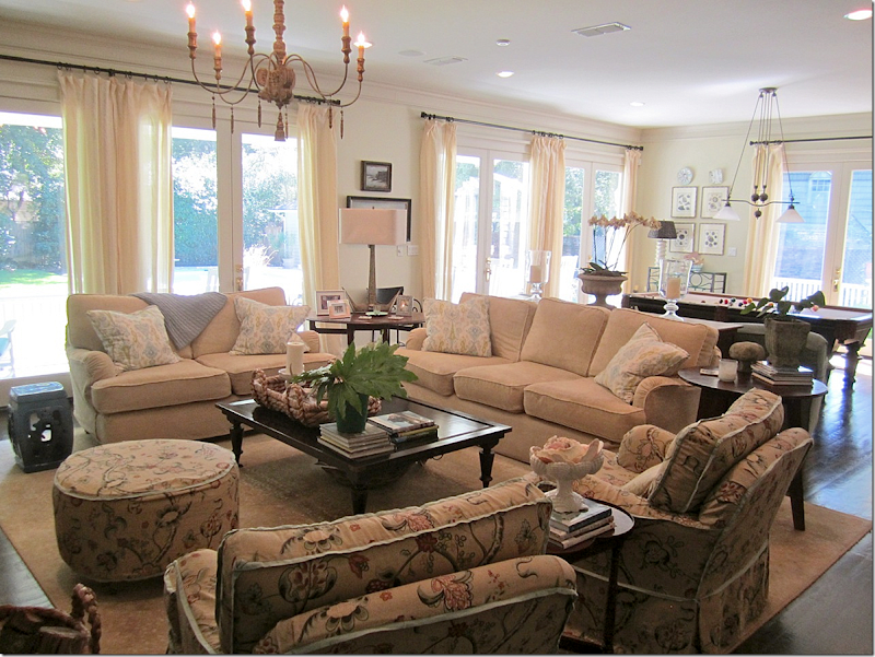
The porch leads back to the kitchen, breakfast area and family room.
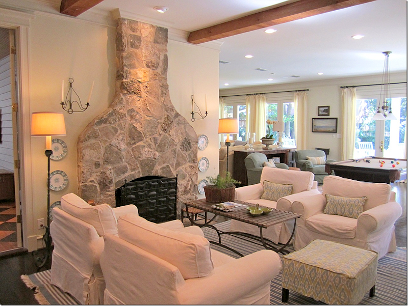
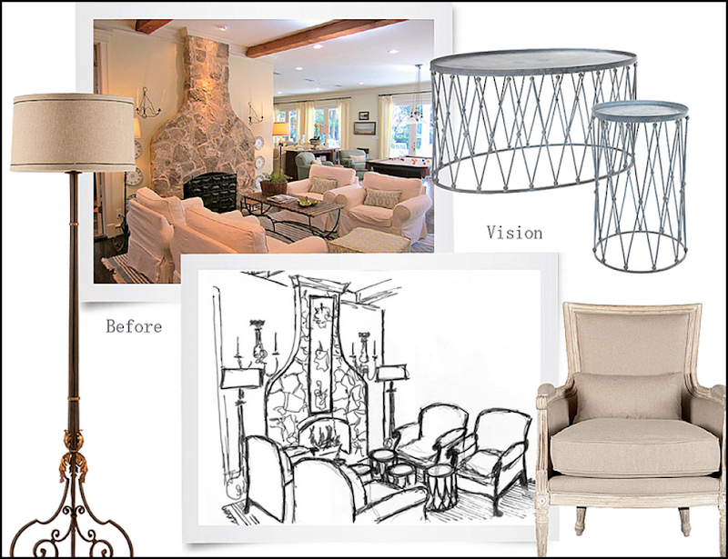
Through the screened-in porch is the keeping room which is right off the kitchen and family room. The space is filled with slipcovered furniture and a blue and white rug. This is another vignette that Randal wanted to photograph.
He planned to place four French bergeres around a trio of small tables. He also wanted to use sconces and floor lamps.
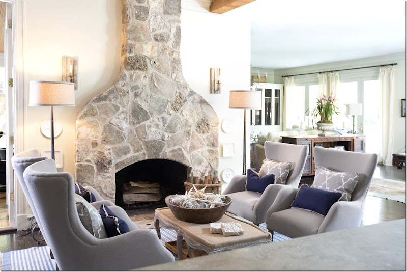
And here is how the room actually turned out – quite different than his original plan. Aidan Gray recently introduced a line of mid-century influenced seating and here, four of the new Olivier chairs in dark linen were used around the new Foley coffee table/bench. Love that bench! He used the Winchester floor lamps as planned, but a different set of sconces were placed on the wall.
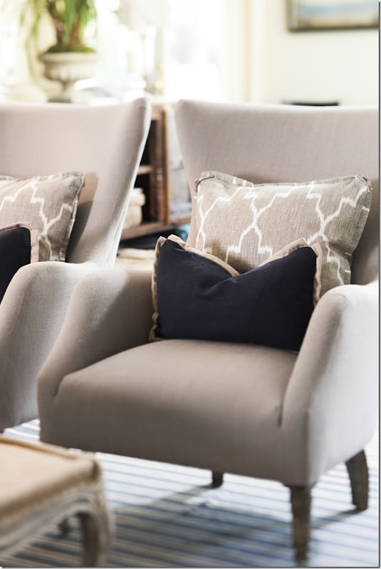
Close up of the new Olivier chairs and pillows. Be sure to check out the other new chairs in their catalogue.
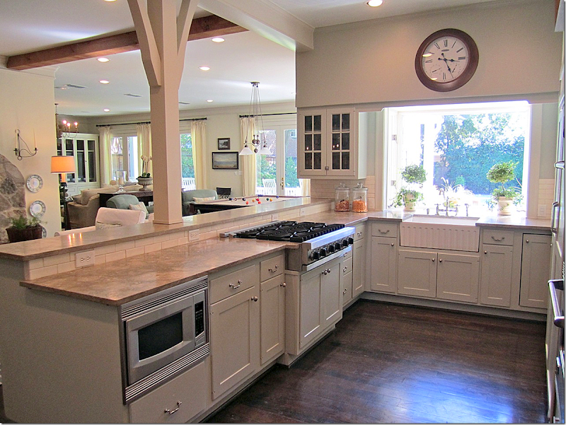
The kitchen overlooks over the keeping room and the family room.
Against the kitchen window, Randal took a few photographs using one of the AG2 lamps and a trio of their candlesticks.
The family room and pool table area over look the large back yard and swimming pool.
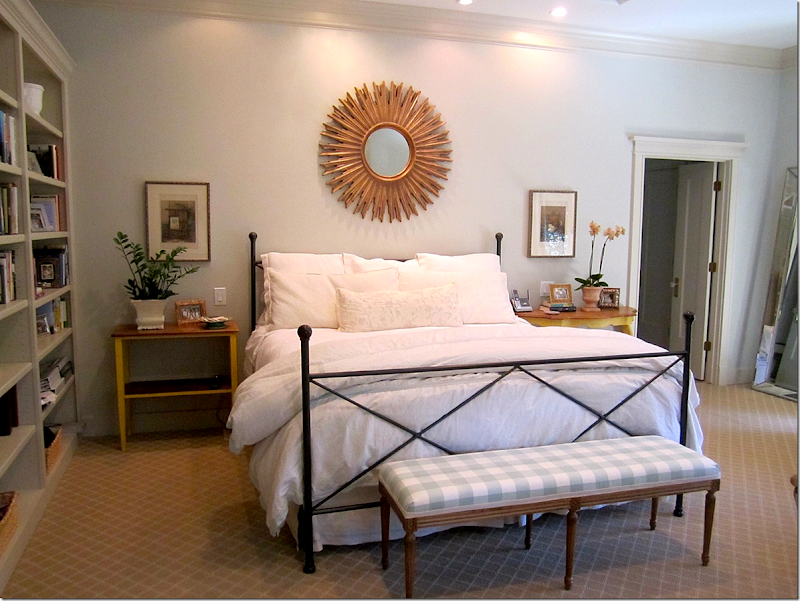
Upstairs the owner showed us her master bedroom suite – with its built in book cases.
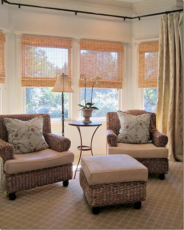
And a bay window with chairs and ottoman.
Randal planned to photograph the master bedroom using an Aidan Gray chest, lamp and bench – but plans changed.
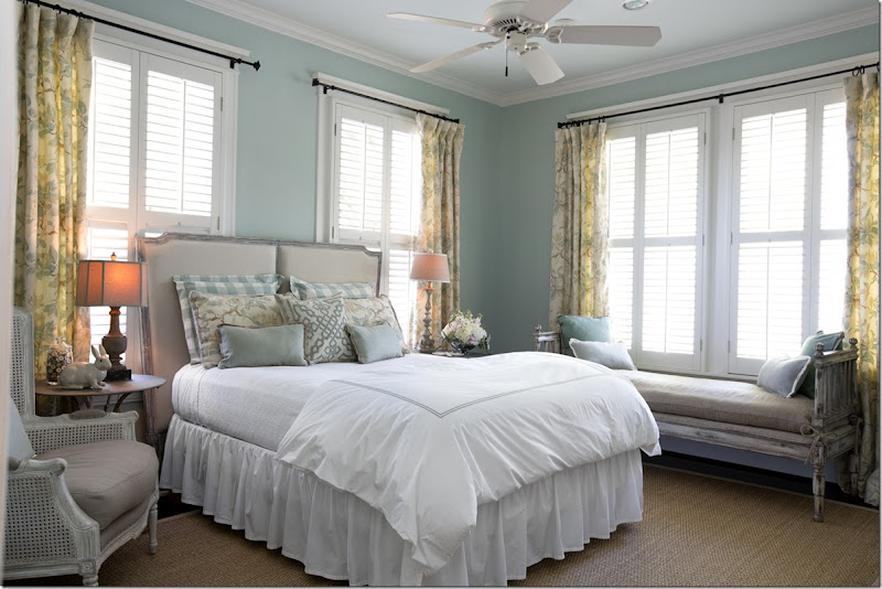
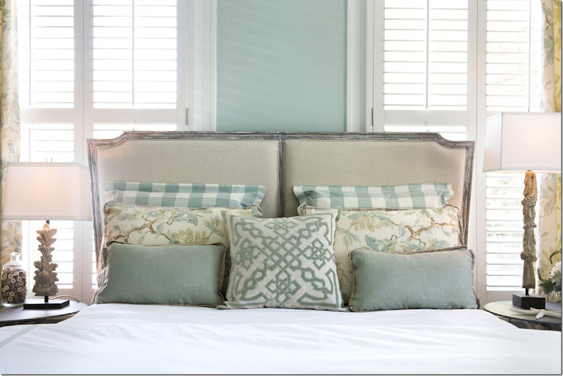
Instead, he photographed a bedroom that the owner didn’t submit in her application. This bedroom – probably a guest room – faces the front of the house. Randal brought in a collection of furniture and lamps to use here.
He used the beautiful Eames bench covered in hemp.
A close up of the linen covered headboard.
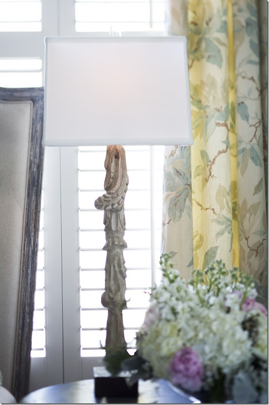
On one side – an Aidan Gray lamp.
And a different Aidan Gray lamp on the right side of the bed.
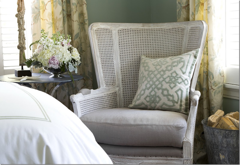
And he chose a large scaled cane bergere for next to the bed. Love this chair!
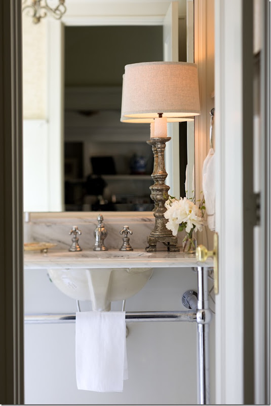
And in another unplanned photograph – an Aidan Gray lamp sits on a bathroom vanity.
And finally, upstairs is another room we didn’t see – a bedroom turned into a sitting area. Randal used the 4 bergeres that were supposed to be used in the keeping room – paired with the wire tables and garden buckets, mirror and sconces. Love those tables. The chandelier is also Aidan Gray. This photograph was used in another mass ad email.
In the end, in the 2nd Place house – some of Randal’s original plans were executed, while others were changed and tweaked – and some photographs, like the dining room and sitting room, were a total surprise!
To read the original story of this house winning 2nd place, go HERE.
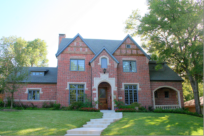
This Gothic Revival house located in Dallas’ Lake Highlands area near White Rock Lake was the 3rd place winner in the Aidan Gray contest. The house was built in 2010.
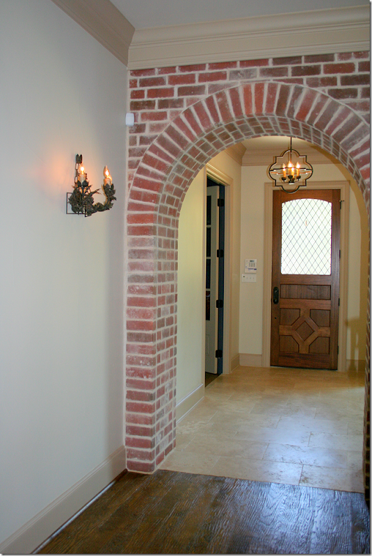
A leaded glass door opens unto the foyer that leads to the family room and kitchen which are located through the brick arch. Right off the front foyer is the blue paneled library and the dining room.
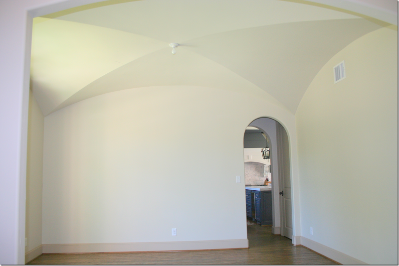
To the left of the foyer is the dining room with its pretty ceiling – through the arch is the kitchen. Now, as you can see the dining room is completely unfurnished, but this didn’t stop Randal from choosing this house for 3rd Place. Randal didn’t submit any plans to use this room, instead the plans he submitted were for the kitchen. But, this is where it gets really interesting!
When Randal came to tour the house, the homeowner, Tiffani McKenzie, explained that she had been an interior designer who had worked for a high-end firm until she got pregnant. Now she does interior design under her own name. Tiffani shared with Randal what her ideas for the dining room were – and one item was to glaze the walls – using Houstonian Leslie Sinclair’s firm – Segreto Finishes. Along with the glazed dining room, Tiffani also wanted Segreto to work on the beautiful cabinets in the family room. Randal quietly listened to her plans and then left.
The next day, Randal called her to tell her that Segreto would be painting her dining room and family room cabinets!!!!!!!!!!!!!! Talk about winning the LOTTO!!! Hey, Randal, I want my house glazed too!!! Tiffani was besides herself and couldn’t quite believe it. She said she felt like she was in a dream. I can only imagine! Segreto is the best of the best – bar none, and anyone lucky enough to be able to use them is truly blessed.
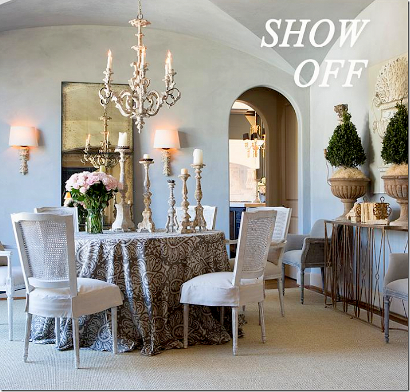
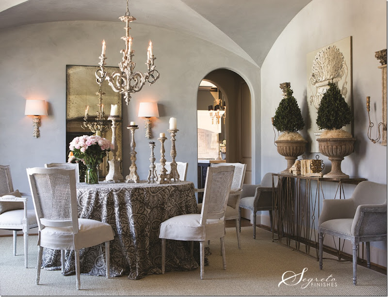
And here is how the once empty dining room now looks!!!! OMG!!! I love the gray glazed walls that Leslie did. Since there is so much blue in the house – the soft color makes perfect sense! Isn’t the color gorgeous? Randal used a skirted table and placed a collection of his chairs around the table along with a combination of Aidan Gray candlesticks. He included two Sue caned dining chairs around the beautiful Marlene console with its antiqued mirror. He used the Fragment Carved Leaf sconces, along with the new Ebby High French chandelier. Against the wall is the large, three sectioned antiqued mirror. Large gilt sconces flank the console and a seagrass rug anchors it all.
Wow. I am so happy for Tiffani and so grateful for Leslie of Segreto for doing this. What a dream come true!!!
Tiffani wrote me:
It has been so fun to collaborate with Randal on my dining room and see my design ideas come to life once he started layering it with his beautiful furniture and accessories and then to have Leslie's talented crew out to my house....I still feel like I'm dreaming. I can't say enough about Leslie's team and how professional and nice they all were. I worked closely with her head cabinet artist to come up with the finish of the cabinets in the great room and I couldn't be more pleased!! Everything feels much more balanced now.
The photo shoot was so fun and I am so grateful to you and Randal for running this contest. Randal has to be one of the nicest and most talented people I have ever met. I feel so honored that he would want to collaborate with me on my dining room! And as I'm sure you can understand to have someone as creative and talented as Randal tell me that he really loved and appreciated all the other design features I created in my house is huge for me personally and as a designer. I really can't wait for you and everyone else to see how all the photos turned out! Randal's new products are amazing!
Thanks Tiffani!
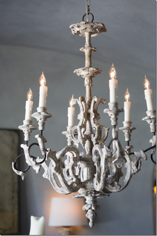
A close up of the new Ebby chandelier.
The tablescape.
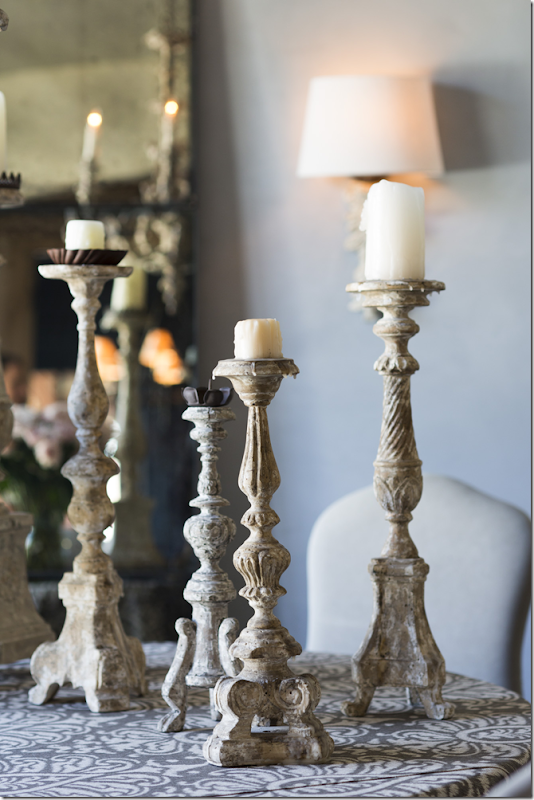
A collection of Aidan Gray candlesticks – these are really great, I use them all the time.
A view of the beautiful sconces – the Corinthian Column Top Wall Candelabra. Love this vignette with the orchids in the wood like urns.
Close up of the Aidan Gray products used in the dining room.
And here is the final photograph that was sent out in a promotional email.
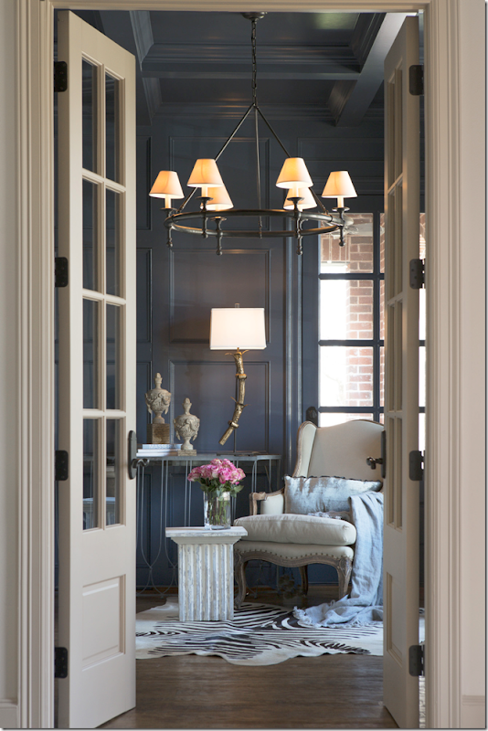
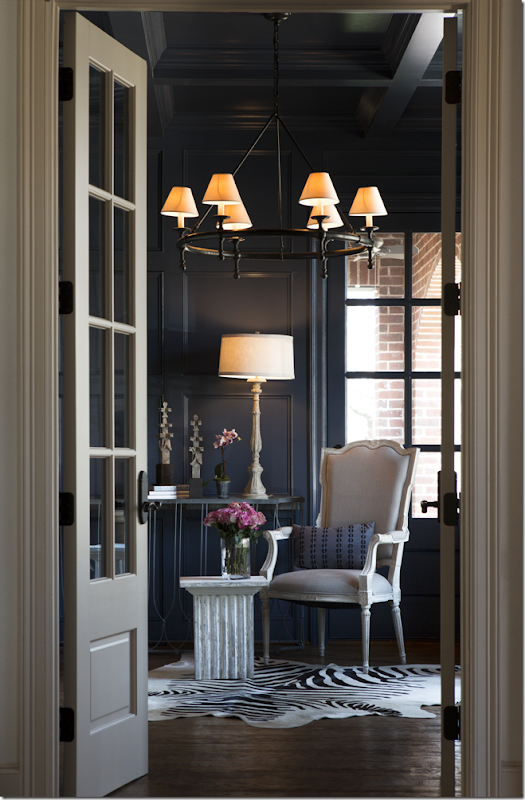
Off the foyer to the right is the blue painted paneled library that faces the front yard and leads to an arched porch.
In the library, Randal set up a small vignette using his bergere and his column table – which comes in two sizes! These are much more price friendly than the RH ones. Against the wall is a console with AG finials and an Aidan Gray lamp. Surprisingly, the homeowner’s own chandelier was used in the picture!!
Here – a change out of the chair and the lamp and accessories. I think I like the first picture best. I really like that table!!! The Wishbone console has the antique mirror top.
Close up of the accessories on the console table in photo #2.
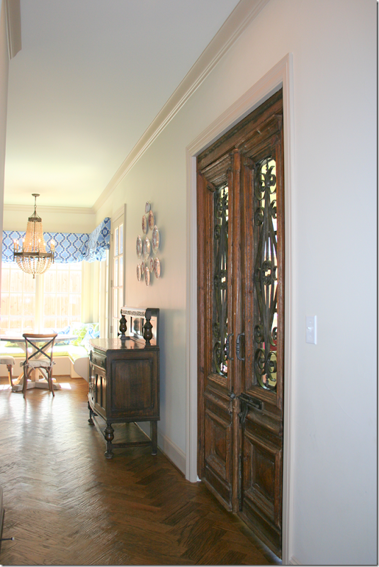
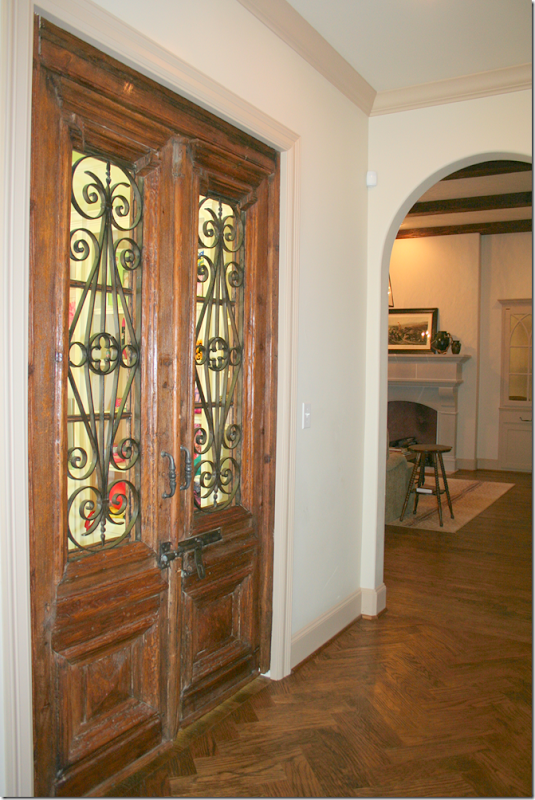
The entry leads to a hall that runs along the back of the house. Towards the left of the hall is the kitchen and the playroom which is behind the antique doors seen here.
And to the right of the hall is the family room seen here, which leads to the large covered porch and the master bedroom suite.
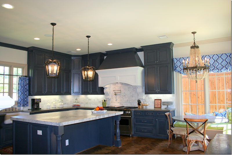
The kitchen and breakfast room are painted in the same dark blue as the library. The backsplash and island countertop is marble.
There is a small sitting area in the kitchen with a fireplace. Randal liked the kitchen and wanted to take pictures in here.

He proposed using two Aidan Gray chandeliers, along with barstools and accessories.
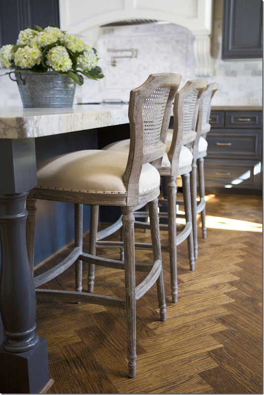
Here is how the final ad looks! A trio of Aidan Gray Chelsea barstools were used, as were a pair of gilt light Grenoble fixtures. Brass and navy are hot today, and I think if Tiffani ever updates – she could switch out the hardware in here to shiny brass. I love how the gilt looks against the dark walls. He also used his wire basket and candlesticks.
Close up of the Chelsea bar stools. Pretty hardwoods!
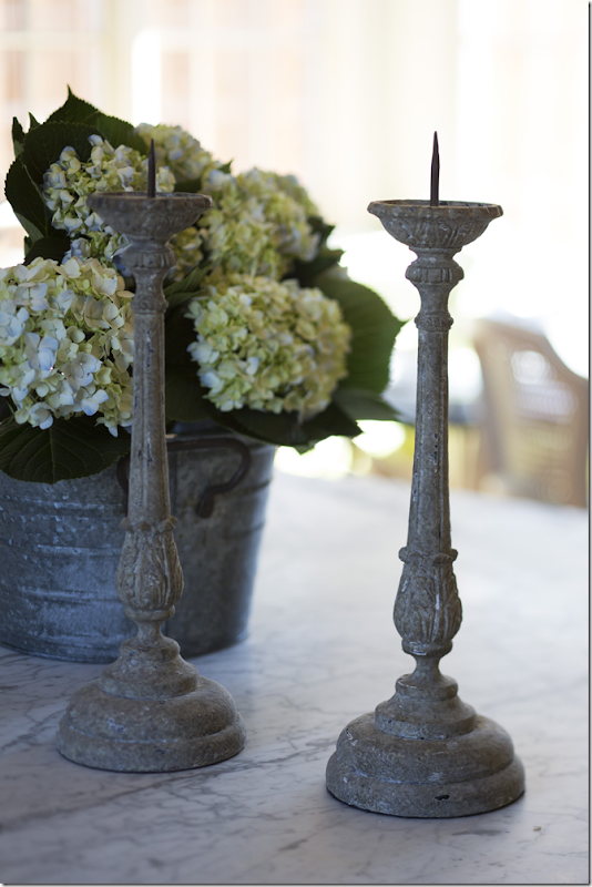
And close up of the Aidan Gray candlesticks.
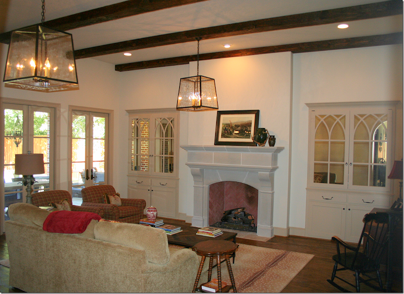
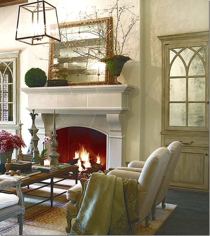
To the right of the front entry and back hall is the master bedroom suite and the family room – both rooms open up to the outdoor covered porch with dining area and seating area around a large fireplace. Two lanterns hang over the large room with its antelope rug. The two cabinets with their gothic inspired detailing have antiqued mirror glass in them. Tiffani says that the antiquing process was never strong enough – but she didn’t want to tear it apart to redo them. Additionally, she had always wanted Segreto Finishes to glaze the cabinets. Enter Randal Weeks. He asked Leslie Sinclair from Segreto to come to Dallas to do these cabinets and the dining room walls. While the cabinets were being glazed – Tiffani took out the mirrors and had them re-antiqued for a much more dense look, which she now loves. While Randal did not originally plan to photograph the family room – after seeing it, he decided to go ahead and do it, to beautiful results:
Here is the family room filled with Aidan Gray merchandise!!! Wow!!! I LOVE this!!! First, the room itself is beautiful with the beamed ceiling, French doors, stone fireplace and Gothic inspired mirrored cabinets. You can see where cabinets now have a glazed finish on them which gives them an aged appearance. Also, the heaver antiqued mirrors look so much better – what a great, permanent change for the homeowners! Randal kept her lantern – which surprised me – and he kept the antelope rug, which didn’t surprise me. They don’t carry rugs at AG right now. In the middle of the room, he used the homeowner’s coffee table – another surprise that he didn’t use the opportunity to showcase one of their own tables. Next he placed the Liam bench in front of the fireplace – I love this look – he put four Paris Salon chairs around the coffee table. He accessorized the coffee table with various decorative items from AG. On the mantel he placed more accessories and the Aidan Gray gold Bilzen mirror. This mirror is exceptionally pretty. It also comes in a gray finish, but I’m partial to this finish below:
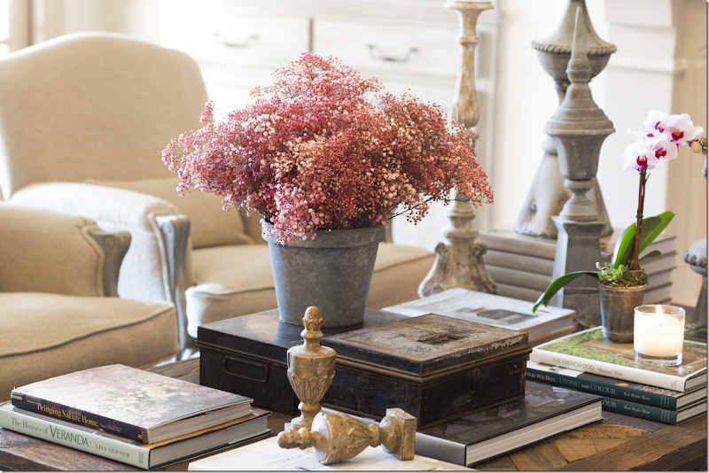
Close up of coffee table – I have those two gilt Jeanette Alter finials and they look great in bookshelves and on tables.
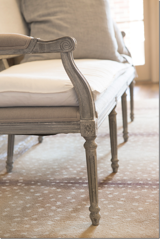
Close up of the Liam bench.
Close up of the newly glazed cabinets with the antique mirrored glass.
And here is the master suite in the taupes and blues that run throughout the house.
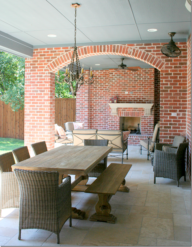
And the back porch that runs along the family room and the master bedroom.
And, though only the kitchen was planned to be shot – Aidan Gray also photographed the dining room, library, and the family room for their new catalogue. Still, whatever happened to the house that won 1st Place? Or the three runner-up houses?
To read the original story about the 3rd Place winner, go HERE.
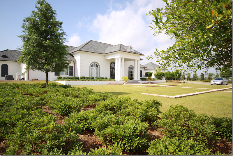
The house that won First Place is located in Louisiana – newly built, the homeowners were still in the middle of decorating the large house when they entered the contest.
Here’s the original story of the 1st place winner. HERE.

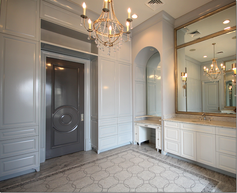
And he wants to set up the master bathroom like a salon.
Since the house is in Louisiana, logistics for photographing there are a bit harder than in Dallas. Plus, there are 2 houses in Houston and one in Austin that were runners up that haven’t been photographed yet either.
It’s possible that he will try to get to these houses before the year is up, but if not - there is always next year!
Randal, a huge thank you for sharing your catalogue process with us! This has been so great! I think everyone has truly enjoyed this from start to finish!!!



















No comments:
Post a Comment