It seemed like everywhere I turned last week I ran into Rachel Ashwell, the English woman who brought slipcovers to the United States. Yes. She did. If Rachel never had had two little children with “sticky fingers” I wonder if anyone would have done what she singlehandedly did. It’s amazing to think about really. She started a trend that shows no signs of letting up – while slipcovers have changed a lot – over the years, they remain a constant in our lives. Today, slips aren’t wrinkly and oversized, instead most are tailored and sometimes not even obviously a slip. I will never live without a slipcovered sofa again, because there is nothing I love more than freshly laundered fabric on my furniture.
Still, though the modern world owes this woman a debt that could never really be repayed (too bad there isn’t a patent on slipcovers – she’d be a billionaire!) – her life as a businesswoman hasn’t been easy going. A few year ago Rachel’s Shabby Chic went bankrupt – forcing her to close all her stores and sell off excess fabric, most of it plain, at a huge discount. The future looked very bleak at the time, with her line with Target the only bright light.
Today, that has all changed. You can’t keep a good woman down – especially one that changed the design world. She has slowly reopened a few stores in key locations: NYC, London, San Francisco, Santa Monica, and Round Top, Texas. It stills make me smile to think that Rachel Ashwell owns a piece of Round Top. The stores are now known as “Rachel Ashwell Shabby Chic Couture” and nothing really seems to have changed.
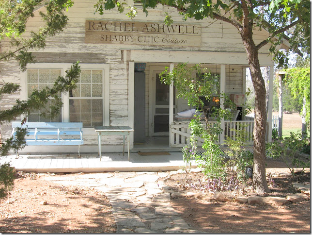
The Round Top store at “The Prairie by Rachel Ashwell.”
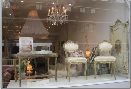
The London Store.
Besides getting back into the retail business, she’s doing a bit of decorating – and seems to be concentrating on that aspect of the business. Through the stores and email – she is now offering In Home Design Consulting.
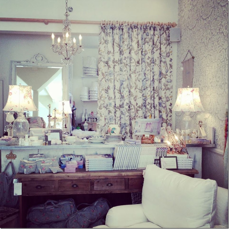
The newest store in San Francisco – Rachel sells Farrow and Ball – whose wallpaper is seen here and Bennison – whose fabrics make up the curtains in this store. Wow! Two of my favorite companies!!
Rachel sits on the porch steps of one of the cottages at The Prairie – her B&B Guest Ranch in Round Top, Texas. Elisabeth swears she want to get married here, with only family and a few friends. Sure. Just watch – we’ll be at the Four Seasons with 300+ guests!!! (Oh, I hope not!!!)
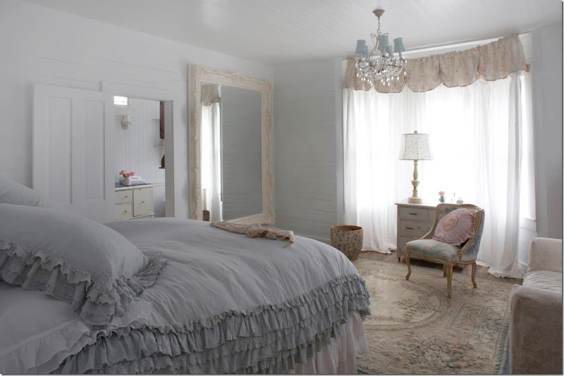
Each of the cottages at The Prairie are decorated differently in Rachel’s Shabby Chic style.
Besides retailing and ranching, Rachel has a new book due to come out in October which will document The Prairie (can’t wait!!) And she is working on an autobiography of sorts – a memoir. Many of her books showcase her latest house, of which there have been plenty. As I’ve written before, one of her Malibu houses which she documented in “Shabby Chic Home” is one of my favorites design stories and I wrote a story about this house, HERE. Rachel is no stranger to buying and selling houses – typical in Los Angeles, I’m discovering. Besides that Malibu house, there’s her earlier rental house right on the beach and her tiny Malibu compound right off the beach, and now, her newest, “The Shabby Shack,” another beachfront rental, on the Pacific coast. There’s also her house in Brentwood and the house she lived in before that and the one before that. There’s her flat in London and the one she rents while in NYC. Plus, there’s the Prairie and all its cottages. And, finally, there’s the house she recently bought for her daughter, a tiny artist’s cottage in Venice Beach – the cutest!
Rachel’s newest book cover – sitting in the Pearl Barn at The Prairie.
Which leads me to this blog story. It seemed everywhere I turned – Rachel popped up. First, an eagle eyed reader emailed the info on Rachel’s former Malibu compound that is now for sale (people, please, please email me any houses you think I might like!) She owned that house for several years and then rented it out – one such renter was Britney Spears after her divorce. She also rented it long term to actress Peri Gilpren and her artist husband. The rental cost? $20k – a month. Peri and her husband ended up buying it about two years ago and last week put it up for sale.
And then, there was the news last week that Jessica Simpson’s house was on the market – decorated by none other than Rachel Ashwell.
With some gorgeous real estate photographs to peruse – let’s see what Rachel has been up to lately!
Enjoy!
“The Malibu Compound”
This house is across the street from the beach, with no water views. It is also a few houses down from Rachel’s previous beach house which she wrote about in “Shabby Chic Home.” The house backs up to a private golf course and has views of the mountains. It resembles a small compound of cottages – all painted Shabby Chic white. It’s just 1,783 sq ft and is for sale at $4.4 million. It is right across the street from a shared beach access with a deck and is located in the prime, gated, Malibu Colony.
Ms. Ashwell bought the beach house, which she completely renovted, in February of 2003 for $1,950,000. There are 3 bedrooms and bathrooms and one separate guest cottage that houses a bedroom and bath. When she sold it two years ago –it was during the bleakness of the bankruptcy days.
Here is how it looked when she showed it in the book “Shabby Chic Interiors.”
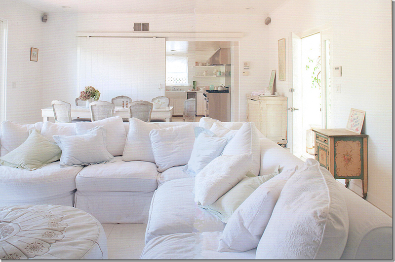
You may remember pictures of the Malibu compound when Rachel lived there. The living room/dining room opened up to the kitchen through a sliding white, wood barn door. The large Shabby Chic sectional has been moved to five different houses.
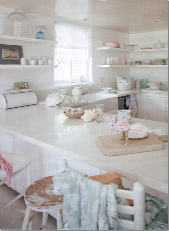
The kitchen is typical of Rachel’s no frills redo jobs – with white marble, farm sink, and stainless appliances. No upper cabinets, just shelves.
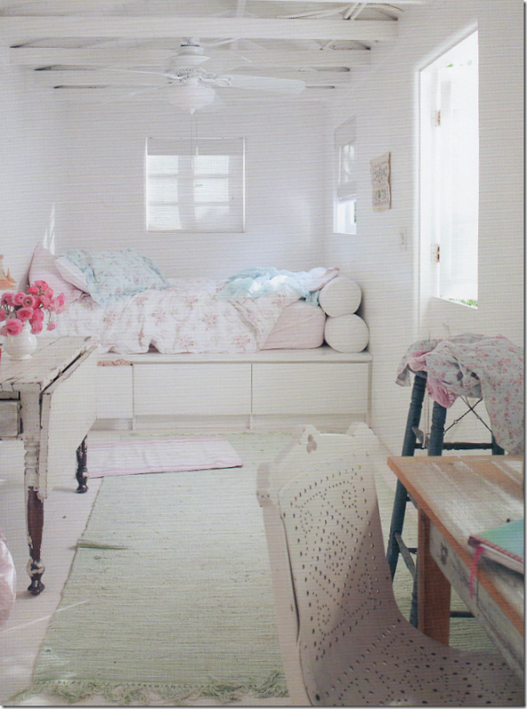
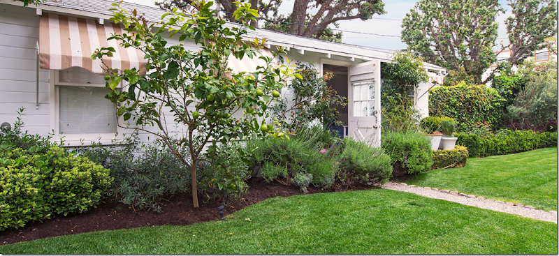
The guest cottage opens to the front garden through a Dutch door. The ceiling is exposed to the rafters and here, Rachel styled the room using her own sheets and linens. Darling.

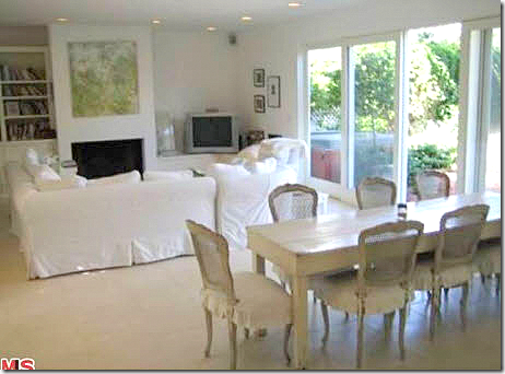
Here is how the real estate pictures looked when Rachel sold the cottage to Peri Gilpren – the cottage was listed, even though Peri had rented it for two years. Some of the pieces in these pictures was actually Peri’s.
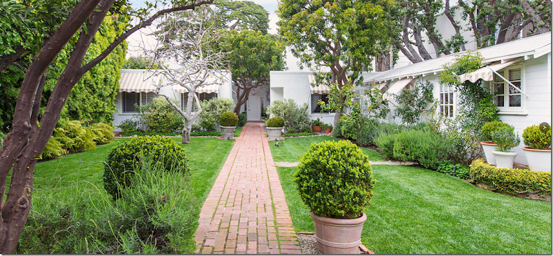
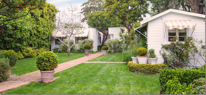
And here are the real estate photos from the Malibu compound – that Rachel sold two years ago to Peri – who is now selling it herself. At the right is the small guest cottage with its Dutch door. Love the awnings! Those are new – installed by Peri and I think they make a huge difference.
Another view of the front yard with the guest cottage and its awning to the right.
How the house looked when Rachel sold it – no awnings. And the landscape was not nearly as pretty as it is now.
Look at the fruit tree!! The landscaping is so pretty, especially for a beach house – even one that is over $4 million. Gasp!
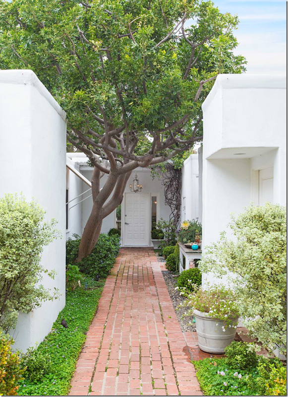
The front brick walkway leads to the door, painted white.
The unusual lantern, left over from Rachel, who installed it.
The front door leads straight into the main living/dining room with views to the back yard.
Inside, the room is divided into two areas – just as Rachel had it before.
How the house looked under Rachel – The shelves were added all the way around the living room by Peri – AND she also added a new fireplace mantel. I like both changes, a lot.
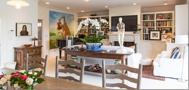
The living area – the master bedroom is through the door by the large painting. Remember – the owner is an artist so I assume all the canvases are his.
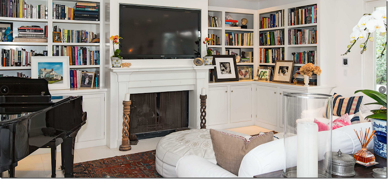
There’s even enough room for a piano here. Great shelves – they make the room so warm and cozy. I love them. I do wonder who decorated this house – did Rachel, or Peri, or her artist husband?
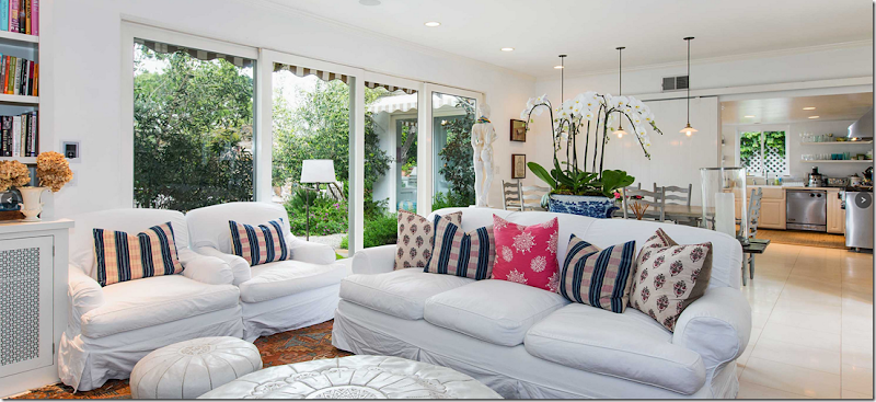
Obviously the new owners are fans of Shabby Chic. They have Rachel’s slipcovered furniture along with her large and small Moroccan poufs in white leather.
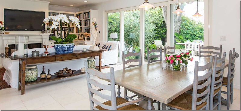
Even though the furniture is white, like Rachel’s was, and Rachel also used the poufs here, the room looks so different now – with the brighter colors and books and dark rug. I love the décor!!
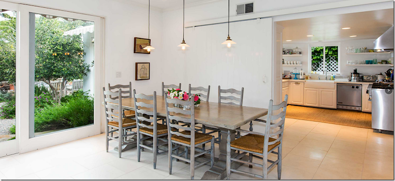
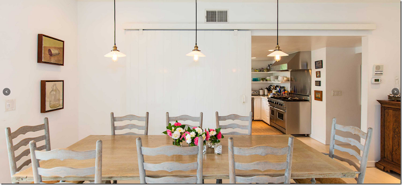
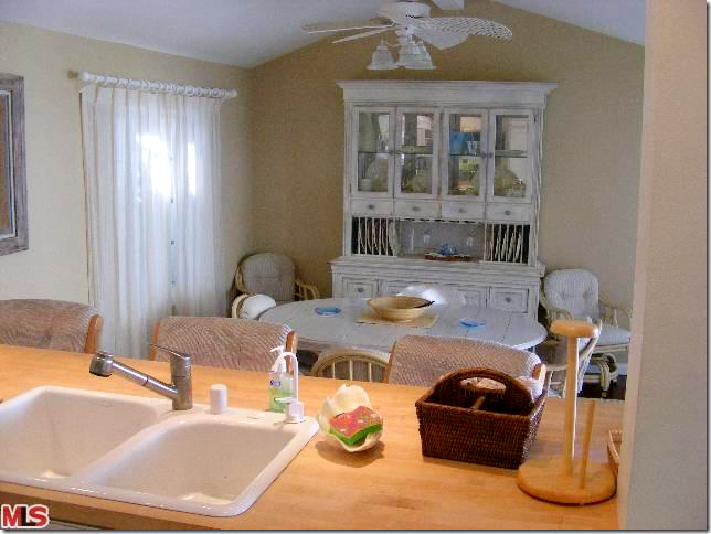
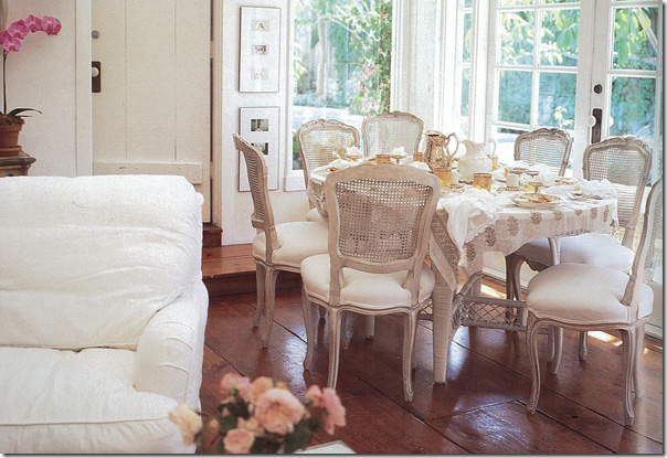
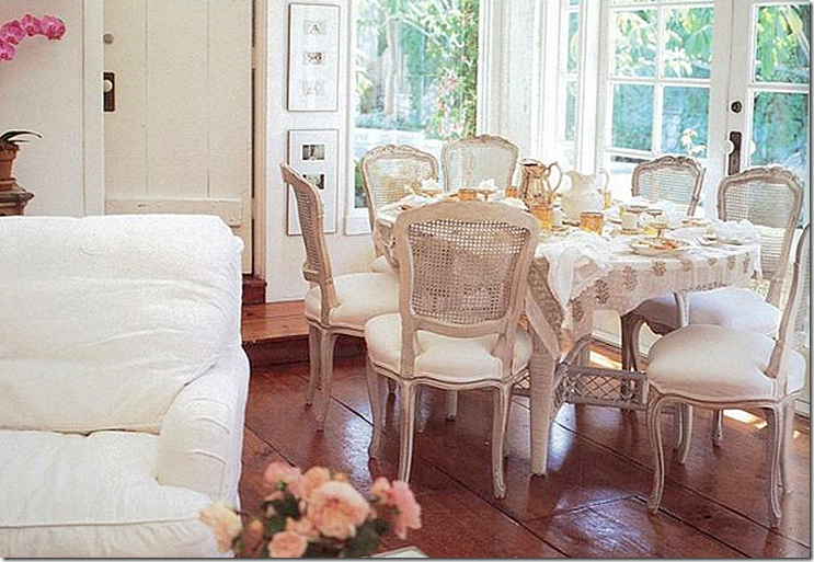
The new owners added the three pendant lights. And instead of Louis XVI French caned chairs, they used ladder back – gray washed just like the table.
The barn doors – these are great. Rachel put those in when she renovated the house.
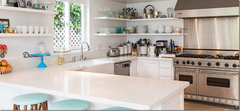
The kitchen remains the same, except for a new faucet and rug.
The family room off the kitchen.
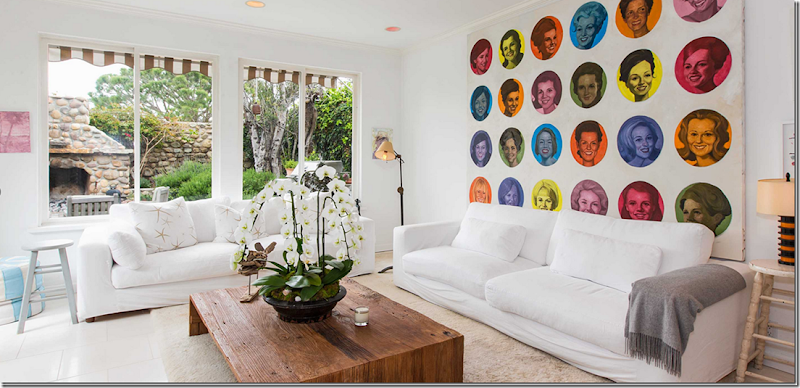
Off the kitchen is a family room – with another large piece of mod art work. The owner’s name is artist Christian Vincent – and if you like his work, go HERE and HERE to see more of it! Some of it is really, really fabulous. He is so talented.
The family room has more white Shabby Chic slipped sofas – very tailored – and it overlooks the back yard. This furniture was shown in the real estate brochure when Rachel owned it. Since the owners were renters at the time – it was probably their furniture, or did they buy it from Rachel?
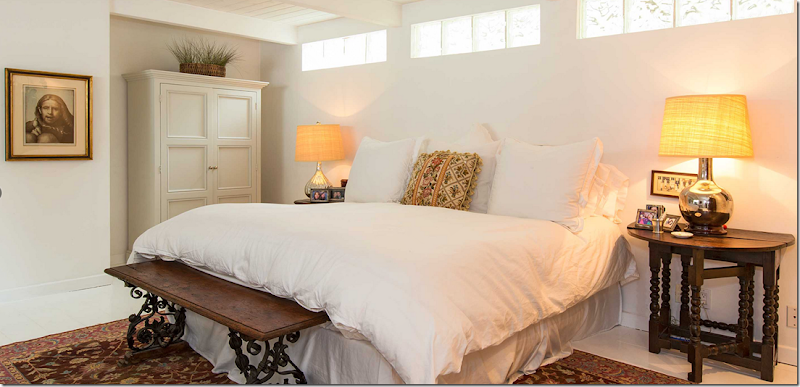
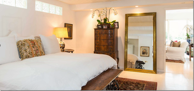
The master bedroom – Rachel’s mirrored furniture is gone, but the renter’s tables and lamps stayed on. The ceilings in all the bedrooms are rafters and beadboard – a mix from the contemporary vibe.
And looking into the living room. It’s odd how they rented the house, but didn’t make it a real home for two years – then when they bought it – they added so much to the house, more furniture, the shelves, the piano, etc. And then –they sell it – just two years later! Only in California! I’ve been trying to tell Mr. Slippersocksman that there ARE some people who don’t live in the same house for over 20 years!! He doesn’t care.
Under Rachel’s ownership – plain white with mirrored furniture and white linens. All really boring – I’m sure the house was stripped to the basics because it was rental property.
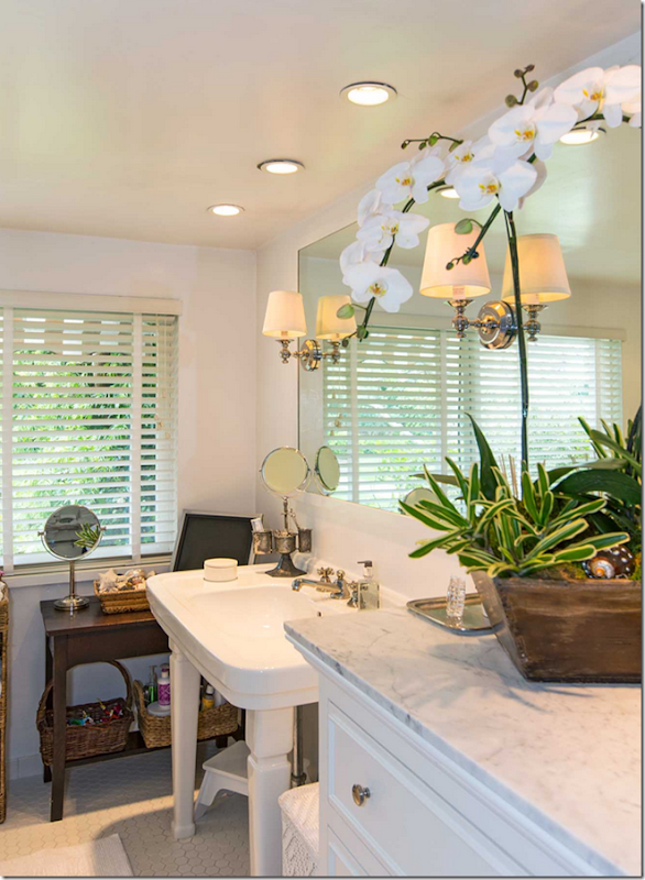
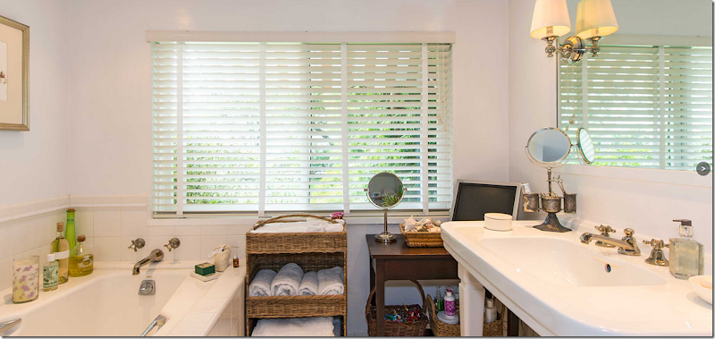
Rachel always creates hotel styled bathrooms with white marble, white tiles, lovely sinks and baths. But true to her style, she never over does it. Nothing is ever ornate or too much. Rachel likes things simple and honest.
Larger view – Rachel would never have added a new wicker piece or a brown wood table. It just isn’t her aesthetic. Still, the bathroom is pretty – especially that sink.
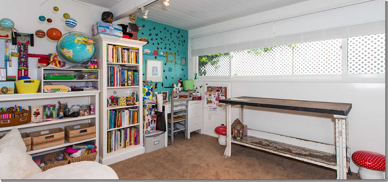
The daughter’s room. Not sure if the new owners put in that carpet. That’s another non Rachel aesthetic. I’ve never seen a house of her with carpet like this.
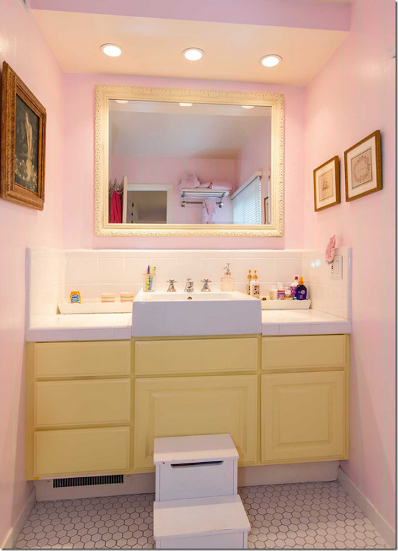
The daughter’s bath – newly painted and wallpapered – in non Ashwell colors. Rachel loves pink – but a soft, quiet pink, and never, ever yellow.
The third bedroom.
My favorite part of the house – the guest cottage. Rather than decorated in tones of soft pinks and turquoise like Rachel, the new owners used navy and white – which ties it in with the décor of the main house. It looks like the new owners added this row of built ins. Again, something Rachel would never have done. She particularly doesn’t care for built ins.
And the guest room bath. I’ll bet Rachel just added the tiles and the new shower door, but left the old sink. If that sink was original – she would have never changed it – it looks too much like her!
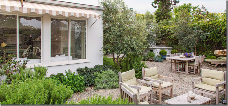
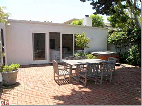
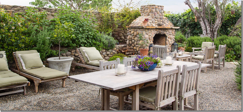
The backyard, which backs up to a private golf course, is charming – with its gravel terrace. In the corner is a hot tub, which probably came with the house – even before Rachel’s time – another thing I doubt Rachel would buy. I’m surprised no one ever took the spa out and built a tiny pool! The back yard was completely redone by the new owners – the gravel used to be brick, like the front walk way. I wonder why they didn’t make the front walk way gravel too – instead of the red brick?
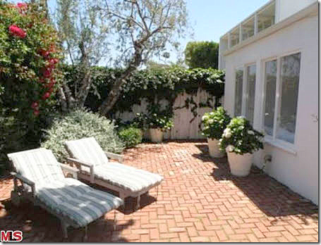
How the same back yard looked when Rachel owned it. I love the gravel so much better and I miss the awnings!!!
Another Before view with the brick terrace. Just can’t compare!
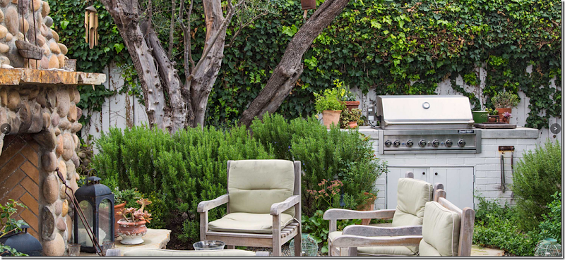
And looking toward the new stone back fence – the owners added this fireplace. I hate to say this, but I really don’t like the style of the fireplace. It doesn’t go with the style of the house. Not sure why they chose that rock? Looks like a beehive. Buzz!!
And they added an outdoor bbq center.
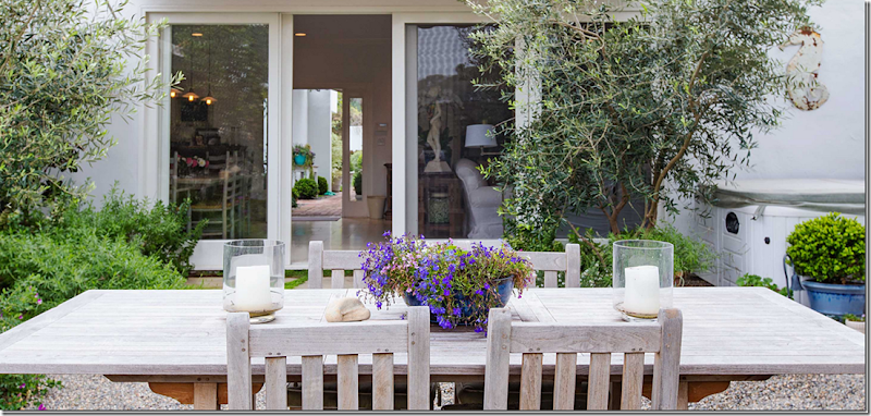
The terrace off the living room and the family room.
Looking through the living/dining room to the front door.
Take a look at more photos of the property here
Rachel sold this house after her business went into bankruptcy – a very hard, hard time for Rachel personally. She moved to a new beach house, a rental which she calls the “Shabby Shack.” This rental is beachfront and it’s a cross between contemporary and shabby. It has this great deck which is perfect for dining and sunning.
“The Shabby Shack”
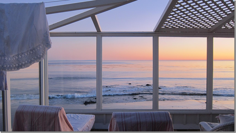
Sunsets at the Shabby Shack.
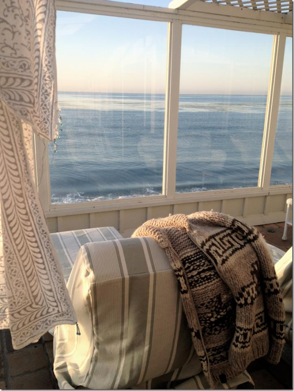
And early morning on the shore.
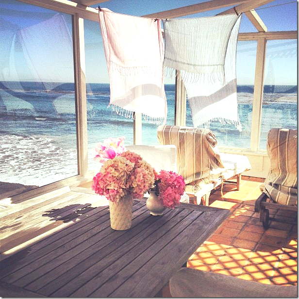
Rachel loves clotheslines and hanging up things to dry with clothespins.
She furnishes the deck with Shabby Chic pieces, like the table and the chairs – both available on her web site.
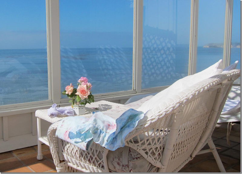
Another view of the deck with her furniture.
Whoa. Can I come stay?
The deck connects to the living room – with its Shabby Chic slipcovered sofa. Rachel says normally she would have put hardwood floors down, but since it’s a rental, she kept the terra cotta tiles instead.
This house kind of resembles her former Malibu Compound, with the contemporary angles and the wood roof.
Her Russian styled sofas, piled with colorful pillows.
Or styled with just white linen.
Her beach bedroom features her gray tufted Dakota chair and ottoman from her web site.
And her daughter’ Lily’s bedroom.
Below, there is a small pool.
Los Angeles:
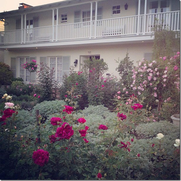
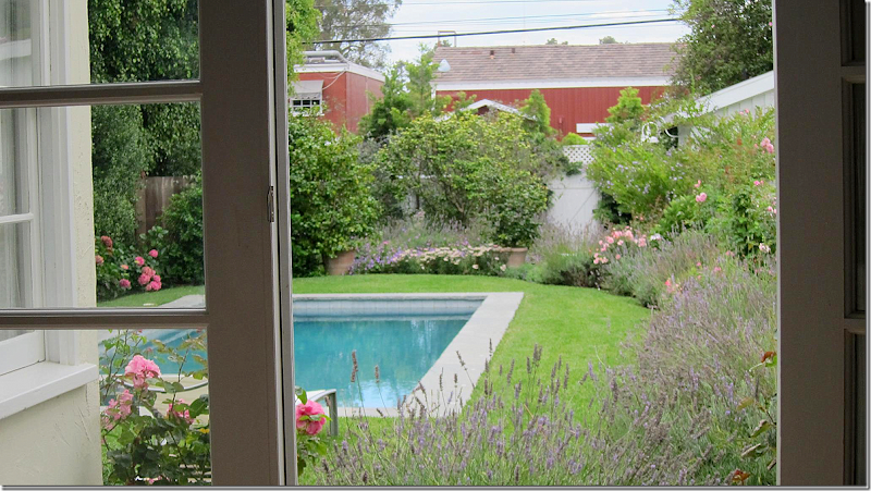
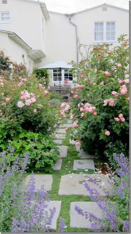
In Los Angeles, Rachel lives in this older 1920’s two story home with a lovely balcony and a zillion rose bushes.
She totally renovated the house, knocking down walls and reconfiguring the space according to her needs. The wood floors were lightened and given a lime wash.
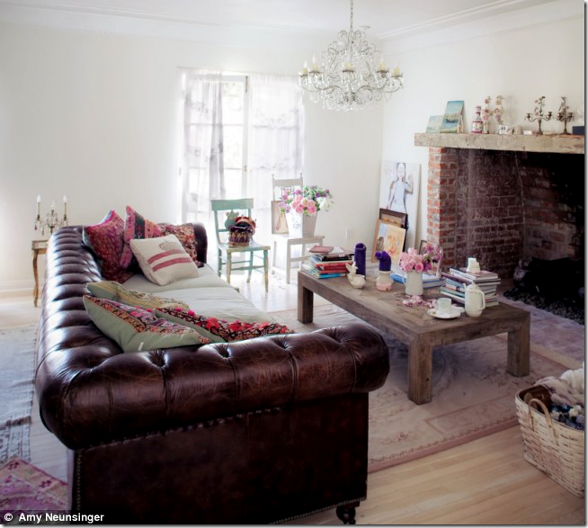
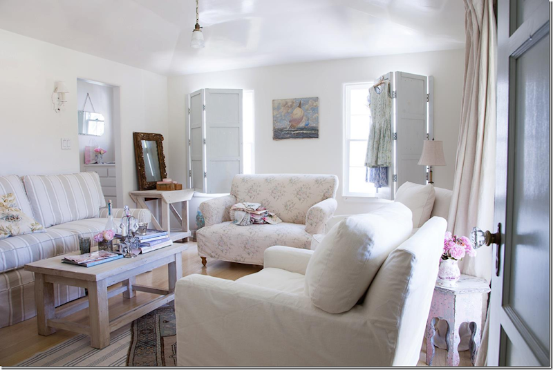
Inside the living room, there is a surprising brown leather chesterfield sofa and a wonderful crystal chandelier. The sofa is sold on her web site, as is the coffee table and chandelier. Rachel lightens the sofa up by putting slipped cushions on the seat instead of the leather.
I love the fireplace in the living room. Never seen one quite like it. Rachel said the fireplace was a real draw to the house – it reminded her of the English countryside.
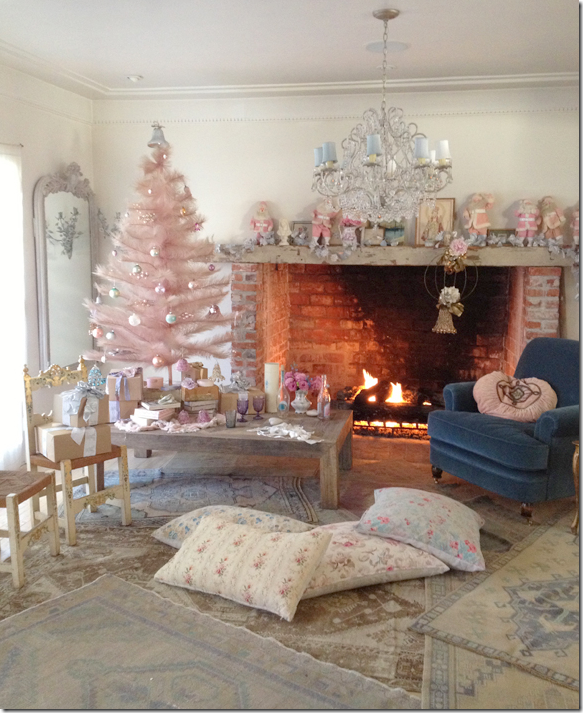
Styling the living room for a pink Rachel Christmas. Notice the pink and white Santas on the mantel that she collects.
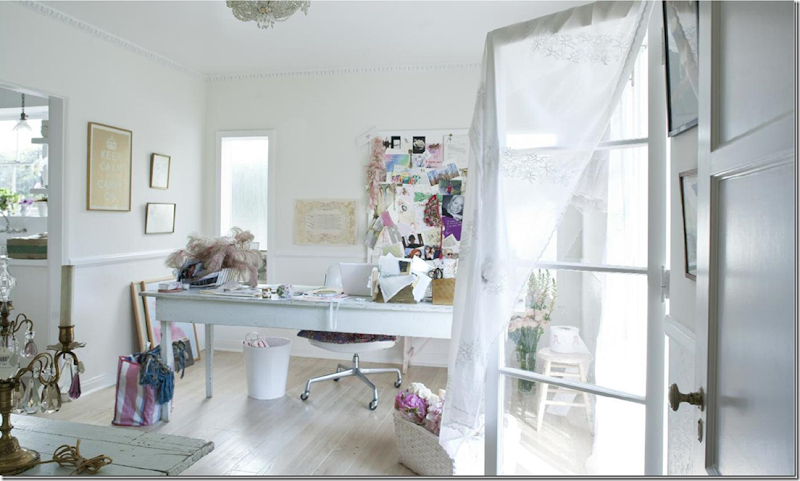
Instead of a formal dining room, Rachel set up her office in that space. I love how she doesn’t follow any rules in her houses. She uses the space exactly how she wants to without thinking – “I should have the dining room here!”
Between the family room and the kitchen she set up her dining room – this is an early view with a pink sofa.
This chandelier is for sale on her web site. I really loved the pink linen sofa although it didn’t stay there for very long.
And her dining room styled with new Shabby Chic furniture.
Today, the room has more modern chairs and white sofas from her web site/stores. I just love that chandelier.
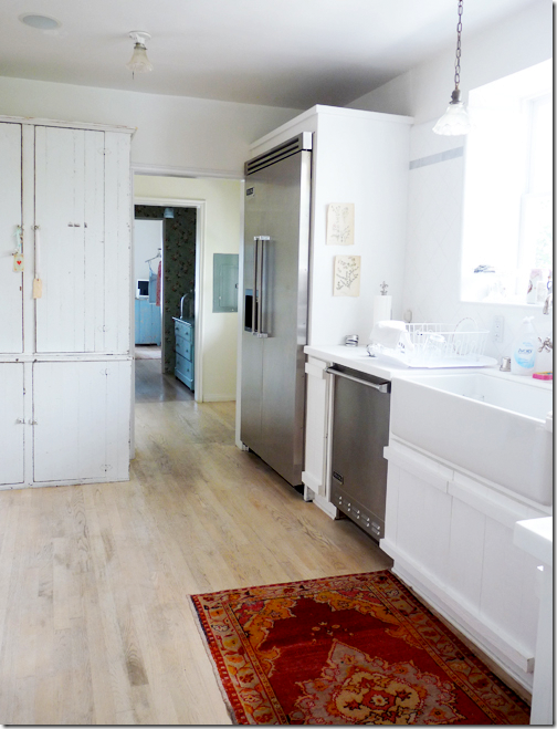
She ripped out the fancy, totally renovated kitchen and put in this quiet, plain one in its place. I love the cabinets – so English. The entire back wall is tiled in white.
A view in the opposite direction.
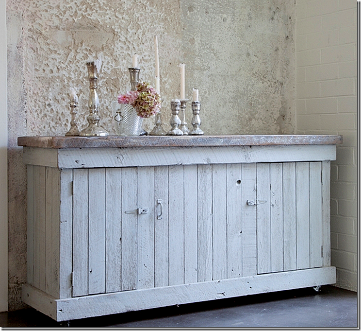
If you were putting together an unfinished kitchen – this new old-looking piece from her shops would make a great cabinet section. It’s on sale now, too!
And typically Rachel, the range is placed around the corner instead of in the main area of the kitchen. Which, I kind of really don’t understand! ha!
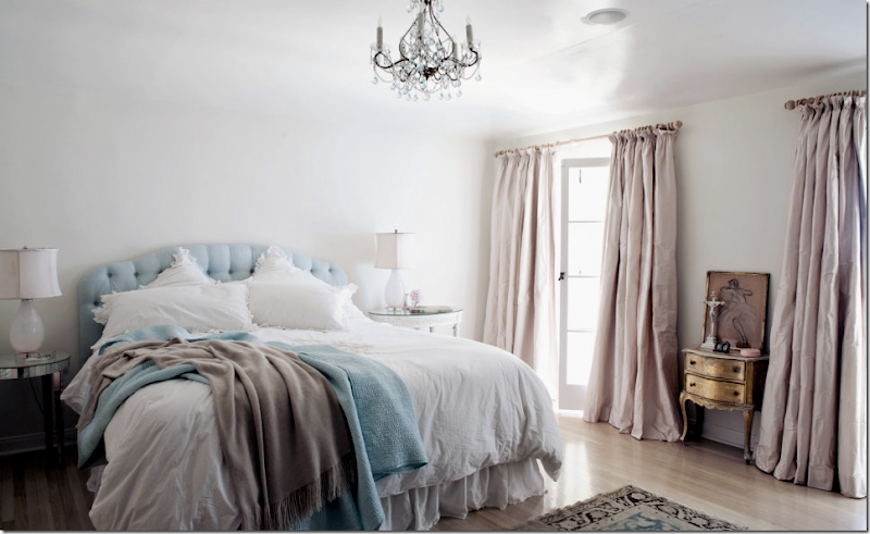
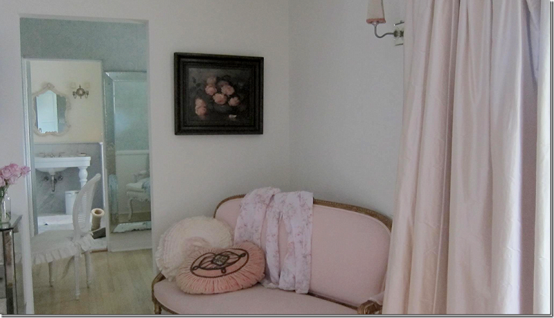
Her bedroom is my favorite with the blush silk curtains.
And styled here with her new line of monogrammed sheets.
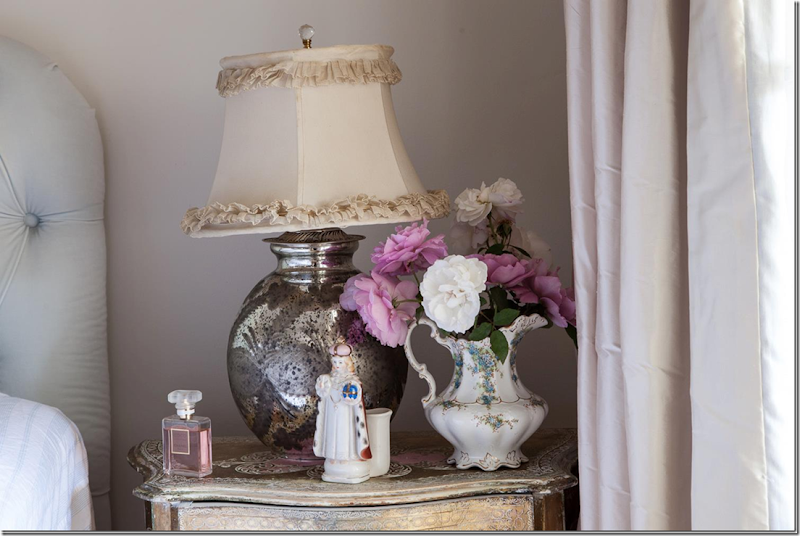
And so Rachel – her “wonky” lampshade”
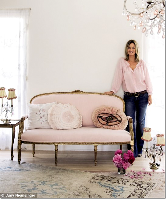
Love the pink settee – that was on the cover of her book.
The beautiful photo from her bedroom that became the cover of her book. She said she wore that silk pink shirt until it fell apart.
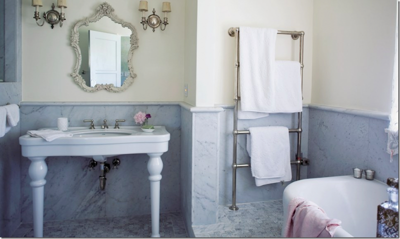
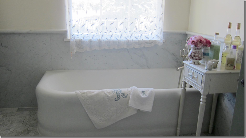
Her hotel bath with marble wainscoting and floors. Love the walls!! And the sink vanity. She also splurges on towel heaters.
The beautiful tub – white against gray marble walls.
Jake’s bedroom turned into a showcase of her apartment sized furniture. LOVE!!!! All the furniture is on her web sites/stores – including the wood tables. Notice the original glass doorknobs. Charming.
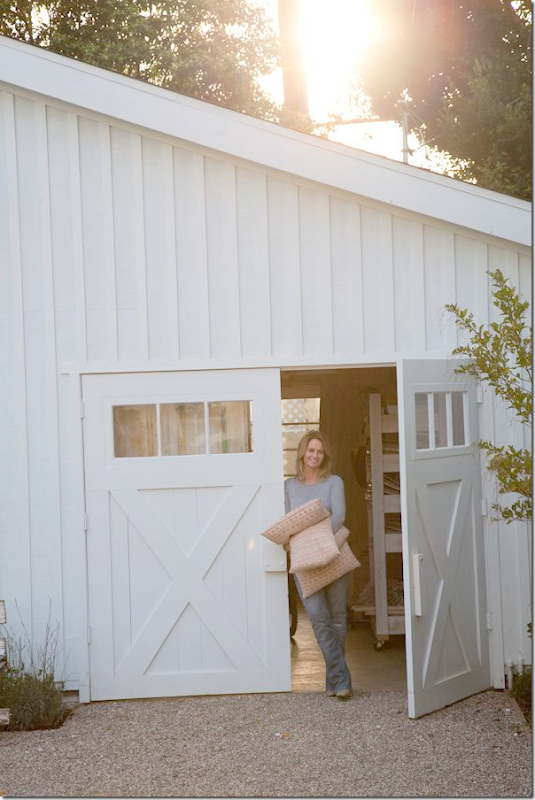
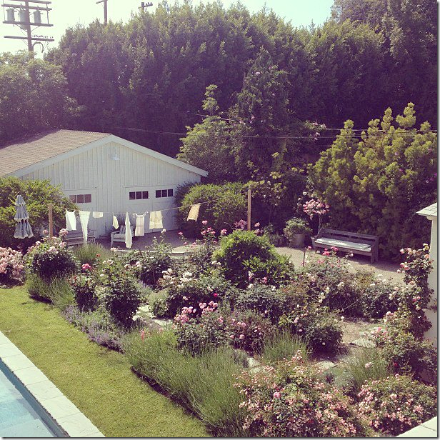
In the back yard, she built a huge white barn which doubles as a guest house, a place to entertain, and a place for her business photoshoots. The garden grew from nothing to this in two short years. Amazing.
Beautiful Rachel at the front of the barn doors.
Summer in the city.
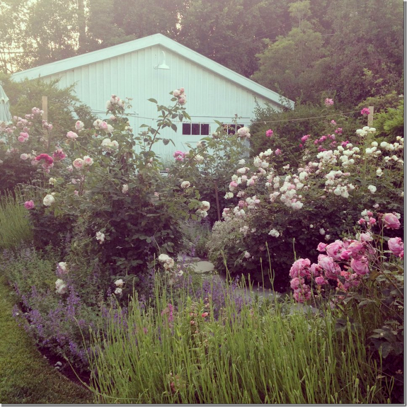
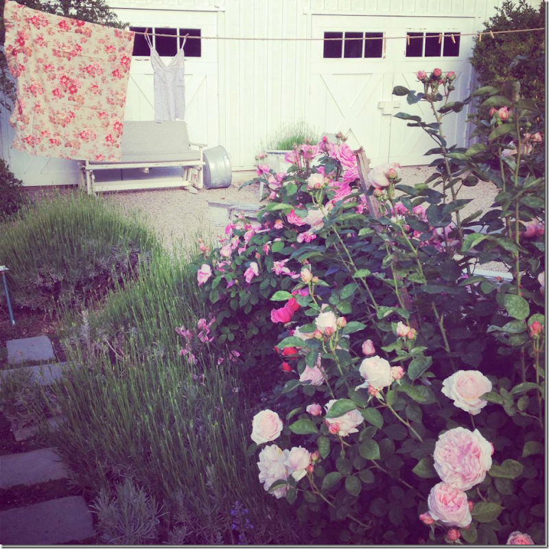
And another view of the barn and rose garden – of course there is a clothes line.
The pool – with roses and lavender.
Just gorgeous.
And more roses.
The barn, set up for a photoshoot. I love the tutu oil paintings that she sells in her shops.
And another photoshoot in the barn.
The Witch’s House:
I wrote a story about my favorite Shabby Chic book “The Shabby Chic Home” – which told the story of Rachel’s house in Malibu that she bought after her divorce. Researching the story about the Malibu Compound on Googlemaps, I saw that this original “Witches” house was just a few doors down from the white compound! An internet search showed the house was actually for lease. But what a disappointment it was. The new owners ruined the house!! It’s just awful now.
The original house was very small, really a 2 bedroom. Rachel used the living room as her bedroom and the library as her son’s room. It’s obvious the new owners decided to turn this small house into a very large one – getting rid of the charm at every turn. Now instead of two bedrooms – it’s four, with 4 bathrooms.
Care to see the massacre?
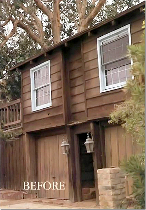
On Malibu Colony Road, right across from the beach, Rachel found this “witch’s house” as she called it. Dark and forbidding, she took a long time to decide to buy it.
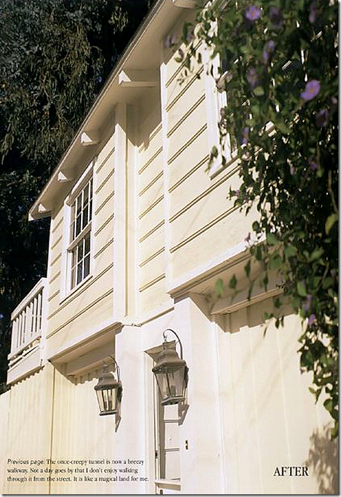
And after – here is how she changed the exterior –with bright creamy paint. She chose carefully what to change and what to leave – she wanted to keep the charm, but not turn the house into something that it wasn’t. Her motto then and now is – see the beauty in the imperfection. How true that was with this house.
The house as it looks today – still very pretty from the street. But you can see the breezeway between the garages is now gone. The exterior is still charming, no doubt about it – but that is the ONLY compliment I will give it.
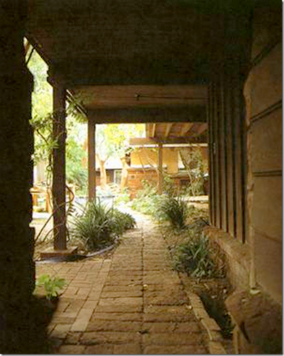
Before: Looking at the garages with the breezeway between – upstairs is the guest house as Rachel found it when she bought the house.
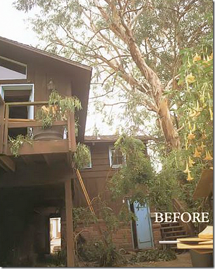
Before – the breezeway – dark and depressing.
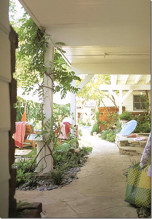
And how Rachel changed it. All wood was painted white. New flagstone walkways were laid. At the right, under the stairs is the beautiful spa.
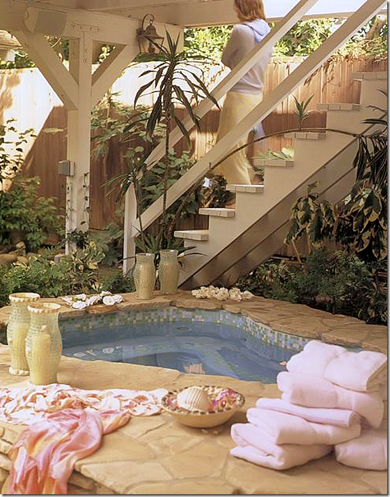
The beautiful spa – painted turquoise with mosaic tiles to match the pool. The stairs lead to the guesthouse upstairs. Rachel completely landscaped the entire lot – realizing the garden was essential to the house’s charm since the garden is visible from each room inside. My favorite picture from the book.
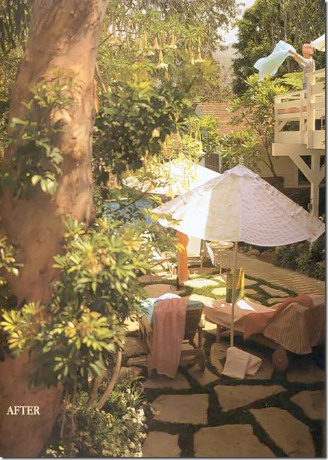
Across the yard from the spa - the view of the walkway with the flags set into the grass. Upstairs – Rachel at the guest house. So charming!
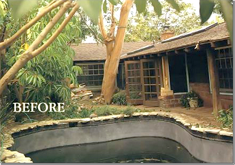
Before: All brown wood and red brick. The pool’s bottom surface was painted black to make it more lagoon like. It had to all be chipped away by hand to turn it into the turquoise color Rachel wanted. She also installed all new mosaic tiles.
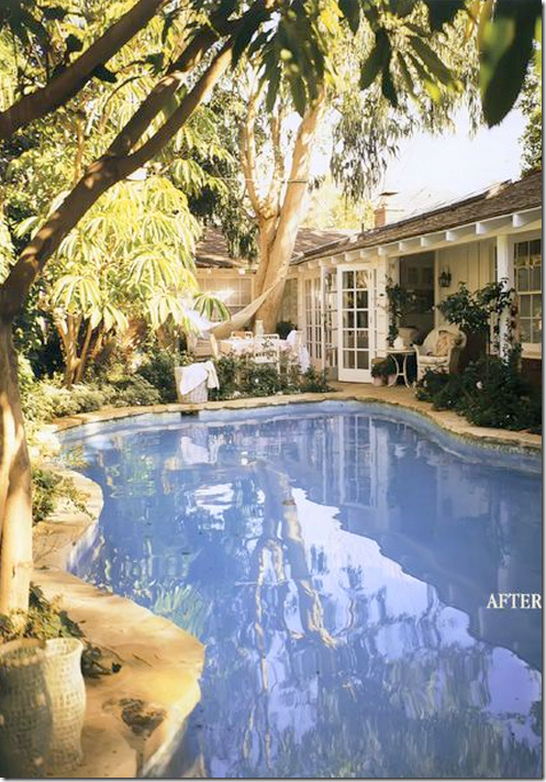
And after: Rachel’s turquoise blue pool – so gorgeous still, after all these years that the book was published. I would move here if I could afford it in a nanosecond. So romantic, so charming!! Just beautiful. I still think this house was her masterpiece.
AND TODAY – THE NEW OWNERS:
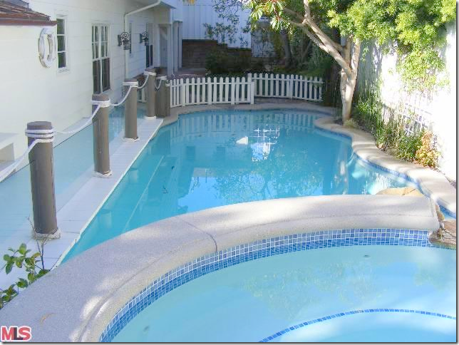
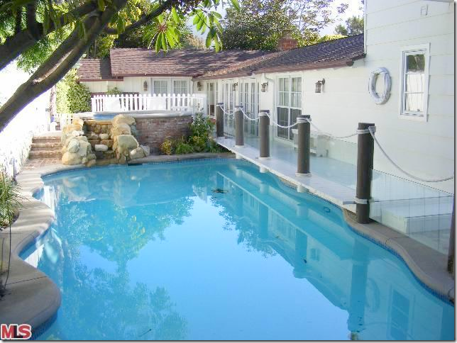
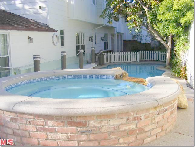
OMG! I almost died! First, they have added on a second floor – getting rid of the stairs to the guest quarters and the spa, connecting the house with the guesthouse. Now, the spa is behind the pool – see that high picket fence? That’s the spa now. And what is with those piers? Maybe they have small children and this helps keep them out of the pool. But, if you have small children who can’t swim – this isn’t the house for you! Why buy it and ruin it? Don’t buy it!!! Just awful. Do you see how all the beautiful flags are gone now- replaced by concrete? And there’s a rock fountain. So cheesy. UGH!!
 Rachel’s version. The area behind the pool – next to her bedroom – had a hammock and a place for outdoor meals. No longer.
And now. With the spa behind the pool and the gangplank on the left. Is this an ocean liner???
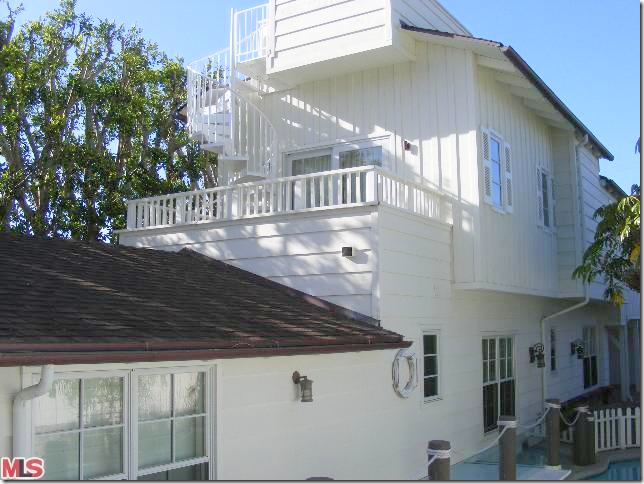
And here you can see how the new owners joined the house with the guest house, overcrowding the lot.
Yep, it’s an ocean liner or a barge. Ships ahoy matey! It gets worse, trust me.
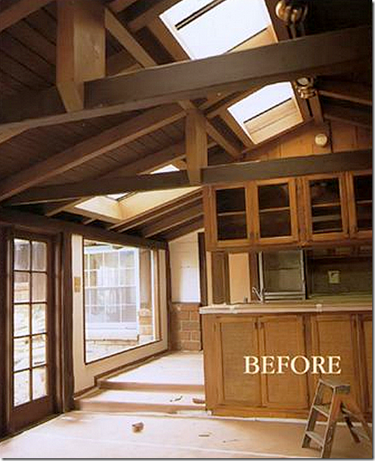
Inside, before. The kitchen between the living area and Rachel’s bedroom in the back. Again, all dark wood.
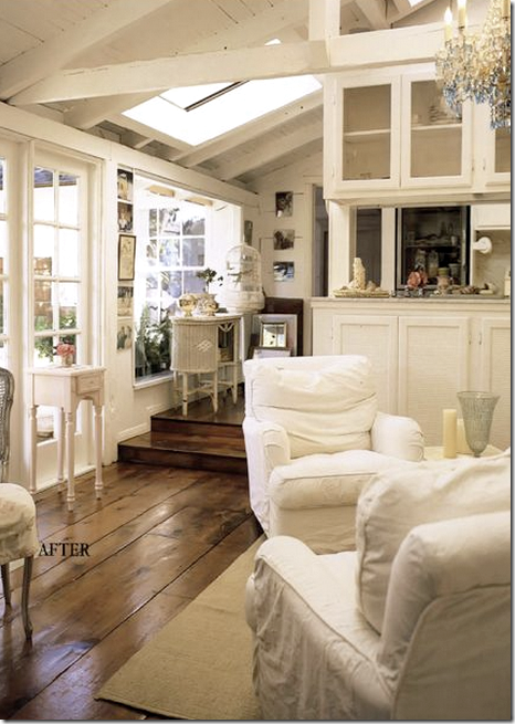
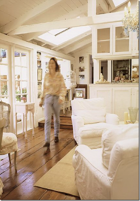
After – Rachel left all the steps that are found between the rooms. The hardwoods are original, as are the windows. Look how beautiful the hardwoods are! They are irregularly sized in width and length. Just gorgeous. And notice the ceiling with the skylights and the beams and rafters. Just notice. OK?
Remember when magazines always showed the owner out of focus in motion in the room? Love the chair on the left.
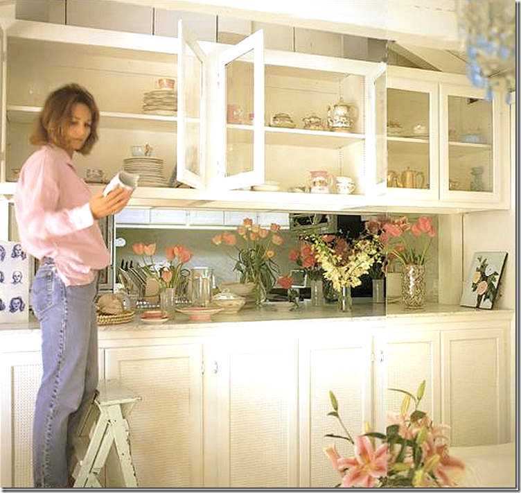
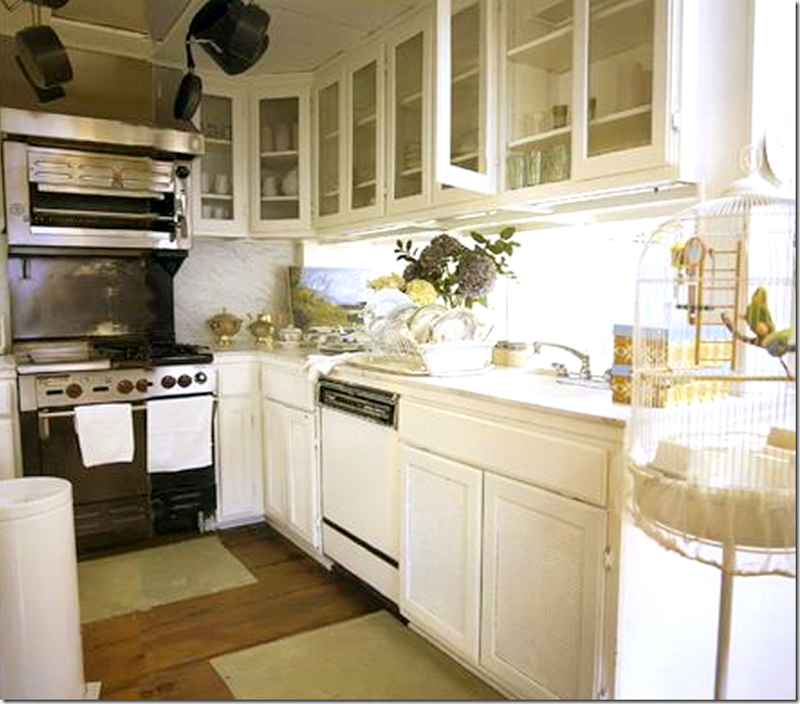
Rachel kept the cabinets – with their caned fronts – she just painted them white.
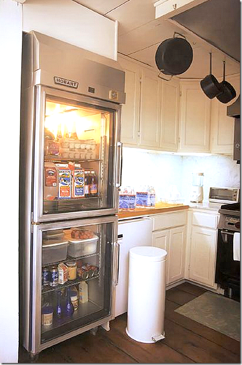
The fabulous oven and glass refrigerator came with the house – so she got lucky with those. Rachel added white marble to the counters and the backsplash.
And her fabulous refrigerator. I think this was the first time I had seen one of these used in a house. Wonder why this was styled with the garbage can? Things have surely changed all these years later.
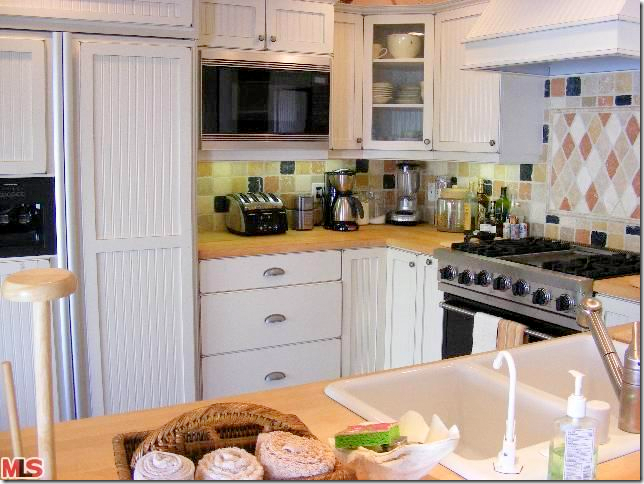
And the kitchen today under the new owners. No more white marble. No more glass refrigerator. Why mess with perfection?
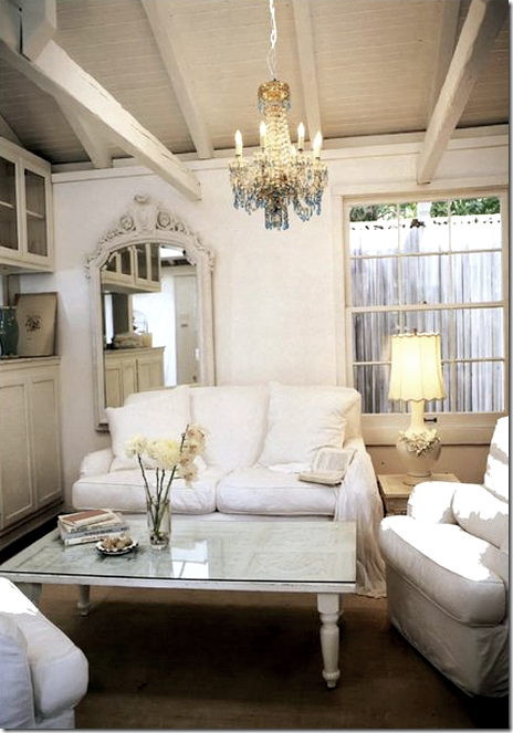
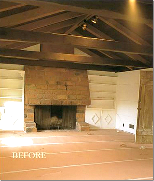
And Rachel’s living area off the kitchen. Notice the beautiful ceiling with beams and rafters. Just perfect.
And how it looks today – the same area with a CEILING FAN!!!!!! IN WHITE!!!! THOSE CURTAINS!!! WHAT HAPPENED TO THE CEILING???? WHERE ARE THE RAFTERS AND THE BEAMS AND THE SKYLIGHTS????? WHY?????? This is beyond awful. Is this even the same house? What you don’t see in Rachel’s pictures is that there was a fireplace in the corner – it’s gone now, disappeared. It looks like they cut this room in half – this beautiful room with the fabulous floors and windows and ceilings and fireplace. The architect should be banned.
Rachel: The other side of the living/dining room – overlooking the pool. That ceiling! That door! So charming. Those floors. All gone today.
How could they ruin all this? Just to make the house bigger? Go find another house to ruin!! Shame on you!!
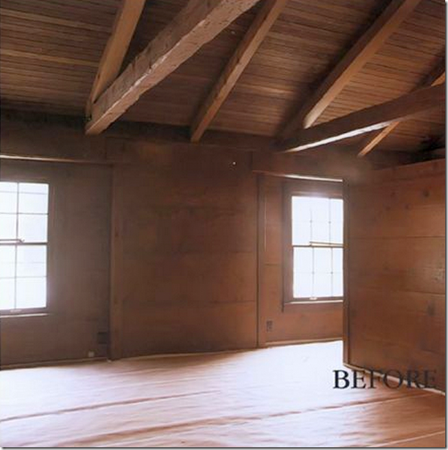
BEFORE: The living room, which Rachel made into her bedroom. Ok – the house WAS small. It really had only two bedrooms – one in the main house and one in the guest house. If I was Rachel, I would have probably put the two kids up in the guest apartment and slept in the bedroom downstairs – but they might have been too young to separate like that at the time. So, Rachel used the living room as her bedroom – an imperfect solution – but remember her motto – she sees the beauty in imperfection. She said she never regretted her solution to the bedrooms in this house. Notice the beautiful ceiling here.
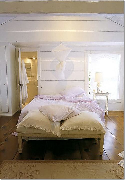
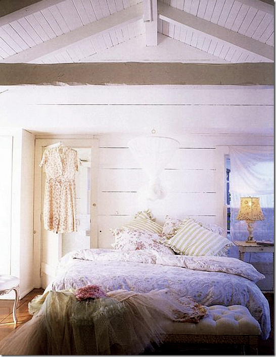
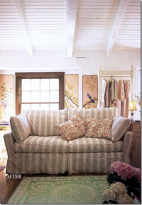
The living room/Rachel’s bedroom - is off the kitchen and family room. She painted the entire room white – including the wood paneled walls. The armoire became her closet.
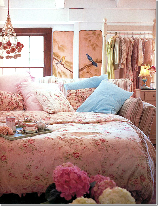
Her Shabby Chic bed. Styled one way…
And another.
Behind the door – an antique chaise and screen. Love the door and knobs – again, so charming.
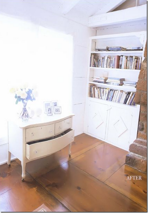
She left the fireplace unpainted – which I probably would have painted. Be sure to notice the floors. They are truly amazing.
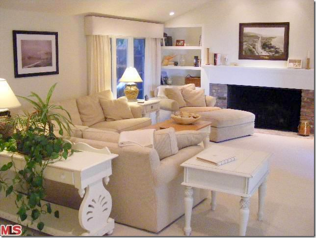
And today the same room under the new owners: OMG!!!! What is this????? They sheet rocked over all the paneling and carpeted over the gorgeous hardwoods!!!!!!! Took out the mantel. I have no idea what these IDIOTS were thinking. And yes, I called them idiots. Notice they sheet rocked over the beams and rafters too. I have no words. NONE.
Before – the guest house. All dark woods. Now, I went back and reread the book before I wrote this story – and Rachel wrote that she was urged to connect the guest house with the main house, but she refused to. She said that the only time she wished they were connected was when it rained, which is rare in southern California. The guest house was used as the office and family room. It held the only TV in the house! And the only computer was up there too. So – the guest house was used on a daily basis.
Rachel writes that she enjoyed walking between the houses – through the garden. She enjoyed not having an intercom and being forced to walk by the flowers to open the front door. So, I can see why she didn’t want the two houses connected.
Seeing how it looks connected today – it just takes up too much space on the lot and gets rid of the charming spa beneath the stairs. There is much less garden space – and it just takes so much of the beauty away. The deck is gone, replaced by another one that has ocean views – so that is a plus, but the minuses so outweigh the pluses.
Like I said before – if her kids were just a little older, she could have put their bedrooms here in the guest house and used the their room and library as her own space in the main house and turned her bedroom back into the living room. That would have been the perfect solution. Instead, the new owners ruined a perfectly charming house and garden, turning it into a big house, taking away all the paneling and beamed ceilings and gorgeous wood floors. Never will I understand what they did- except to make the big bucks when renting this out and selling it.
Rachel’s guesthouse bedroom. She used a sofa bed to make the bedroom in the guest house more functional. No closet? Set up a pretty portable railing instead. Again, beautiful ceiling – painted white. Rachel decided to keep the moldings around the windows in the guest house brown, as opposed to how it is in the main house.
The bedroom in the guest house. There is also a main room, a bathroom, and a kitchenette. Here, the sofa bed made up as a bed piled high with Shabby Chic linens.
And with the new owners - the guest house today sheet rocked and carpeted, lacking in all charm. Unreal. Just unreal.
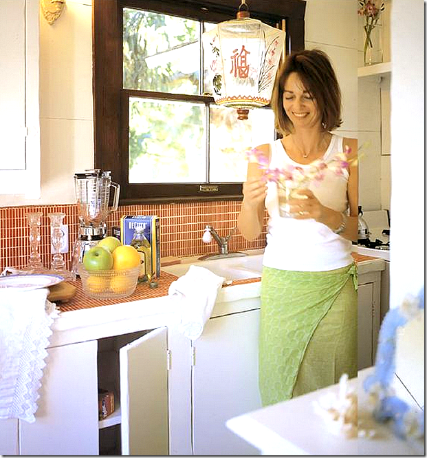
The kitchen in the guest house. Rachel said the first thing she was going to do was remove the orange tiles, but she grew to love them. I do too. Darling lantern. Darling Rachel.
And new kitchenette in the guest house. Yuck. OMG – this just gets worse and worse!!
Rachel’s deck on the upper level of the guest house. Rachel extended the banquette to make it wide enough for a double mattress to nap on.
Rachel’s pool.
And today – the same pool area.
And from this to….
This. What a shame. All the excitement of finding this darling house – all these years later – and to see it looking like this – with all Rachel’s hard work erased….so disappointing!
So what is Rachel up to today?
Finish reading the story in Part Two!!






























No comments:
Post a Comment