First, a huge thank you to my good friend, blogger & interior designer Artie Vanderpool who lead me to this story and then scanned in a million photographs for me!! Scanning for me is like loading the dishwasher. Yuck!! It’s just so boring and you have to sit there in front of the scanner and do nothing else while it goes back and forth like a metronome, but without the music. So, a huge thanks to Artie for the scans! I bet Artie loves to load the dishwasher too. Right now he is re-shingling the roof of his house – so, loading & unloading is probably nothing to him! Actually – I prefer to load rather than unload.
This looks like my house!!!
OK – enough about boring dishwashers!
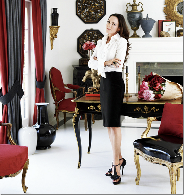
A few years ago interior designer Mary McDonald lived with her long time partner in a gorgeous Tudor inspired Beverly Hills house. As you know if you watch Million Dollar Decorators, Mary and her partner split up and she moved back to her own smaller house that she used to live in and had kept all these years as a large guest house. Her partner, a high priced property developer, was left to sell their house. Easier said than done.
Too talented and beautiful for her own good. So gorgeous and chic!!
The house, built by Elmer Grey (related to Christian perhaps?) in 1922, is called The Harvey Mudd Estate because the philanthropist and mining billionaire Mudd lived there from 1925 until 1958. The original owner was Charles Boldt, the Mason jar manufacturer and one of the wealthiest Americans at that time.
The house has quite a pedigree of former owners: Harry S. Rothschild of Rothschild Oil Co. owned it from 1966 to 1968, and then the acting duo of Martin Landau and Barbara Bain moved in, staying until 1991. They sold the house to film producer (Cast Away) Jack Rapke, who then sold it to John Bercsi. Back then, Bercsi was one of the all time biggest property “flippers” in Hollywood. The Realestalker claimed that during his heyday Bercsi was flipping houses in the $5 to $25 million range. Not your typical HGTV flipper at all, he was the big stuff.
In 2009, Bercsi put the Harvey Mudd house up for sale after it was featured in many magazines and in Mary McDonald’s own book. In the end though, it was a foreclosure, the asking price had started at $11.49 million and was lowered to $7.995 million. Developer Brendan Deschamps bought it for only $6.25 million and has spent the last three years renovating the house. It is believed that Bercsi paid around $5,950,000 for the Mudd Estate – not exactly a profitable investment. Apparently the new owner has doubled the square footage and spent millions on the renovation. The asking price? Just $22,995 million. Taking a closer look at the claims, the “original square footage” is questionable. When Bercsi put the estate up for sale it was said to be 7,256 sq ft with 7 bedrooms and 7 bathrooms. The current real estate brochure says the square footage is 10,993 – nowhere near doubled. Not sure where the discrepancy comes from?
Additionally, the house is described as having a swimming pool and aviary and English styled gardens. There is also a conservatory, a paneled entry and a wine cellar. It has seven bedrooms, 7 bathrooms and two powder rooms. The seventh bedroom and bathroom is located in a “guest house.”
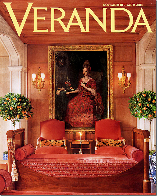
Back when Bercsi listed his house, most of us were familiar with the way Mary had decorated the house – especially the orange painted entry hall and its white and black patterned wood floor which had been on the cover of Veranda. We knew all about the wood paneled living room and the animal printed sunroom. We had seen many pictures of Mary’s bedroom and her guest room – along with pictures of her darling breakfast room. The surprise was the bathrooms and the kitchen. Neither had been restored and both needed it, badly, which is why buyers probably balked at the $11.49 and $7.995 asking price! Another huge factor was Michael Ovitz.
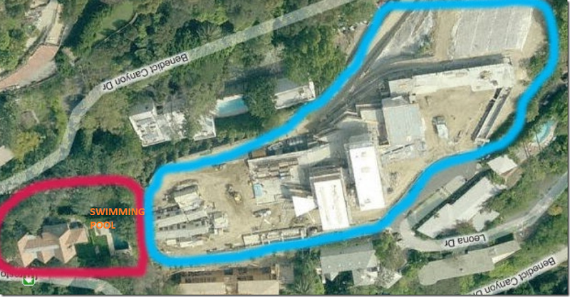
Back then Michael Ovitz, former CAA and Walt Disney executive, had bought the property directly behind the Mudd estate – and was building an office building, disguised as a house. It’s size – 30,000 sq. ft.
The 30,000 sq ft + house was being built when Bercsi was trying to sell the house. Of the 80 or so real estate pictures, he managed to hide the fact that a monstrosity was going up right next to the swimming pool. But in this one photo, you can clearly see the tents right behind the hedges at the swimming pool.
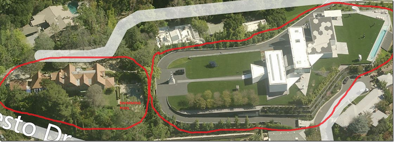
And in this photo, you can see the monstrosity being built – and how close it actually is next to the house and the swimming pool – right over the fence. The Bercsi house looks like a tiny doll house next to Ovitz’s office/house.
Today, the sellers are much luckier. The house is finished and there is no more construction noise and traffic for the new owners to deal with.
So, how does the newly renvoated Harvey Mudd Estate compare to the wonderfully decorated house by Mary McDonald? The new kitchen and bathrooms were much needed and are much better. But all the charm that Mary added is long gone. Of course the new owners who buy the house can hire Mary to work her magic again. And whoever styled the house for the sale should be fired – again, I would have hired Mary to style the house. She has decorated a few of the houses that Bercsi flipped and they were so fabulous. They are most famous for the renovation of the Buster Keaton house which is what put Mary McDonald on the map. But I love another house they did together several years later. Remember this one that was shown in Veranda:
Bercsi restored this house and had Mary decorate it for the sale.
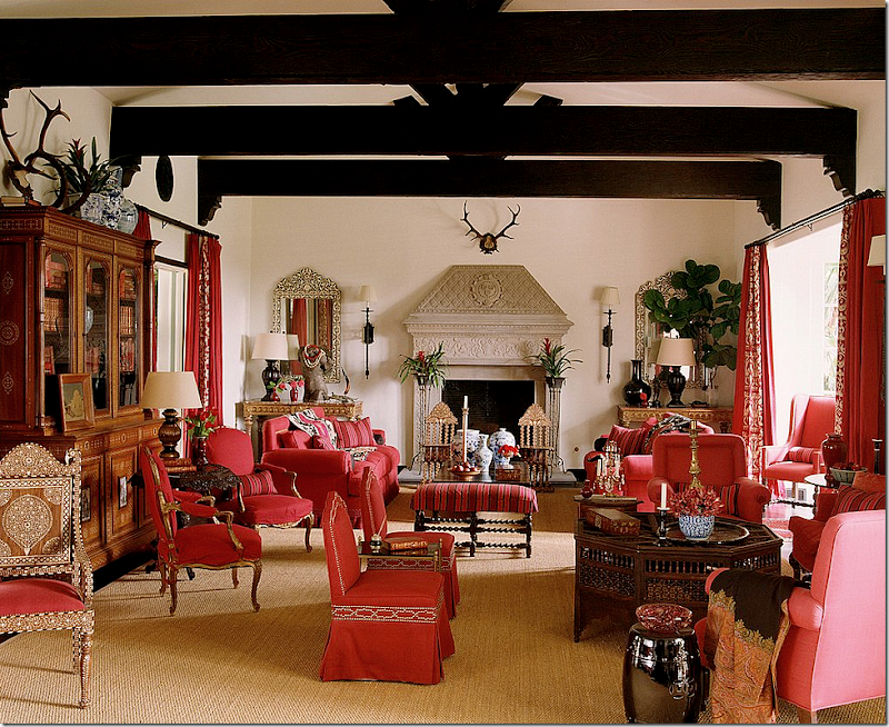
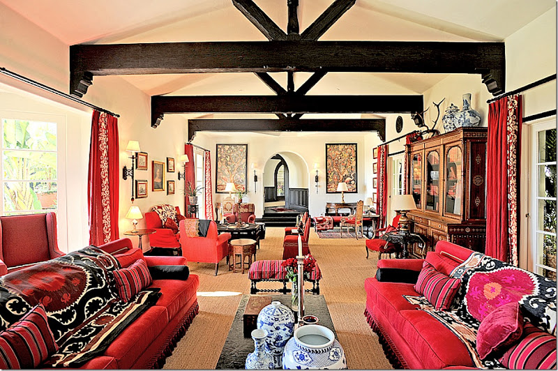
Mary’s design was shown in magazines and books. She did the living red in all red and seagrass and suzanis.
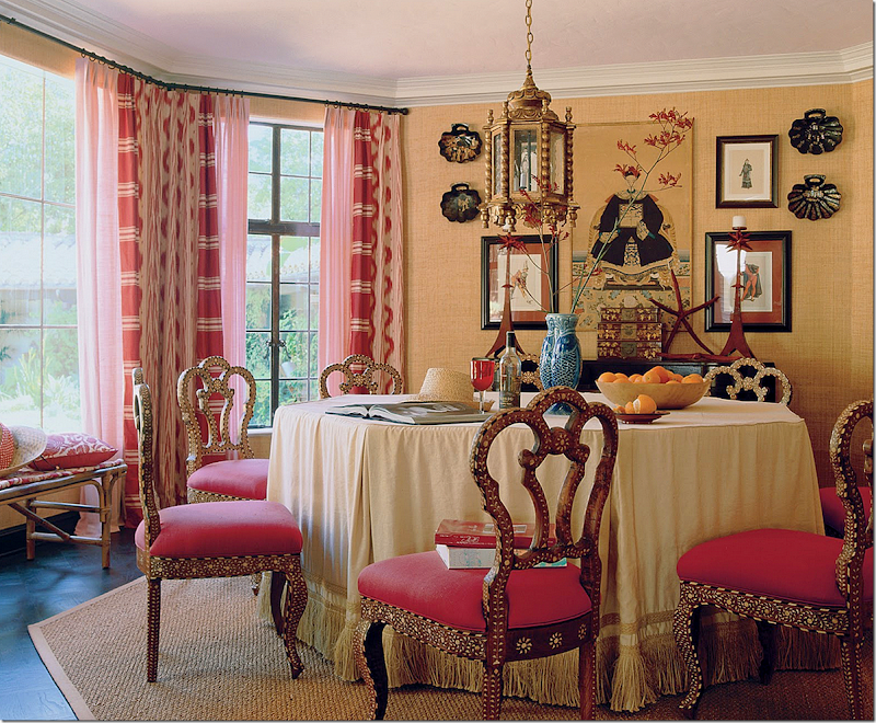
The shape of the breakfast room was very similar to her own breakfast room. Love this!
The family room was also in red – with ikats and suzanis. I was so in love with this house and still think of it as one of Mary’s greatest designs.
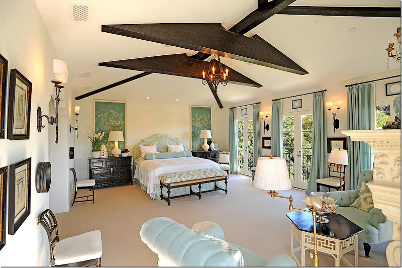
The master bedroom was similar to hers also – icy and chinoiseries mixed with ikats.
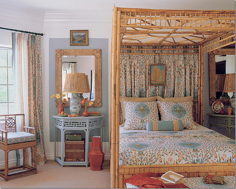
One of the bedrooms was done in bamboo with Indian inspired fabrics.
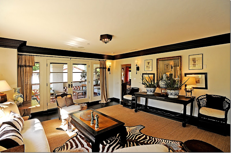
The upstairs sitting room – all black and white and zebra.
Even the porch was decorated to the nines. Not an inch was left undone.
The loggia – decorated with rattan and blue and white. The staging of the house was a phenomenal feat – I haven’t even shown half of all the rooms she designed for the house. I have often wondered if the buyers of the house purchased it furnished? I would have – talk about moving in with just your toothbrush.
Selling this house was easier than selling their own. While the house she staged for Bercsi was top of the line with everything new, their own house, the Mudd Estate in Beverly Hills, had a strange layout to deal with, along with the dated kitchen and bathrooms - and, there was also the behemoth house being built almost in the backyard. Couple this with property devaluations and the recession, the house was finally sold in foreclosure.
THEN: Here’s how the house looked then – the driveway ran around the front of the house from the right side to the left. A large slate porch led to the front door. The swimming pool was off the left. At the back of the house was a yard with many overgrown bushes and trees. Today, the layout of the grounds has been completely changed.
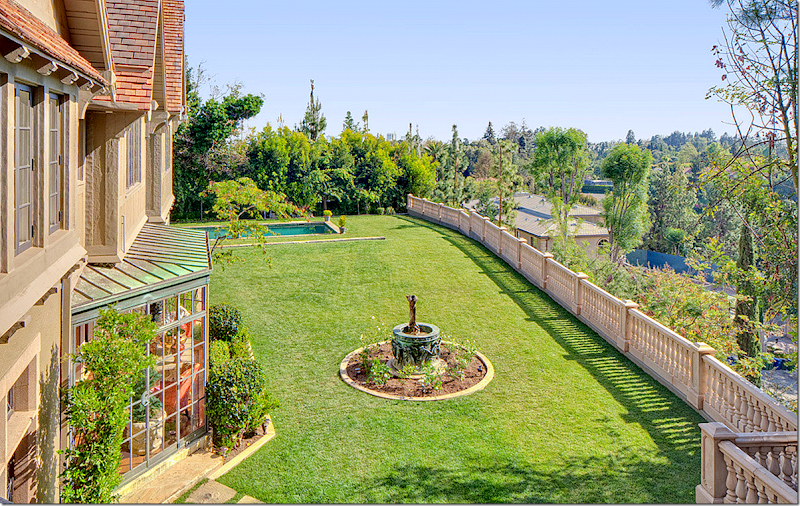
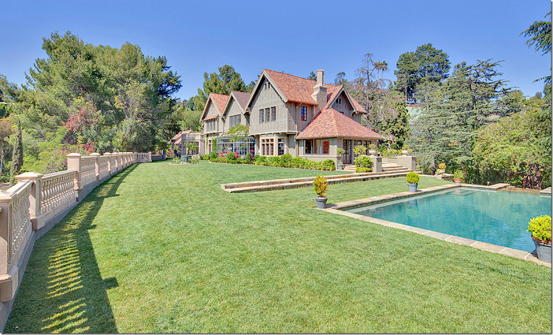
NOW: The change in the landscape of the yard is immense. Today, the driveway has been replaced by a beautiful stone set in grass drive. There is no longer a slate terrace. Instead there is a very large stone terrace with a set of new double stone staircases that lead up to the front door. The patio continues around the side of the house. The pool is now set into the grass without a border. A stone fountain terraces down the side of the house to the front of it. The back yard has been cleared of the bushes and is now surrounded by a stone fence. And another new stone terrace is off the kitchen at the back side of the house. I can’t really see where the square footage has been added – perhaps at the lowest level, basement level, new rooms were added?
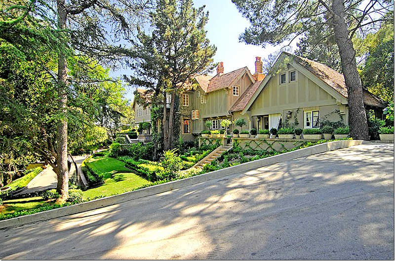
THEN: The house is long and narrow and the property has been divided over years making its approach a bit strange. The street curves around the side of it.
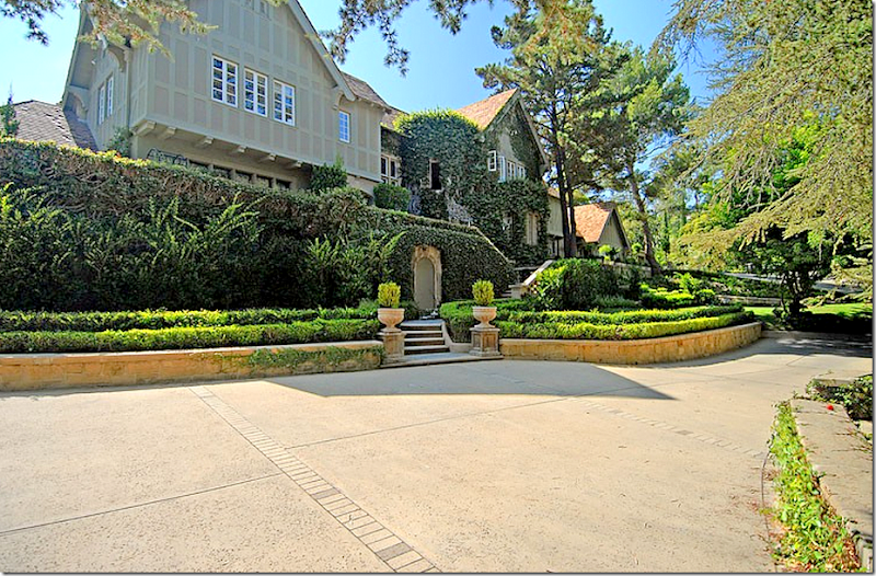
THEN: From the street, the driveway leads you in front of the house to the left side, where the front door is.
THEN: Love the tiny paned windows that are left open to capture the cool ocean breezes. The kitchen is on the right – up the stairs. To the very left of the house is the front door.
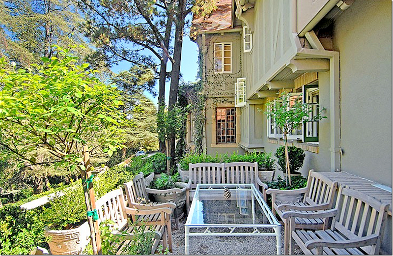
THEN: Outside the kitchen is this porch overlooking the lush front yard.
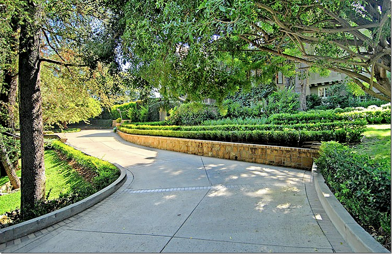
THEN: The landscaping is beautiful – the front yard curves around the driveway.
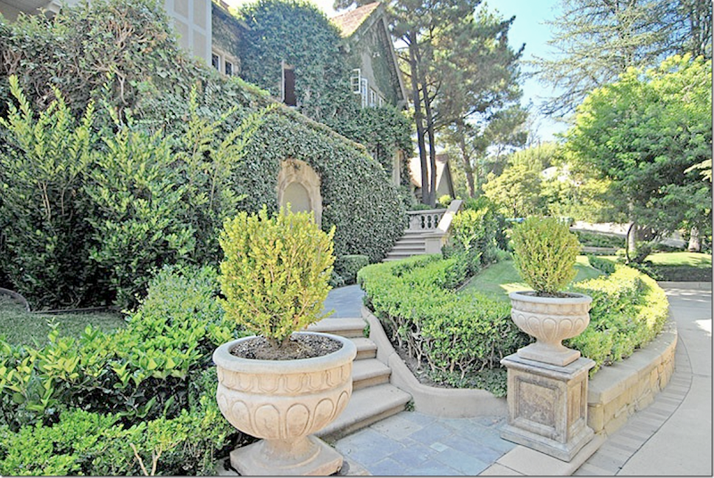
THEN: The urns and steps lead the way to the front door.
THEN: The stone stairs lead to the slate porch and the front door. The arched door hidden in the ivy leads to the basement level.
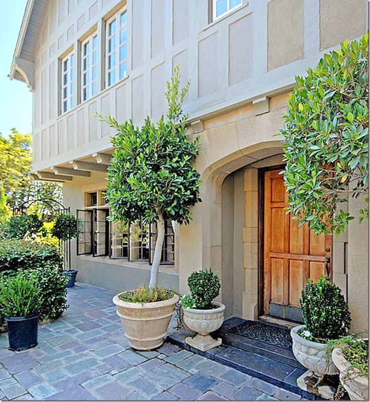
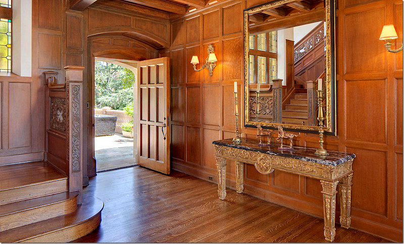
THEN: A slate patio leads to the wood door that opens to the large paneled entry hall.
Now, lets look at the front of the house as it is today.
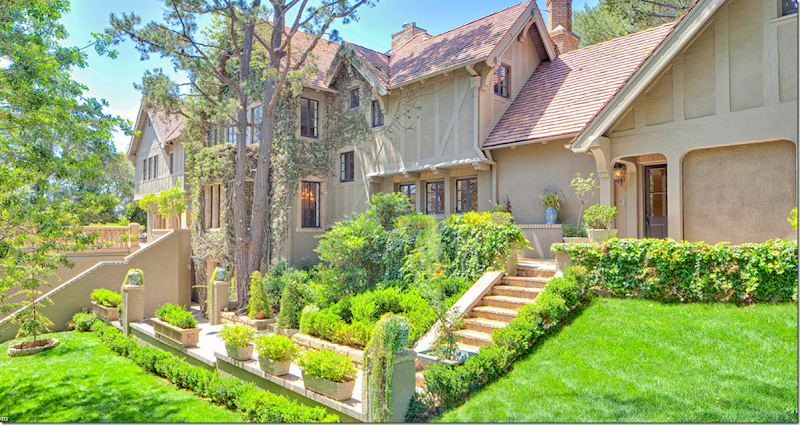
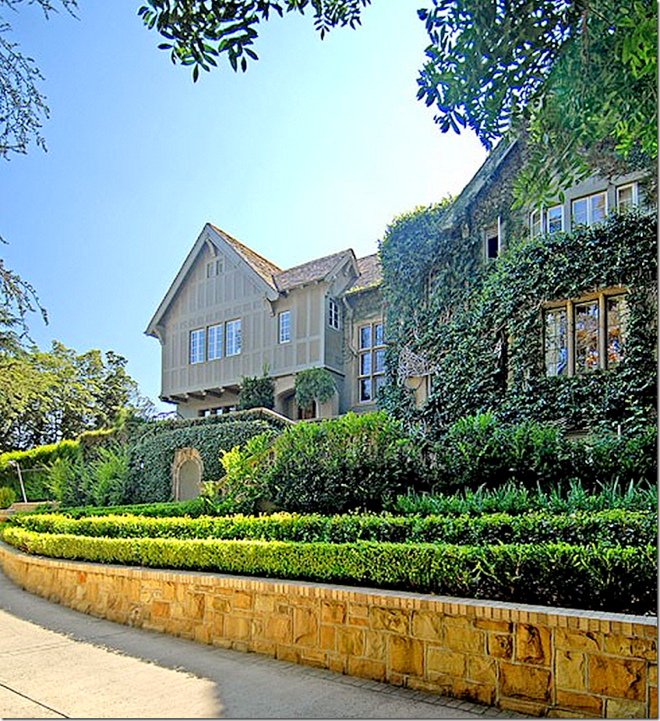
TODAY: First, you notice the color of the house has changed – it’s more beige and less gray-taupe. The flower bed at the very right of the house is now gone, replaced with grass. The driveway is much prettier – stone inset in grass – but the large, newly built stone terrace juts out from the front of the house – significantly changing the way the front looks. On each side of the terrace is a stone staircase that leads from the driveway up to the front door. You can see the staircase here.
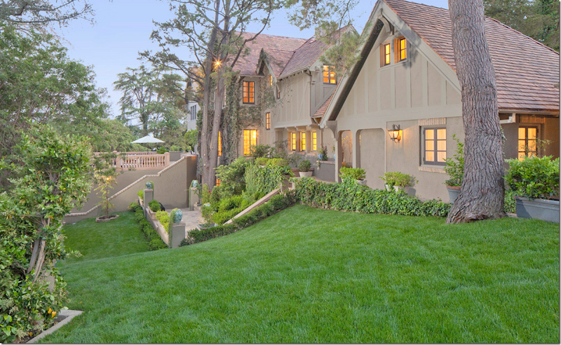
NOW: A pretty night view of the same area.
NOW: A close view of the kitchen with the three small casement windows – and the space to the right of the kitchen which has changed – no more windows. Again, the new front terrace is to the left.
At the end of the house the driveway ends in a circle. To the right is the terracing fountain that leads to the swimming pool at the side of the house. I must say – the driveway is a huge improvement. Much prettier.
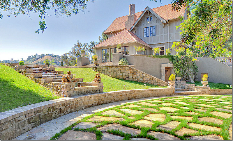
The stone fountain that terraces from the pool down the side of the house to the driveway – this is a completely new structure. Is that fountain too much - too fancy? Underneath the new stone terrace is a door that probably leads to the basement rooms. This door was moved from where it originally was. The room shown above on the first floor is the sunroom – formerly Mary’s animal print room.
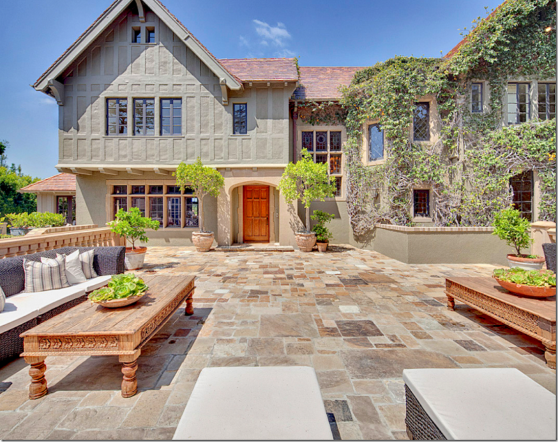
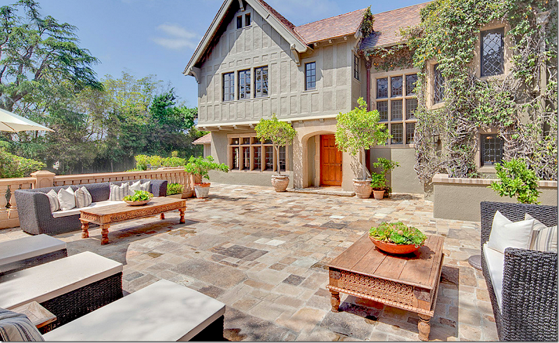
NOW: Here is the large stone terrace that replaced the much smaller slate patio. Here you can see the front door – with the bay of stained glass to its right – that is found in the stairhall. To the right is the leaded glass windows that follow the stairs to the second floor.
NOW: Another view of the front terrace. The new terrace does seem grand – and well thought out. But, I wonder if I would have put it here. The house has survived for almost 90 years without it. Did it really need such a grand terrace? I assume it is good for entertaining – but the long, beautiful line of the house has been marred with this terrace.
THEN: Here is how it was then, without the front terrace that juts out to the driveway. It is prettier now or then? I have to vote then – without the front terrace.
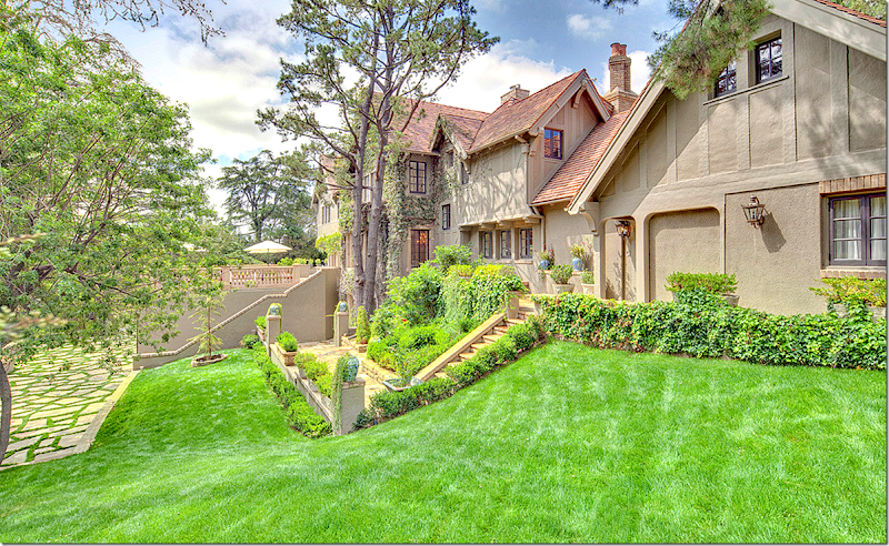
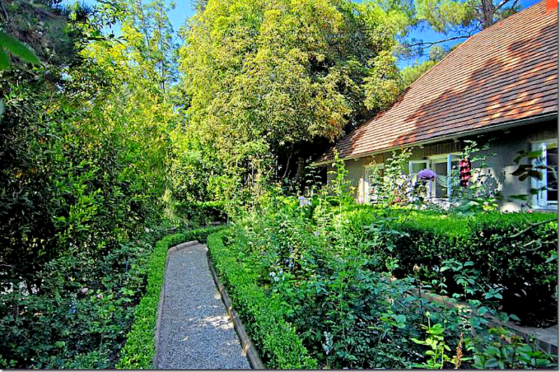
THEN: At the back of the house – the yard is long and narrow. The view used to be hidden behind a wall of greenery, shrubs, and trees. Here – the backyard starts at the kitchen. A gravel path leads past a flower bed.
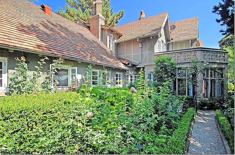
THEN: Looking the other direction. The kitchen garden is to the left. Ahead is the beautiful breakfast room with a terrace above its roof. So enchanting!
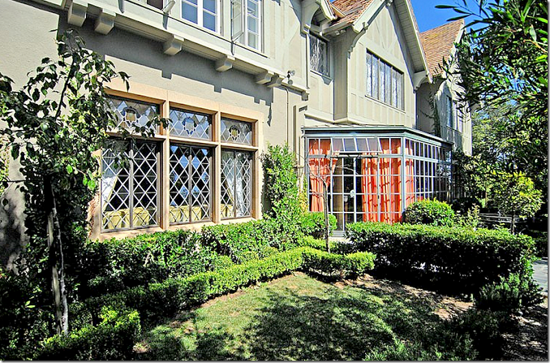
THEN: The gravel path turns into a slate walkway. Past the stone breakfast room, is the conservatory off the large entrance hall. The curtains are the deep persimmon that Mary decorated the room in. The new owners kept the fountain, but moved it out a bit.
THEN: And the other direction – looking past the conservatory onto the rest of the back yard.
Past the entry hall conservatory is the sun room that Mary decorated in all animal print. Ahead is a stone balustrade that divides the yard from the swimming pool. You can see the construction tents here from the Ovitz house behind the pool. Notice how green and lush the yard is. To the right – the shrubbery acts like a screen.
Let’s see how the back yard looks today:
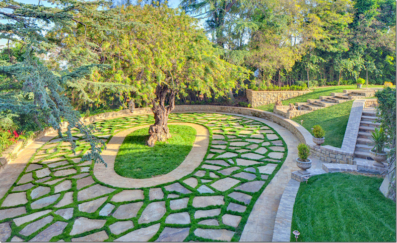
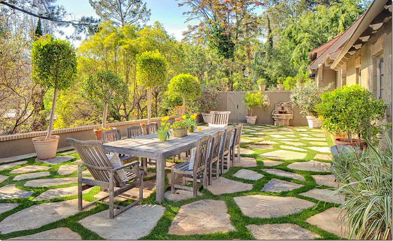
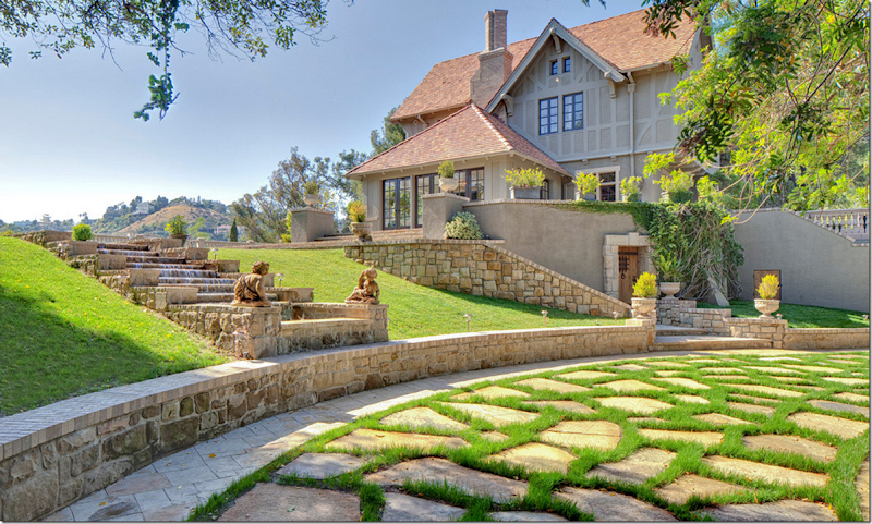
NOW: Starting at the kitchen- the area was totally cleared out. Along the left is a new stone fence that replaces all the shrubbery and trees. The flower garden is long gone, replaced by a large stone terrace set in grass, just like the driveway. There’s a table for al fresco dining. Very beautiful, no doubt. But I miss the English styled flower beds.
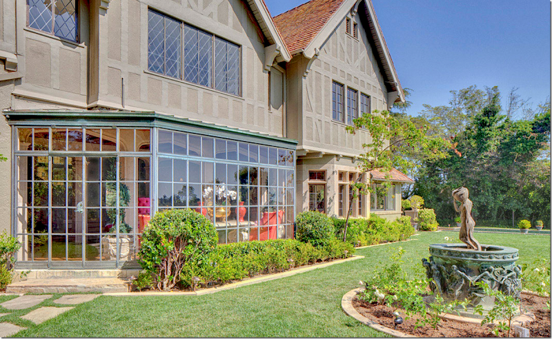
A view of the entry hall’s conservatory overlooking the fountain – which came with the sale of the house. The slate path is now stone in grass.
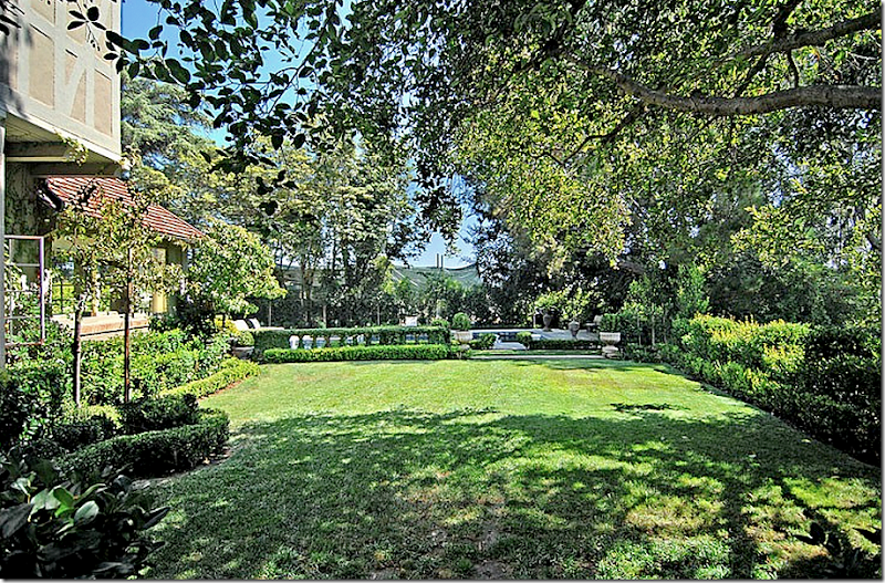
NOW: And looking at the back yard toward the swimming pool. ALL the shrubs, trees and plants have been cleared out. There is a new stone balustrade fence – I suppose this was done to open up a view. Seems like a compromise could have been made?
Remember how green it was?
THEN: The sitting room, conservatory, breakfast room - green, English styled garden. And NOW…
NOW: The exact same view - looking back toward the sun room, the living room, the entry hall conservatory, the library, the breakfast room and the kitchen. Notice all the greenery on the left is gone – it is now open to the view. Better? I don’t think so. But, maybe the view is prettier now.
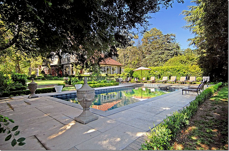
THEN: The pool was surrounded by decking and the balustrade with stone steps.
THEN: Mary decorated it with stone urns in the corner.
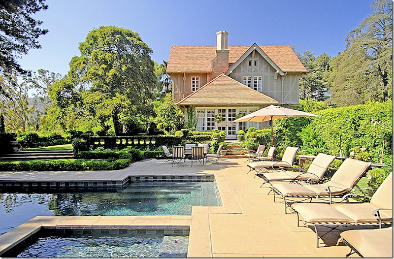
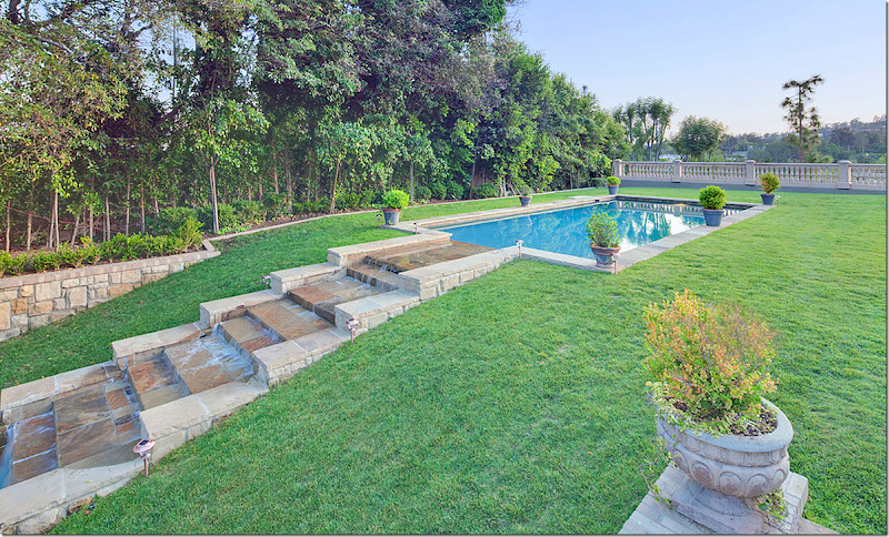
NOW: Today, there is no deck around the pool. The balustrade fence is gone, replaced with the stone steps. At the right of the pool, the water flows down, terracing like a fountain to the front of the house and the driveway.
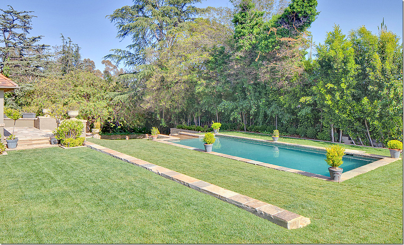
NOW: The pool is simple and plain, except for the fountain at the left. Shrubs and trees block the view of the Ovitz estate.
NOW: The fountain terracing down to the front of the house.
It’s possible that before Ovitz bought and built his office/house – there was a great view in that direction. Now that his house is right past the swimming pool, perhaps the view is now directed towards the back yard which was once hidden by the shrubs and trees. That might be why it was all removed. It does seem like the new landscape is more Roman in feel than English, despite the Tudor style of the house.
Let’s go inside now:
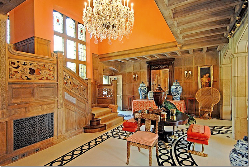
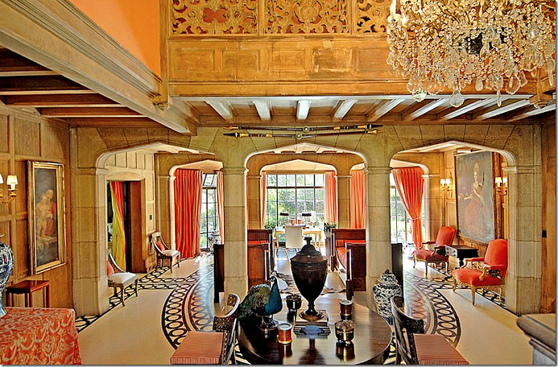
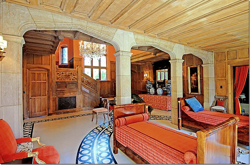
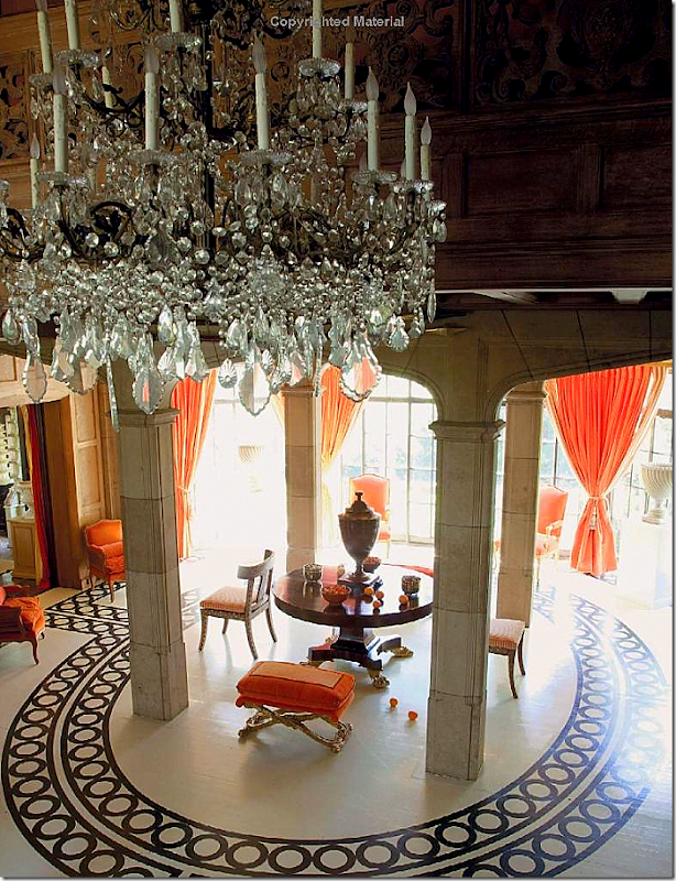
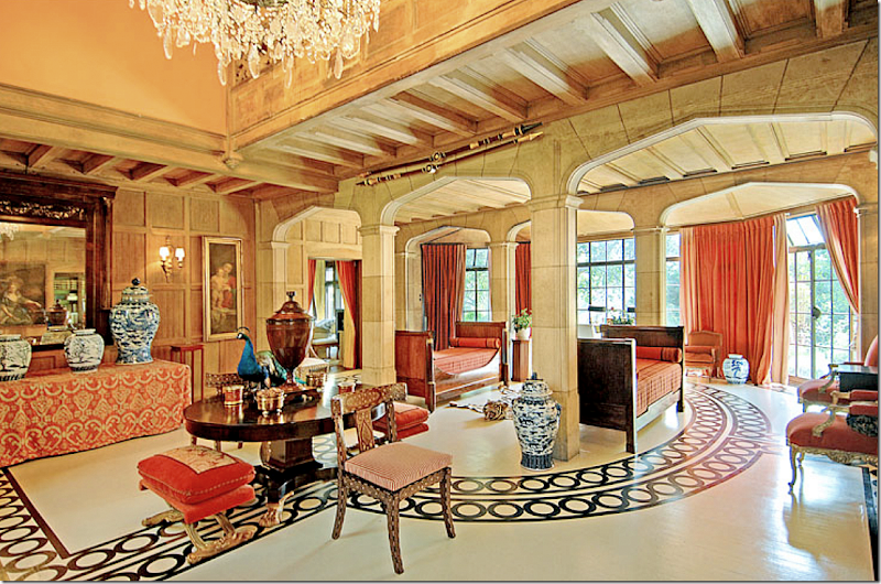
THEN: Perhaps no other space is more identified with Mary McDonald than her former entry hall, stair hall and conservatory. She painted it orange first, then after a few years, painted the wood floor white with a black circular pattern. The pattern was brilliant – it circled around the area between the stone arches. Here the door opens to the two story hall where the intricate wood paneling leads up the stained glass staircase. For a few years the oak was stained quite dark and Mary lightened it up.
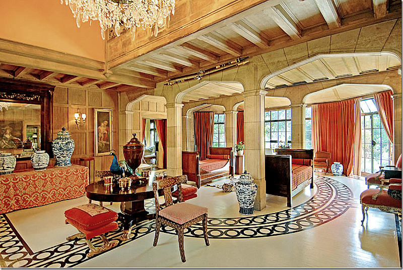
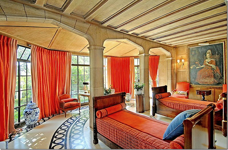
THEN: Here you see how the patterned floor circles around the stone arches and through to the conservatory – that overlooks the backyard. Two empire styled antique beds sit inside the stone arches. Through the door to the left is the living room, then the sunroom which overlooks the pool at the side of the house.
THEN: Looking at the center table, through the stone arches to the conservatory which looks out on the back yard. Hanging from above is a huge chandelier.
THEN: Looking from the stone arches back toward the staircase and front door.
THEN: Looking toward the conservatory with its steel doors and blue and white porcelains.
THEN: This view show you the right side of the house – through the dining room and through the next door – the library. The kitchen and breakfast room are past those two rooms. Here you can see the second floor overlooks the entry hall – through the carved wood landing.
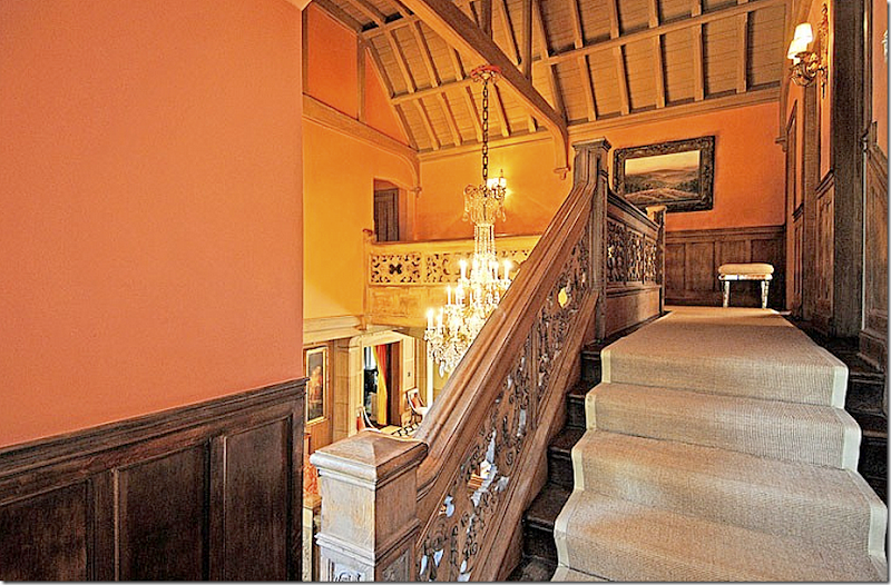
THEN: Up the stairs, Mary used simple seagrass. The master bedroom is off to the left, over the living room and overlooking the pool.
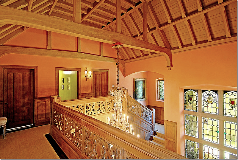
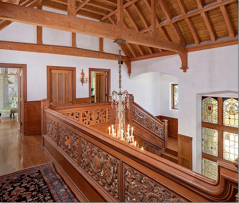
THEN: The landing overlooks the entry hall. Notice the stained glass windows. Through the door are the guest bedrooms.
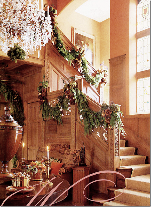
Shorty before the house was put up for sale, it was photographed for Christmas by Veranda.
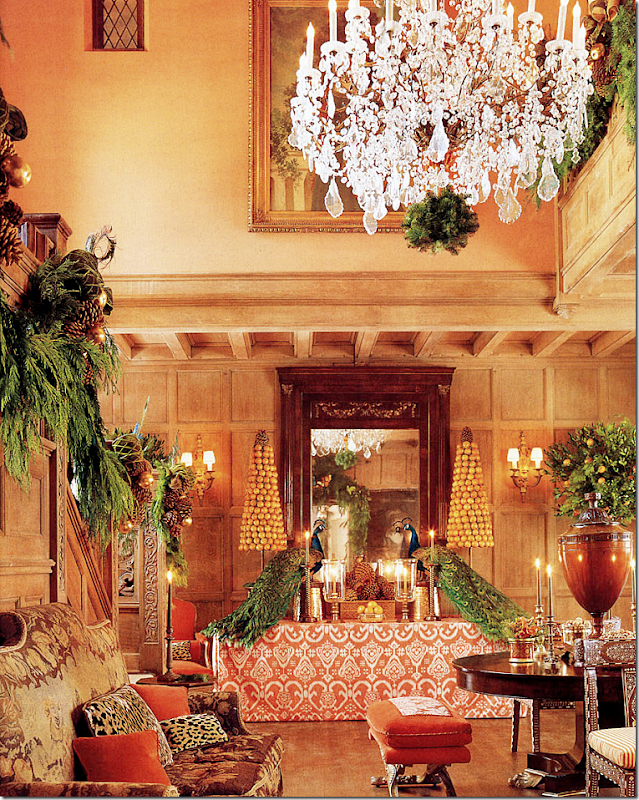
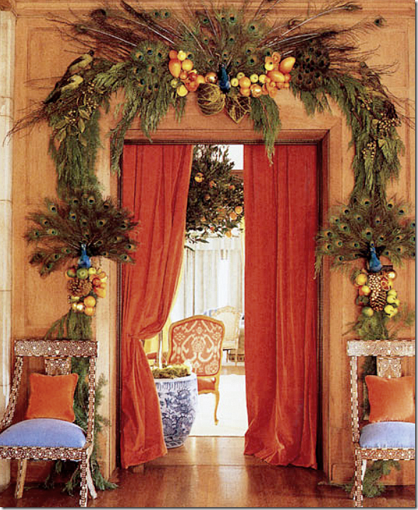
Mary decorated the stairway for Christmas. She jokingly called the entry hall – The Lobby, because its size was large enough for a hotel. It is surely one of the grandest entrance rooms!!
Most surprising now – is the floor wasn’t painted then. Obviously, she didn’t live with the painted floors very long before the house was sold. The antique sofa was probably added for the photoshoot – it’s missing from the real estate photos. My favorite was the orange and white ikat fabric covering the console.
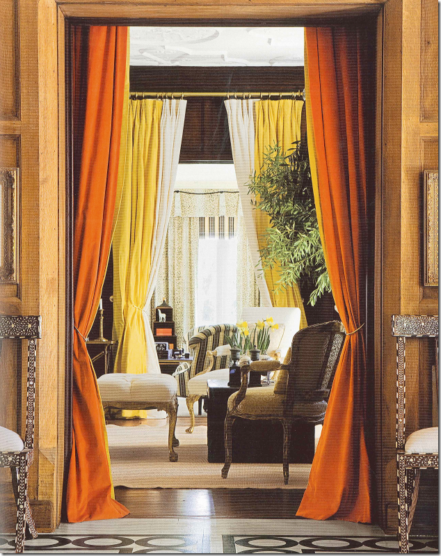
Through the orange portieres is the living room.
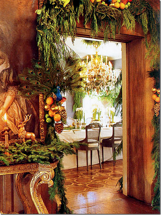
And a peek into the dining room.
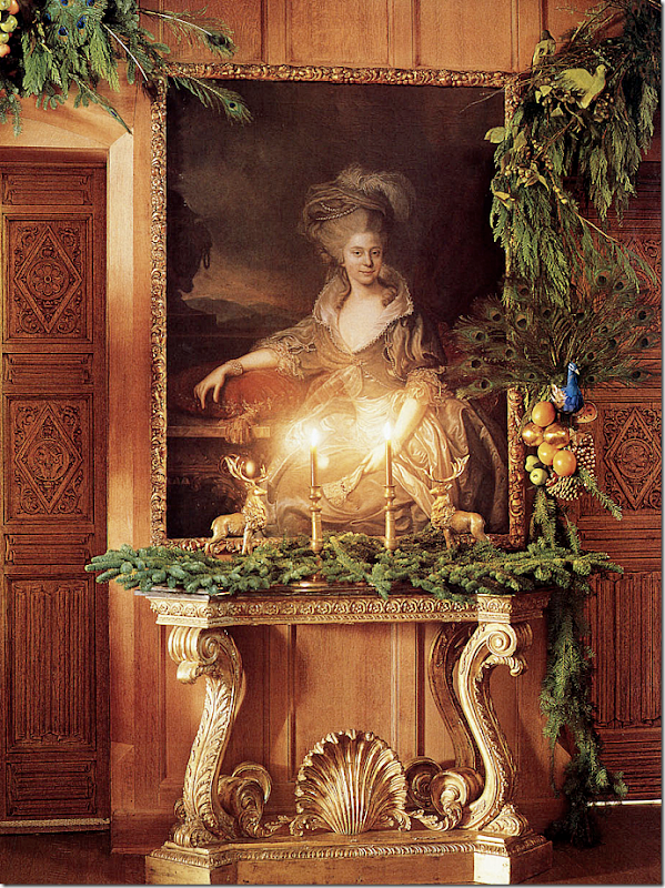
And this beautiful vignette under an oil portrait.
In her book, Mary introduced the painted floor – that she says was inspired by a house in England. I love this vignette with the Ikat fabric and blue and white porcelains – her trademark.
In this gorgeous photo from her book, Mary implies she no longer uses the day beds in the entry hall nor the desk in the conservatory. I do like this arrangement, but in the real estate brochure, the day beds were back, hinting that they never really were moved out of this room.
SO…..how does the entry hall look today- after the three year renovation? Ready?
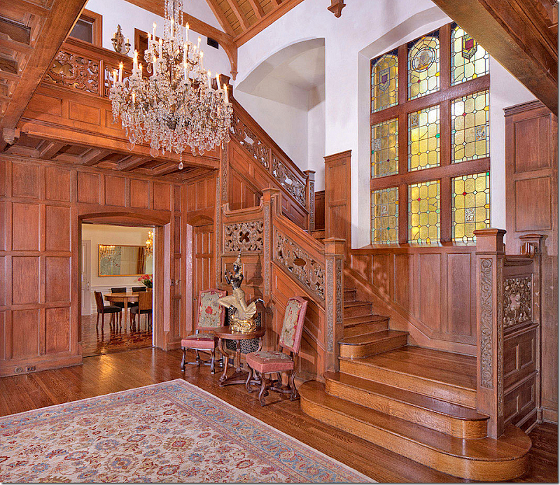
NOW: Well, first – the painted white and black floor is now gone, which is a shame! It was fabulous! Instead we are left with wood, and wood, and more wood.
And the persimmon walls are gone – now painted white. The décor is tres horrible. Ugh. Ugh. Ugh. Does the white look too stark here? Was this right choice for this type of house?
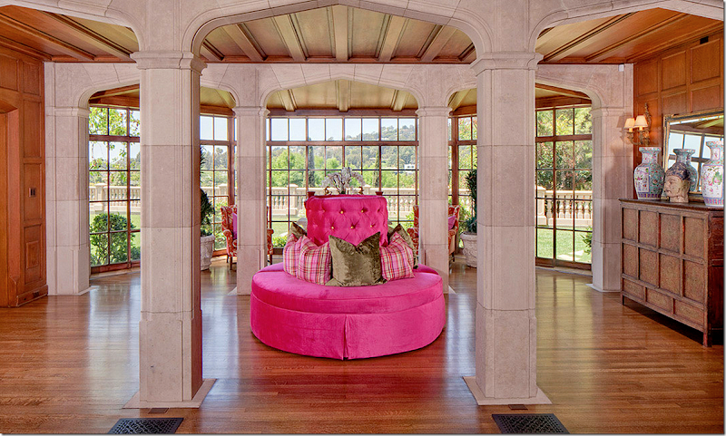
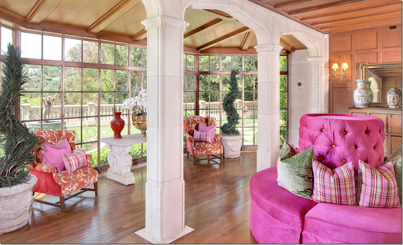
Go ahead, I’ll wait while you howl with laughter. WHO STYLED THIS???????????? It’s over 22 million dollars and it looks like they went to Victorian S Us! OMG. Are you through laughing yet? OK- I’ll give them this – the view does look spectacular here – without all the shrubs and trees – you can see the hills beyond. So that is a plus. No curtains. I miss Mary’s Empire day beds! Hot pink and brown wood?
Ummm. What can I say? Red and white with hot pink? Lovely. Love the tufting too. Oh, whoever styled this needs to find another job. I’m sorry. OK, compare this styling to the job Mary did for John Bercsi’s house that I showed at the beginning of the story. Remember?
THIS!!!! This is how you style a $22 plus million dollar house you want to sell! Like this!!!! OK. I’ll calm down. Let’s continue.
NOW: The upstairs – with a tacky rug – BUT at least they kept the sconces and the gorgeous French chandelier that Mary bought for the house – it’s over six feet tall, btw.
OK, if you are going to get rid of the painted floor and the orange walls – shouldn’t maybe have lightened the paneling at least – maybe limed it? Maybe called Segreto Finishes and let them work their magic? I would have.

Maybe something like this paneling color by Segreto?
Let’s move on to the living room:
For some reason, there were no pictures of Mary’s living room in the Real Estate brochure, so here it is from magazines and her book:
THEN: The enfilade view from the entry hall to the living room to the sitting room.
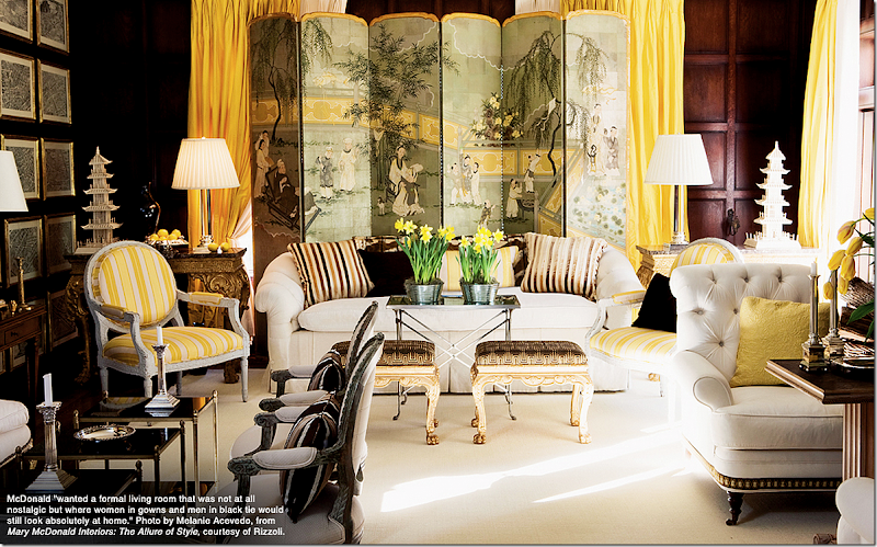
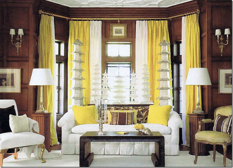
THEN: Mary kept the dark wood walls in here – and then decorated it in sunny yellows. The wood becomes like brown paint! The screen is the focal point of the room. Just gorgeous. So Mary!
Along the side wall – a series of framed maps and a French antique settee.
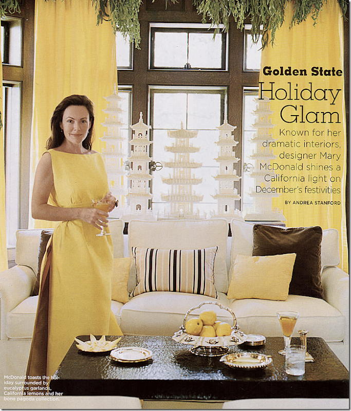
And here, Mary in her living room in front of her famed pagoda collection.
Another view of her gorgeous pagoda collection against the bay window that overlooks the backyard.
and now….
NOW: The living room – it looks like they lightened these walls. At least the décor is somewhat better. The room almost seems Mary inspired with the sunburst mirror and yellow pillows.
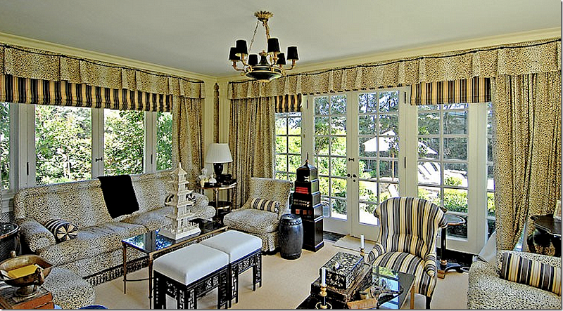
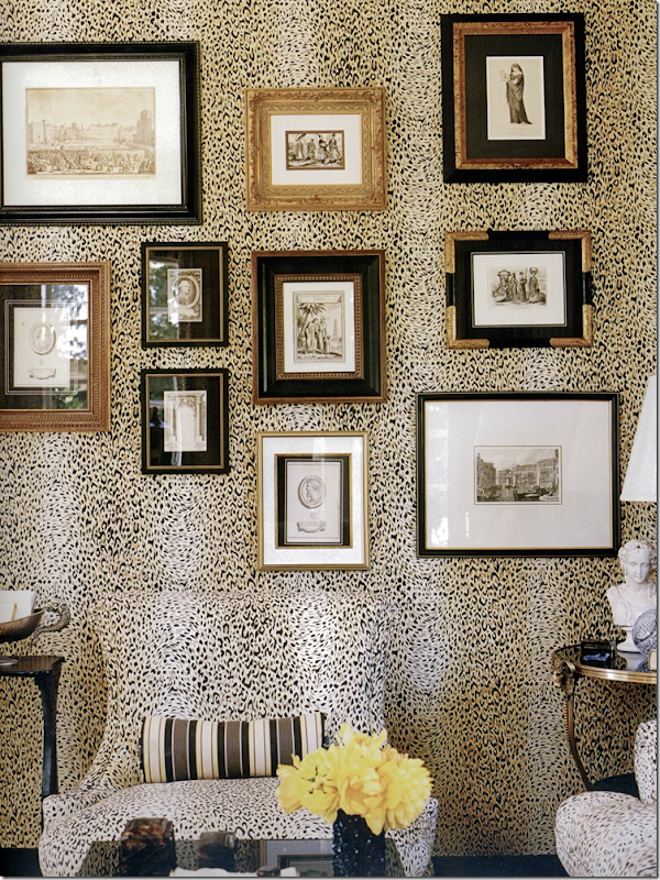
THEN: Past the living room is the sunroom that overlooks the swimming pool. Pictured here for the real estate brochure it looks very similar to how it looked in Mary’s book and in magazines.
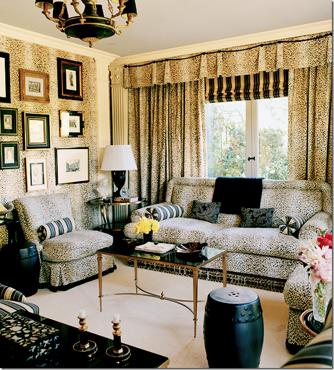
Mary really went all out decorating this room.
The chair almost disappears into the walls.
And today:
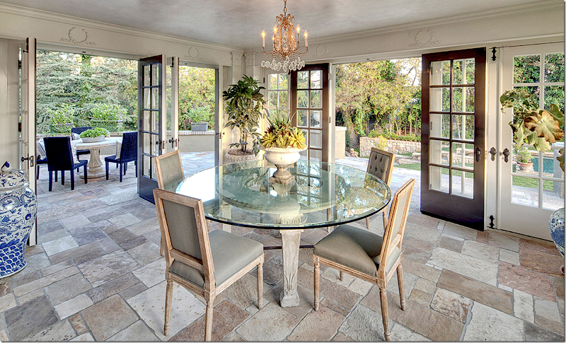
NOW: Well, the owners changed this room into a sort of pool room with a new stone floor and French doors that open to the new terrace. I’m not sure why they would give up a sitting room for this. But I guess whomever buys it could put regular furniture in it. I don’t quite understand the wood reliefs above the doors that look either French or Swedish in feel – isn’t this a Tudor house? And a tiny crystal chandelier in a sunroom? I give up!!!
Ok, let’s go forward – from the Entry Hall to the Dining Room:
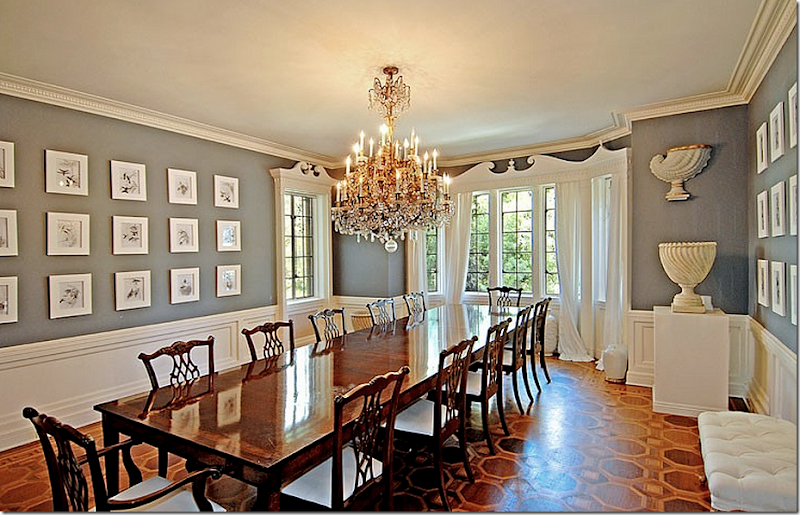
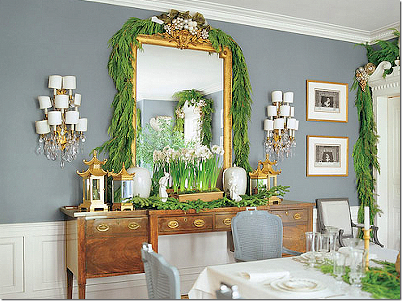
THEN: The dining room was painted gray with white moldings and a beautiful chandelier. Mary had hung small gray prints around the walls. The floor was stained in a pattern.
Looking the other direction – the windows face the front of the house.
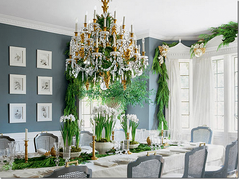
THEN: For Veranda’s Christmas story – Mary borrowed her gray French chairs from the breakfast room – isn’t her chandelier gorgeous.
And she added Christmas garland. Of course photographs from magazines make rooms look so much prettier than real estate brochures.
For her book, she used different chairs again.
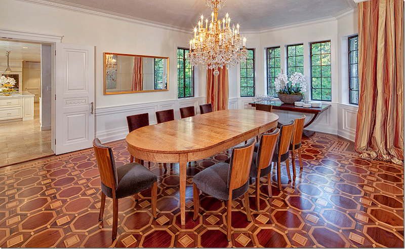
NOW: They kept the floor but painted the walls white and added contemporary styled chairs. I’m just shocked that Mary sold all the chandeliers with the house! They also removed all her Dorothy Draper inspired molding which is probably correct since this is a Tudor house. Again, STYLING!!!
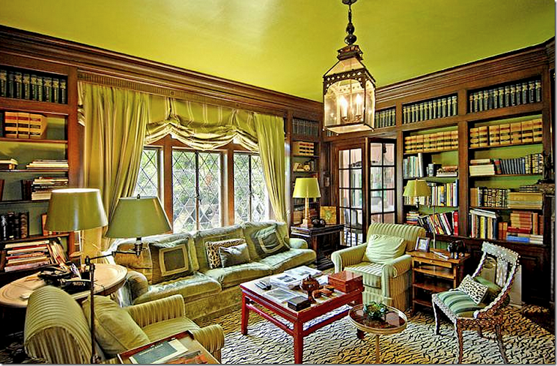
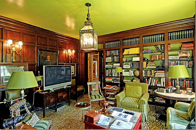
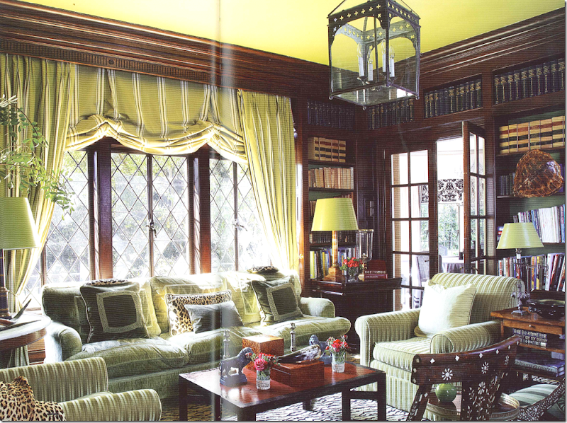
THEN: Through the door in the entry hall is the library. It sits directly behind the dining room and there is a door that leads to the breakfast room. This room overlooks the back yard. Because of the dark oak paneling, Mary painted the ceiling and bookshelves a bright apple green. She filled it with green upholstery in silk and velvet and an animal skin rug. A red coffee table is the surprise. I love all the green paper lamp shades! You can tell from this unstyled real estate brochure photo that this is a room they truly lived in.
Looking the other direction – this door leads to the entry hall. Above is a Moroccan styled lantern.
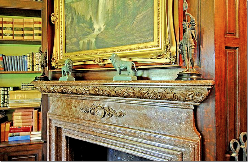
Beautiful mantel.
From Mary’s book – the same room, more organized and cleaned up.
Ready to see what this room looks like today:
NOW: It is now painted all red, including the paneling, which really clashes with the fireplace. Again, the styling is beyond terrible. A motorcycle???? With such terrible styling, I am really wondering why they even bothered to do it at all? Should have left it empty.
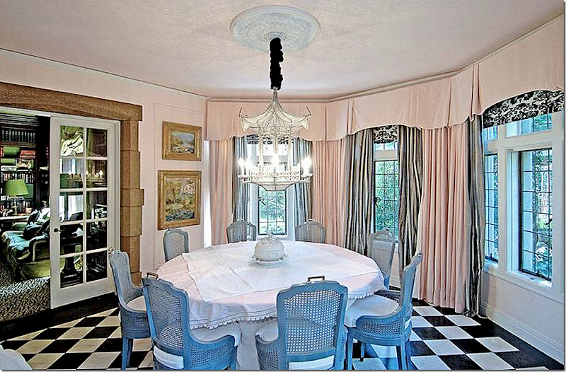
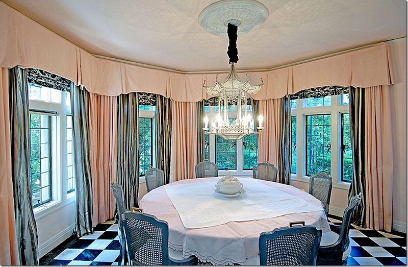
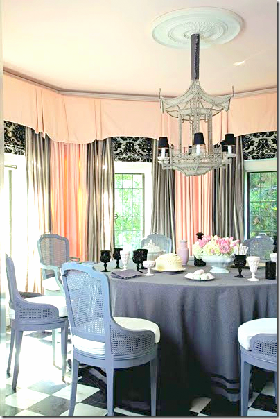
THEN: The breakfast room is reached off the kitchen and the library through French doors. There is a stone arch surround. The floor was black and white linoleum. Mary decorated it with a crystal pagoda chandelier and silk pink curtains with black and white toile shades and a gray silk lining.
And another view.
Styled for her book.
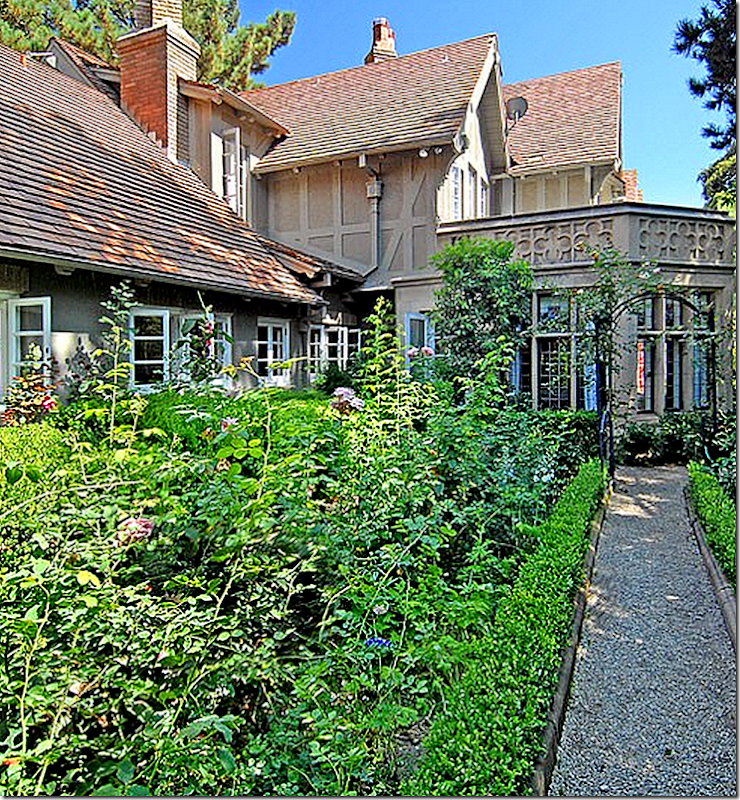
Remember how pretty this room is from the outside?
The kitchen is on the left with all the casement windows – and the breakfast room is ahead with the bay windows.
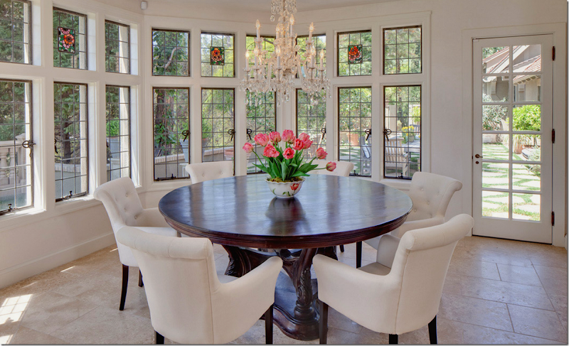
Ready to see the breakfast room today?
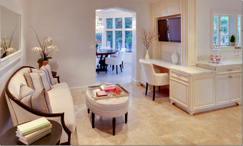
TODAY: When the house was first put up for sale, everyone was amazed to see that the kitchen and surrounding areas had not been updated in a while – especially considering the original $12 million asking price. People also remarked on the black and white linoleum floor. The new owners totally gutted the kitchen and in the breakfast room they added the limestone floor. The also removed all the landscaping – the dreamy English garden, the gravel path outside the windows. Today, instead there is a large dining terrace with a stone on grass floor.
TODAY: and here is how it looks outside the breakfast room and kitchen – all the flower beds are long gone, along with the gravel path. Instead there is this large dining terrace, which is very pretty.
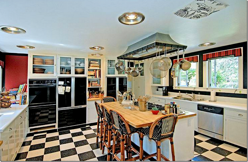
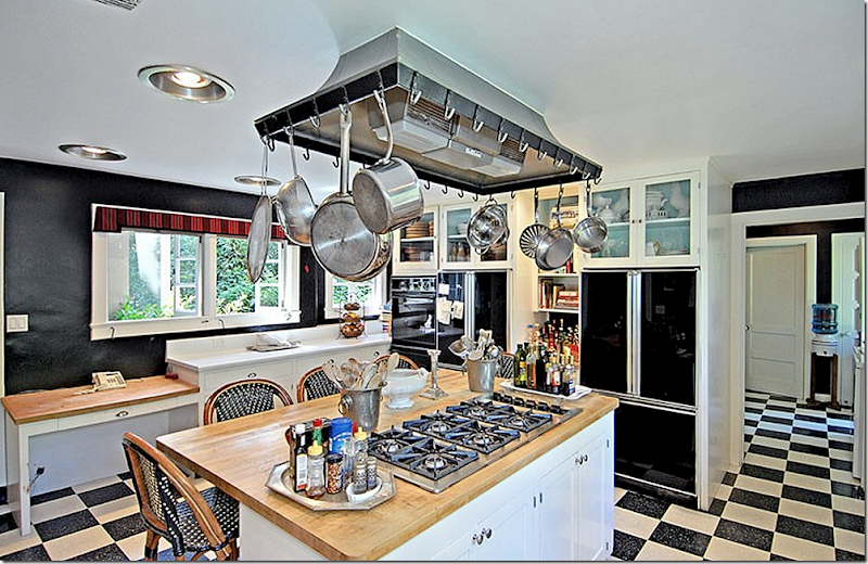
THEN: The kitchen was in desperate need of a makeover – especially with a $12 million price tag. One side overlooks the front with its own terrace, and the other side over looks the back yard. Many people commented on why there was a piece of toile wallpaper on the ceiling. I suppose the light fixture had broken or burned and it was never replaced.
And looking the other direction.
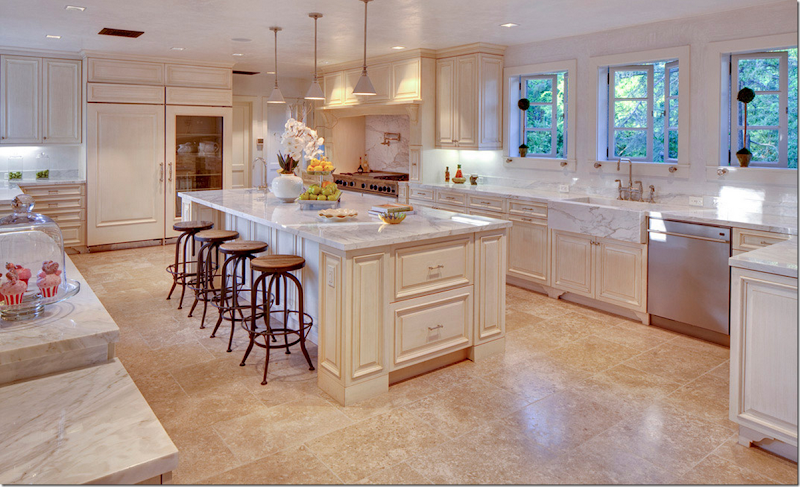
NOW: The kitchen is very pretty with white marble and stone floor. I’m not sure it really goes with all the dark paneling and Tudor style of the house – but it is a definite improvement. I think I would have used dark hardwoods through this area so it’s not such a jarring change.
NOW: Very pretty kitchen. Wood countertops would have been more English in feel. This could have been a more English styled design to match the feel of the house. And again the stone floors are just so wrong for this house.
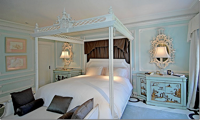
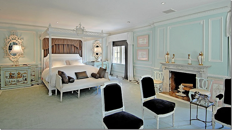
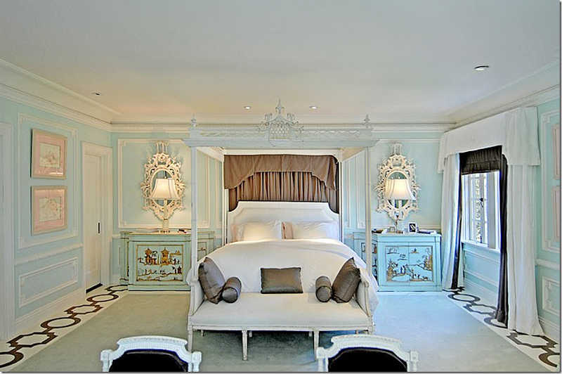
THEN: The master bedroom – upstairs - was typical Mary, very chinoserie styled with her copy of a Chippendale bed and her nightstands and mirrors.
The fireplace is original to the house.
She added a pattern border around the rug. So Mary!
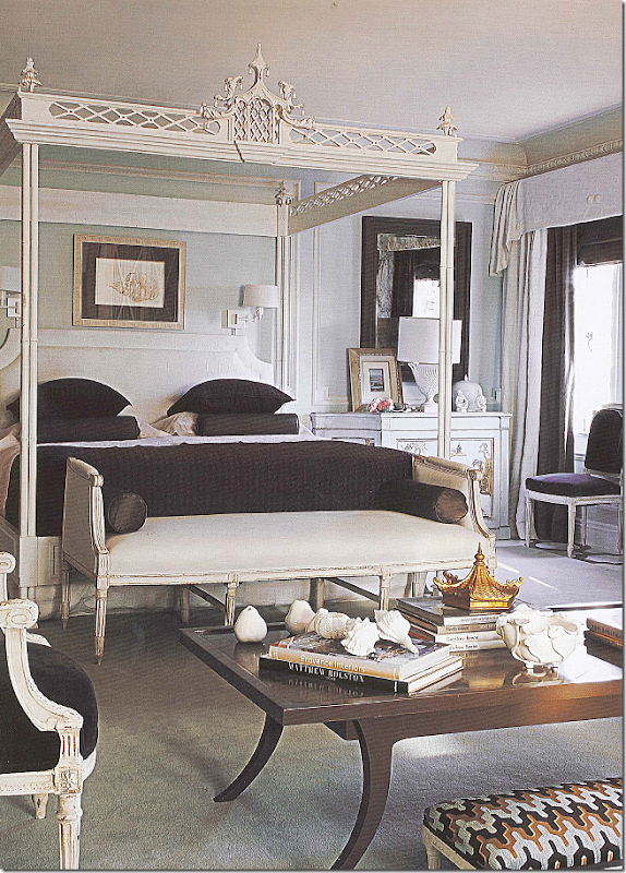
Later styled for her book, the brown drape behind the bed was removed and she brought up the coffee table from her living room, along with new mirrors. I have a feeling the drape was just photoshoped out and the hanging lamps added because the drape was there when the house was sold and those pictures were taken!
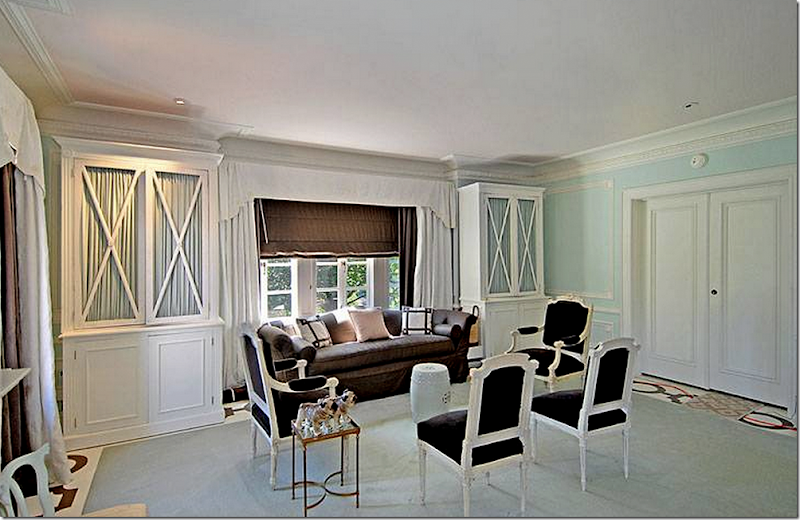
The sitting area across from the bed.
From her book – she brought in a white sofa and new pillows just for the picture.
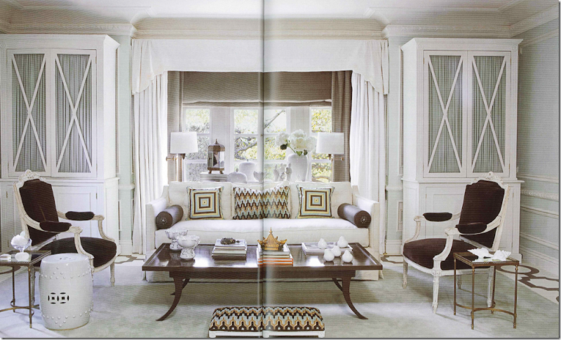
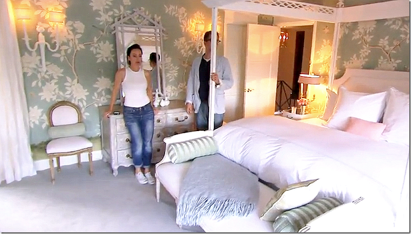
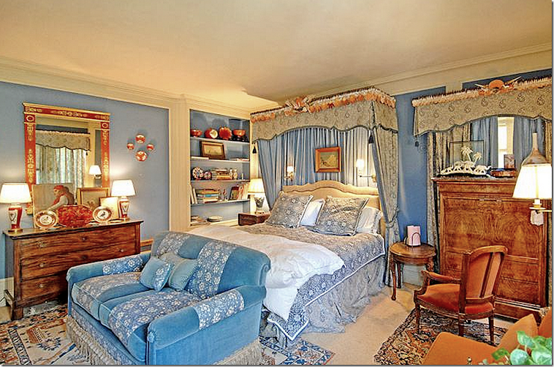
When Mary and Bercsi broke up – she moved back into her former house, which she had keep for guests. She showed her newly decorated bedroom on Bravo’s Million Dollar Decorators. The Chippendale inspired bed is now here, along with the French settee at the end of the bed and the French chairs. No telling what happened to all the other furniture. Not much of it appears to be used by her in this house.
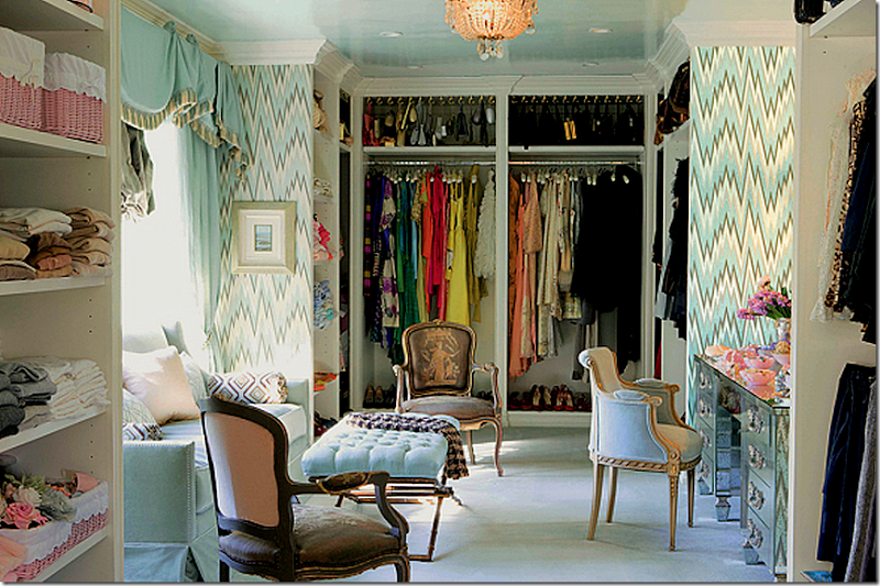
Her closet – she used it as a dressing room.
The gorgeous mirrored desk. Just gorgeous. I wonder where this desk is now?
Ready for NOW?
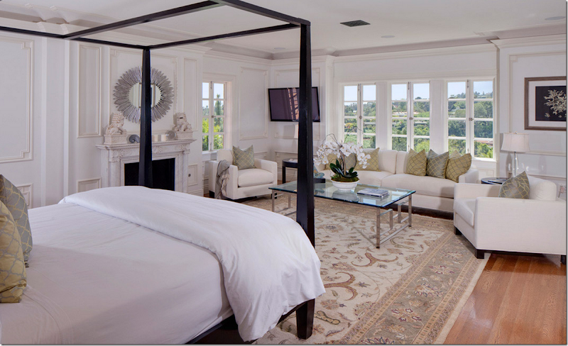
It looks like they kept the fireplace and the moldings – but added the not-dark, not-light wood floors, which IMO are just awful. Either go light or go dark! They also took about out the cabinets – but that’s fine. Furniture looks nice in here. The white walls look pretty too – but if the floor was dark, the walls would look even better. Pretty view.
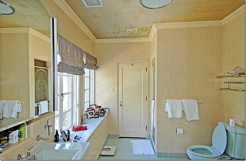
THEN: It was assumed this was the master bath or at least one of them. And, it really needed updating – though I love the windows in here.
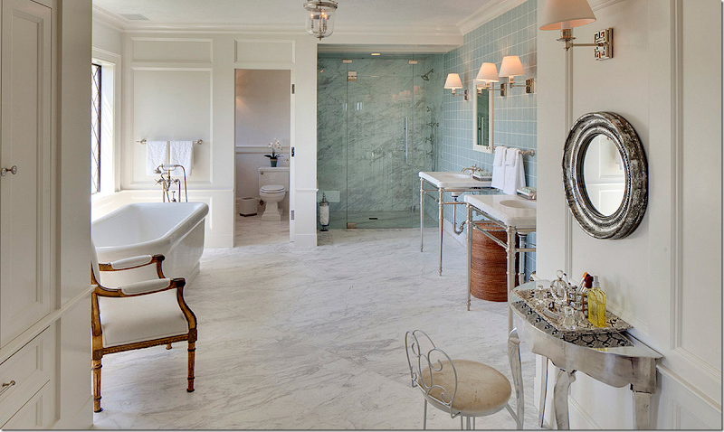
NOW: Not sure if this is the same master bathroom – because these windows are leaded. Not sure why they did part of it in white marble and part in green tile? All white would have been nicer. I feel like I’m nitpicking here, but for $23 million – shouldn’t it be fabulous???????
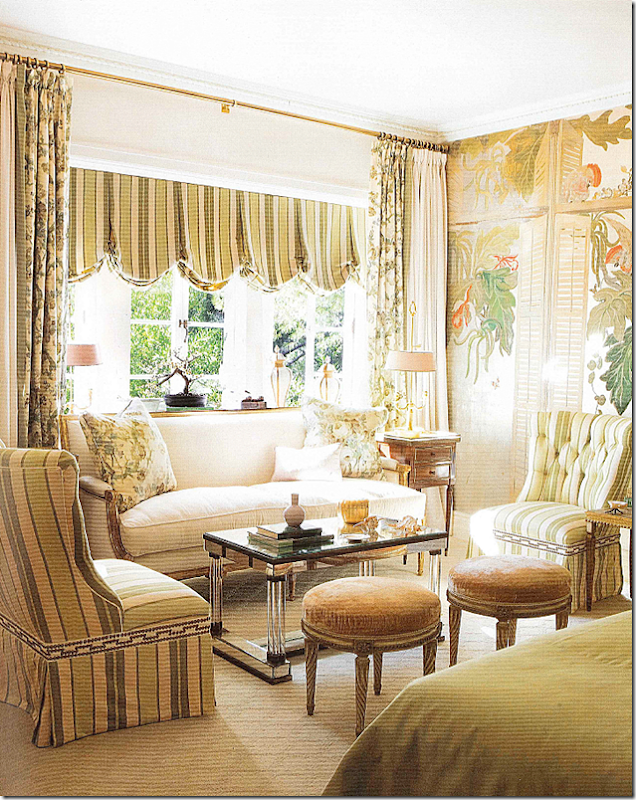
THEN: The guest room is right off the landing on the second floor. The house came with this paper and Mary kept it, saying it reminded her of the play: A Streetcar Named Desire. Of course, the room was styled for the real estate pictures and it doesn’t look nearly as cute as it did in her book.
Then: The sitting area of the guest room – so pretty.
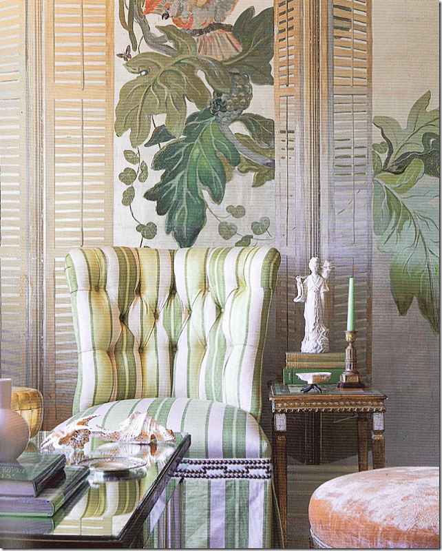
THEN: Close up of the paper with the shutters drawn over the landscaping.
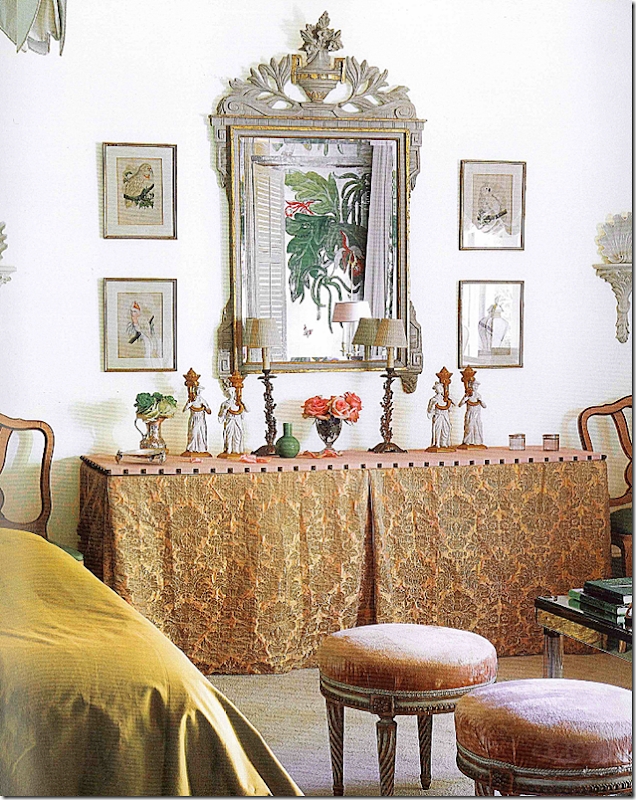
THEN: On the side of the room, Mary added a long skirted table with a fabulous mirror.
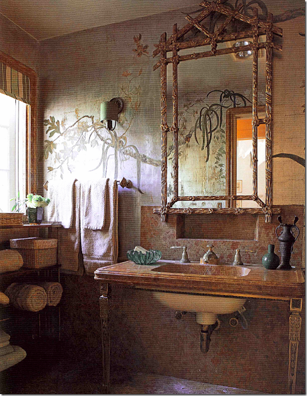
THEN: In the book, the guest room looked magical with more wallpaper and a beautiful rose marble.
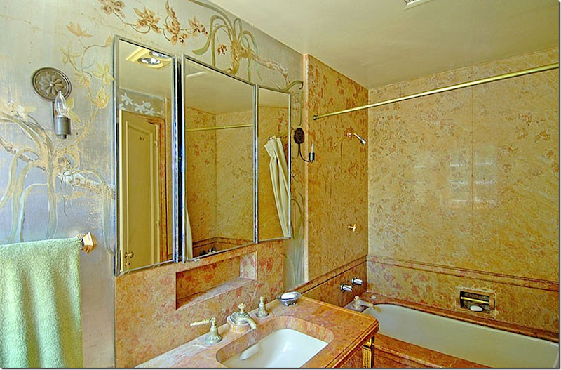
THEN: In reality – the same bathroom was not quite as magical looking and looked in need of an overhaul. Maybe it was prettier in person?
And today?
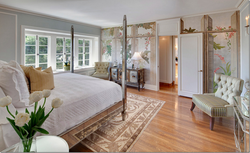
NOW: Surprisingly, the new owners kept the wallpaper – Kudos to them for doing so. I’m not sure why they even bothered with these rugs – they are all the wrong size and none of them add a thing.
THEN: Another guest room. Mary furnished it with items she used in a showhouse that ended up on the cover of House Beautiful.
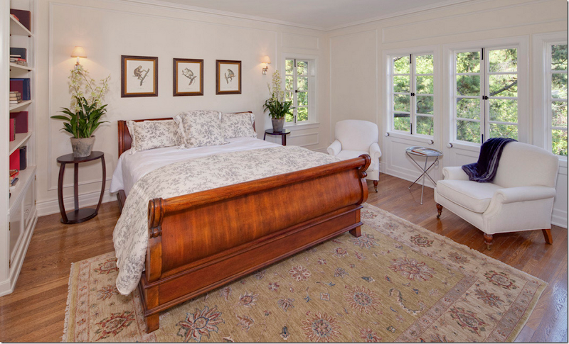
NOW: Again, pretty with the white walls, dark floors would have really made the walls stunning. I love using fake orchids on both sides of a bed – great idea! Kidding!!!!
So, I’m just stumped. Where is all the extra square footage that they say was added? In and interview the new owners said it was doubled – but where?
THEN: This might be the answer – before the house was renovated – there was an arched door that was found under the front slate terrace – see it there? Did it lead to a basement?
THEN: And here – to the right of the front terrace, you can see windows below that are on the basement level.
NOW: It looks like that door may have been moved over to the left somewhat – nearer to the terracing fountain.
NOW: And here you can see how under the front terrace that was added on to – there is a basement level with windows.
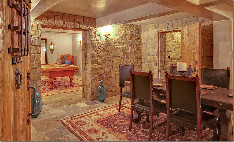
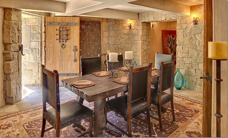
NOW: The door leading to the basement from the outside opens up to a wine cellar and games room and a media room. Pretty in stone floors and walls – I have no idea if this was here before, or if they added the stone. Is this where all the extra square footage comes from?
Looking out from the cellar to the front door.
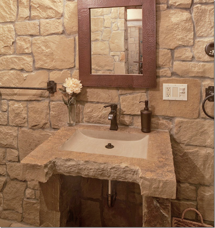
The guest bath – all stone. Makes me wonder if all the stone was just added for effect.
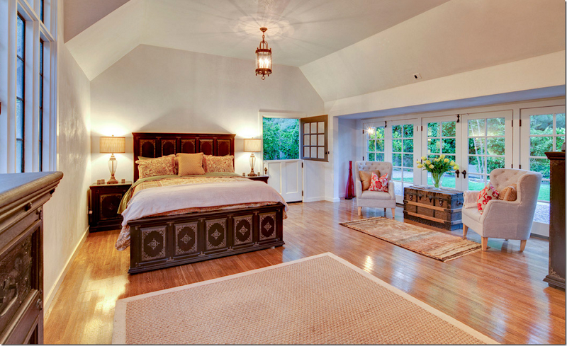
NOW: And finally, there is this bedroom on the first level, that might be new? This might be off the kitchen area – and could be the guest quarter. Although the house was bought with 7 bedrooms and there are still 7 bedrooms. I doubt the sq. ft. was almost doubled as was reported. I think the stone basement level is where they found extra footage and perhaps this bedroom, off the garage – called a guest house.
So, that’s it. Again, what a disappointment! I’m sorry to say this, I know the new developers put a lot of money into it - but I just question their choices. I know they couldn’t do painted walls like Mary had – and white is a nice choice, but the medium orange oak floors are terrible. I also think the kitchen and bathrooms could have been in a more English style and been fabulous – again with hardwoods in the kitchen area, not light limestone. The house is so English – with the entry hall and paneled rooms – to ignore that décor and just add onto it, without taken this account seems wrong. It doesn’t seem like they hired a designer to help with these huge decisions and I will be interested to see how long this stays on the market. If they had hired a stylist like Mary who has shown a great talent in styling houses, would it help sell it faster?
And while I do know that selling a house looking like it did when Mary owned it would have been a tough sell, I do miss that gorgeous persimmon entrance hall:
And yes, it does look like this is some house in the countryside of England. Mary took a forbidding backdrop and made it come alive in a fun, yet sophisticated way.
Instead we have this.
I’m curious to hear if any of you have ideas of what you would have done to this house - how you would have styled it to make it look it’s absolute best? Especially this entrance hall which is so hard to decorate. Is stark white the best color against all the wood? Is the kitchen wrong or right? Let me know what you think!
Monday, July 1, 2013
BEVERLY HILLS: A BEFORE & AFTER
Subscribe to:
Post Comments (Atom)

























No comments:
Post a Comment