One of my favorite bloggers is Maria Killam who writes “Colour Me Happy.” Maria is a color expert who hails from Canada, hence her spelling of color with a “u!” Whenever I get an email from a reader questioning what color should she paint her front door to go with her brick, or something to that effect, I refer her to Maria, because I know her answer will be correct.
Colour Me Happy is a like a textbook of what to do and what not to do when decorating your house. She deals with all aspects of design, not just paint colors, but paint is her expertise. Last year Maria put together a selection of her fifty favorite Benjamin Moore paint colors and had them painted on very large 11”x14” sample boards. I have her kit and find it so helpful to use with clients. The large boards really give you a sense of what the color is going to look like when painted on the walls, and when you tape the boards up to look at them, you get a good sense of the undertones and how they will affect your space.
Additionally, Maria has written an e-book entitled
The book explains how to choose one color over another and it explains the importance of undertones and why they matter so much when picking a paint color. Maria has used her system for 10 years and in the book, she explains it in easy to understand terms for the novice. The book can be downloaded as a PDF file, or to your Ipad or Kindle.
Recently, Maria revised her book and added a large question and answer section based on emails she received from readers. To celebrate the newest edition of “How To Choose Paint Colors – It’s All in the Undertones” Maria has written a guest blog post today about color and natural fiber rugs, such as seagrass.
I hope you enjoy what Maria has written!!!
Maria Killam from Colour Me Happy writes:
Recently a reader emailed me this question, 'Do you consider natural fiber rugs to be neutral?' I thought about the answer to this question for a while. At first I thought maybe they could be like most hardwood floors which I do consider to be fundamentally neutral unless you have some wild 'look at me' stain on them. Also sometimes a natural fiber rug looks like it almost blends into the hardwood depending on what colour it is. However, you can't generally take a wood flooring and break it down into three beige undertones like you can with a sisal or seagrass rug. After all, a natural fiber rug does not read like a multi-toned wood floor. So that means that they cannot be considered neutral (maybe).
Take a look at these three images (above). The first one on the left has a green undertone. The one in the middle has a pink undertone and the one on the right clearly has a yellow/gold undertone. (Image source, one, two three)
Here's another stack of sisal and seagrass rugs in varying shades of yellow and green beige except for the one on the bottom which is more taupy brown.
Next I'll identify the undertones in the following interiors and you can judge for yourself whether you think they are neutral or not?
In this image, a blue area rug is layered on top of the seagrass rug so you could probably choose any undertone for the rug underneath although this one in the green/yellow family relates really well to the undertones in the fireplace stone. Also the fireplace stone is visually the most important feature in the room as the furniture is all so quiet and neutral. source
Here the walls have a green beige undertone and the jute area rug has a pink beige undertone. Notice that the drapes and the pattern in the charcoal coloured chairs also pick up the pink undertone in the rug. source Would it look as cohesive if the area rug was suddenly gold?
The Reese Witherspoon ranch that Joni blogged about here has a pink beige jute area rug, however you can see that the same undertone is repeated in the drapes, the tufted settee placed directly beside the drapery on the left as well as the damask toss pillows on the sofa.
Here the seagrass area rug reads pink beige in this interior combined with mostly yellow beige furniture and walls.
In this living room designed by Jeffrey Bilhuber the seagrass area rug appears to have a pinker undertone than the pattern in the sofas, the chairs and ottoman. The room is so beautifully decorated and filled with so many interesting pieces to look at that the rug appears neutral here.
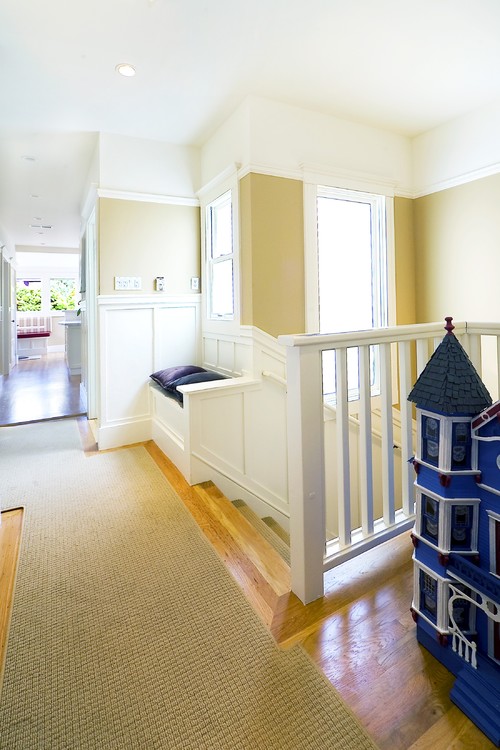
A space like a carpeted hallway without any furniture looks the best when you coordinate the colour with the walls like this one with the yellow beige sisal runner and yellow beige walls.
This chevron sisal rug has a green undertone and it's repeated in a very pale shade in the wall colour which looks like it could be a blue/green shade. Note that if the area rug was a yellow/gold beige or pink beige it would look odd if the neutral wall colour was not repeated.
In this living room decorated by Joni, she repeated the green beige of the seagrass on the walls and with all the brown and white slipcovered furniture.
(and in a note by Joni: the ceiling will be stained in a week or two to a more grayish color, instead of the pink wood tones it is now.)
Here is Joni's family room with green beige seagrass and the same undertone is repeated in the wall colour and woven wood shades.
This interior which Joni compared to all others in her Top 10 Design Elements series, has yellow beige seagrass with all the white slipcovers. Notice that the accent pillows and fringe on the ottomans all pick up on the area rug with the same yellow/gold tones.
Bottom line, any item in a solid colour that is darker than white or cream is no longer neutral in most interiors. As soon as you're calling it beige or grey (neutral) instead of orange or blue (a colour) there's an undertone that you need to choose to work with or ignore if it works to do that.
JONI: I have something to add to the discussion of textured rugs and color! Of course! When seagrass is new, or young, it is often very green. As it ages, the green fades and it becomes more golden. So, don’t get nervous if you buy a new seagrass and it looks really green. One day soon, you will look at it, and will be much lighter and brighter.
Here are the 3 choices for downloading Maria’s book:
Maria’s book is the definitive book on how to choose paint colors. It was written specifically for everyone who wants to pick the right paint colors for their home and increase their confidence when doing so. Imagine after reading this book, you’ll be ready to…
Look at any home through new eyes,
develop a paint color plan and
pick the colors that will make your space sing.
Maria’s book cost $29.99, but for the next week, she has reduced the price to $19.99 for Cote de Texas readers. When ordering, put TEXAS in the code to receive your discount.
And to order Maria’s Color Boards – 50 large paint samples, go HERE:
A huge thanks to Maria for this lesson in color and textured rugs!!! To read Maria’s blog, Colour Me Happy, go HERE.
AND IN VERY EXCITING NEWS:
Houston Interior designer Sally Wheat, whose beautiful living room is pictured above, is going to be hosting a sale on One King’s Lane!
Sally sells her vintage finds and furniture on her web site HERE and at Memorial Interiors and Antiques HERE. Her One Kings Lane sale will be on Tuesday Jan. 22, 10:00 am CST. Be sure to mark your calendars !!!


No comments:
Post a Comment